Warm Spring: Your Complete Colour Guide
- Warm Spring: Your Complete Colour Guide
- Part 1: What Being a Warm Spring Actually Means
- Part 2: Your Power Palette — Best Colours (and Why)
- Part 3: The “Handle With a Little Extra Care” List
- Part 4: Pattern Play — Best Prints & Patterns (and Why)
- Part 5: Metal Detector — Best Metals & Jewellery (and Why)
- Part 6: Face Value — Your Makeup Roadmap
- Part 7: Through the Looking Glass — Eyewear
- Part 8: Crowning Glory — Hair Colour
- Part 9: Fingertips — Nail Polish
- Part 10: Texture & Fabric Talk
- Part 11: Putting It All Together — Styling Tips
- Part 12: Common Pitfalls (a.k.a. “Oh, That’s Why”)
- “Warm means everything should be brown.”
- “Spring means neon.”
- “I’m near Autumn, so all Autumn colours should work.”
- Choosing Colours That Are Too Cool
- Choosing Colours That Are Too Dark
- Choosing Colours That Are Too Muted
- Choosing Colours That Are Too Pale
- Defaulting to Black
- Buying Cool “Basics”
- Assuming Every Warm Colour Works
- Avoiding All Earthy Colours
- Forgetting Personal Style
- Quick-Reference Cheat Sheet
- A Final Word
So, the results are in: you’re a Warm Spring!
Which means your colouring has all the lively freshness of Spring, but with a little extra warmth, richness, and golden glow.
Your palette is sunny, welcoming, and full of colour. Not neon. Not earthy enough to disappear into a decorative bowl of pinecones. Not permanently dressed like you have been invited to cut the ribbon at a citrus festival.
Your colours feel warm and energised, but they still have enough softness and balance to look connected to you.
Warm Spring sits firmly within the Spring family, meaning your colouring is fundamentally:
- Warm in undertone
- Medium-light to medium in overall value
- Medium to moderately high in chroma
But because you sit closer to Autumn than some other Spring palettes do, you can borrow a little of Autumn’s depth and earthiness. Your best colours are still lighter, fresher, and clearer than Autumn shades, but they carry more richness than the palest or brightest parts of the Spring spectrum.
Think coral rather than cool rose. Warm turquoise rather than icy blue. Leaf green rather than greyed sage. Golden camel rather than cool taupe. Fresh, but grounded.
The goal is not to turn you into an Autumn. Autumn colours can become too dark, muted, brown, or heavy against you. Instead, you borrow just enough of Autumn’s warmth and richness to give your Spring palette a little extra substance.
In other words: warm, radiant, lively, and softly grounded.
Let’s get into what that actually means for your wardrobe.
Part 1: What Being a Warm Spring Actually Means
Colour analysis looks at three main things about your natural colouring — your skin, hair, and eyes working together:
- Temperature — are your undertones warmer or cooler?
- Value — is your overall colouring lighter or deeper?
- Clarity — is your colouring clearer and more vivid, or softer and more muted?
For you, the strongest and most important quality is warmth.
Your colouring is supported by shades with golden, peach, coral, yellow, warm green, or red-orange undertones. Colours containing a noticeable amount of blue, cool grey, mauve, icy pink, or blue-red may sit separately from you rather than blending naturally.
This does not mean every colour needs to look as though it has been marinating in sunshine.
Warm Spring colour is fresh rather than heavily roasted. You suit warmth with light and movement in it — golden coral, apricot, warm turquoise, leaf green, tomato red, and butter yellow — rather than colours that have become dark, muddy, or densely brown.
Your second quality is your medium-light to medium value.
You can wear light colours beautifully, but you are not restricted to delicate pastels. You also need enough substance to support your warmth.
Your easiest colours tend to sit between very pale and very deep:
- Warm light colours with visible pigment
- Fresh medium brights
- Golden earthy shades
- Richer accents that remain clearly colourful
The difficulty often begins when a colour becomes very dark, blackened, or visually heavy.
Your third quality is your medium to moderately high chroma.
Spring colouring benefits from freshness and clarity. Your colours should look alive.
However, Warm Spring is not about the most electric or fluorescent versions of colour. You can handle brightness, but your best shades have a warm, natural quality rather than a sharp, synthetic one.
A clear coral may bring you to life. A neon fuchsia may begin holding a press conference beside your face.
Here is the easiest way to picture your palette:
Imagine a garden in warm late-morning sunlight.
There are coral flowers, golden daffodils, fresh leaves, warm blue skies, peach blossoms, and terracotta pots. The colours are bright enough to feel energised, but everything is softened slightly by warmth.
A few other things worth knowing:
- Warm Spring can appear across many skin tones, hair colours, and eye colours. It is not restricted to light skin, freckles, or golden hair.
- Warm does not automatically mean dark or earthy. Many of your best colours are fresh, clear, and medium-light.
- Bright does not mean neon. Your colours should have life, but they do not need to glow in the dark.
- Your Autumn influence is useful, but it is not the whole story. You can borrow some depth, camel, olive, and terracotta, but the darkest and most muted Autumn shades may overwhelm you.
- Temperature often matters before anything else. A slightly softer warm colour may work better than a vivid shade with a cool blue base.
- Brown is not your only neutral. You have cream, warm navy, camel, golden beige, tan, warm grey, and even olive available to you.
The central rule is simple:
Keep it warm, keep it fresh, and stop before the colour becomes either too dark or too dusty.
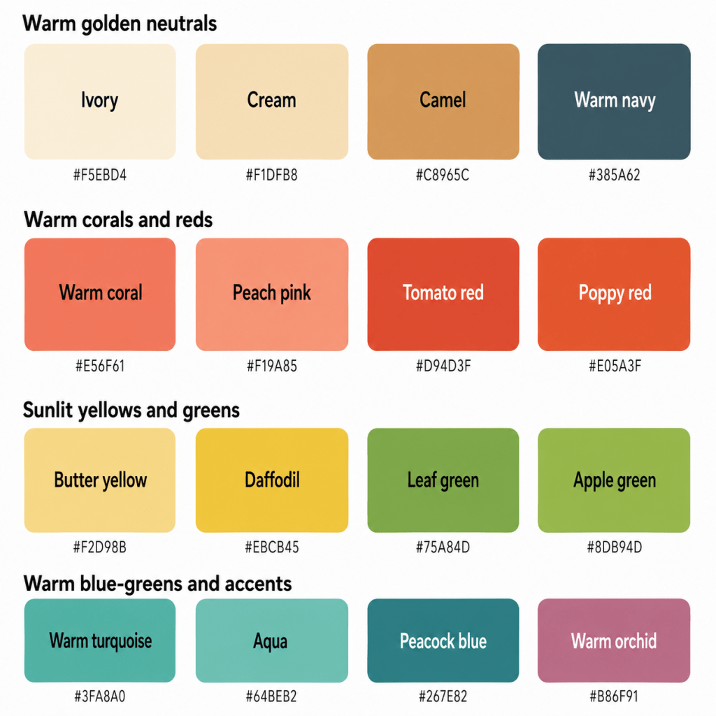
Part 2: Your Power Palette — Best Colours (and Why)
The unifying theme of your palette is warm, fresh colour with golden richness.
Your best shades are neither chalky nor muddy. They are not fluorescent, but they are not shy either. They look sunlit, lively, and warmly polished.
The Golden, Grounded Neutrals
- Ivory — warm and gentle, without the sharpness of optic white
- Cream — a soft yellow-based off-white
- Golden Beige — warm, fresh, and lighter than camel
- Camel — a rich warm neutral with enough clarity to remain lively
- Warm Tan — a medium golden brown without excessive depth
- Warm Navy — a softened, slightly green-leaning navy rather than an inky blue-black
These neutrals work because they reflect your warmth without becoming too heavy.
Ivory and cream are often much more harmonious than brilliant white. They give you lightness while supporting the golden quality in your colouring.
Golden beige and camel provide warmth and structure. Warm tan gives you a practical leather-like neutral, while warm navy offers an alternative when brown feels too earthy.
You may also suit:
- Light cognac
- Warm stone
- Golden khaki
- Light chocolate
- Warm taupe
- Olive used as a neutral
Yes, olive can be a neutral. It has filled out the forms and is waiting patiently by reception.
Corals, Pinks & Reds
- Warm Coral
- Peach Pink
- Salmon
- Tomato Red
- Poppy Red
- Warm Watermelon
- Persimmon
- Geranium
Your pinks and reds should have a warm, peachy, coral, or orange-red quality.
Warm coral is one of your strongest colours because it combines warmth, freshness, and enough saturation to reflect your Spring energy. Peach pink offers a lighter option, while tomato and poppy red give you a stronger statement.
Warm watermelon works when it stays coral-based rather than blue-pink. Persimmon and geranium add richer warmth without becoming dark brick or rust.
Avoid cool raspberry, magenta, burgundy, blue-red, and mauve-based pinks.
Your reds should suggest poppies, tomatoes, coral petals, and summer fruit — not a bowl of chilled cranberries.
Oranges & Peaches
- Apricot
- Peach
- Papaya
- Tangerine
- Melon
- Soft Orange
- Warm Nectarine
- Golden Coral
Orange is often one of your most natural colour families.
Because your undertone is strongly warm, you can wear peach, apricot, papaya, and soft orange without the colour appearing separate from your skin.
The key is keeping the shade fresh rather than dark or browned.
Apricot and peach make lovely lighter shades. Papaya and tangerine bring more energy. Golden coral works beautifully when you want something between orange and pink.
Be more cautious with burnt orange, deep rust, and brownish terracotta, which may become too heavy.
Yellows
- Butter Yellow
- Golden Yellow
- Daffodil
- Sunflower
- Primrose
- Warm Lemon
- Marigold
- Honey Yellow
Yellow is one of your strongest families because it echoes your natural warmth.
Butter yellow gives you a soft light option. Daffodil and warm lemon are fresh and clear. Golden yellow and sunflower create more impact.
Marigold and honey yellow can work because of your Autumn influence, provided they remain colourful rather than brown or mustard-heavy.
Avoid icy lemon, greenish fluorescent yellow, and murky mustard.
Your yellow should look sunlit, not institutional.
Greens
- Leaf Green
- Apple Green
- Warm Jade
- Fresh Olive
- Chartreuse
- Avocado
- Grass Green
- Moss Green
Green is especially useful because it reflects both Spring freshness and your Autumn-adjacent warmth.
Leaf green and apple green are bright, natural choices. Warm jade adds sophistication. Fresh olive and avocado give you earthier options without becoming too muted.
Chartreuse can work in controlled amounts, particularly when it leans golden rather than fluorescent. Moss green may also suit you when it remains medium and visibly green.
Avoid blue-based pine, icy mint, grey sage, or blackened forest green.
You want the sort of green that looks as though it has recently grown something.
Blues & Blue-Greens
- Warm Turquoise
- Aqua
- Peacock Blue
- Teal
- Warm Sky Blue
- Petrol Blue
- Marine Blue
- Clear Blue-Green
Blue can be slightly trickier because it is naturally cool, but your strongest blues contain noticeable green or warmth.
Warm turquoise and aqua are especially flattering because they combine Spring brightness with a yellow-based green influence. Peacock and petrol blue offer more depth.
Warm sky blue can work when it remains fresh and slightly turquoise rather than icy. Marine blue gives you a more structured medium shade.
Avoid icy blue, periwinkle, blue-violet, cool navy, and steel blue.
Your blue should look as though the sea has been warmed by sunlight, not as though it has been preserved in a glacier.
Warm Purples
- Red-Violet
- Warm Orchid
- Soft Aubergine
- Warm Plum
- Heathered Grape
- Reddish Purple
Purple is not your broadest colour family because many purples lean strongly blue.
Your best versions contain enough red or warmth to prevent them from becoming cool.
Warm orchid can be especially effective when it leans pink rather than violet. Red-violet and warm plum create stronger accents. Soft aubergine may work in smaller quantities if it remains visibly warm and not nearly black.
Avoid icy lavender, blue-purple, cool lilac, and ultraviolet shades.
Warm Light Colours
- Ivory
- Peach Cream
- Butter Yellow
- Warm Mint
- Light Aqua
- Apricot
- Soft Coral
- Pale Golden Green
Your lighter colours should feel creamy, sunlit, and visibly warm.
They should not become:
- Chalky
- Icy
- Greyed
- Blue-based
- Nearly white
A light peach with visible warmth can look beautiful. A cold, milky pink may leave you looking slightly unconvinced by your own shirt.
Deeper Accent Colours
- Warm Teal
- Petrol Blue
- Tomato Red
- Warm Plum
- Cognac
- Deep Olive
- Warm Chocolate
- Terracotta
You can wear some depth because of your Autumn influence, especially in smaller amounts or when balanced with lighter colours.
The key is stopping before the shade becomes very dark, muted, or blackened.
Warm teal works better than midnight navy. Cognac works better than espresso. Terracotta works better than deep rust.
Depth is useful. A colour that appears to have spent several winters in a cellar may be less cooperative.
A Starter Palette
| Colour | Hex | Notes |
|---|---|---|
| Ivory | #F5EBD4 | Warm, gentle light neutral |
| Cream | #F1DFB8 | Soft golden off-white |
| Golden Beige | #D8B98A | Warm and versatile |
| Camel | #C8965C | Rich golden neutral |
| Warm Tan | #B77B48 | Medium warm brown |
| Warm Navy | #385A62 | Deep but not inky |
| Warm Coral | #E56F61 | Fresh signature coral |
| Peach Pink | #F19A85 | Light, warm pink |
| Salmon | #E98672 | Soft orange-pink |
| Tomato Red | #D94D3F | Clear warm red |
| Poppy Red | #E05A3F | Bright but natural |
| Persimmon | #D96745 | Rich warm accent |
| Apricot | #F3B47C | Soft golden peach |
| Peach | #F6C09A | Gentle warm light |
| Papaya | #ED8B55 | Lively orange |
| Tangerine | #EA713A | Clear and energetic |
| Butter Yellow | #F2D98B | Soft warm yellow |
| Daffodil | #EBCB45 | Fresh golden yellow |
| Sunflower | #DDAF2B | Rich, clear yellow |
| Honey Yellow | #D5A642 | Warm medium yellow |
| Leaf Green | #75A84D | Fresh natural green |
| Apple Green | #8DB94D | Clear and lively |
| Warm Jade | #4C9B74 | Polished warm green |
| Fresh Olive | #8D9950 | Earthy but alive |
| Warm Turquoise | #3FA8A0 | Warm blue-green |
| Aqua | #64BEB2 | Fresh, light blue-green |
| Peacock Blue | #267E82 | Rich, colourful depth |
| Warm Orchid | #B86F91 | Red-based purple-pink |
Part 3: The “Handle With a Little Extra Care” List
This is not a list of colours you must remove from your wardrobe while an orange scarf watches smugly from the doorway.
These are simply colours that sit further away from your natural combination of warmth, medium-light value, and lively chroma. They may require more thoughtful styling, especially near your face.
The Coolest Colours
- Icy blue
- Blue-violet
- Cool lavender
- Magenta
- Blue-red
- Cool raspberry
- Steel grey
- Silver-grey
- Cool navy
- Blue-based pink
Coolness is often your clearest challenge.
These colours may create the appearance of shadows, sallowness, redness, or unevenness because their blue base does not naturally echo your colouring.
Choose:
- Warm turquoise instead of icy blue
- Coral instead of cool pink
- Tomato red instead of blue-red
- Warm orchid instead of lavender
- Warm navy instead of inky navy
- Golden beige instead of steel grey
A cool colour may be perfectly stylish. It may simply be stylish in someone else’s changing room.
The Darkest Colours
- Jet black
- Espresso
- Blue-black
- Near-black navy
- Blackened burgundy
- Deep aubergine
- Very dark forest green
- Oxblood
These colours can create too much weight and contrast.
Your palette benefits from light, warmth, and colour. Very dark shades may make your features appear shadowed or overwhelmed.
Choose:
- Warm navy instead of black
- Cognac instead of espresso
- Warm plum instead of black-purple
- Deep olive instead of forest-black
- Terracotta instead of oxblood
The Dustiest, Most Muted Colours
- Greyed mauve
- Dusty blue-grey
- Murky taupe
- Faded khaki
- Browned sage
- Smoky rose
- Lifeless beige
- Heavily muted olive
Spring colouring needs freshness.
A colour with too much grey may make you look tired, flat, or slightly beige around the edges.
Choose:
- Peach pink instead of dusty rose
- Aqua instead of grey-blue
- Leaf green instead of muted sage
- Golden beige instead of grey taupe
- Coral instead of browned rose
Your colours may be softened slightly. They should not appear to have lost all enthusiasm.
The Brightest, Most Artificial Colours
- Neon pink
- Fluorescent yellow
- Electric blue
- Acid green
- Highlighter orange
- Brilliant violet
- Synthetic magenta
- Highly saturated black-and-white combinations
You can wear clear colour, but the most fluorescent shades may become disconnected from your natural warmth.
Choose:
- Coral instead of neon pink
- Daffodil instead of fluorescent yellow
- Warm turquoise instead of electric blue
- Apple green instead of acid green
- Tangerine instead of highlighter orange
Your colours can be lively without requiring protective eyewear.
The Iciest Pastels
- Frost pink
- Icy lavender
- Pale blue-white
- Cool mint
- Sharp optic white
- Near-white grey
- Silvered pastel shades
Very icy colours can feel too pale, cool, and detached.
Choose:
- Peach cream instead of icy pink
- Apricot instead of frosted coral
- Warm mint instead of cool mint
- Ivory instead of optic white
- Light aqua instead of frost blue
You want cream, sunlight, and colour — not the visual atmosphere of a very expensive refrigerator.
The Deepest Autumn Colours
Because you sit near Autumn, it is easy to assume every Autumn shade will work.
Be cautious with:
- Dark rust
- Deep mustard
- Mahogany
- Bitter chocolate
- Black olive
- Burnt umber
- Dense brown-orange
- Very dark moss
These colours may be warm enough, but they can still become too deep, heavy, or muted.
Choose:
- Persimmon instead of dark rust
- Daffodil instead of mustard
- Camel instead of mahogany
- Warm tan instead of bitter chocolate
- Fresh olive instead of black olive
How to Make a Less-Ideal Colour Work
You have several options:
- Move it away from your face
- Pair it with one of your best warm colours
- Use it in a smaller proportion
- Choose a warmer or lighter version
- Add gold jewellery or warm makeup near your face
- Place an ivory, coral, peach, or turquoise neckline between you and the colour
- Use the colour in shoes, bags, trousers, or patterns
- Keep the overall outfit warm and medium in contrast
The goal is not wardrobe obedience. It is understanding why something may feel too cool, dark, muted, icy, or heavy — and knowing how to bring it back towards you.
Part 4: Pattern Play — Best Prints & Patterns (and Why)
Warm Spring patterns work best when they reflect the same balance found in your solid colours:
- Warm overall temperature
- Medium-light to medium value
- Medium contrast
- Clear but natural colour
- Energetic shapes
- Enough softness to avoid harshness
What Works for You
Medium-Contrast Patterns
Think:
- Ivory and warm navy
- Coral and camel
- Aqua and golden beige
- Leaf green and cream
- Tomato red and warm tan
These combinations create definition without becoming stark.
Tonal Patterns
Tonal patterns use several versions of a similar colour:
- Peach, coral, and persimmon
- Butter yellow, daffodil, and honey
- Aqua, warm turquoise, and peacock
- Apple green, leaf green, and fresh olive
These can look especially harmonious because they create depth while keeping warmth and brightness consistent.
Fresh Florals
Excellent florals include:
- Coral flowers
- Peach blossoms
- Golden centres
- Warm green leaves
- Aqua backgrounds
- Poppy-red accents
- Cream or ivory bases
Be cautious with florals dominated by:
- Cool mauve
- Blue-grey
- Black backgrounds
- Icy pink
- Burgundy
- Dusty sage
- Silver-grey leaves
Playful Geometrics
Your Spring energy suits:
- Warm stripes
- Cheerful checks
- Polka dots
- Rounded geometrics
- Colourful abstract prints
- Mid-scale motifs
- Organic patterns
Try:
- Coral and cream stripes
- Aqua and camel geometrics
- Leaf green and ivory checks
- Warm navy with peach or yellow accents
Botanical Prints
Warm Spring often suits botanical patterns beautifully when they contain:
- Fresh leaves
- Golden greens
- Coral flowers
- Fruit-inspired colours
- Warm blue-greens
- Medium contrast
You may look particularly good in prints that feel alive and organic rather than faded or highly formal.
Animal Prints
Traditional animal prints can work when they remain warm, fresh, and not excessively dark.
Try:
- Golden leopard
- Camel-and-cognac markings
- Warm tan zebra
- Olive-and-cream snake print
- Coral-brown abstract animal patterns
Avoid animal prints dominated by jet black, cool grey, or very deep espresso.
Your animal print should look sun-warmed and lively, not as though the animal has recently completed a very serious tax audit.
Patterns Worth a Second Look
- Stark black-and-white prints
- Cool grey geometrics
- Dusty low-contrast florals
- Icy blue-and-pink combinations
- Very dark backgrounds
- Neon multicoloured prints
- Burgundy, mauve, and slate combinations
- Heavy brown-on-brown patterns
- Extremely tiny prints that blur into beige
Pattern Scale
Colour analysis does not determine pattern scale on its own; your facial features, body proportions, personal style, and garment shape also matter.
However, your lively colouring often works well with:
- Small-to-medium florals
- Medium geometrics
- Cheerful checks
- Organic motifs
- Patterns with visible rhythm
- Prints with some open space
- Moderate contrast
The pattern does not need to whisper. It may speak enthusiastically. It simply should not seize the microphone and begin a twelve-part presentation.
Part 5: Metal Detector — Best Metals & Jewellery (and Why)
Your undertone is decisively warm, making warm-toned metals your most harmonious choices.
Best Metals
- Yellow gold
- Champagne gold
- Rose gold
- Copper
- Bronze
- Brass
- Warm mixed metals
- Light antique gold
Yellow gold is one of your easiest options because it reflects the golden quality in your colouring.
Champagne gold provides a lighter, softer alternative. Rose gold can work beautifully when it leans peachy or warm rather than pink-grey.
Copper, bronze, and brass connect with your Autumn influence, but they are easiest when they remain polished or medium in depth rather than heavily darkened.
Finish Matters
Your Spring clarity allows more shine than very muted palettes.
Excellent finishes include:
- Polished gold
- Satin gold
- Hammered metal
- Lightly brushed finishes
- Warm gleam
- Delicate sparkle
- Textured gold
- Moderate shine
Very blackened antique metal may become too heavy, while extremely mirror-like pieces may become overly intense when combined with bright stones and high contrast.
Your jewellery may sparkle. It does not need to communicate with satellites.
Silver
Silver is not your easiest metal, especially when it is:
- Very icy
- Blue-white
- Highly polished
- Paired with cool stones
- Darkened to gunmetal
That said, silver jewellery is not required to leave your home under cover of darkness.
Warmer, softer silver may be easier, especially when:
- Mixed with gold
- Worn in a delicate scale
- Paired with warm stones
- Brushed rather than mirror-polished
- Surrounded by warm clothing
Rose Gold
Your best rose gold is:
- Peachy
- Warm
- Light
- Golden-pink
- Softly polished
Very cool pink rose gold may be less connected.
Mixed Metals
Mixed metals can work when the overall effect remains warm.
Try:
- Gold with small silver accents
- Copper and champagne gold
- Rose gold and yellow gold
- Brass with warm pewter
- Gold jewellery with multicoloured warm stones
Gemstones
Excellent options include:
- Citrine
- Amber
- Peridot
- Warm turquoise
- Coral
- Carnelian
- Golden topaz
- Warm green jade
- Sunstone
- Peach moonstone
- Fire opal
- Yellow sapphire
- Warm aquamarine
- Light garnet
- Tiger’s eye in lighter tones
Your best stones tend to be:
- Warm
- Clear to moderately clear
- Light to medium in depth
- Lively
- Golden, peach, green, or turquoise
Very dark black stones or icy blue-violet gems may feel too heavy or cool.
Pearls can work beautifully when they are:
- Cream
- Warm white
- Peach
- Golden
- Champagne
- Soft coral-pink
They look elegant without appearing overly formal, which is useful because pearls occasionally behave as though they have inherited property.
Part 6: Face Value — Your Makeup Roadmap
Your most flattering makeup enhances your warmth, freshness, and medium contrast without becoming muddy, cool, or overly dramatic.
The goal is warm definition with visible life.
You do not need to cover your face in orange bronzer and declare the matter settled. Warm makeup still needs balance, dimension, and restraint.
Foundation & Concealer
Look for undertones described as:
- Warm
- Golden
- Peach
- Warm-neutral
- Yellow
- Golden olive, where appropriate
- Peach-neutral
The exact undertone depends on your individual skin tone. Some Warm Springs need clearly golden formulas, while others require peach or warm-neutral shades.
Always test the actual product against your skin.
A shade called “Warm Sand” may be perfect. It may also resemble the contents of a poorly supervised biscuit tin. Cosmetic naming remains ambitious.
Avoid formulas that turn:
- Pink
- Rosy-cool
- Blue-red
- Ashy
- Grey
- Very orange
Natural, satin, softly luminous, and fresh finishes often work beautifully.
Very flat matte makeup can dull your Spring clarity, while extremely wet-look shine may feel excessive.
Blush
Best blush colours include:
- Peach
- Apricot
- Warm coral
- Salmon
- Warm pink
- Papaya
- Soft terracotta
- Golden rose
Peach and warm coral are among your strongest everyday options.
Apricot creates a softer effect, while papaya and golden rose provide more visible colour. Soft terracotta can work because of your Autumn influence, provided it is not too brown or deep.
Be cautious with:
- Cool mauve
- Dusty rose
- Blue-pink
- Plum
- Burgundy
- Icy pink
A blush should bring warmth and animation to the face, not sit there looking as though it has misunderstood the meeting.
Bronzer & Contour
Warm Spring can often wear bronzer beautifully.
Try:
- Golden beige
- Warm tan
- Honey bronze
- Light caramel
- Peach-bronze
- Golden brown
- Warm neutral bronzer
Avoid bronzers that are:
- Very orange
- Too dark
- Muddy
- Grey-brown
- Cool taupe
- Red-brown
Contour should still mimic natural shadow, so choose:
- Warm taupe
- Light neutral brown
- Golden mushroom
- Soft tan
- Warm beige-brown
The goal is sunlit dimension, not the urgent construction of an entirely new face before 8:00 a.m.
Lips
Your best lip colours are warm, fresh, and light-to-medium in depth.
Try:
- Warm coral
- Peach pink
- Tomato red
- Poppy red
- Warm watermelon
- Apricot rose
- Salmon
- Papaya
- Geranium
- Warm terracotta-red
For a natural lip:
- Peach nude
- Warm pink nude
- Coral beige
- Apricot balm
- Golden rose
- Warm peach gloss
Your nude lipstick should contain visible peach, coral, or warm pink pigment. Cool beige, mauve, grey-pink, or brown nudes may drain the face.
For a statement lip:
- Tomato red
- Poppy red
- Warm coral-red
- Persimmon
- Geranium
Very dark burgundy may feel heavy, while blue-red may look disconnected.
Eyes — Shadow
Excellent eyeshadow colours include:
- Golden beige
- Camel
- Warm taupe
- Peach
- Apricot
- Copper
- Bronze
- Olive
- Moss
- Warm teal
- Aqua
- Golden green
- Warm brown
- Soft terracotta
- Champagne
For an everyday neutral eye, combine champagne, golden beige, and warm brown.
For colour, try olive, warm teal, peach, or aqua.
Your version of grey should be warm and slightly brown rather than steel or blue-grey.
Eyes — Liner
Best eyeliner colours include:
- Warm brown
- Bronze
- Olive
- Deep teal
- Warm navy
- Copper-brown
- Cognac
- Soft chocolate
- Petrol blue
Black eyeliner may create too much contrast, especially when applied thickly.
For everyday wear, warm brown, bronze, olive, or teal often creates definition without hardening the face.
A thick black wing may look stylish. It may also look as though it has arrived from a different climate.
Mascara
Try:
- Brown-black
- Warm black
- Chocolate brown
- Bronze-brown
- Deep olive-brown
- Soft black
Black mascara can work when your natural features provide enough contrast, but brown-black is often more seamless.
Brows
Choose brow products that are:
- Warm blonde
- Golden blonde
- Caramel
- Warm taupe
- Auburn-brown
- Golden brown
- Soft chestnut
- Warm dark brown
Avoid products that are:
- Ash grey
- Cool taupe
- Blue-black
- Charcoal
- Violet-brown
- Extremely dark
Matching temperature is just as important as matching depth.
A brow pencil can be technically the correct darkness and still look as though two small pieces of driftwood have become involved.
Highlighter
Best highlighters include:
- Champagne
- Soft gold
- Peach pearl
- Warm ivory
- Golden opal
- Light bronze
- Warm rose gold
- Apricot shimmer
Avoid:
- Icy white
- Blue pearl
- Silver
- Lavender
- Cool pink
- Grey-beige frost
Your highlighter should create warm luminosity rather than a stripe of Arctic weather across the cheekbone.
Part 7: Through the Looking Glass — Eyewear
Eyewear sits directly on the face, so colour, warmth, and visual weight matter.
Your best frames are warm, lively, and medium in contrast.
Best Frame Colours
- Golden tortoiseshell
- Camel
- Cognac
- Warm tan
- Olive
- Leaf green
- Warm teal
- Turquoise
- Coral
- Tomato red
- Peach
- Golden beige
- Warm navy
- Copper
- Bronze
- Gold
Tortoiseshell
Warm Spring can often wear tortoiseshell beautifully when it is:
- Golden
- Honeyed
- Caramel
- Light-to-medium in contrast
- Warm brown
- Amber-toned
- Free from excessive black
Very dark tortoiseshell with heavy black patches may become too weighty.
Your ideal tortoiseshell should look sunlit and lively, not as though it has been stored in an antique desk since 1842.
Transparent Frames
Transparent frames can work beautifully when they contain:
- Peach
- Warm coral
- Amber
- Honey
- Olive
- Warm turquoise
- Golden beige
- Clear warm brown
Completely clear frames may work, but a hint of warmth often connects more naturally with your colouring.
Frame Contrast
Medium contrast is usually your easiest range.
Excellent choices include:
- Warm tortoiseshell
- Golden metal
- Olive acetate
- Coral frames
- Warm teal
- Cognac
- Amber transparent frames
Dark frames can work when:
- The colour remains warm
- The shape is not extremely heavy
- Your natural features support the depth
- The frame does not read as solid black
Frames Worth a Second Look
- Cool grey
- Silver
- Icy pink
- Blue-violet
- Jet black
- Optic white
- Dark burgundy
- Steel blue
- Cool transparent lavender
- Very heavy dark frames
Your glasses should frame your face, not arrive as an unrelated subplot.
Part 8: Crowning Glory — Hair Colour
Your most harmonious hair colours are warm, golden, and medium-light to medium in overall depth.
Because hair surrounds the face, cool ash tones, very dark solid colour, or overly muted shades can quickly alter the balance.
Best Blonde Shades
- Golden blonde
- Honey blonde
- Warm beige blonde
- Strawberry blonde
- Champagne-gold blonde
- Caramel blonde
- Butterscotch blonde
- Light copper blonde
Your blonde should remain warm and luminous rather than icy or grey.
Avoid:
- Ash blonde
- Silver blonde
- Mushroom blonde
- Icy platinum
- Blue-toned beige
- Grey-rooted blonde
Very pale platinum may create too much coolness and contrast, while dark golden blonde can work beautifully when it still has light and dimension.
Best Brunette Shades
- Golden brown
- Light chestnut
- Warm medium brown
- Caramel brown
- Light chocolate
- Amber brown
- Warm hazelnut
- Soft auburn-brown
Your best brunette shades have visible gold, caramel, or warm red undertones.
Very dark espresso, ash brown, blue-black, and cool mushroom brown may become too heavy or flat.
Red Hair
Warm Spring is especially compatible with warm red hair shades.
Excellent options include:
- Strawberry blonde
- Light copper
- Golden copper
- Warm auburn
- Ginger
- Apricot copper
- Copper-gold
- Soft cinnamon
The best reds remain fresh and luminous rather than dark or brown-heavy.
Deep burgundy, cool cherry, blue-red auburn, and blackened mahogany may feel too dark or cool.
Fashion Colours
Excellent creative hair colours include:
- Peach
- Coral
- Warm pink
- Apricot
- Copper
- Golden yellow
- Warm turquoise
- Aqua
- Warm green
Choose colours that remain warm and lively rather than neon or blue-based.
A soft peach wash may look beautiful. Electric violet may begin requesting separate billing.
Highlights & Balayage
Look for:
- Golden highlights
- Honey ribbons
- Caramel pieces
- Strawberry-blonde accents
- Copper-gold dimension
- Warm beige balayage
- Apricot-toned highlights
- Sunlit contrast
Avoid:
- Ash highlights
- Silver ribbons
- Mushroom balayage
- Icy blonde stripes
- Blue-grey dimension
- Very dark roots with pale icy ends
Highlights should look sunlit and blended rather than stripy or frosted.
Hair Depth
Your medium-light to medium value means very dark hair may create too much weight.
Before darkening substantially, consider:
- Whether your skin looks shadowed
- Whether your eyes lose brightness
- Whether the colour demands heavier makeup
- Whether the warmth remains visible
- Whether the hair appears before your face
A warm medium brunette with dimension is usually easier than one solid near-black shade.
A Note on Grey Hair
Natural grey and white hair can introduce coolness into your colouring, but it does not remove your underlying warmth.
Excellent approaches include:
- Warm white
- Champagne grey
- Golden silver
- Soft pewter with warm highlights
- Creamy grey
- Blended silver and honey tones
- Warm beige-grey
If the hair becomes very blue-grey or stark white, your warm clothing and makeup colours become especially useful near the face.
You do not have to cover grey hair. You may simply want to prevent it from turning yellow in an uncontrolled way while still avoiding an excessively icy result.
Grey hair can look beautiful with coral, warm turquoise, camel, leaf green, gold, and tomato red.
Part 9: Fingertips — Nail Polish
Nail polish sits away from the face, so you have more flexibility, but your palette still offers an excellent shortcut.
Best Everyday Colours
- Peach
- Warm coral
- Apricot
- Salmon
- Warm pink
- Golden beige
- Camel
- Warm nude
- Leaf green
Light Colours
- Ivory
- Peach cream
- Butter yellow
- Warm mint
- Light aqua
- Pale apricot
- Soft coral
- Champagne
Medium Colours
- Tomato red
- Papaya
- Warm turquoise
- Apple green
- Daffodil
- Warm orchid
- Golden tan
- Geranium
Deeper Colours
- Warm teal
- Petrol blue
- Terracotta
- Cognac
- Deep olive
- Warm chocolate
- Warm plum
Your deeper nail colours can go slightly darker than your best clothing colours because they cover a smaller area.
Nudes
Your best nude nail colours include:
- Peach beige
- Golden nude
- Warm pink-beige
- Light caramel
- Apricot nude
- Soft camel
- Warm cream
Avoid:
- Grey beige
- Mauve nude
- Cool taupe
- Blue-pink
- Ash brown
- Stark white nude
Metallic Nails
Try:
- Gold
- Champagne
- Copper
- Rose gold
- Warm bronze
- Peach shimmer
- Golden green metallic
- Coral-gold
Silver and blue-grey chrome may still be worn for fun, but they create a cooler contrast rather than a seamless effect.
Sometimes the goal is polished elegance. Sometimes the goal is fingertips that look like tiny pieces of sunshine. Both are entirely reasonable.
Part 10: Texture & Fabric Talk
Colour does most of the heavy lifting in seasonal analysis, but texture changes how bright, deep, muted, or contrasting a colour appears.
Warm Spring tends to suit fabrics that feel fresh, tactile, softly polished, and lively rather than heavy or heavily weathered.
Fabrics That Flatter
- Smooth cotton
- Linen
- Silk
- Lightweight wool
- Cashmere
- Soft denim
- Suede in warm colours
- Satin with gentle shine
- Fine knits
- Chiffon
- Crepe
- Light leather
- Corduroy
- Refined tweed
- Jersey
Your Spring quality is reflected in freshness and light, while your Autumn influence allows a little texture and natural richness.
A coral silk blouse, camel suede jacket, or turquoise linen dress can all work beautifully.
Shine
You can handle:
- Polished leather
- Satin
- Silk
- Gold thread
- Delicate sequins
- Warm shimmer
- Pearl finishes
- Moderate gloss
Be more cautious with:
- Mirror-finish metallics
- Very dark patent leather
- Black sequins
- Icy silver shine
- Neon gloss
- Heavy bronze lamé
The issue is not shine itself. It is whether the shine feels warm and connected or cold and theatrical.
Your palette enjoys sparkle. It simply does not require its own spotlight operator.
Matte & Textured Fabrics
Textured fabrics can work beautifully, particularly when they remain medium in weight and warm in colour.
Excellent options include:
- Linen
- Fine corduroy
- Suede
- Soft leather
- Lightweight tweed
- Natural cotton
- Basket-weave knits
- Brushed wool
Be cautious with textures that are:
- Extremely rough
- Very dark
- Heavily distressed
- Muddy in colour
- Dense and bulky
- Greyed or washed out
A golden-beige linen jacket may look beautiful. A near-black, heavily distressed blanket coat may begin telling an entirely different story.
Structure
You can wear both flowing and tailored shapes.
Your lively warmth often suits:
- Relaxed tailoring
- Clean lines
- Rounded details
- Open necklines
- Natural draping
- Light structure
- Playful accents
- Refined but approachable pieces
Very rigid, severe tailoring may feel too formal, especially in black, cool navy, or grey.
Think polished, warm, and energetic.
Not dressed to announce that everyone’s annual leave requests have been declined.
Part 11: Putting It All Together — Styling Tips
Knowing individual colours is useful. Knowing how to combine them is what turns your palette into a functioning wardrobe.
Build Around Warm Neutrals
Choose two or three primary neutrals, such as:
- Ivory
- Camel
- Golden beige
- Warm navy
- Warm tan
- Fresh olive
These make it easier to combine your brighter colours.
For example:
- Ivory + coral + camel
- Warm navy + aqua + peach
- Golden beige + leaf green + tomato red
- Warm tan + butter yellow + turquoise
- Fresh olive + apricot + cream
Keep the Overall Outfit Warm
You do not need to dress entirely in orange, gold, and camel.
The goal is simply to maintain enough warmth throughout the outfit that the colours feel connected.
Excellent combinations include:
- Ivory and warm turquoise
- Camel and coral
- Golden beige and leaf green
- Cream and tomato red
- Warm navy and peach
- Olive and apricot
Use Medium Contrast
Your easiest outfits tend to use medium contrast.
For example:
- Ivory + warm navy
- Coral + camel
- Aqua + golden beige
- Leaf green + cream
- Tomato red + warm tan
Stark black and white may create too much hardness. Ivory and warm navy provide a similarly polished effect with far more harmony.
Use Colour Near the Face
When an outfit includes a less harmonious colour — perhaps a cool grey coat, black jacket, or icy-blue top — place one of your best warm shades near your face.
Try:
- Coral lipstick
- A peach scarf
- Gold earrings
- An ivory neckline
- A turquoise cardigan
- Warm blush
The closer the colour is to your face, the more influence it has.
Borrow from Autumn Carefully
Because Warm Spring sits closer to Autumn, you can borrow:
- Camel
- Cognac
- Terracotta
- Olive
- Warm chocolate
- Bronze
- Suede textures
- Earthier prints
However, borrow one or two Autumn qualities at a time.
For example:
- Cognac leather with aqua
- Terracotta paired with ivory
- Olive in a fresh lightweight fabric
- Bronze jewellery with coral
- Camel with tomato red
When depth, mutedness, brownness, and heavy texture all appear together, the outfit may become too Autumnal.
Autumn has lent you a very attractive leather satchel. It has not asked you to move permanently into a woodland cabin.
Let Coral and Turquoise Do the Work
Corals and warm blue-greens are among your strongest statement families.
Use:
- Peach for softness
- Coral for freshness
- Tomato red for energy
- Aqua for lightness
- Warm turquoise for impact
- Peacock for depth
These work beautifully in dresses, blouses, knitwear, scarves, coats, jewellery, nail polish, and makeup.
Replace Cool Wardrobe Staples
Instead of:
- Optic white, try ivory
- Cool grey, try warm stone
- Cool navy, try warm navy
- Mauve, try warm orchid
- Blue-red, try tomato red
- Icy blue, try aqua
- Cool pink, try peach pink
- Silver, try gold
Replace Dark Wardrobe Staples
Instead of:
- Black, try warm navy or chocolate
- Espresso, try cognac
- Blackened burgundy, try terracotta-red
- Deep forest, try fresh olive
- Midnight blue, try petrol blue
- Charcoal, try warm taupe
Create a Cohesive Wardrobe
A practical Warm Spring wardrobe might centre on:
Neutrals
- Ivory
- Camel
- Golden beige
- Warm navy
Core colours
- Coral
- Aqua
- Leaf green
- Tomato red
Golden accents
- Butter yellow
- Apricot
- Fresh olive
Because these colours share a warm, fresh foundation, they combine easily.
Your wardrobe begins behaving like a very competent brunch group: everyone is cheerful, the colours get along, and cool grey has quietly been removed from the reservation.
Part 12: Common Pitfalls (a.k.a. “Oh, That’s Why”)
“Warm means everything should be brown.”
Absolutely not.
Your palette contains coral, turquoise, aqua, peach, yellow, green, red, and warm blue.
Warmth refers to undertone, not an obligation to dress entirely like a well-appointed leather sofa.
“Spring means neon.”
No.
Your colouring benefits from clarity and freshness, but fluorescent colour may still overwhelm you.
Choose warm, natural brightness rather than artificial intensity.
Coral, apple green, warm turquoise, and daffodil have plenty of life without requiring batteries.
“I’m near Autumn, so all Autumn colours should work.”
Some richer and earthier shades can work because you sit close to Autumn.
However, the deepest Autumn colours may be:
- Too dark
- Too muted
- Too brown
- Too heavy
- Too rustic
Terracotta may work. Blackened rust may begin making the room feel several degrees dimmer.
Choosing Colours That Are Too Cool
A colour may have the right brightness and still look disconnected because of its blue undertone.
Be especially cautious with:
- Mauve
- Cool raspberry
- Blue-red
- Icy blue
- Steel grey
- Cool navy
- Lavender
Choosing Colours That Are Too Dark
Very dark shades can overshadow your medium-light colouring.
Try warm navy, cognac, petrol blue, deep olive, or warm chocolate before automatically choosing black, espresso, or midnight navy.
Choosing Colours That Are Too Muted
Greyed, dusty colours can dull your Spring freshness.
If a shade makes you look tired, try a clearer version.
Move from dusty rose to coral.
From sage-grey to leaf green.
From blue-grey to aqua.
From muddy mustard to daffodil.
Choosing Colours That Are Too Pale
Warm Spring is not limited to delicate pastels.
Very pale colours may lack enough pigment to support you, especially if they are chalky or cool.
Choose cream, peach, butter yellow, and light aqua rather than near-white icy shades.
Defaulting to Black
Black is practical and plentiful, but it may create more contrast and coolness than you need.
You do not need to eliminate it. Consider softening it with:
- Coral
- Peach
- Gold jewellery
- Warm turquoise
- Ivory
- Tomato-red lipstick
Or replace it with warm navy, chocolate, petrol blue, or deep olive.
Buying Cool “Basics”
Grey, optic white, blue-black, icy beige, and cool navy are often treated as universal neutrals.
They are not.
Ivory, camel, golden beige, warm navy, olive, and warm tan are more reliable choices for you.
Assuming Every Warm Colour Works
A colour can be warm and still be:
- Too dark
- Too muted
- Too brown
- Too orange
- Too fluorescent
You still need freshness, medium value, and balanced clarity.
Avoiding All Earthy Colours
Your Autumn influence gives you access to:
- Camel
- Cognac
- Terracotta
- Fresh olive
- Warm chocolate
- Bronze
The key is keeping the rest of the outfit fresh enough that the overall effect remains Spring.
Forgetting Personal Style
Your palette tells you which colours harmonise with your natural colouring. It does not tell you whether you prefer relaxed linen, polished tailoring, romantic dresses, vintage knitwear, or clothing that makes you look like the charismatic owner of a citrus orchard where at least one family secret is buried.
Use the palette to support your style, not replace it.
Quick-Reference Cheat Sheet
| Category | Yes, Please | Worth a Second Look (Not Banned!) |
|---|---|---|
| Neutrals | Ivory, cream, golden beige, camel, warm tan, warm navy | Optic white, cool grey, jet black, deep espresso |
| Pinks | Peach pink, warm coral, salmon, warm watermelon | Mauve, cool rose, magenta, icy pink |
| Reds | Tomato red, poppy red, persimmon, geranium | Blue-red, burgundy, cool cranberry, blackened red |
| Oranges | Apricot, peach, papaya, tangerine, golden coral | Burnt orange, deep rust, brown terracotta |
| Yellows | Butter yellow, daffodil, sunflower, honey yellow | Icy lemon, fluorescent yellow, murky mustard |
| Greens | Leaf green, apple green, warm jade, fresh olive, avocado | Cool sage, blue pine, black forest, grey-green |
| Blues | Warm turquoise, aqua, peacock, petrol blue, marine blue | Icy blue, periwinkle, steel blue, cool navy |
| Purples | Warm orchid, red-violet, warm plum | Lavender, blue-violet, ultraviolet, black-purple |
| Light colours | Ivory, peach cream, butter yellow, light aqua | Frost pink, icy blue, optic white, cool mint |
| Deep colours | Warm teal, petrol, cognac, olive, warm chocolate | Jet black, espresso, midnight navy, blackened burgundy |
| Brights | Coral, tomato red, apple green, turquoise, daffodil | Neon, fluorescent, sharply synthetic brights |
| Patterns | Warm florals, botanical prints, medium contrast, playful geometrics | Stark black-and-white, dusty florals, cool grey graphics |
| Metals | Gold, champagne gold, rose gold, copper, bronze, brass | Icy silver, gunmetal, blackened metal |
| Foundation | Warm, golden, peach, warm-neutral undertones | Cool pink, rosy-blue, grey or ashy undertones |
| Blush | Peach, apricot, coral, salmon, golden rose | Mauve, cool pink, plum, dusty rose |
| Bronzer | Golden beige, honey bronze, warm tan, peach-bronze | Cool taupe, grey-brown, muddy deep bronzer |
| Lipstick | Coral, peach pink, tomato red, poppy, warm watermelon | Blue-red, mauve nude, burgundy, cool raspberry |
| Eyeshadow | Gold, camel, peach, copper, olive, warm teal, champagne | Silver, cool grey, mauve, blue-purple |
| Eyeliner | Warm brown, bronze, olive, teal, warm navy | Sharp black, cool grey, blue-violet |
| Hair colour | Golden blonde, honey, strawberry blonde, copper, warm brown | Ash blonde, silver, mushroom, blue-black |
| Eyewear | Golden tortoiseshell, camel, olive, coral, gold, warm teal | Cool grey, silver, jet black, icy transparent frames |
| Nail polish | Coral, peach, tomato red, aqua, gold, warm green | Mauve, blue-red, cool nude, silver-grey |
| Fabrics | Linen, silk, cotton, suede, light leather, satin, fine knits | Heavy black patent, icy metallics, very dark rustic textures |
A Final Word
Warm Spring is a palette of sunshine with substance.
Your colours do not need to become fluorescent, dark, or heavily earthy to make an impact. Their strength comes from warmth and life: coral that brings colour to the face, turquoise that feels fresh rather than icy, golden neutrals that support rather than weigh you down, and greens that look as though they are still actively growing.
You sit in a particularly useful place: anchored firmly in Spring, but close enough to Autumn to borrow a little extra richness, texture, and depth.
That gives you access to ivory, camel, coral, peach, golden yellow, leaf green, warm turquoise, tomato red, cognac, olive, and some especially excellent versions of teal.
Your best wardrobe will not be entirely bright, entirely pale, or entirely brown. It will move between light and rich, colourful and grounded, while keeping that warm, sunlit thread running through everything.
So wear the coral. Choose the ivory instead of the optic white. Investigate the gold jewellery. Approach steel grey with the same cheerful caution one might use when someone says, “I’ve made a spreadsheet for the holiday itinerary.”
And remember: your palette is not “Spring, but orange.”
It is Spring, warmed by sunlight.
