Universal Palette: Your Complete Colour Guide
- Universal Palette: Your Complete Colour Guide
- Part 1: What Being Universal Actually Means
- Part 2: Your Power Palette — Best Colours (and Why)
- Part 3: The “Handle With a Little Extra Care” List
- Part 4: Pattern Play — Best Prints & Patterns (and Why)
- Part 5: Metal Detector — Best Metals & Jewellery (and Why)
- Part 6: Face Value — Your Makeup Roadmap
- Part 7: Through the Looking Glass — Eyewear
- Part 8: Crowning Glory — Hair Colour
- Part 9: Fingertips — Nail Polish
- Part 10: Texture & Fabric Talk
- Part 11: Putting It All Together — Styling Tips
- Part 12: Common Pitfalls (a.k.a. “Oh, That’s Why”)
- “Universal means I can wear literally anything.”
- “Universal means I have no real palette.”
- Buying Everything Because It Technically Works
- Decision Paralysis
- Making Everything Too Safe
- Avoiding Extremes Entirely
- Combining Too Many Extremes
- Assuming Neutral Undertone Means Foundation Is Effortless
- Choosing Colours That Are Too Pale
- Choosing Colours That Are Too Dark
- Choosing Colours That Are Too Dusty
- Assuming “Medium” Means Dull
- Forgetting Personal Style
- Quick-Reference Cheat Sheet
- A Final Word
So, the results are in: you’re Universal!
Which means you have managed to land in the exact centre of the colour map — a location most people pass through briefly while trying to get somewhere warmer, cooler, lighter, deeper, brighter, or softer.
You, meanwhile, have set up camp.
Before this starts sounding like colour analysis has shrugged, handed you a participation ribbon, and said, “Honestly, just wear whatever,” let’s be clear: Universal is not the absence of a palette.
It is a very specific palette.
Your colouring sits close to the midpoint across all three dimensions:
- Neutral in undertone
- Medium in overall value
- Medium in chroma
You are not strongly warm or strongly cool. You are not distinctly light or distinctly deep. You are not especially vivid or especially muted.
You are, in colour terms, extremely well balanced.
Which is excellent news — and occasionally mildly inconvenient news — because while an enormous range of colours can work for you, the most extreme versions of those colours may still require a little strategy.
You are not necessarily at your best in the iciest ice blue, the darkest blackened plum, the dustiest grey-mauve, the most golden camel, or a neon green visible from low Earth orbit.
But the medium, balanced version of almost every colour family?
That is where things get very interesting.
Think soft white rather than optic white or cream. Medium navy rather than midnight or faded denim. Rose red rather than orange tomato or blue cranberry. Jade rather than yellow olive or icy mint. Balanced, not beige.
In other words: versatile, harmonious, adaptable, and suspiciously difficult to inconvenience.
Let’s get into what that actually means for your wardrobe.
Part 1: What Being Universal Actually Means
Colour analysis looks at three main things about your natural colouring — your skin, hair, and eyes working together:
- Temperature — are your undertones warmer or cooler?
- Value — is your overall colouring lighter or deeper?
- Clarity — is your colouring clearer and more vivid, or softer and more muted?
For most people, one or two of these dimensions lean clearly in a particular direction.
A Winter may need coolness, contrast, or depth.
A Spring may need warmth, light, or clarity.
A Summer may need coolness and softness.
An Autumn may need warmth, richness, or muted depth.
Your colouring sits much closer to the middle.
Your undertone is neutral.
This does not necessarily mean your skin has no visible warmth or coolness. It means that, when your colouring is viewed as a whole, neither direction consistently dominates.
You may suit:
- Soft gold and silver
- Warm rose and cool rose
- Camel and grey
- Terracotta and plum
- Warm navy and cool navy
The most strongly warm or strongly cool versions may be less effortless, but you have considerable range between them.
Your overall value is medium.
You can wear both light and dark colours, but your easiest shades usually sit somewhere between the two extremes.
Very pale colours may feel insubstantial when worn alone. Very dark colours may become visually heavy. Medium tones create the most natural connection.
Your chroma is also medium.
You need enough pigment to avoid looking washed out, but not so much saturation that the colour takes over.
A clear cornflower blue may look wonderful. Electric blue may be more of an event. A softened rose may suit beautifully. A heavily greyed mauve may look tired.
This creates a useful principle:
You are not defined by one direction. You are defined by your ability to balance directions.
Here is the easiest way to picture your palette:
Imagine a full colour wheel with every hue gently adjusted towards the centre.
Nothing is fluorescent. Nothing is blackened. Nothing is bleached nearly white. Nothing is so greyed that it has forgotten its original job.
The colours remain recognisable, attractive, and wonderfully usable.
A few other things worth knowing:
- Universal can appear across many skin tones, hair colours, and eye colours. It is not one particular physical “look”.
- Neutral does not mean beige. Your palette includes blue, red, green, plum, coral, teal, pink, yellow, and many other colour families.
- Medium does not mean boring. Tomato rose, cornflower blue, jade green, and medium plum all have personality.
- Versatility is not the same as invincibility. Extremes can still overpower, drain, or disconnect.
- Your widest range appears in balanced versions of colour.
- Personal style matters enormously. Because fewer colours are ruled out, your preferences do more of the decision-making.
The central rule is simple:
Keep the overall effect balanced, and let only one or two elements move towards an extreme at a time.
Part 2: Your Power Palette — Best Colours (and Why)
The unifying theme of your palette is medium, balanced colour with neutral temperature.
Your strongest shades are neither extremely light nor extremely dark, neither highly saturated nor heavily muted, and neither strongly warm nor strongly cool.
They look harmonious, approachable, and capable of getting along with almost everything in your wardrobe without organising a formal mediation.
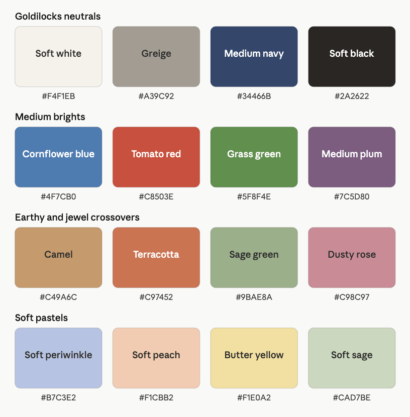
The Balanced Neutrals
- Soft White — gentler than optic white, cleaner than cream
- Greige — a balanced meeting point between grey and beige
- Medium Grey — neither icy silver nor warm taupe
- Medium Navy — deep enough to anchor, but not nearly black
- Soft Black — a slightly softened near-black
- Mushroom — a neutral grey-brown without strong warmth
These neutrals work because they avoid extremes.
Soft white gives you lightness without becoming stark or yellow. Greige is particularly useful because it contains both warm and cool qualities. Medium grey provides polish without icy severity.
Medium navy may become one of your hardest-working neutrals. It offers depth, colour, and structure without the weight of midnight navy or black.
Soft black can be easier than jet black, particularly in large areas near the face.
You may also suit:
- Warm stone
- Cool taupe
- Soft charcoal
- Rose taupe
- Medium cocoa
- Neutral olive
Greige is essentially beige and grey agreeing to stop arguing in public.
Balanced Pinks & Reds
- Rose Red
- Tomato Rose
- Medium Raspberry
- Watermelon
- Dusty Rose
- Warm Cranberry
- Soft Berry
- Geranium
Your reds and pinks can move slightly warm or cool, provided they remain balanced in depth and saturation.
Rose red is especially useful because it sits between orange-red and blue-red. Tomato rose provides warmth without becoming aggressively orange. Medium raspberry adds coolness without moving into vivid magenta.
Dusty rose works when it retains enough visible pink. Soft berry gives you more depth without becoming burgundy or black cherry.
Avoid assuming that “neutral red” means dull red. It simply means a red that has not pledged total loyalty to either orange or purple.
Blues
- Cornflower Blue
- Medium Denim
- Classic Blue
- Soft Navy
- Periwinkle Blue
- Medium Teal-Blue
- Slate Blue
- Balanced Turquoise
Blue is one of your easiest families because it comes in so many useful medium forms.
Cornflower blue is particularly harmonious because it is colourful without becoming electric. Classic blue gives you more structure. Medium denim is practical and widely available.
Periwinkle blue works when it sits between blue and violet without becoming too pale or icy. Balanced turquoise gives you freshness without turning tropical or neon.
Look for denim that appears:
- Medium blue
- Gently faded
- Balanced rather than yellowed
- Free from extreme bleaching
- Neither very dark nor very pale
- Soft but still visibly blue
You want jeans, not an archaeological record of every distressing technique invented since 2004.
Greens
- Grass Green
- Jade
- Medium Olive
- Sage
- Leaf Green
- Eucalyptus
- Balanced Emerald
- Pine Green
Green is another broad and useful family.
Grass green and leaf green bring freshness. Jade offers polish. Medium olive reflects your access to gently warm earth tones, while eucalyptus and sage provide softer alternatives.
Balanced emerald gives you more richness without becoming intensely jewel-toned. Pine works when you need greater depth, provided it remains visibly green.
Your best greens usually avoid:
- Very yellow chartreuse
- Extremely blue pine
- Blackened forest
- Lifeless grey sage
- Neon lime
Corals, Peaches & Warm Pinks
- Soft Coral
- Peach Rose
- Salmon Pink
- Apricot Rose
- Warm Blush
- Muted Watermelon
- Terracotta Rose
- Soft Papaya
Your neutral undertone gives you more access to warm pinks and corals than cool palettes generally have.
The best versions remain medium and balanced.
Soft coral should contain enough pink to prevent it from becoming orange. Peach rose works beautifully when it is not too pale or sugary. Terracotta rose can provide earthiness without becoming brown or rust-heavy.
Strong orange coral may become too warm, while icy blue-pink may become too cool.
You want the middle ground — a phrase your palette has quietly copyrighted.
Purples
- Medium Plum
- Soft Amethyst
- Grape
- Heather Purple
- Orchid
- Mauve-Plum
- Balanced Violet
- Aubergine, used in moderation
Purple can work especially well because many versions naturally combine warm red and cool blue.
Medium plum is one of your most versatile statement colours. Soft amethyst offers more clarity, while heather and mauve-plum provide gentler options.
Aubergine can work when you need greater depth, particularly in accessories or evening wear, but very blackened purple may become heavy.
Avoid purples that are extremely electric, icy, brown, or greyed.
Yellows
- Butter Yellow
- Soft Lemon
- Primrose
- Honey Yellow
- Muted Golden Yellow
- Straw
- Soft Mustard
- Pale Marigold
Yellow can be surprisingly versatile when it stays in your medium zone.
Butter yellow and primrose give you lighter options. Honey yellow offers warmth without becoming too golden. Soft mustard can work because your neutrality allows some earthiness, provided it does not become dark, brown, or muddy.
Very icy lemon may look sharp, while intense marigold may feel overly warm.
Blue-Greens
- Balanced Teal
- Muted Turquoise
- Sea Green
- Jade Teal
- Medium Petrol
- Aqua Green
- Eucalyptus Blue
- Peacock, in moderation
Blue-greens can be excellent because they naturally sit between temperature families.
Balanced teal is particularly useful. Sea green and jade teal offer freshness. Medium petrol provides more depth without becoming blackened.
Peacock can work in smaller areas when it remains medium in value rather than extremely dark or saturated.
Earthy & Jewel Crossovers
Your position near the centre allows several shades that combine earthiness with visible colour:
- Terracotta
- Camel
- Dusty Rose
- Medium Plum
- Sage
- Muted Teal
- Rosewood
- Warm Navy
These colours work best when they remain medium.
Terracotta should not become dark rust. Camel should not become intensely golden. Plum should not become black-purple. Sage should retain visible green.
This category is one of your palette’s particular strengths: colour that feels grounded without becoming dull.
Soft Pastels
- Soft Peach
- Soft Periwinkle
- Butter Yellow
- Soft Sage
- Powder Rose
- Pale Aqua
- Light Warm Grey
- Soft Lavender
Your light colours should retain enough pigment to remain connected.
They are usually easier when they feel gentle rather than icy, chalky, or nearly white.
Soft peach and periwinkle can both work because your undertone is balanced. Soft sage and powder rose provide quieter options.
Avoid pastels that are:
- Extremely icy
- Nearly white
- Heavily greyed
- Chalky
- Sugary
- Fluorescent
Deeper Accent Colours
- Medium Navy
- Soft Black
- Medium Plum
- Pine
- Deep Teal
- Rosewood
- Soft Burgundy
- Medium Charcoal
You can wear deeper shades, especially when they remain slightly softened rather than nearly black.
These colours work beautifully in coats, trousers, footwear, bags, eyewear, and evening clothing.
The key is stopping before depth becomes the only thing happening.
A Starter Palette
| Colour | Hex | Notes |
|---|---|---|
| Soft White | #F3F0E9 | Gentle neutral white |
| Greige | #A49D93 | Balanced grey-beige |
| Medium Grey | #929397 | Clean neutral grey |
| Medium Navy | #405273 | Versatile blue neutral |
| Soft Black | #2B2928 | Softened dark anchor |
| Mushroom | #A39A90 | Neutral grey-brown |
| Rose Red | #BD4F5E | Balanced medium red |
| Tomato Rose | #C95B4D | Gently warm red |
| Medium Raspberry | #B15470 | Cool-neutral pink-red |
| Watermelon | #D06B78 | Fresh medium pink |
| Dusty Rose | #C38B94 | Soft but visibly pink |
| Soft Berry | #985D72 | Rich without darkness |
| Cornflower Blue | #678FC0 | Medium clear blue |
| Classic Blue | #4E6E9E | Balanced everyday blue |
| Medium Denim | #64809B | Practical muted blue |
| Periwinkle Blue | #899BC2 | Soft blue-violet |
| Slate Blue | #6C7E94 | Structured softened blue |
| Balanced Turquoise | #4AA5A3 | Medium blue-green |
| Grass Green | #6C994F | Fresh medium green |
| Jade | #4E9579 | Polished neutral green |
| Medium Olive | #85894F | Warm-neutral earthy green |
| Sage | #9DAA89 | Soft balanced green |
| Leaf Green | #78A158 | Natural medium green |
| Eucalyptus | #7D9D91 | Muted cool-neutral green |
| Soft Coral | #D98472 | Warm but balanced |
| Peach Rose | #DEA18C | Gentle warm pink |
| Medium Plum | #7B5A79 | Rich balanced purple |
| Butter Yellow | #E9D98D | Soft warm yellow |
Part 3: The “Handle With a Little Extra Care” List
For many palettes, this section is essentially a list of difficult colours.
For you, it is more accurately a list of advanced styling choices.
Nothing here is automatically forbidden. These shades simply sit further away from your medium, balanced colouring.
The Iciest Pastels
- Frost blue
- Icy pink
- Near-white lavender
- Sharp mint
- Silver-white
- Very pale lemon
- Optic white
- Blue-white grey
These shades may feel too pale, cool, or diluted when worn alone.
Choose a slightly softer or more pigmented version, or pair the icy shade with a medium anchor such as navy, greige, rose, or denim.
A frost-blue scarf with navy may work beautifully.
A head-to-toe outfit the colour of an expensive freezer interior may require more negotiation.
Neon & Fluorescent Colours
- Highlighter yellow
- Neon pink
- Acid green
- Electric orange
- Laser blue
- UV purple
These colours operate at a level of saturation that may overpower your medium chroma.
Use them as:
- Accessories
- Small pattern details
- Shoes
- Nail polish
- Bags
- A single accent piece
Pair them with balanced neutrals or medium colours.
The neon may attend the party. It does not need to host, cater, and control the playlist.
The Deepest, Near-Black Shades
- Jet black
- Midnight navy
- Black plum
- Espresso
- Blackened forest
- Oxblood
- Very dark charcoal
- Blue-black
You can wear dark colours, but large areas of near-black depth may feel heavy.
Choose softened versions such as medium navy, soft black, plum, or charcoal, or introduce a lighter medium shade near the face.
The Dustiest, Greyest Colours
- Muddy mauve
- Lifeless beige-grey
- Weathered sage
- Smoky khaki
- Faded denim-grey
- Browned rose
- Dusty mushroom
- Colours that appear to have quietly given up
Some softness works well, but too much grey may make your colouring look dull.
Choose a version with slightly more pigment:
- Dusty rose rather than grey mauve
- Sage rather than murky khaki
- Cornflower rather than washed blue-grey
- Medium plum rather than brownish purple
The Warmest Golden Colours
- Bright mustard
- Golden camel
- Marigold
- Strong orange
- Honey bronze
- Pumpkin
- Rich cognac
- Yellow olive
Your neutral undertone allows warmth, but the most yellowed versions may still sit apart from you.
Choose medium camel rather than golden camel, terracotta rather than pumpkin, and olive rather than yellow-green.
The Coolest Ash-Based Colours
- Steel blue
- Icy lavender
- Blue-grey
- Frost pink
- Silver
- Cool charcoal
- Blue-black
- Sharp optic white
You can wear cool shades, but an entire outfit built around strongly icy, ashy colours may feel severe.
Balance them with a warmer-neutral element:
- Rose
- Camel
- Soft white
- Terracotta
- Warm taupe
- Gold jewellery
Extremely Light Outfits
A full outfit in pale peach, light grey, cream, or powder blue may lack enough visual structure.
Add:
- Medium navy
- Soft black
- Plum
- Denim
- Medium green
- A stronger accessory
- More defined makeup
Extremely Dark Outfits
Head-to-toe black or very dark jewel tones may feel heavier than your natural colouring.
You can lighten the effect with:
- Soft white
- Rose
- Cornflower
- Greige
- Silver or gold jewellery
- A medium-value pattern
Extremely Muted Earth Tones
- Muddy olive
- Brown khaki
- Dusty terracotta
- Grey camel
- Faded rust
- Brown sage
Your palette can wear earth tones, but they still need visible colour.
Muted does not have to mean recently excavated.
How to Make an Extreme Colour Work
You have several options:
- Pair it with a medium anchor
- Use it in a smaller proportion
- Keep the rest of the outfit balanced
- Repeat the extreme colour in a small accessory
- Place a medium-value neckline near your face
- Use mixed-metal jewellery to bridge temperature
- Add makeup with moderate definition
- Avoid combining several extremes at once
The goal is not to avoid extremes.
It is to make sure they have adult supervision.
Part 4: Pattern Play — Best Prints & Patterns (and Why)
Universal patterns work best when the overall effect remains balanced.
You have considerable freedom with style, scale, and contrast. The main difficulty appears when several extremes are combined in one print.
What Works for You
Medium-Contrast Patterns
Think:
- Soft white and navy
- Greige and plum
- Denim blue and rose
- Camel and teal
- Sage and terracotta
- Medium grey and coral
These combinations create definition without becoming stark.
Tonal Patterns
Tonal patterns can work beautifully:
- Cornflower, denim, and navy
- Rose, berry, and plum
- Sage, olive, and pine
- Peach, coral, and terracotta
- Greige, mushroom, and soft black
These look cohesive because the colours remain within a shared medium range.
Florals
You can wear a broad range of florals:
- Watercolour florals
- Graphic florals
- Botanical prints
- Medium-scale roses
- Multicoloured garden prints
- Tonal florals
- Vintage-inspired motifs
The easiest versions contain several balanced colours rather than a strong warm, cool, dark, or bright bias.
Geometrics
Try:
- Stripes
- Checks
- Plaid
- Polka dots
- Herringbone
- Abstract geometrics
- Rounded motifs
- Colour blocking
Medium-scale and medium-contrast designs are especially effortless, but you are not limited to them.
Watercolour Prints
Watercolour patterns can suit you beautifully when they retain enough pigment.
Look for:
- Visible colour
- Medium contrast
- A mix of warm and cool shades
- Defined enough shapes
- No overwhelming beige haze
Graphic Prints
Crisper patterns also work:
- Navy-and-white stripes
- Black-and-soft-white houndstooth
- Colour-blocked prints
- Strong botanical outlines
- Medium-scale abstract art
When the print is highly contrasted, keep the rest of the outfit calmer.
Animal Prints
Classic animal prints are often surprisingly easy:
- Balanced tortoiseshell
- Medium leopard
- Taupe-and-black snake
- Grey-brown zebra
- Olive-and-cream markings
- Plum abstract animal print
Avoid versions that are extremely orange, stark black-and-white, or very faded.
Your animal print has options. The animal does not need to select a single seasonal allegiance.
Patterns Worth a Second Look
- Black-and-white prints with neon accents
- Extremely pale prints with almost no contrast
- Very dark prints with no visible medium tones
- Strong orange-and-mustard combinations
- Frosty blue-and-silver prints
- Heavily faded vintage patterns
- Muddy brown-on-brown designs
- Prints combining brightness, darkness, and contrast all at once
Pattern Scale
Colour analysis does not determine pattern scale by itself; your facial features, proportions, height, style, and garment shape also matter.
However, your balanced colouring can often support:
- Small-to-medium florals
- Medium geometrics
- Refined large motifs
- Moderate spacing
- Tonal patterns
- Layered prints
- Clear but not aggressive rhythm
Your palette offers freedom here.
The pattern can whisper, speak normally, or occasionally give a short and well-prepared presentation.
Part 5: Metal Detector — Best Metals & Jewellery (and Why)
Your undertone is balanced, which gives you unusually broad access to metal colours.
Best Metals
- Silver
- Yellow gold
- Rose gold
- White gold
- Champagne gold
- Pewter
- Mixed metals
- Soft bronze
You do not need to pick one permanent lane.
Silver reflects the cooler side of your colouring. Gold reflects the warmer side. Rose gold sits between the two, while mixed metals often echo your balance especially well.
This is excellent news for inherited jewellery, watches, engagement rings, and anyone who has accidentally mixed three metal colours before leaving the house.
Finish Matters
Your easiest finishes tend to be medium in intensity:
- Soft polish
- Satin metal
- Brushed finishes
- Gentle shine
- Light hammering
- Moderate patina
- Refined antique finishes
- Mixed textures
You can wear high polish and heavily antiqued metal, but those sit closer to the extremes.
Silver
Silver can work beautifully in:
- Polished finishes
- Brushed silver
- Antique silver
- Pewter
- Stainless steel
- White gold
Extremely icy, mirror-polished silver may feel sharp when used in very large pieces, but it is still entirely wearable.
Yellow Gold
Gold works especially well when it is:
- Medium yellow
- Champagne-toned
- Softly polished
- Brushed
- Refined rather than brassy
Very orange or intensely yellow gold may become too warm.
Rose Gold
Rose gold is a natural bridge metal for you.
Look for:
- Balanced pink-gold
- Soft polish
- Moderate warmth
- Minimal orange copper
- Clean or romantic designs
Very pale cool rose gold and strongly coppery rose gold sit further towards opposite extremes.
Mixed Metals
Mixed metals are one of your strongest options:
- Silver and gold
- Rose gold and white gold
- Pewter and champagne gold
- Three-tone watches
- Layered mixed-metal necklaces
- Mixed-metal earrings
Keep repetition somewhere in the outfit so the combination feels intentional.
Not that it must be intentional. It is simply nice when the jewellery receives credit for planning.
Gemstones
You have broad access to both warm and cool stones:
Cooler options
- Sapphire
- Aquamarine
- Amethyst
- Moonstone
- Blue topaz
- Emerald
- Labradorite
Warmer options
- Citrine
- Amber
- Garnet
- Carnelian
- Warm jade
- Golden topaz
- Peach moonstone
Balanced options
- Opal
- Pearl
- Tourmaline
- Fluorite
- Moss agate
- Muted turquoise
- Multicoloured stones
Your easiest gemstones tend to be medium in colour intensity rather than extremely pale or extremely dark.
Pearls work in:
- Soft white
- Cream
- Grey
- Pink
- Peach
- Lavender
Pearls have been waiting a very long time for someone who refuses to make them choose between warm and cool.
Part 6: Face Value — Your Makeup Roadmap
Your most flattering makeup enhances your balanced undertone, medium value, and medium chroma without pushing the face too warm, cool, pale, deep, bright, or muted.
The goal is flexible, balanced definition.
Foundation & Concealer
Look for undertones described as:
- Neutral
- Neutral-warm
- Neutral-cool
- Balanced beige
- Olive-neutral
- Peach-neutral
- Rosy-neutral
You may find that several undertone families work depending on the brand.
This does not eliminate the need to shade-match. Foundation manufacturers remain fully capable of labelling a vivid orange formula “Neutral Linen” with no apparent consequences.
Always test the formula against your skin and observe it after it dries.
Natural, satin, soft-matte, and softly luminous finishes all work well.
Extremely matte or highly wet-looking formulas may feel less balanced, but finish is also strongly influenced by skin type and preference.
Blush
Best blush colours include:
- Dusty Rose
- Warm Rose
- Soft Terracotta
- Medium Pink
- Peach Rose
- Berry Rose
- Muted Coral
- Plum Rose
You can move slightly warm or cool.
Your easiest blushes stay medium in both depth and intensity.
A dusty rose may look polished. Soft terracotta adds warmth. Berry rose provides cooler definition.
Be cautious with:
- Neon pink
- Very pale baby pink
- Dark burgundy
- Bright orange
- Grey mauve
- Strong bronze
Bronzer & Contour
You can often wear bronzer more easily than strongly cool palettes.
Try:
- Medium neutral bronzer
- Warm-neutral tan
- Soft golden beige
- Neutral cocoa
- Balanced caramel
- Rose-brown bronzer
Avoid formulas that become:
- Very orange
- Dark red-brown
- Muddy grey
- Too pale to show
- Strongly golden
For contour, choose:
- Neutral taupe
- Soft grey-brown
- Medium mushroom
- Balanced cocoa
- Neutral brown
The goal is dimension.
Not the sudden installation of two entirely new cheekbones with no planning permission.
Lips
Your lip colours have considerable flexibility.
Try:
- Rose Red
- Tomato Rose
- Terracotta Rose
- Medium Plum
- Dusty Rose
- Raspberry
- Soft Berry
- Warm Cranberry
- Muted Coral
- Watermelon
- Rosewood
- Medium Cherry
For a natural lip:
- Rose beige
- Pink-brown
- Peach rose
- Soft berry balm
- Mauve rose
- Balanced nude
For a statement lip:
- Rose red
- Tomato red
- Raspberry
- Medium plum
- Terracotta red
- Clear berry
Be more cautious with:
- Concealer beige
- Neon pink
- Blackened wine
- Bright orange
- Very cool magenta
- Grey-brown nude
Eyes — Shadow
Excellent eyeshadow colours include:
- Soft Taupe
- Warm Grey
- Medium Brown
- Sage
- Medium Plum
- Soft Bronze
- Rose Taupe
- Slate Blue
- Mushroom
- Muted Teal
- Champagne
- Cocoa
- Soft Olive
- Lavender Grey
You can move between warm and cool families.
Your most effortless eye looks generally use medium shades with moderate contrast.
For colour, try plum, sage, teal, olive, or slate.
For neutrals, try taupe, warm grey, cocoa, and soft bronze.
Eyes — Liner
Best eyeliner colours include:
- Soft Black
- Charcoal
- Medium Brown
- Brown-Black
- Navy
- Plum
- Deep Teal
- Olive-Brown
- Graphite
Black can work, but softer black, brown-black, charcoal, or navy may feel easier for daytime.
Mascara
Try:
- Black
- Soft black
- Brown-black
- Deep brown
- Navy-black
- Plum-black
The best option depends on your natural contrast and the rest of your makeup.
Brows
Choose brow products that:
- Match your natural depth
- Stay neutral or close to neutral
- Avoid obvious orange or grey
- Create definition without becoming too dark
Excellent families include:
- Neutral blonde
- Taupe
- Neutral brown
- Soft ash brown
- Warm-neutral brown
- Brown-black
You have some flexibility with temperature, but depth still matters.
Two shades darker than your actual brows may create more drama than anyone requested before breakfast.
Highlighter
Best options include:
- Champagne
- Soft pearl
- Rose gold
- Neutral opal
- Soft silver-beige
- Pale gold
- Peach pearl
- Cool pearl
You can move warmer or cooler based on the rest of the makeup look.
Your easiest finish is a gentle sheen rather than extreme frost or molten gold.
Part 7: Through the Looking Glass — Eyewear
Eyewear sits directly on the face, so colour and visual weight matter, but your balanced colouring gives you broad flexibility.
Best Frame Colours
- Balanced tortoiseshell
- Soft black
- Charcoal
- Medium navy
- Camel
- Terracotta
- Rosewood
- Olive
- Sage
- Plum
- Teal
- Clear grey
- Gold
- Silver
- Mixed metal
Tortoiseshell
Tortoiseshell is often one of your easiest options.
Look for:
- Medium contrast
- A balance of warm and cool brown
- Amber that is not too orange
- Dark areas that are not overwhelmingly black
- Visible variation
- A medium overall depth
You can usually wear both warmer and cooler tortoiseshell, but balanced classic versions are especially harmonious.
Transparent Frames
Try:
- Clear crystal
- Transparent taupe
- Soft rose
- Grey
- Olive
- Plum
- Blue-grey
- Amber
- Peach
- Smoky navy
Very icy colourless frames or highly neon transparent frames may feel more extreme, but they remain available as statement choices.
Frame Contrast
Medium contrast is usually easiest.
Excellent options include:
- Tortoiseshell
- Soft black
- Medium navy
- Rosewood
- Olive
- Mixed-metal frames
- Defined transparent colour
Very thick jet-black frames may feel heavy, while very pale frames may disappear.
The frame’s shape and scale will matter just as much as colour.
Sunglasses
You have broad options:
- Black
- Brown
- Tortoiseshell
- Gold
- Silver
- Olive
- Navy
- Rose
- Grey
- Gradient lenses
- Warm or cool smoke lenses
Frames Worth a Second Look
- Extremely icy pastel frames
- Neon acetate
- Very heavy near-black frames
- Bright orange tortoiseshell
- Frosted white
- Strong blue-black
- Extremely yellow gold
Your glasses are allowed personality.
They simply do not need to assume full legal control of your face.
Part 8: Crowning Glory — Hair Colour
Your most harmonious hair colours tend to be medium in depth and balanced in temperature.
You have more flexibility than many palettes, but dramatic extremes may shift the overall balance.
Best Blonde Shades
- Neutral Beige Blonde
- Dark Blonde
- Champagne Blonde
- Soft Golden Blonde
- Neutral Ash Blonde
- Wheat Blonde
- Caramel Blonde
- Medium Pearl Blonde
Your best blonde usually avoids becoming extremely icy, white, yellow, or orange.
Best Brunette Shades
- Neutral Brown
- Chestnut
- Medium Ash Brown
- Soft Chocolate
- Mushroom Brown
- Caramel Brown
- Neutral Dark Brown
- Hazelnut
Both warm and cool brunette shades may work, provided they stay close to medium and avoid extreme undertones.
Red Hair
Artificial red shades that may suit include:
- Soft Auburn
- Cinnamon Brown
- Rose Brown
- Medium Copper
- Muted Cherry
- Warm Mahogany
- Strawberry Brown
- Terracotta Brown
Very bright copper may become too warm, while deep burgundy may become too dark.
Black Hair
Soft black or neutral black may work, especially if your natural features provide enough depth.
Jet black or blue-black may create a stronger effect than necessary.
Before going very dark, consider:
- Whether the eyes remain visible
- Whether the skin looks clearer
- Whether you need stronger makeup
- Whether a dark brown would create a softer result
Fashion Colours
You have wide access to creative colour:
- Dusty Pink
- Medium Teal
- Plum
- Rose Gold
- Denim Blue
- Peach
- Lavender
- Emerald
- Berry
- Soft Copper
Your easiest fashion shades remain medium.
Pastel or neon colours can work as intentional statements, particularly with dimensional roots or balanced placement.
Highlights & Balayage
Look for:
- Neutral beige highlights
- Caramel ribbons
- Ash-beige pieces
- Soft golden dimension
- Mushroom balayage
- Rose-brown accents
- Mixed warm and cool dimension
- Medium contrast
Avoid:
- Very icy white stripes
- Extremely golden highlights
- High-contrast black-and-platinum combinations
- Neon colour with no grounding
- Overly faded, indistinct colour
Hair Depth & Contrast
Your balanced colouring gives you room to move lighter or darker.
The further you move from medium depth, the more the result becomes a deliberate style statement rather than an effortless extension of your colouring.
A Note on Grey Hair
Natural grey can work beautifully.
Excellent tones include:
- Soft silver
- Medium grey
- Salt-and-pepper
- Mushroom grey
- Pewter
- Warm grey
- Cool grey
- Soft white
Because your colouring is balanced, both warmer and cooler greys may integrate well.
You may choose to preserve your natural grey, add warmth, cool it down, or blend it with your existing colour.
Grey is not the end of your palette.
It is simply another neutral applying for a very achievable position.
Part 9: Fingertips — Nail Polish
Nail polish is one of your most flexible categories.
Best Everyday Colours
- Dusty Rose
- Tomato Rose
- Terracotta
- Medium Plum
- Soft Sage
- Watermelon
- Rosewood
- Medium Navy
- Teal
Light Colours
- Soft Peach
- Butter Yellow
- Soft Lavender
- Pale Aqua
- Warm White
- Soft Grey
- Powder Rose
- Light Sage
Medium Colours
- Cornflower
- Grass Green
- Raspberry
- Jade
- Medium Red
- Plum
- Muted Coral
- Balanced Blue
Deep Colours
- Soft Black
- Medium Navy
- Burgundy
- Pine
- Aubergine
- Deep Teal
- Charcoal
- Dark Rosewood
Statement Colours
- Bright red
- Cobalt
- Hot pink
- Chrome
- Neon accents
- Black-and-white nail art
- Gold foil
- Multicoloured designs
These are excellent for variety, even when they sit outside your easiest medium range.
Nudes
Your best nude nail colours include:
- Rose Beige
- Pink-Brown
- Greige
- Mushroom
- Soft Caramel
- Mauve Nude
- Peach Beige
- Neutral Taupe
Metallic Nails
Try:
- Gold
- Silver
- Rose gold
- Pewter
- Champagne
- Bronze
- Mixed metallics
- Soft chrome
You are allowed to mix metals here too.
Your fingernails will not report you.
French Manicure
For a French manicure:
- Use a soft white rather than necessarily optic white
- Choose a pink, beige, or clear base
- Try navy, terracotta, plum, or metallic tips
- Keep the overall contrast suited to your personal style
Part 10: Texture & Fabric Talk
Colour does most of the heavy lifting in seasonal analysis, but texture changes how light, deep, clear, or muted a colour appears.
Your balanced colouring can support an unusually wide range of fabric finishes.
Fabrics That Flatter
- Cotton
- Silk
- Satin
- Linen
- Wool
- Cashmere
- Suede
- Leather
- Velvet
- Denim
- Tweed
- Crepe
- Jersey
- Corduroy
- Chiffon
Smooth and textured fabrics can both work beautifully.
Shine
You can handle:
- Satin
- Silk
- Polished leather
- Gentle sequins
- Metallic thread
- Pearl finishes
- Moderate gloss
- Soft shimmer
High shine can work as a statement, but it becomes more intense when paired with very bright or dark colour.
Matte Fabrics
Excellent matte choices include:
- Wool
- Cotton
- Linen
- Suede
- Crepe
- Jersey
- Soft leather
- Fine knits
Matte fabrics can soften brighter colours or make earthy tones feel more grounded.
Textured Fabrics
You can wear:
- Tweed
- Bouclé
- Chunky knit
- Brushed wool
- Corduroy
- Raw silk
- Suede
- Textured leather
- Mélange fabrics
Texture works especially well when balanced with a smoother element elsewhere.
Lightweight & Sheer Fabrics
You can also wear:
- Chiffon
- Organza
- Fine silk
- Mesh
- Lightweight linen
- Voile
Very pale sheer fabrics may need more structure or colour elsewhere, while very dark sheers may need softer styling.
Extremes Worth Balancing
Be more thoughtful with:
- Head-to-toe patent leather
- Full mirror sequins
- Extremely distressed fabric
- Raw unfinished edges everywhere
- Very bulky rough knits
- Ultra-delicate pale chiffon outfits
These can still work.
They simply enjoy the company of something more moderate.
Structure
You can wear both:
- Relaxed tailoring
- Sharp tailoring
- Soft drape
- Defined collars
- Natural fabrics
- Structured bags
- Rounded details
- Clean minimalism
- Layered texture
This gives your personal style considerable authority.
Colour analysis has provided options and then politely stepped away.
Part 11: Putting It All Together — Styling Tips
Knowing that many colours work is useful.
Knowing how to curate them is what prevents your wardrobe from becoming a small department store with no signage.
Build Around Anchor Neutrals
Choose two or three primary neutrals, such as:
- Soft white
- Greige
- Medium navy
- Soft black
- Mushroom
- Medium grey
These will help your broader colour range feel cohesive.
Choose a Personal Colour Family
Select three or four core colours you especially love:
- Rose + Plum + Sage
- Cornflower + Navy + Terracotta
- Teal + Camel + Coral
- Denim + Berry + Olive
- Peach + Jade + Medium Grey
The goal is not to wear every flattering colour.
It is to build a palette that feels recognisably yours.
Keep the Overall Contrast Moderate
Your easiest combinations often include:
- Soft white + navy
- Greige + plum
- Denim + rose
- Camel + teal
- Sage + terracotta
- Grey + coral
For more drama:
- Soft black + bright red
- Navy + icy blue
- Camel + neon pink
- Greige + deep emerald
- White + black + one medium colour
Use Extremes as Accents
An extreme shade can work beautifully when it occupies a smaller area:
- Neon bag
- Icy scarf
- Black shoe
- Bright lipstick
- Deep jewel coat
- Metallic jewellery
- High-contrast print
Balance Temperature
When wearing a very warm shade, add a cooler element:
- Silver jewellery
- Navy
- Blue
- Grey
- Plum
When wearing a very cool shade, add a warmer-neutral element:
- Gold jewellery
- Camel
- Rose
- Terracotta
- Warm taupe
You do not always need to do this, but it is a reliable way to restore balance.
Balance Value
When wearing a very light colour, add medium or dark grounding.
When wearing a very dark colour, add a medium or light element near the face.
Balance Chroma
When wearing neon, keep the rest calmer.
When wearing very muted colour, add one clearer shade, polished accessory, or defined makeup element.
Let Mixed Metals Work for You
Use:
- Layered gold and silver
- Two-tone watches
- Mixed-metal hardware
- Rose-gold accents
- Inherited jewellery without unnecessary guilt
Replace Extreme Wardrobe Staples
Instead of:
- Optic white, try soft white
- Jet black, try soft black or navy
- Neon pink, try watermelon or raspberry
- Icy blue, try cornflower
- Black plum, try medium plum
- Mustard, try butter yellow or soft mustard
- Golden camel, try balanced camel
- Grey mauve, try dusty rose or plum
Create a Cohesive Wardrobe
A practical Universal wardrobe might centre on:
Neutrals
- Soft White
- Greige
- Medium Navy
- Soft Black
Core colours
- Cornflower Blue
- Rose Red
- Jade
- Medium Plum
Earthy accents
- Camel
- Terracotta
- Sage
Because these colours sit close to the centre in temperature, value, and chroma, they combine easily.
Your wardrobe begins behaving like a well-run international summit: warm and cool are both represented, nobody has veto power, and greige is somehow chairing the meeting.
Part 12: Common Pitfalls (a.k.a. “Oh, That’s Why”)
“Universal means I can wear literally anything.”
You can wear a very broad range.
That is not quite the same as every version of every colour being equally effortless.
The extremes still matter.
“Universal means I have no real palette.”
Quite the opposite.
Your palette is defined by:
- Neutral temperature
- Medium value
- Medium chroma
- Balanced contrast
That is a specific position, not a shrug.
Buying Everything Because It Technically Works
A wide colour range can lead to a wardrobe full of individually flattering pieces that have absolutely no interest in speaking to one another.
Choose anchors and repeat them.
Decision Paralysis
When almost everything is possible, choosing can become harder.
Return to:
- Soft white
- Greige
- Medium navy
- Rose
- Cornflower
- Jade
- Plum
These are reliable starting points.
Making Everything Too Safe
Balance does not require caution at all times.
Wear the neon shoe. Buy the deep plum coat. Try icy lavender.
Just give the extreme something medium to work with.
Avoiding Extremes Entirely
Extreme colours are not banned.
They simply work best as accents, intentional statements, or part of a balanced outfit.
Combining Too Many Extremes
A neon top, jet-black trousers, mirror-silver boots, and an icy-white jacket may technically contain several wearable pieces.
Together, they may create a small meteorological event.
Choose one or two extremes at a time.
Assuming Neutral Undertone Means Foundation Is Effortless
Neutral foundation ranges are often your best starting point.
You still need to match:
- Depth
- Surface tone
- Oxidation
- Formula
- Coverage
- Finish
Choosing Colours That Are Too Pale
A very pale colour may need stronger accessories, makeup, or a darker layer to avoid looking insubstantial.
Choosing Colours That Are Too Dark
Very dark shades may need a softer neckline, lighter accessory, or medium colour to keep the outfit from becoming heavy.
Choosing Colours That Are Too Dusty
A heavily greyed shade may make you look tired even though muted colour generally suits you.
Choose softness with visible pigment.
Assuming “Medium” Means Dull
Medium colour includes:
- Cornflower
- Tomato rose
- Jade
- Terracotta
- Plum
- Teal
- Raspberry
- Grass green
Your palette is balanced.
It is not allergic to fun.
Forgetting Personal Style
Your palette gives you more options than restrictions.
That means your style preferences matter even more.
You may prefer minimalist neutrals, romantic colour, earthy layers, polished tailoring, or clothing that makes you look like the charming owner of an eclectic bookshop where the silver candlesticks and gold picture frames have agreed not to fight.
Use your range to build something recognisably yours.
Quick-Reference Cheat Sheet
| Category | Yes, Please | Worth a Second Look (Not Banned!) |
|---|---|---|
| Neutrals | Soft white, greige, medium grey, medium navy, soft black, mushroom | Optic white, jet black, very warm cream, icy silver-grey |
| Pinks | Dusty rose, watermelon, medium raspberry, peach rose | Neon pink, icy pink, grey mauve, very pale blush |
| Reds | Rose red, tomato rose, soft berry, geranium | Fluorescent red, black cherry, orange-red, brown maroon |
| Blues | Cornflower, classic blue, medium denim, slate, balanced turquoise | Electric blue, frost blue, near-black navy, faded grey-blue |
| Purples | Medium plum, soft amethyst, grape, orchid, mauve-plum | Ultraviolet, black-purple, icy lilac, muddy mauve |
| Greens | Grass green, jade, sage, olive, eucalyptus, balanced emerald | Acid green, black forest, yellow olive, lifeless grey sage |
| Warm accents | Coral, peach rose, terracotta, camel | Bright orange, golden camel, rust, pumpkin |
| Yellows | Butter yellow, primrose, honey, soft mustard | Highlighter yellow, deep mustard, icy lemon, marigold |
| Light colours | Soft peach, periwinkle, sage, powder rose, pale aqua | Near-white icy pastels, chalky or heavily greyed shades |
| Deep colours | Medium navy, plum, pine, deep teal, soft burgundy | Jet black, blackened jewels, espresso, midnight navy |
| Brights | Medium-intensity brights across most colour families | Neon and fluorescent shades in large areas |
| Patterns | Medium-contrast, tonal, florals, geometrics, watercolour, graphic prints | Patterns combining several extremes at once |
| Metals | Silver, gold, rose gold, pewter, champagne, mixed metals | Very icy mirror silver, orange gold, heavily blackened metal |
| Foundation | Neutral, neutral-warm, or neutral-cool formulas matched for depth | Assuming any “neutral” label will automatically match |
| Blush | Dusty rose, warm rose, terracotta, berry rose, medium pink | Neon pink, very pale blush, dark burgundy, orange |
| Bronzer | Medium neutral bronzer, soft tan, neutral cocoa | Orange, very dark, strongly golden, muddy grey |
| Lipstick | Rose red, tomato rose, terracotta rose, plum, dusty rose, berry | Neon pink, blackened wine, concealer beige, bright orange |
| Eyeshadow | Taupe, warm grey, brown, sage, plum, bronze, slate, teal | Extreme ice frost, molten copper, black smoky eye alone |
| Eyeliner | Soft black, brown-black, charcoal, navy, plum, teal | Very pale liner, severe jet black when unsupported |
| Hair colour | Medium blonde, brunette, soft auburn, balanced warm or cool shades | Icy platinum, blue-black, vivid copper, extreme contrast |
| Eyewear | Tortoiseshell, soft black, camel, navy, plum, olive, mixed metal | Neon, icy pale, very heavy near-black frames |
| Nail polish | Terracotta, dusty rose, plum, sage, tomato red, teal | Almost anything extreme as an everyday default |
| Fabrics | Cotton, silk, wool, linen, velvet, suede, tweed, satin, mixed textures | Head-to-toe mirror shine or extremely rough undone texture |
A Final Word
Universal is a palette of balance with an unusually wide field of possibility.
Your colours do not need to be pushed towards one particular extreme to make an impact. Their strength comes from harmony: reds that sit between orange and blue, neutrals that bridge warm and cool, blues that remain colourful without becoming electric, and earth tones that retain enough life to avoid looking muddy.
You sit at the centre of the system, which means you can borrow from every direction without belonging entirely to any one of them.
That gives you access to soft white, greige, navy, camel, rose, cornflower, jade, terracotta, plum, sage, coral, and many more — all united by a medium, balanced quality.
Your best wardrobe will not contain every technically flattering colour available.
It will contain the colours that feel most like you, repeated often enough to create a clear point of view.
So wear the mixed metals. Choose the cornflower blue. Keep the terracotta lipstick. Buy the neon bag if it makes you happy — just perhaps do not invite the icy silver trousers and black sequin blazer to the same outing.
And remember: your palette is not “everything, whatever.”
It is colour, beautifully balanced.
