True Summer: Your Complete Colour Guide
- True Summer: Your Complete Colour Guide
- Part 1: What Being a True Summer Actually Means
- Part 2: Your Power Palette — Best Colours (and Why)
- Part 3: The “Handle With a Little Extra Care” List
- Part 4: Pattern Play — Best Prints & Patterns (and Why)
- Part 5: Metal Detector — Best Metals & Jewellery (and Why)
- Part 6: Face Value — Your Makeup Roadmap
- Part 7: Through the Looking Glass — Eyewear
- Part 8: Crowning Glory — Hair Colour
- Part 9: Fingertips — Nail Polish
- Part 10: Texture & Fabric Talk
- Part 11: Putting It All Together — Styling Tips
- Part 12: Common Pitfalls (a.k.a. “Oh, That’s Why”)
- “Summer means pale and dusty.”
- “Cool means icy.”
- Choosing Colours That Are Too Warm
- Choosing Colours That Are Too Bright
- Choosing Colours That Are Too Muted
- Choosing Colours That Are Too Dark
- Defaulting to Black
- Buying Warm “Basics”
- Assuming Every Cool Colour Works
- Avoiding All Contrast
- Forgetting Personal Style
- Quick-Reference Cheat Sheet
- A Final Word
So, the results are in: you’re a True Summer!
Which means your colouring sits right at the heart of the Summer palette: cool, balanced, elegant, and softly defined.
You are not borrowing heavily from another season. There is no strong Spring brightness, Autumn earthiness, or Winter drama steering the ship. You are Summer in its most centred form — calm, cool, and beautifully composed.
Not faded. Not icy. Not destined to spend the rest of your life wearing pale blue cardigans while gazing thoughtfully out of rain-streaked windows.
Your palette has colour. It simply prefers refinement over spectacle.
True Summer sits firmly within the Summer family, meaning your colouring is fundamentally:
- Cool in undertone
- Medium in overall value
- Medium in chroma, with a softly blended quality
Your best colours have enough softness to remain harmonious, but they are not so muted that they become dusty or flat. They have enough depth to create structure, but they are not dark. They are cool without becoming frozen and colourful without becoming loud.
Think cool rose rather than coral. Cornflower rather than electric blue. Blue spruce rather than olive. Plum rather than blackened aubergine. Balanced, but never bland.
In other words: cool, graceful, softly colourful, and beautifully even.
Let’s get into what that actually means for your wardrobe.
Part 1: What Being a True Summer Actually Means
Colour analysis looks at three main things about your natural colouring — your skin, hair, and eyes working together:
- Temperature — are your undertones warmer or cooler?
- Value — is your overall colouring lighter or deeper?
- Clarity — is your colouring clearer and more vivid, or softer and more muted?
For you, the strongest and most important quality is coolness.
Your colouring is supported by shades with blue, pink, rose, violet, and cool grey undertones. Warm colours containing noticeable yellow, orange, peach, rust, golden brown, or yellow-green tend to sit separately from you rather than blending naturally.
This does not mean every colour needs to look as though it has just been chipped out of a glacier.
True Summer coolness is softer than Winter coolness. Your colours are blue-based, but they usually contain a little grey, softness, or watercolour blending. They are cool without becoming stark.
Your second quality is your medium value.
You are not defined primarily by lightness or depth. Your easiest colours sit around the middle of the value scale, with room to move somewhat lighter or deeper.
You can wear:
- Soft pastels with visible colour
- Medium blues, pinks, greens, and purples
- Deeper cool accents
- Balanced light-and-dark combinations
The difficulty begins when a colour moves too far towards either extreme.
Very pale, near-white shades may make you look washed out or disconnected. Very dark, near-black colours may create too much weight and contrast.
Your third quality is your medium chroma.
True Summer is not heavily muted, but it is not highly saturated either. Your best colours are visibly colourful, softened just enough to remain elegant and blended.
A colour that is too grey may make you look tired. A colour that is too bright may overpower you.
You need the middle ground: colour with presence, but no shouting.
Here is the easiest way to picture your palette:
Imagine a Summer garden after rain.
The roses are cool pink. The leaves are blue-green. The sky is cloudy blue. The lavender is soft but recognisable. Everything looks fresh and colourful, but the light is diffused rather than blazing.
A few other things worth knowing:
- True Summer can appear across many skin tones, hair colours, and eye colours. It is not limited to fair skin, ash-blonde hair, or blue eyes.
- Cool does not mean pale. Plum, blue spruce, raspberry, cool navy, and berry can all belong in your palette.
- Medium chroma does not mean muted beyond recognition. Your colours should still look alive.
- Balance matters. Colours that are too light, too deep, too greyed, or too vivid can all move away from your best range.
- Temperature often matters first. A slightly softer cool shade may work better than a warm colour at the perfect depth.
- You do not need another season’s influence to make your palette interesting. True Summer has plenty to work with all on its own, thank you very much.
The central rule is simple:
Keep it cool, keep it balanced, and stop before the colour becomes either too dusty or too dramatic.
Part 2: Your Power Palette — Best Colours (and Why)
The unifying theme of your palette is balanced cool colour with gentle softness.
Your best shades are not greyed into submission, but they are not highly saturated either. They are cool, medium in depth, and softened just enough to create harmony.
They look polished, composed, and quietly colourful.
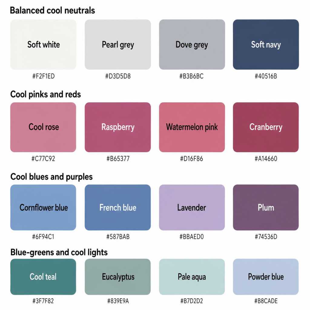
The Balanced Cool Neutrals
- Soft White — cool and gentle, without the hard edge of optic white
- Pearl Grey — a light, softly luminous grey
- Dove Grey — a balanced medium-light neutral
- Pewter — a deeper grey with soft structure
- Cool Taupe — a grey-brown without yellow warmth
- Soft Navy — a blue-based dark neutral that avoids near-black heaviness
These neutrals work because they support your colouring without becoming warmer, brighter, or deeper than you are.
Soft white is usually more harmonious than brilliant white. Dove grey is one of your easiest wardrobe anchors. Pewter offers depth without the severity of charcoal or black.
Cool taupe can function as your version of beige, provided it remains visibly greyed rather than camel, tan, or golden brown.
Soft navy may become one of the hardest-working colours in your wardrobe. It provides definition, polish, and practicality without introducing stark contrast.
You may also suit:
- Blue-grey
- Slate
- Soft charcoal
- Rose taupe
- Cool cocoa
- Muted aubergine used as a neutral
Aubergine may not have completed the official paperwork required to become a neutral, but we are allowing it.
Cool Pinks & Reds
- Cool Rose
- Raspberry
- Watermelon Pink
- Rose Pink
- Soft Berry
- Cranberry
- Blue-Red
- Mauve Pink
Your pinks and reds should have a cool, blue-based, or rosy quality.
Cool rose is an excellent everyday colour because it adds freshness without becoming bright. Raspberry provides more energy. Cranberry and soft berry give you depth while remaining clearly connected to your palette.
Watermelon pink works when it leans cool rather than coral. Blue-red can be especially effective for statement pieces or lipstick, provided it is softened enough to avoid Winter-level intensity.
Avoid orange-red, tomato, brick, salmon, peach, and strongly coral shades.
Your red should suggest rose petals, berries, or chilled wine — not a bowl of paprika.
Blues
- Cornflower Blue
- Powder Blue
- French Blue
- Slate Blue
- Periwinkle
- Cool Denim
- Storm Blue
- Soft Navy
Blue is one of the strongest and broadest areas of your palette.
Cornflower blue is particularly harmonious because it is cool, medium in value, and moderately clear. French blue gives you a polished, slightly stronger option. Slate and storm blue provide softened depth.
Periwinkle works beautifully because it bridges blue and violet. Powder blue gives you a lighter option, provided it contains enough pigment and does not become icy-white.
Look for denim that appears:
- Cool blue
- Blue-grey
- Medium wash
- Softly faded
- Free from yellow or warm beige distressing
Very dark indigo may become heavy, while extremely bleached denim may feel too pale.
Purples
- Lavender
- Mauve
- Heather
- Orchid
- Plum
- Blue-Violet
- Soft Aubergine
- Blackberry
Purple is naturally compatible with True Summer because it combines cool blue and red.
Lavender and mauve work as gentle everyday colours. Orchid adds more visible pigment. Plum and soft aubergine provide depth without requiring black.
Your best purples remain cool and balanced. Very red-violet shades may become too warm, while electric purple may become too intense.
You want elegant purple, not purple that has hired a fog machine.
Greens & Blue-Greens
- Cool Teal
- Sea Green
- Eucalyptus
- Blue Spruce
- Cool Jade
- Pine
- Muted Emerald
- Blue-Green
Your strongest greens lean blue rather than yellow.
Cool teal and sea green offer visible colour while remaining balanced. Eucalyptus gives you a softer option. Blue spruce and pine provide deeper accents without becoming blackened.
Muted emerald can work beautifully when it retains enough softness. A highly saturated jewel emerald may become too intense.
Some sage shades may suit you, but they need to remain cool. Avoid sage that turns yellow, khaki, or olive.
You want green that looks as though it has been beside a lake, not marinating in mustard.
Cool Light Colours
- Powder Pink
- Lavender Mist
- Powder Blue
- Soft Periwinkle
- Pale Aqua
- Cool Mint
- Pearl
- Pale Blue-Grey
Your lighter colours should be cool and softly pigmented.
They should not become:
- Chalky
- Nearly white
- Sugary
- Icy and sharp
- Beige-softened
A powder blue with visible colour is excellent. A nearly white frost blue may feel too weak or too stark.
Your best light shades feel diffused rather than bleached.
Deeper Accent Colours
- Plum
- Cranberry
- Soft Navy
- Blue Spruce
- Blackberry
- Storm Blue
- Soft Charcoal
- Deep Cool Teal
You can wear depth, especially in smaller areas or when balanced with lighter colours.
The key is stopping before the colour becomes nearly black.
Soft navy works better than midnight navy. Plum works better than black-purple. Blue spruce works better than blackened forest green.
Depth is welcome. Drama with its own soundtrack may be less necessary.
A Starter Palette
| Colour | Hex | Notes |
|---|---|---|
| Soft White | #F2F1ED | Cool and gentle |
| Pearl Grey | #D3D5D8 | Light, softly polished |
| Dove Grey | #B3B6BC | Balanced cool neutral |
| Pewter | #7D838C | Structured medium grey |
| Cool Taupe | #AAA1A0 | Greyed, versatile neutral |
| Soft Navy | #40516B | Deep without becoming harsh |
| Cool Rose | #C77C92 | Balanced everyday pink |
| Raspberry | #B65377 | Cool and lively |
| Watermelon Pink | #D16F86 | Fresh but controlled |
| Soft Berry | #9F6078 | Rich, softened pink-red |
| Cranberry | #A14660 | Cool deeper red |
| Blue-Red | #B24758 | Cool statement red |
| Cornflower Blue | #6F94C1 | Balanced clear blue |
| Powder Blue | #B8CADE | Soft light blue |
| French Blue | #587BAB | Polished medium blue |
| Slate Blue | #71839B | Soft structured blue |
| Periwinkle | #A9B2D2 | Gentle blue-violet |
| Storm Blue | #596C7D | Deep but softened |
| Lavender | #BBAED0 | Cool soft purple |
| Mauve | #A98CA2 | Balanced purple-pink |
| Orchid | #A873A4 | Colourful but controlled |
| Plum | #74536D | Cool, elegant depth |
| Cool Teal | #3F7F82 | Balanced blue-green |
| Sea Green | #63989A | Fresh cool green |
| Eucalyptus | #839E9A | Soft blue-green |
| Blue Spruce | #4F7073 | Deep, calm green |
| Cool Jade | #6E9C91 | Polished cool green |
| Pale Aqua | #B7D2D2 | Light, fresh accent |
Part 3: The “Handle With a Little Extra Care” List
This is not a list of colours you must place in a ceremonial basket and release into the wilderness.
These are simply colours that sit further away from your natural combination of coolness, medium value, and balanced chroma. They may require more thoughtful styling, especially near your face.
The Warmest Colours
- Pumpkin
- Rust
- Burnt orange
- Mustard
- Golden yellow
- Warm camel
- Cognac
- Peach
- Coral
- Tomato red
- Yellow olive
Warmth is often one of your clearest challenges.
These colours may create the appearance of redness, sallowness, shadows, or unevenness because their yellow or orange base does not naturally echo your colouring.
Choose:
- Cool rose instead of coral
- Cranberry instead of brick
- Cool taupe instead of camel
- Blue spruce instead of olive
- Raspberry instead of tomato red
- Soft white instead of cream
A warm colour may be perfectly lovely. It may simply be lovely over there.
The Brightest Colours
- Neon pink
- Electric blue
- Brilliant magenta
- Acid green
- Bright turquoise
- Intense royal purple
- Fluorescent yellow
- Highly saturated jewel tones
True Summer can handle visible colour, but not extreme saturation.
A colour that is too bright may overpower your softer qualities and make your face appear faded.
Choose:
- Raspberry instead of hot pink
- French blue instead of electric blue
- Cool teal instead of tropical turquoise
- Orchid instead of vivid violet
- Cool mint instead of acid green
Your colours should be awake. They do not need three espressos and a microphone.
The Most Muted, Dusty Colours
- Muddy mauve
- Heavily greyed beige
- Faded khaki
- Browned rose
- Murky olive
- Lifeless blue-grey
- Very dusty mushroom
- Colours that have lost nearly all pigment
Summer softness is part of your palette, but True Summer usually needs more visible colour than heavily muted shades provide.
The most greyed colours may make you look tired, flat, or undefined.
Choose:
- Cool rose instead of muddy rose
- Cornflower instead of washed-out blue-grey
- Eucalyptus instead of murky khaki
- Mauve instead of brown-mauve
- Cool taupe instead of lifeless beige
Muted is allowed. Colourless is not compulsory.
The Darkest Shades
- Jet black
- Near-black navy
- Espresso
- Blackened burgundy
- Deep aubergine
- Black-purple
- Very dark forest green
- Oxblood
These colours can create too much weight and contrast.
You can still wear deeper shades, but your best versions remain visibly blue, plum, green, or grey rather than reading as almost black.
Choose:
- Soft navy instead of midnight navy
- Plum instead of black-purple
- Blue spruce instead of blackened green
- Pewter instead of black
- Cool cocoa instead of espresso
The Iciest Shades
- Optic white
- Frost blue
- Icy pink
- Near-white lavender
- Very pale mint
- Sharp silver-white
- Pastels diluted almost completely with white
True Summer can wear light colours, but extremely icy shades may become too pale and sharp.
Choose:
- Soft white instead of optic white
- Powder blue instead of frost blue
- Powder pink instead of icy pink
- Lavender instead of near-white lilac
- Pale aqua instead of icy mint
You want soft daylight, not the inside of a freezer.
The Yellowest Browns
Warm browns often contain more yellow, orange, or red than your palette supports.
Look twice at:
- Caramel
- Cognac
- Chestnut
- Golden tan
- Warm chocolate
- Camel
- Tobacco brown
- Rust-brown
Better options include:
- Cool taupe
- Mushroom-grey
- Rose taupe
- Cool cocoa
- Charcoal-brown
- Plum-brown
How to Make a Less-Ideal Colour Work
You have several options:
- Move it away from your face
- Pair it with one of your best cool colours
- Use it in a smaller proportion
- Choose a cooler version
- Add silver or pewter jewellery near your face
- Place a cool neckline, scarf, collar, or jacket between you and the colour
- Use the colour in shoes, bags, trousers, or patterns
- Keep the overall contrast moderate
The goal is not wardrobe obedience. It is understanding why something may feel too warm, bright, dusty, dark, or pale — and knowing how to bring it back towards you.
Part 4: Pattern Play — Best Prints & Patterns (and Why)
True Summer patterns work best when they reflect the same balance found in your solid colours:
- Cool overall temperature
- Medium value
- Medium contrast
- Soft definition
- Visible but controlled colour
- Balanced rather than extreme combinations
What Works for You
Medium-Contrast Patterns
Think:
- Soft white and navy
- Dove grey and raspberry
- Powder blue and plum
- Cool rose and slate
- Eucalyptus and blue spruce
These combinations create enough definition to look polished without becoming harsh.
Tonal Patterns
Tonal patterns use several versions of a similar colour:
- Powder blue, cornflower, and navy
- Cool rose, raspberry, and cranberry
- Lavender, mauve, and plum
- Eucalyptus, sea green, and blue spruce
These are especially harmonious because they create visual depth while keeping temperature and intensity consistent.
Watercolour Prints — With Definition
Watercolour florals and blended abstract prints suit your Summer quality beautifully.
Look for:
- Cool colours
- Soft edges
- Recognisable shapes
- Medium contrast
- Visible pigment
- Greyed or navy outlines rather than black
A print in cool rose, cornflower, lavender, and eucalyptus can look excellent.
A print where every colour has dissolved into one vague grey puddle may be asking too much of the concept.
Cool Florals
Excellent florals include:
- Cool pink roses
- Lavender flowers
- Bluebells
- Blue-green leaves
- Plum accents
- Hydrangea blues
- Soft-white or navy backgrounds
Be cautious with florals dominated by:
- Orange
- Peach
- Mustard
- Rust
- Golden leaves
- Black backgrounds
- Tropical brightness
Refined Geometrics
Try:
- Soft navy and pearl stripes
- Raspberry and dove-grey checks
- Slate-blue geometrics
- Cool multicoloured spots
- Medium-scale plaid
- Blue-grey herringbone
Stark black-and-white geometrics may feel too sharp, while extremely low-contrast prints may look flat.
Animal Prints
Traditional leopard may be too warm, but cooler versions can work:
- Grey leopard
- Dove-and-charcoal snake print
- Blue-grey animal print
- Plum abstract markings
- Cool taupe and soft black
- Slate and navy
You are allowed animal print. The animal simply needs to have spent a reasonable amount of time in a cool climate.
Patterns Worth a Second Look
- Stark black-and-white prints
- Warm orange-and-brown animal prints
- Neon multicoloured patterns
- Mustard, rust, and olive combinations
- Very faded, indistinct prints
- Extremely high-contrast graphics
- Black backgrounds with vivid colours
- Very dark patterns with little visible colour
Pattern Scale
Colour analysis does not determine pattern scale on its own; your facial features, body proportions, personal style, and garment shape also matter.
However, your balanced intensity often works well with:
- Medium-scale florals
- Refined geometrics
- Clearly defined stripes
- Layered abstract patterns
- Medium motifs
- Prints with visible rhythm and moderate spacing
The pattern does not need to whisper. It simply should not leap onto the table and begin leading the meeting.
Part 5: Metal Detector — Best Metals & Jewellery (and Why)
Your undertone is decisively cool, making cool-toned metals your most harmonious choices.
Best Metals
- Silver
- White gold
- Platinum
- Pewter
- Cool stainless steel
- Soft gunmetal
- Cool rose gold, provided it remains pink rather than coppery
Silver is one of your easiest options because it reflects your coolness without adding yellow warmth.
White gold and platinum create a polished effect. Pewter and brushed silver are excellent when you prefer something softer or less reflective.
Soft gunmetal can work in smaller amounts, provided it does not become extremely dark.
Finish Matters
Your balanced chroma allows both soft polish and gentle texture.
Excellent finishes include:
- Satin metal
- Brushed silver
- Frosted metal
- Hammered silver
- Soft polish
- Delicate sparkle
- Pearlised finishes
- Moderate shine
Very mirror-like metal may become too bright, while heavily blackened metal may become too dark.
Your jewellery does not need to look ancient, but it also does not need to signal passing aircraft.
Yellow Gold
Yellow gold is not your easiest metal, especially when it is:
- Bright yellow
- Rich
- Brassy
- Orange
- Heavily antique
- Paired with warm stones
That said, sentimental jewellery remains exempt from colour-analysis prosecution.
Pale, softly brushed gold may be easier than rich yellow gold. You can also pair gold with:
- Silver
- Pearls
- Cool gemstones
- Cool clothing
- A smaller scale
Rose Gold
Your best rose gold is:
- Cool pink
- Pale
- Soft
- Lightly polished
- Free from strong copper or peach
Very coppery rose gold may be too warm.
Gemstones
Excellent options include:
- Sapphire
- Amethyst
- Aquamarine
- Moonstone
- Blue topaz
- Cool pink tourmaline
- Tanzanite
- Pearl
- Grey pearl
- Cool ruby
- Labradorite
- Opal with blue or violet flashes
- Blue-green tourmaline
- Lavender quartz
Your best stones can be either softly diffused or moderately clear, provided they remain cool.
Pearls are especially strong:
- Soft white
- Silver-grey
- Pink-grey
- Lavender
- Blue-grey
They are elegant, cool, and never appear to be trying too hard. Suspiciously on brand.
Part 6: Face Value — Your Makeup Roadmap
Your most flattering makeup enhances your coolness, medium contrast, and balanced chroma without becoming harsh, muddy, or overly warm.
The goal is polished definition.
You need enough colour to bring your features into focus, but not so much that the makeup begins appearing separately in photographs.
Foundation & Concealer
Look for undertones described as:
- Cool
- Pink
- Rosy
- Cool-neutral
- Neutral-pink
- Blue-red, where appropriate
Some True Summers need clearly cool foundation, while others may suit neutral-cool formulas better.
Strongly golden, peach, orange, or yellow foundations are generally less harmonious.
Always test the actual product against your skin.
A shade called “Cool Porcelain” may be perfect. It may also emerge from the bottle looking like an optimistic biscuit. Shade names remain a creative-writing exercise.
Avoid formulas that turn:
- Yellow
- Orange
- Peach
- Golden
- Warm olive
- Chalky or grey
Natural, satin, softly luminous, and soft-matte finishes often work beautifully.
Very heavy matte makeup may look dense, while intense wet-look shine may feel too bright.
Blush
Best blush colours include:
- Cool rose
- Mauve pink
- Raspberry pink
- Berry rose
- Watermelon
- Soft plum
- Cranberry rose
- Blue-based pink
Cool rose is one of your easiest everyday options. Mauve pink gives a softer effect. Raspberry and berry shades provide more definition.
Be cautious with:
- Coral
- Peach
- Apricot
- Terracotta
- Cinnamon
- Orange-red
- Golden bronze blush
A blush should connect with your natural colouring rather than sitting on top like a small decorative emergency.
Bronzer & Contour
Traditional golden bronzer may become too orange.
Try:
- Cool taupe
- Rosy beige
- Neutral-cool brown
- Soft cocoa
- Grey-brown
- Muted rose-brown
- Cool neutral bronzer
Contour should mimic natural shadow, making cool taupe and grey-brown especially useful.
Avoid:
- Orange-gold bronzer
- Caramel
- Warm tan
- Red-brown
- Copper
- Deep chocolate contour
The goal is dimension, not an impromptu attempt to renovate the face.
Lips
Your best lip colours are cool, medium in depth, and moderately clear.
Try:
- Cool rose
- Raspberry
- Cranberry
- Mauve pink
- Berry
- Plum-rose
- Watermelon
- Blue-red
- Soft fuchsia
- Cool cherry
For a natural lip:
- Cool pink nude
- Rose beige
- Mauve nude
- Pink-plum
- Soft berry balm
- Rosewood pink
Your nude lipstick should contain visible pink, mauve, or rose pigment. Beige, caramel, peach, or brown nudes may drain the face.
For a statement lip:
- Blue-red
- Cranberry
- Raspberry
- Cool cherry
- Soft berry
Very dark burgundy may feel heavy, while neon pink may become too bright.
Eyes — Shadow
Excellent eyeshadow colours include:
- Pearl grey
- Dove grey
- Pewter
- Cool taupe
- Mauve
- Lavender
- Plum
- Slate
- Blue-grey
- Soft navy
- Eucalyptus
- Cool teal
- Soft charcoal
- Rose taupe
- Silver-grey
For an everyday neutral eye, combine pearl grey, cool taupe, and soft charcoal.
For colour, try lavender, plum, slate blue, or cool teal.
Your version of brown should be:
- Cool cocoa
- Grey-brown
- Mushroom
- Rose taupe
Avoid caramel, copper, orange-brown, and warm bronze.
Eyes — Liner
Best eyeliner colours include:
- Charcoal
- Soft black
- Cool navy
- Plum
- Slate
- Deep teal
- Blackberry
- Cool espresso
- Pewter
Black eyeliner may work, particularly when used delicately or when your features have enough natural contrast.
For everyday wear, navy, charcoal, plum, or deep teal often provides definition without becoming severe.
A thick black line may look chic. It may also look as though your eyeliner has arrived under separate cover.
Mascara
Try:
- Soft black
- Black
- Charcoal-black
- Navy-black
- Plum-black
- Cool brown-black
The best option depends on your natural contrast.
Black can work when it looks integrated. If it appears harsh, try soft black or charcoal-black.
Brows
Choose brow products that are:
- Ash blonde
- Cool taupe
- Ash brown
- Grey-brown
- Cool dark brown
- Soft charcoal
- Neutral-cool brown
Avoid:
- Auburn
- Golden blonde
- Warm chocolate
- Copper
- Red-brown
- Orange undertones
Matching temperature is just as important as matching depth.
A brow pencil can be technically the right darkness and still look as though two small pecans have become involved.
Highlighter
Best options include:
- Pearl
- Icy pink used softly
- Cool champagne
- Opal
- Silver-beige
- Soft lavender
- Pale rose
- Blue-white in small amounts
Avoid:
- Yellow gold
- Copper
- Warm peach
- Bronze
- Deep champagne
Your highlighter should create a gentle sheen rather than a metallic stripe visible through cloud cover.
Part 7: Through the Looking Glass — Eyewear
Eyewear sits directly on the face, so colour, depth, and contrast matter.
Your best frames are cool, medium in value, and refined rather than stark.
Best Frame Colours
- Cool navy
- Slate
- Blue-grey
- Plum
- Mauve
- Cool rose
- Raspberry
- Cranberry
- Pewter
- Soft charcoal
- Cool taupe
- Cool teal
- Eucalyptus
- Silver
- Gunmetal
- Clear frames with cool tinting
Cool tortoiseshell can work when it leans towards:
- Grey
- Charcoal
- Plum
- Blue-grey
- Cool cocoa
- Rose taupe
Traditional orange-and-brown tortoiseshell may be too warm.
Transparent Frames
Transparent frames can work beautifully when they contain:
- Cool blush
- Mauve
- Blue-grey
- Clear navy
- Lavender-grey
- Soft teal
- Cool rose
- Transparent charcoal
Completely colourless frames may work, though a soft cool tint often creates more connection with your colouring.
Frame Contrast
Medium contrast is usually your easiest range.
Excellent choices include:
- Soft navy acetate
- Pewter wire
- Mauve frames
- Slate blue
- Cool rose
- Medium transparent grey
Dark frames can work when:
- The frame is not excessively thick
- The finish is softened
- Your natural features support the depth
- The colour remains visibly navy, plum, or charcoal rather than black
Frames Worth a Second Look
- Orange tortoiseshell
- Warm caramel
- Golden beige
- Copper
- Yellow gold
- Heavy jet black
- Optic white
- Neon colours
- Very pale icy frames
Your glasses should frame your face, not open negotiations for ownership of it.
Part 8: Crowning Glory — Hair Colour
Your most harmonious hair colours are cool, ash-based, and medium in overall depth.
Because hair surrounds the face, visible warmth or extreme depth can quickly alter the balance.
Best Blonde Shades
- Ash blonde
- Cool beige blonde
- Mushroom blonde
- Pearl blonde
- Smoky blonde
- Dark ash blonde
- Silver-beige blonde
- Cool taupe blonde
Your blonde should remain cool or neutral-cool without becoming extremely white.
Very stark platinum may be too bright, while golden or honey blonde may create too much warmth.
Avoid:
- Honey blonde
- Golden blonde
- Butterscotch
- Strawberry blonde
- Caramel blonde
- Copper blonde
Best Brunette Shades
- Ash brown
- Mushroom brown
- Cool medium brown
- Taupe brown
- Smoky brown
- Cool cocoa
- Soft dark brown
- Neutral-cool brunette
Cool brunette shades often look especially polished.
Avoid obvious:
- Red
- Copper
- Mahogany
- Gold
- Orange warmth
Very dark espresso and blue-black may become heavy, depending on your natural contrast.
Red Hair
Naturally occurring red hair can appear within any palette, and the full combination of skin, hair, and eyes determines the result.
For artificial red shades, True Summer generally suits:
- Cool auburn with minimal orange
- Berry brown
- Plum brown
- Muted cherry
- Cool burgundy-brown
- Rose-brown
Classic copper, ginger, vivid auburn, and golden red are usually too warm.
Fashion Colours
Excellent creative hair colours include:
- Lavender
- Smoky violet
- Cool pink
- Raspberry
- Blue-grey
- Silver
- Plum
- Cool teal
- Periwinkle
Choose medium or softly muted versions rather than neon shades.
A lavender wash may look beautiful. Fluorescent orange may begin applying for festival permits.
Highlights & Balayage
Look for:
- Ash highlights
- Pearl highlights
- Cool beige ribbons
- Mushroom balayage
- Silver-grey accents
- Taupe dimension
- Soft smoky pieces
Avoid:
- Caramel
- Honey
- Golden balayage
- Copper ribbons
- Strong warm contrast
- Very bright icy stripes
Highlights should blend smoothly into the base colour.
Hair Depth
Your medium value gives you flexibility, but extreme darkness can still become heavy.
Before darkening substantially, consider:
- Whether your eyes remain visible
- Whether shadows increase beneath the eyes
- Whether your skin appears clearer or paler
- Whether you need heavier makeup
- Whether the hair appears before your face
A cool medium-to-dark shade with dimension is usually easier than one solid near-black colour.
A Note on Grey Hair
Natural grey, silver, and white hair can harmonise beautifully with True Summer.
Excellent tones include:
- Pearl grey
- Silver
- Pewter
- Blue-grey
- Soft white
- Charcoal-grey
- Dove grey
- Cool mushroom-grey
If the hair begins to yellow, violet or blue-toning products may help maintain a cooler result when appropriate.
Grey hair does not remove colour from your wardrobe. Quite the opposite: it may give raspberry, navy, teal, plum, and lavender an exceptionally elegant background.
Part 9: Fingertips — Nail Polish
Nail polish sits away from the face, so you have more flexibility, but your palette still offers an excellent shortcut.
Best Everyday Colours
- Cool rose
- Mauve pink
- Raspberry
- Berry
- Watermelon
- Plum
- Cool taupe
- Dove grey
- Slate
Light Colours
- Powder pink
- Lavender
- Powder blue
- Pearl grey
- Cool mint
- Pale mauve
- Blue-grey
- Soft white
Medium Colours
- Cornflower blue
- French blue
- Cool teal
- Raspberry
- Cool rose
- Orchid
- Eucalyptus
- Cranberry
Deeper Colours
- Soft navy
- Plum
- Blackberry
- Blue spruce
- Deep teal
- Soft charcoal
- Muted aubergine
Your deeper nail colours can go slightly darker than your best clothing colours because they cover a smaller area.
Nudes
Your best nude nail colours include:
- Pink-beige
- Rose taupe
- Mauve nude
- Cool mushroom
- Soft grey-pink
- Pearl nude
Avoid:
- Warm beige
- Caramel
- Peach nude
- Yellow cream
- Orange-brown
Metallic Nails
Try:
- Silver
- Pewter
- Cool pearl
- Icy rose
- Lavender shimmer
- Blue-grey metallic
- Soft champagne
Gold, copper, and bronze may still be worn for fun, but they create a warmer contrast rather than a seamless effect.
Sometimes the goal is elegant hands. Sometimes the goal is fingers that appear to have been dipped into a moonbeam. Both have their place.
Part 10: Texture & Fabric Talk
Colour does most of the heavy lifting in seasonal analysis, but texture changes how bright, dark, muted, or contrasting a shade appears.
True Summer sits beautifully between very matte softness and high-gloss intensity.
Fabrics That Flatter
- Fine wool
- Cashmere
- Smooth cotton
- Brushed cotton
- Soft denim
- Silk with gentle sheen
- Satin with controlled lustre
- Velvet
- Suede in cool shades
- Fine knits
- Chiffon
- Crepe
- Soft leather
- Refined tweed
- Jersey
Your Summer quality is reflected in softness and drape, while your balanced chroma allows moderate polish and structure.
A French-blue silk blouse, plum velvet jacket, or cool-rose cashmere jumper can all work beautifully.
Shine
You can handle:
- Soft satin
- Pearl finishes
- Polished leather
- Delicate sequins
- Frosted shine
- Metallic thread
- Moderate gloss
- Soft shimmer
Be more cautious with:
- Head-to-toe patent leather
- Mirror-finish sequins
- Highly reflective metallics
- Neon gloss
- Very shiny black fabrics
The issue is not shine itself. It is the intensity the shine adds.
Your palette appreciates a glow. It does not necessarily require emergency lighting.
Matte & Textured Fabrics
Matte and gently textured fabrics suit you well.
Excellent options include:
- Brushed wool
- Fine tweed
- Suede
- Soft denim
- Mélange knits
- Washed silk
- Crepe
- Soft corduroy
Be cautious with fabrics that are:
- Extremely rough
- Very rustic
- Heavily distressed
- Warm and earthy
- Dense and dark
A blue-grey tweed may look excellent. A thick rust-brown blanket coat may begin telling an entirely different seasonal story.
Structure
You can wear both flowing and tailored shapes.
Your balanced palette works well with:
- Soft tailoring
- Clean seams
- Defined but not rigid collars
- Gentle draping
- Refined pleats
- Structured bags in softened colours
- Sleek jewellery
- Balanced layering
Very sharp, severe tailoring may feel harder, particularly in stark black or white.
Think polished, composed, and approachable.
Not dressed to inform the room that several departments will be “restructured” by Friday.
Part 11: Putting It All Together — Styling Tips
Knowing individual colours is useful. Knowing how to combine them is what turns your palette into a functioning wardrobe.
Build Around Cool Neutrals
Choose two or three primary neutrals, such as:
- Soft navy
- Dove grey
- Pewter
- Cool taupe
- Soft white
- Soft charcoal
These make it easier to combine your stronger colours.
For example:
- Soft navy + cool rose + soft white
- Dove grey + raspberry + plum
- Pewter + powder blue + cranberry
- Cool taupe + eucalyptus + mauve
- Soft charcoal + lavender + French blue
Keep the Overall Contrast Moderate
Your easiest outfits use medium contrast.
Excellent combinations include:
- Soft white and navy
- Dove grey and raspberry
- Powder blue and plum
- Cool rose and slate
- Lavender and storm blue
- Eucalyptus and blue spruce
For slightly more drama:
- Soft white + navy + blue-red
- Powder pink + soft charcoal
- French blue + pearl grey
- Cool teal + plum
Stark black and optic white may create more contrast than you need.
Use Colour Near the Face
When an outfit includes a less harmonious neutral — such as camel trousers, a warm brown coat, or a black jacket — place one of your best shades near your face.
Try:
- Raspberry lipstick
- A French-blue scarf
- Silver earrings
- A lavender blouse
- A cool-rose neckline
- A teal cardigan
The closer the colour is to your face, the more influence it has.
Let Coolness Lead
Because True Summer sits firmly within Summer, you do not need to borrow heavily from another season.
Use your best cool families:
- Blues
- Cool pinks
- Berries
- Purples
- Blue-greens
- Cool greys
These colours naturally combine because they share the same undertone.
Let Blue and Berry Shades Do the Work
Blue and berry colours are among your most useful statement shades.
Use:
- Cornflower for freshness
- French blue for polish
- Raspberry for energy
- Cranberry for richness
- Plum for sophistication
- Cool teal for depth
They work in dresses, knitwear, blouses, scarves, coats, accessories, nail polish, and makeup.
Replace Warm Wardrobe Staples
Instead of:
- Camel, try cool taupe
- Cream, try soft white or pearl
- Cognac, try cool cocoa
- Olive, try eucalyptus
- Rust, try cranberry
- Coral, try cool rose or watermelon
- Mustard, try soft cool lemon in small amounts
- Chocolate, try plum-brown or soft charcoal
Replace Stark Dark Neutrals
Instead of:
- Black, try soft navy
- Deep espresso, try cool cocoa
- Near-black charcoal, try pewter
- Midnight navy, try storm blue
- Blackened burgundy, try plum
- Very dark forest, try blue spruce
Create a Cohesive Wardrobe
A practical True Summer wardrobe might centre on:
Neutrals
- Soft navy
- Dove grey
- Cool taupe
- Soft white
Core colours
- Cornflower blue
- Cool rose
- Eucalyptus
- Mauve
Deeper accents
- Plum
- Cranberry
- Cool teal
Because these colours share a balanced cool foundation, they combine easily.
Your wardrobe begins to behave like a competent committee: everyone knows why they are there, the colours cooperate, and mustard has not been invited to chair the meeting.
Part 12: Common Pitfalls (a.k.a. “Oh, That’s Why”)
“Summer means pale and dusty.”
Not necessarily.
True Summer needs softness, but it also needs visible colour.
Very pale or heavily greyed shades may make you look flat.
Move from faded mauve to cool rose.
From murky blue-grey to cornflower.
From washed-out sage to eucalyptus.
From beige-pink to raspberry.
“Cool means icy.”
No.
Your colours are cool, but they are softer and more balanced than extremely icy shades.
Powder blue may work better than frost blue. Soft white may work better than optic white. Lavender may work better than near-white lilac.
Choosing Colours That Are Too Warm
A colour may be the right depth and still look disconnected because of its warmth.
Be especially cautious with:
- Camel
- Rust
- Mustard
- Coral
- Peach
- Warm brown
- Yellow olive
Choosing Colours That Are Too Bright
A vivid shade may be cool and still overwhelm you.
Ask:
- Does the colour make my features look clearer?
- Or does my face become background scenery?
Choose the balanced version.
Choosing Colours That Are Too Muted
True Summer is softer than Winter, but it is not as greyed as very muted palettes.
If the shade makes you look tired or colourless, try a version with more pigment.
Choosing Colours That Are Too Dark
Very dark shades can add too much weight.
Try soft navy, plum, storm blue, or blue spruce before reaching automatically for black, espresso, or blackened jewel tones.
Defaulting to Black
Black is practical and plentiful, but it may create more contrast than you need.
You do not need to eliminate it. Consider softening it with:
- Cool rose
- Lavender
- Powder blue
- Silver jewellery
- Raspberry lipstick
- Eucalyptus
Or replace it with soft navy, pewter, or plum.
Buying Warm “Basics”
Camel, tan, cognac, cream, and khaki are often marketed as universal neutrals.
They are not.
Cool taupe, soft white, dove grey, soft navy, and cool cocoa are more reliable choices for you.
Assuming Every Cool Colour Works
A colour can be cool and still be:
- Too bright
- Too pale
- Too dark
- Too grey
- Too sharp
You still need balance across all three dimensions.
Avoiding All Contrast
You do not need to dress entirely in one soft cloud.
Medium contrast can bring your features into focus:
- Soft white and navy
- Lavender and plum
- Powder blue and storm blue
- Cool rose and slate
Forgetting Personal Style
Your palette tells you which colours harmonise with your natural colouring. It does not tell you whether you prefer elegant tailoring, romantic dresses, minimalist basics, vintage knitwear, or clothing that makes you look like the highly competent curator of a small but possibly cursed maritime museum.
Use the palette to support your style, not replace it.
Quick-Reference Cheat Sheet
| Category | Yes, Please | Worth a Second Look (Not Banned!) |
|---|---|---|
| Neutrals | Soft white, pearl grey, dove grey, pewter, cool taupe, soft navy | Optic white, jet black, camel, deep espresso |
| Pinks | Cool rose, raspberry, watermelon, mauve pink | Peach, coral, salmon, neon pink |
| Reds | Cranberry, blue-red, soft berry, cool cherry | Tomato red, brick, orange-red, blackened burgundy |
| Blues | Cornflower, powder blue, French blue, slate, soft navy | Electric blue, icy blue, near-black navy, warm turquoise |
| Purples | Lavender, mauve, orchid, plum, blue-violet | Neon violet, red-purple, black-purple |
| Greens | Cool teal, eucalyptus, sea green, cool jade, blue spruce | Olive, moss, chartreuse, dark yellow-green |
| Light colours | Powder pink, powder blue, lavender mist, pale aqua | Near-white icy pastels, beige-softened pastels |
| Deep colours | Soft navy, plum, cranberry, blue spruce, soft charcoal | Jet black, espresso, blackened jewel tones |
| Brights | Raspberry, French blue, cool teal, orchid | Neon, fluorescent, highly saturated Winter brights |
| Patterns | Cool, tonal, watercolour, medium contrast, refined geometrics | Warm animal prints, stark black-and-white, neon tropical prints |
| Metals | Silver, white gold, platinum, pewter, cool rose gold | Yellow gold, copper, brass, deep bronze |
| Foundation | Cool or neutral-cool undertones matched carefully for depth | Golden, orange, peach, warm olive |
| Blush | Cool rose, mauve pink, raspberry, berry rose | Coral, apricot, terracotta, cinnamon |
| Bronzer | Cool taupe, rosy beige, neutral-cool brown | Orange-gold, caramel, deep warm bronzer |
| Lipstick | Cool rose, raspberry, cranberry, plum-rose, blue-red | Peach nude, coral, orange-red, dark brown |
| Eyeshadow | Pearl grey, cool taupe, mauve, plum, slate, cool teal | Copper, warm gold, orange-brown, intense black |
| Eyeliner | Charcoal, navy, plum, slate, deep teal | Warm brown, copper, dense black when too harsh |
| Hair colour | Ash blonde, pearl blonde, mushroom brown, cool brunette, silver | Honey, caramel, copper, golden blonde, blue-black |
| Eyewear | Navy, slate, plum, mauve, pewter, cool transparent frames | Orange tortoiseshell, caramel, gold, heavy black |
| Nail polish | Cool rose, berry, plum, navy, lavender, silver-grey | Coral, rust, warm nude, copper |
| Fabrics | Fine wool, silk, satin, velvet, soft denim, refined textures | Extreme mirror shine, very rough warm textures, neon gloss |
A Final Word
True Summer is a palette of balance with unmistakable coolness.
Your colours do not need to become icy, dusty, dark, or dramatically bright to make an impact. Their strength comes from harmony: blues that remain soft but visible, pinks that feel cool and fresh, greens with a watery undertone, and purples that create depth without heaviness.
You sit at the centre of Summer, which gives you access to the full character of the season without needing to lean heavily towards Spring, Autumn, or Winter.
That means elegant greys, cool navy, cornflower blue, eucalyptus, lavender, raspberry, cranberry, plum, and teal all have a natural place in your wardrobe.
Your best outfits will not be entirely pale, entirely muted, or entirely dark. They will move between light and deep, gentle and defined, while keeping that cool, balanced thread running through everything.
So wear the cornflower blue. Choose the soft navy instead of the black. Investigate the silver jewellery. Approach burnt orange with the same measured caution one might use when opening an email marked “Quick question”.
And remember: your palette is not “Summer, but basic.”
It is Summer, perfectly balanced.
