True Spring: Your Complete Colour Guide
- True Spring: Your Complete Colour Guide
- Part 1: What Being a True Spring Actually Means
- Part 2: Your Power Palette — Best Colours (and Why)
- Part 3: The “Handle With a Little Extra Care” List
- Part 4: Pattern Play — Best Prints & Patterns (and Why)
- Part 5: Metal Detector — Best Metals & Jewellery (and Why)
- Part 6: Face Value — Your Makeup Roadmap
- Part 7: Through the Looking Glass — Eyewear
- Part 8: Crowning Glory — Hair Colour
- Part 9: Fingertips — Nail Polish
- Part 10: Texture & Fabric Talk
- Part 11: Putting It All Together — Styling Tips
- Part 12: Common Pitfalls (a.k.a. “Oh, That’s Why”)
- “Warm means everything should be brown.”
- “Spring means neon.”
- “True Spring means I can wear every warm colour.”
- Choosing Colours That Are Too Cool
- Choosing Colours That Are Too Dark
- Choosing Colours That Are Too Muted
- Choosing Colours That Are Too Bright
- Choosing Colours That Are Too Pale
- Defaulting to Black
- Buying Cool “Basics”
- Assuming All Gold Is Automatically Perfect
- Avoiding Strong Colour
- Forgetting Personal Style
- Quick-Reference Cheat Sheet
- A Final Word
So, the results are in: you’re a True Spring!
Which means your colouring sits right at the heart of the Spring family: warm, fresh, colourful, and apparently determined to make even an ordinary Tuesday feel like the sun has come out.
True Spring does not do gloomy.
Your colours are the visual equivalent of opening the curtains on the first lovely morning of the year. Peach looks juicy. Green looks freshly grown. Turquoise appears to have booked a holiday. Yellow is cheerful without veering into industrial mustard, and coral has arrived with excellent energy and absolutely no intention of sitting quietly in the corner.
Unlike Spring palettes that lean more heavily towards extra brightness, delicate lightness, or Autumn-like warmth, you are not being steered by another season from the back seat.
Summer has not arrived with a bucket of grey.
Autumn has not started browning everything.
Winter has not demanded sharper contrast and a more serious coat.
You are Spring in its most centred, unmistakable form.
Your colouring is fundamentally:
- Warm in undertone
- Medium-light to medium in overall value
- Medium in chroma, with a fresh and clear quality
That balance is what makes your palette so wonderfully wearable.
Your best colours are warm without looking roasted, clear without requiring a high-visibility warning, and light enough to feel buoyant without dissolving into one large pastel cloud.
They have colour. They have movement. They look awake.
But they are organised about it.
Think coral rather than dusty rose. Leaf green rather than muddy olive. Warm turquoise rather than icy blue. Golden yellow rather than mustard. Peach rather than beige wearing a faint pink disguise.
In other words: warm, lively, sunlit, and suspiciously good at making everyone else’s “safe neutral” look a little underprepared.
Let’s get into what that actually means for your wardrobe — because once you know how to spot a colour that looks fresh rather than faded, shopping becomes much less like guesswork and much more like selecting your own extremely flattering fruit bowl.er than vaguely beige, shopping becomes much less mysterious.
Part 1: What Being a True Spring Actually Means
Colour analysis looks at three main things about your natural colouring — your skin, hair, and eyes working together:
- Temperature — are your undertones warmer or cooler?
- Value — is your overall colouring lighter or deeper?
- Clarity — is your colouring clearer and more vivid, or softer and more muted?
For you, the strongest and most important quality is warmth.
Your colouring is supported by shades containing yellow, peach, coral, golden, warm green, or red-orange undertones. Cool shades containing a noticeable amount of blue, grey, mauve, icy pink, or blue-red may sit separately from you rather than blending naturally.
This does not mean every colour needs to look as though it has been dipped in melted sunshine.
True Spring warmth is fresh, clean, and natural. It is lighter and livelier than Autumn warmth.
Your colours should suggest:
- Sunlit flowers
- Fresh leaves
- Clear warm water
- Peach skin
- Golden light
- Bright fruit
- Spring gardens
They should not all look baked, smoked, browned, or preserved in amber.
Your second quality is your medium-light to medium value.
You are not defined by extreme lightness, but your palette generally feels lifted rather than heavy.
You can wear:
- Warm light colours
- Clear medium shades
- Some richer accents
- Light-and-medium combinations
- Warm neutrals with visible freshness
The difficulty usually begins when a shade becomes very dark, blackened, or dense.
Your third quality is your medium chroma with natural clarity.
Spring colour needs enough pigment to look fresh and alive, but True Spring is not defined by the most intense or neon brightness.
Your colours should look recognisable and energetic without appearing artificial.
A coral dress may light up your face. A fluorescent pink dress may enter the room several seconds before you do.
Here is the easiest way to picture your palette:
Imagine a garden in clear late-morning sunlight.
The flowers are coral, peach, yellow, and warm pink. The leaves are fresh green. The sky is turquoise-blue. Everything is colourful and awake, but nothing has been turned up to an unnatural level.
A few other things worth knowing:
- True Spring can appear across many skin tones, hair colours, and eye colours. It is not limited to fair skin, freckles, or golden hair.
- Warm does not mean brown. Coral, turquoise, leaf green, peach, and warm blue all belong in your palette.
- Clear does not mean neon. Your colours should look lively, not battery-operated.
- Light does not mean pastel-only. Tomato red, warm teal, grass green, and golden yellow can all have real presence.
- You do not need another season’s influence to make your palette interesting. True Spring contains plenty of colour entirely on its own.
- Temperature often matters first. A softer warm shade may suit you better than a vivid cool one.
The central rule is simple:
Keep it warm, keep it fresh, and stop before the colour becomes either muddy or fluorescent.
Part 2: Your Power Palette — Best Colours (and Why)
The unifying theme of your palette is warm, clear colour with balanced lightness.
Your best shades are not heavily greyed, browned, darkened, or diluted. They look natural, colourful, and sunlit.
They have enthusiasm, but they have also read the room.
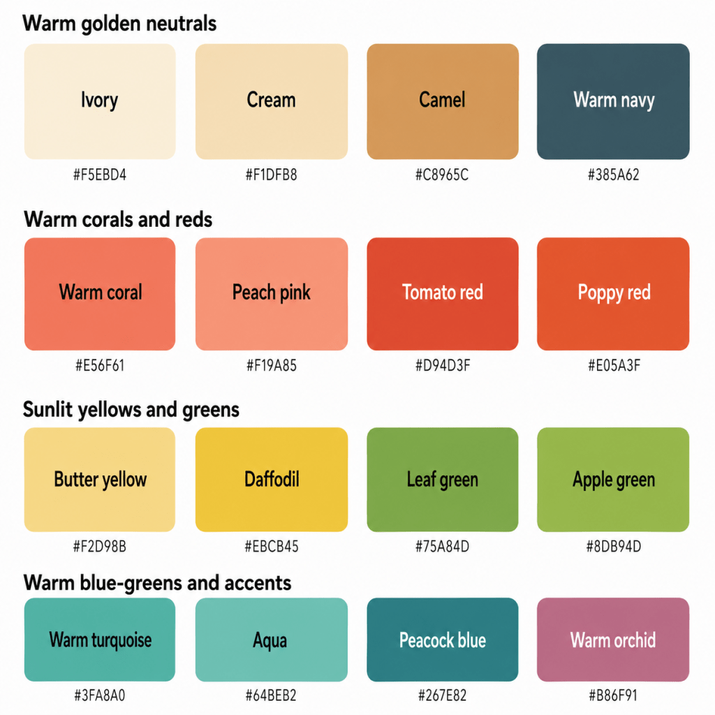
The Warm, Fresh Neutrals
- Ivory — warm and light without the sharpness of optic white
- Cream — softly golden and gentle
- Golden Beige — warmer and livelier than greige
- Camel — a polished golden neutral with enough clarity
- Warm Taupe — balanced brown-grey without cool ashiness
- Warm Navy — deep enough to anchor, but softer and greener than cool ink navy
These neutrals work because they support your warmth without becoming too heavy.
Ivory is generally more harmonious than brilliant white. Cream gives you softness without turning chalky.
Golden beige and camel provide practical alternatives to cool grey or black, while warm taupe is especially useful when you want a neutral brown that does not become orange.
Warm navy may become one of the hardest-working colours in your wardrobe. It offers structure without introducing the severe coolness of blue-black or the weight of true black.
You may also suit:
- Light cognac
- Warm stone
- Honey beige
- Soft olive
- Caramel
- Warm cocoa
Neutral does not mean colourless. Camel has submitted the relevant paperwork and will be staying.
Corals, Peaches & Warm Pinks
- Warm Coral
- Peach Pink
- Salmon
- Apricot Rose
- Warm Watermelon
- Geranium Pink
- Papaya Pink
- Warm Rose
This is one of your strongest colour families.
Warm coral combines warmth, freshness, and visible colour. Peach pink gives you a softer option, while watermelon and geranium create more impact.
Salmon can work beautifully when it remains pink enough to avoid becoming orange. Apricot rose bridges peach and pink.
Your best pinks should have a peach, coral, or warm rosy quality.
Be cautious with:
- Mauve
- Cool raspberry
- Blue-pink
- Dusty rose
- Magenta
- Icy pink
Your pink should look as though it has recently seen daylight.
Reds
- Tomato Red
- Poppy Red
- Warm Red
- Geranium Red
- Coral Red
- Persimmon
- Warm Cherry
- Clear Terracotta Red
Your reds should lean warm, clear, or slightly orange.
Tomato red is one of your signature shades because it has enough warmth to connect with your undertone while remaining fresh.
Poppy red is lively and polished. Persimmon introduces more orange, while geranium red offers a strong floral option.
Warm cherry can work when it remains clear rather than blue-based or burgundy.
Avoid:
- Blue-red
- Cranberry
- Burgundy
- Oxblood
- Cool wine
- Blackened red
Your red should suggest poppies, tomatoes, and ripe fruit.
Not a velvet curtain in a haunted theatre.
Oranges
- Apricot
- Peach
- Papaya
- Tangerine
- Nectarine
- Melon
- Clear Orange
- Golden Coral
Orange is often exceptionally harmonious because it naturally supports your warm undertone.
Apricot and peach make excellent lighter shades. Papaya and nectarine add more colour. Tangerine can create a lively accent.
Your best oranges remain clear and fresh.
Be cautious with:
- Burnt orange
- Dark rust
- Brown terracotta
- Copper-brown
- Muddy pumpkin
You want fruit, not masonry.
Yellows
- Butter Yellow
- Daffodil
- Warm Lemon
- Golden Yellow
- Sunflower
- Primrose
- Honey Yellow
- Light Marigold
Yellow is one of your strongest families because it echoes the warmth and brightness in your colouring.
Butter yellow gives you a gentle light option. Daffodil and warm lemon provide fresh clarity. Golden yellow and sunflower create stronger impact.
Honey yellow can work when it remains light and colourful rather than brown or mustard-heavy.
Avoid:
- Icy lemon
- Grey-yellow
- Muddy mustard
- Ochre
- Dark antique gold
- Fluorescent yellow
Your yellow should look optimistic.
It need not look as though it has been employed by a roadworks department.
Greens
- Leaf Green
- Grass Green
- Apple Green
- Warm Jade
- Fresh Olive
- Avocado
- Spring Green
- Medium Moss
Green is especially useful because it reflects the freshness of Spring.
Leaf green and grass green are natural, balanced choices. Apple green provides more brightness, while warm jade gives you polish.
Fresh olive and avocado can work when they remain visibly green rather than becoming brown, khaki, or military.
Your best greens lean warm or neutral rather than icy blue-green.
Avoid:
- Cool pine
- Blue spruce
- Grey sage
- Blackened forest
- Murky khaki
- Neon acid green
You want the sort of green that looks as though it has recently grown something and is quite pleased about it.
Blues & Blue-Greens
- Warm Turquoise
- Aqua
- Clear Teal
- Peacock Blue
- Warm Sky Blue
- Marine Blue
- Blue-Green
- Light Petrol Blue
Blue is naturally cool, so your best versions usually contain some green or warmth.
Warm turquoise is one of your strongest blues. Aqua gives you a lighter option. Clear teal and peacock add depth without becoming dark or smoky.
Warm sky blue can work when it leans slightly turquoise rather than icy or violet.
Marine blue offers a useful medium shade with enough warmth to feel connected.
Avoid:
- Icy blue
- Steel blue
- Periwinkle
- Blue-violet
- Cool navy
- Grey-blue
- Electric cobalt
Your blue should look like water beneath sunlight.
Not water beneath a glacier during an administrative emergency.
Purples
- Warm Orchid
- Red-Violet
- Warm Grape
- Soft Aubergine
- Warm Plum
- Fuchsia-Coral
- Reddish Purple
- Heathered Orchid
Purple is not your broadest family because many purples lean strongly blue.
Your best versions contain enough red or warmth to remain connected.
Warm orchid can be especially effective. Red-violet and warm grape provide stronger colour, while soft aubergine can work in smaller areas.
Avoid:
- Icy lavender
- Blue-purple
- Cool lilac
- Ultraviolet
- Grey mauve
- Black-purple
Your purple should look floral and lively rather than cold, smoky, or faintly haunted.
Warm Light Colours
- Ivory
- Peach Cream
- Butter Yellow
- Light Aqua
- Warm Mint
- Apricot
- Soft Coral
- Pale Golden Green
Your lighter colours should be warm, clear, and visibly pigmented.
They should not become:
- Chalky
- Icy
- Greyed
- Beige-softened beyond recognition
- Nearly white
- Sugary
A light peach with visible colour can look beautiful. A nearly white pink may simply look as though the washing machine became overenthusiastic.
Deeper Accent Colours
- Warm Teal
- Peacock
- Tomato Red
- Warm Plum
- Cognac
- Deep Olive
- Warm Cocoa
- Clear Terracotta
You can wear some depth, but your best deeper colours remain visibly warm and colourful.
Warm teal works better than midnight navy. Cognac works better than espresso. Warm plum works better than black-purple.
The key is stopping before the shade becomes dense, blackened, or heavily muted.
Depth may attend.
It simply should not shut all the curtains.
A Starter Palette
| Colour | Hex | Notes |
|---|---|---|
| Ivory | #F5EBD4 | Warm, gentle light neutral |
| Cream | #F0DFBA | Soft golden off-white |
| Golden Beige | #D8B787 | Warm versatile neutral |
| Camel | #C79759 | Rich but not heavy |
| Warm Taupe | #A98C72 | Balanced warm neutral |
| Warm Navy | #365B65 | Deep, softened blue |
| Warm Coral | #E47363 | Signature fresh coral |
| Peach Pink | #F19B86 | Light warm pink |
| Salmon | #E78775 | Soft orange-pink |
| Warm Watermelon | #DD6E75 | Fresh medium pink |
| Geranium Pink | #D65F70 | Clear warm floral pink |
| Apricot Rose | #E9A181 | Warm pink-peach |
| Tomato Red | #D94D3F | Clear warm red |
| Poppy Red | #E35A3F | Bright natural red |
| Persimmon | #D96B45 | Rich warm accent |
| Warm Cherry | #CA4D50 | Clear warm red-pink |
| Apricot | #F2B276 | Soft golden peach |
| Papaya | #ED8D55 | Lively orange |
| Tangerine | #E9793E | Clear energetic orange |
| Butter Yellow | #F1DA8A | Soft warm yellow |
| Daffodil | #EBC943 | Fresh golden yellow |
| Sunflower | #DDAF2B | Rich clear yellow |
| Leaf Green | #75A64B | Fresh natural green |
| Grass Green | #65A24A | Clear medium green |
| Warm Jade | #49956F | Polished warm green |
| Fresh Olive | #87974E | Earthy but alive |
| Warm Turquoise | #3BA8A1 | Clear warm blue-green |
| Aqua | #67BEB1 | Fresh light blue-green |
Part 3: The “Handle With a Little Extra Care” List
This is not a list of colours you must exile while a peach-coloured scarf watches solemnly from the wardrobe door.
These are simply colours that sit further away from your natural combination of warmth, medium-light value, and fresh clarity.
The Coolest Colours
- Icy blue
- Steel grey
- Cool lavender
- Blue-violet
- Magenta
- Blue-red
- Cool raspberry
- Silver-grey
- Cool navy
- Blue-based pink
Coolness is usually your clearest challenge.
These colours may create sallowness, redness, shadows, or a disconnected effect because their blue base does not echo your colouring.
Choose:
- Warm turquoise instead of icy blue
- Coral instead of cool pink
- Tomato red instead of blue-red
- Warm orchid instead of lavender
- Warm navy instead of cool navy
- Golden beige instead of steel grey
A cool colour may be perfectly lovely.
It may simply be lovely in another person’s basket.
The Darkest Colours
- Jet black
- Blue-black
- Espresso
- Midnight navy
- Blackened burgundy
- Deep aubergine
- Near-black forest green
- Oxblood
These shades can create too much visual weight.
Your palette needs light, colour, and warmth. Near-black shades may make the face look shadowed or severe.
Choose:
- Warm navy instead of black
- Cognac instead of espresso
- Warm plum instead of black-purple
- Deep olive instead of black forest
- Tomato red instead of oxblood
- Warm cocoa instead of dark chocolate
The Dustiest, Most Muted Colours
- Grey mauve
- Dusty blue
- Muted sage
- Murky taupe
- Browned rose
- Weathered teal
- Faded khaki
- Lifeless beige
Spring colouring needs visible freshness.
A shade with too much grey may make you look tired or undefined.
Choose:
- Warm rose instead of dusty rose
- Aqua instead of grey-blue
- Leaf green instead of sage
- Golden beige instead of murky taupe
- Coral instead of browned pink
Your colours may be softened slightly.
They should not look as though they have recently lost confidence.
The Brightest Fluorescent Colours
- Neon pink
- Highlighter yellow
- Acid green
- Electric violet
- Fluorescent orange
- Laser blue
You can wear colour, but the most artificial versions may overpower your natural freshness.
Choose:
- Warm coral instead of neon pink
- Daffodil instead of highlighter yellow
- Apple green instead of acid green
- Warm orchid instead of electric violet
- Tangerine instead of fluorescent orange
Your colours should be lively.
They do not need to be visible from the motorway.
The Deepest Autumn Colours
Because you are warm, it can be tempting to assume every Autumn shade will work.
Be cautious with:
- Dark rust
- Deep mustard
- Mahogany
- Bitter chocolate
- Black olive
- Burnt umber
- Dense brown-orange
- Very dark moss
These colours may be warm enough but too deep, muted, or brown.
Choose:
- Persimmon instead of rust
- Daffodil instead of mustard
- Camel instead of mahogany
- Warm cocoa instead of bitter chocolate
- Fresh olive instead of black olive
Warmth alone does not guarantee cooperation.
The Iciest Pastels
- Frost pink
- Ice lavender
- Blue-white
- Cool mint
- Silver-white
- Pale blue-grey
- Near-white lilac
Very icy shades may be too cool and pale.
Choose:
- Peach cream instead of icy pink
- Apricot instead of frost coral
- Light aqua instead of ice blue
- Warm mint instead of cool mint
- Ivory instead of optic white
Your light colours should feel sunlit, not refrigerated.
The Ashiest Neutrals
- Steel grey
- Blue-grey
- Cool charcoal
- Ash brown
- Grey taupe
- Pewter
- Cool mushroom
These may make your warmth look more pronounced in an uneven way.
Choose:
- Warm taupe
- Golden beige
- Camel
- Warm navy
- Cognac
- Warm stone
How to Make a Less-Ideal Colour Work
You have several options:
- Move it away from your face
- Pair it with one of your best warm colours
- Use it in a smaller proportion
- Choose a warmer or lighter version
- Add gold jewellery near your face
- Use coral, peach, or warm lipstick
- Place an ivory, warm aqua, or coral neckline between you and the colour
- Use the shade in shoes, bags, trousers, or prints
- Keep the overall outfit warm and medium in contrast
The goal is not wardrobe obedience. It is understanding why something may feel too cool, dark, muted, icy, or heavy — and knowing how to bring the outfit back towards you.
Part 4: Pattern Play — Best Prints & Patterns (and Why)
True Spring patterns work best when they reflect the same balance found in your solid colours:
- Warm overall temperature
- Medium contrast
- Clear, natural colour
- Fresh visual rhythm
- Defined but not harsh shapes
- Enough lightness to keep the print lively
What Works for You
Medium-Contrast Patterns
Think:
- Ivory and warm navy
- Coral and camel
- Aqua and golden beige
- Leaf green and cream
- Tomato red and warm tan
- Peach and warm teal
These combinations create definition without becoming stark.
Warm Tonal Patterns
Try:
- Peach, coral, and persimmon
- Butter yellow, daffodil, and honey
- Aqua, turquoise, and peacock
- Leaf green, jade, and olive
- Camel, cognac, and cream
These combinations create depth while keeping the temperature and intensity connected.
Fresh Florals
Excellent florals include:
- Coral flowers
- Peach blossoms
- Poppies
- Golden centres
- Fresh green leaves
- Aqua backgrounds
- Warm white bases
- Geranium accents
Be cautious with florals dominated by:
- Dusty mauve
- Cool grey
- Burgundy
- Icy pink
- Black backgrounds
- Grey sage
- Silver leaves
Botanical Prints
Spring botanicals work beautifully when they include:
- Fresh leaves
- Warm greens
- Citrus colours
- Coral flowers
- Golden details
- Blue-green backgrounds
- Medium contrast
Your strongest botanicals should look alive rather than faded or formal.
Playful Geometrics
Try:
- Coral and cream stripes
- Aqua and camel checks
- Warm green dots
- Golden-yellow geometrics
- Rounded abstract shapes
- Mid-scale plaid
- Warm multicoloured motifs
Your Spring energy suits prints with a little movement.
The print may smile.
It does not need to perform a five-minute comedy set.
Fruit & Nature-Inspired Prints
True Spring can carry playful nature prints especially well:
- Citrus
- Strawberries
- Flowers
- Birds
- Leaves
- Garden motifs
- Warm tropical details
- Clear multicoloured prints
Keep the palette refined enough that it feels intentional rather than novelty-heavy, unless novelty-heavy is precisely the plan.
Animal Prints
Traditional animal prints can work when they remain warm, fresh, and not overwhelmingly dark:
- Golden leopard
- Camel-and-cognac markings
- Warm tan zebra
- Olive-and-cream snake print
- Coral-brown abstract animal print
- Honey tortoiseshell
Avoid versions dominated by jet black, cool grey, or deep espresso.
Your animal print should look sun-warmed and alert.
Not like the animal has just received difficult news from its accountant.
Patterns Worth a Second Look
- Stark black-and-white prints
- Cool grey geometrics
- Dusty low-contrast florals
- Icy pink-and-blue combinations
- Very dark backgrounds
- Burgundy and mauve prints
- Neon multicoloured patterns
- Heavy brown-on-brown designs
- Faded vintage prints
Pattern Scale
Colour analysis does not determine pattern scale by itself; your facial features, body proportions, personal style, and garment shape also matter.
However, your fresh, balanced colouring often works well with:
- Small-to-medium florals
- Medium geometrics
- Cheerful stripes
- Organic motifs
- Clearly spaced prints
- Rounded patterns
- Moderate contrast
The pattern does not need to whisper.
It is allowed to suggest brunch enthusiastically.
Part 5: Metal Detector — Best Metals & Jewellery (and Why)
Your undertone is distinctly warm, making warm-toned metals your most harmonious choices.
Best Metals
- Yellow gold
- Champagne gold
- Rose gold
- Copper
- Brass
- Light bronze
- Warm mixed metals
- Soft antique gold
Yellow gold is one of your easiest options because it reflects your natural warmth.
Champagne gold provides a softer alternative. Rose gold can work beautifully when it leans peachy or golden rather than cool pink.
Copper, brass, and bronze connect with your warmth, but lighter or polished versions are generally easier than heavily darkened finishes.
Finish Matters
Your balanced Spring chroma allows:
- Soft polish
- Satin gold
- Hammered metal
- Gentle shine
- Delicate sparkle
- Light brushing
- Refined texture
- Moderate gloss
Very blackened antique metal may become too heavy. Extremely mirror-like jewellery may become more dramatic than necessary.
Your jewellery should catch the light.
It does not need to signal aircraft.
Silver
Silver is not your most seamless metal, particularly when it is:
- Icy
- Blue-white
- Highly reflective
- Paired with cool stones
- Darkened to gunmetal
That does not mean it must be removed under cover of darkness.
Silver may work better when:
- Mixed with gold
- Worn in a delicate scale
- Brushed rather than mirror-polished
- Paired with warm gemstones
- Balanced by warm clothing
Yellow Gold
Your best gold is:
- Warm
- Clear
- Medium yellow
- Polished or satin
- Free from strong orange or green casts
Very dark antique gold may become too heavy, while pale champagne gold offers a quieter option.
Rose Gold
Your best rose gold is:
- Peachy
- Warm
- Light
- Golden-pink
- Softly polished
Very cool or muted rose gold may feel less connected.
Mixed Metals
Mixed metals can work when warm metal remains dominant.
Try:
- Gold with small silver accents
- Copper with champagne gold
- Rose gold with yellow gold
- Brass with warm pewter
- Gold jewellery containing multicoloured stones
Gemstones
Excellent options include:
- Citrine
- Peridot
- Warm turquoise
- Coral
- Carnelian
- Golden topaz
- Warm jade
- Sunstone
- Peach moonstone
- Fire opal
- Yellow sapphire
- Warm aquamarine
- Light garnet
- Amber in lighter tones
Your best stones tend to be:
- Warm
- Clear to moderately clear
- Light-to-medium in depth
- Colourful
- Luminous
Pearls work beautifully in:
- Cream
- Warm white
- Peach
- Golden
- Champagne
- Coral-pink
Pearls look elegant on you without becoming overly formal, which is fortunate because pearls have spent several generations behaving as though they require written invitations.
Part 6: Face Value — Your Makeup Roadmap
Your most flattering makeup enhances your warmth, freshness, and balanced clarity without becoming cool, muddy, or overly dramatic.
The goal is warm definition with visible life.
You do not need to apply orange bronzer to every available surface and declare the matter resolved.
Foundation & Concealer
Look for undertones described as:
- Warm
- Golden
- Peach
- Warm-neutral
- Yellow-neutral
- Golden olive, where appropriate
- Peach-neutral
The correct undertone depends on your individual skin tone. Some True Springs need clearly warm formulas, while others suit warm-neutral or peach-neutral shades.
Always test the actual product.
A foundation called “Warm Sand” may be ideal. It may also resemble a pastry filling. Cosmetic naming remains largely unsupervised.
Avoid formulas that turn:
- Pink
- Rosy-cool
- Blue-red
- Grey
- Ashy
- Strongly orange
Natural, satin, and softly luminous finishes often work beautifully.
Very flat matte formulas may dull your freshness, while extreme wet-look shine can become distracting.
Blush
Best blush colours include:
- Peach
- Apricot
- Warm Coral
- Salmon
- Warm Pink
- Papaya
- Golden Rose
- Soft Terracotta
Peach and warm coral are among your easiest everyday options.
Apricot creates softness, while papaya and golden rose provide more visible colour. Soft terracotta can work when it remains fresh rather than brown.
Be cautious with:
- Cool mauve
- Dusty rose
- Blue-pink
- Plum
- Burgundy
- Icy pink
- Grey-beige blush
Your blush should make you look refreshed, not as though a decorative tile has been applied to each cheek.
Bronzer & Contour
True Spring can often wear bronzer beautifully.
Try:
- Golden Beige
- Warm Tan
- Honey Bronze
- Light Caramel
- Peach-Bronze
- Golden Brown
- Warm-Neutral Bronzer
Avoid bronzers that are:
- Very orange
- Very dark
- Muddy
- Grey-brown
- Red-brown
- Heavy or dense
For contour, try:
- Warm taupe
- Neutral brown
- Soft tan
- Golden mushroom
- Light warm cocoa
The goal is dimension and warmth.
Not an urgent renovation conducted beneath the cheekbones.
Lips
Your best lip colours are warm, fresh, and light-to-medium in depth.
Try:
- Warm Coral
- Peach Pink
- Tomato Red
- Poppy Red
- Warm Watermelon
- Apricot Rose
- Salmon
- Papaya
- Geranium
- Warm Cherry
For a natural lip:
- Peach nude
- Warm pink nude
- Coral beige
- Apricot balm
- Golden rose
- Warm peach gloss
- Soft rosewood
Your nude lipstick should contain visible peach, coral, or warm pink.
Be cautious with beige, grey-pink, mauve, and cool brown nudes.
For a statement lip:
- Tomato Red
- Poppy Red
- Coral Red
- Persimmon
- Geranium
- Warm Cherry
Very dark burgundy may feel heavy, while blue-red may look disconnected.
Eyes — Shadow
Excellent eyeshadow colours include:
- Golden Beige
- Camel
- Warm Taupe
- Peach
- Apricot
- Copper
- Bronze
- Olive
- Leaf Green
- Warm Teal
- Aqua
- Champagne
- Warm Brown
- Soft Terracotta
- Golden Green
For an everyday neutral eye, combine champagne, golden beige, and warm brown.
For colour, try olive, teal, peach, aqua, or golden green.
Your version of grey should be warm and slightly brown rather than steel or blue-grey.
Eyes — Liner
Best eyeliner colours include:
- Warm Brown
- Bronze
- Olive
- Deep Teal
- Warm Navy
- Copper-Brown
- Cognac
- Soft Chocolate
- Petrol Blue
Black eyeliner may work when your natural features provide enough contrast, but it may feel severe for everyday wear.
Warm brown, bronze, olive, and teal provide definition while staying connected.
A thick black wing may look stylish.
It may also arrive with its own legal representation.
Mascara
Try:
- Brown-black
- Warm black
- Chocolate brown
- Bronze-brown
- Deep olive-brown
- Soft black
Black can work, but brown-black often creates a more seamless daytime effect.
Brows
Choose brow products that are:
- Warm blonde
- Golden blonde
- Warm taupe
- Caramel
- Golden brown
- Soft chestnut
- Warm dark brown
- Auburn-brown, where appropriate
Avoid:
- Ash grey
- Cool taupe
- Charcoal
- Blue-black
- Violet-brown
- Extremely dark products
Matching temperature is just as important as matching depth.
A brow pencil may be technically the right darkness and still look as though two small pieces of driftwood have become involved.
Highlighter
Best highlighters include:
- Champagne
- Soft Gold
- Peach Pearl
- Warm Ivory
- Golden Opal
- Light Bronze
- Warm Rose Gold
- Apricot Shimmer
Avoid:
- Icy white
- Blue pearl
- Silver
- Lavender
- Cool pink
- Grey-beige frost
Your highlighter should create warm luminosity.
Not a strip of Arctic weather across the cheekbone.
Part 7: Through the Looking Glass — Eyewear
Eyewear sits directly on the face, so warmth, colour, and visual weight matter.
Your best frames are warm, lively, and medium in contrast.
Best Frame Colours
- Golden tortoiseshell
- Camel
- Cognac
- Warm tan
- Olive
- Leaf green
- Warm teal
- Turquoise
- Coral
- Tomato red
- Peach
- Golden beige
- Warm navy
- Copper
- Gold
Tortoiseshell
True Spring often wears tortoiseshell beautifully when it is:
- Golden
- Honeyed
- Caramel
- Warm brown
- Light-to-medium in contrast
- Amber-toned
- Free from excessive black
Very dark tortoiseshell may become too heavy.
Your ideal tortoiseshell should look sunlit, not as though it has been stored in an antique desk beside several unresolved family matters.
Transparent Frames
Transparent frames can work beautifully when they contain:
- Peach
- Warm coral
- Amber
- Honey
- Olive
- Warm turquoise
- Golden beige
- Clear warm brown
Completely clear frames may work, but a hint of warm colour often creates more connection.
Frame Contrast
Medium contrast is usually your easiest range.
Excellent choices include:
- Warm tortoiseshell
- Golden metal
- Olive acetate
- Coral frames
- Warm teal
- Cognac
- Amber transparent frames
Dark frames can work when:
- The colour remains warm
- The frame is not excessively thick
- Your natural features support the depth
- It does not read as solid black
Sunglasses
Try:
- Warm tortoiseshell
- Cognac
- Olive
- Gold
- Bronze
- Warm navy
- Coral
- Amber
- Brown gradient lenses
- Warm green lenses
Frames Worth a Second Look
- Cool grey
- Silver
- Icy pink
- Blue-violet
- Jet black
- Optic white
- Dark burgundy
- Steel blue
- Cool transparent lavender
- Very heavy frames
Your glasses should frame your face.
They should not open a hostile bid for ownership of it.
Part 8: Crowning Glory — Hair Colour
Your most harmonious hair colours are warm, golden, and medium-light to medium in depth.
Because hair surrounds the face, cool ashiness, extreme darkness, or heavy mutedness can quickly alter the balance.
Best Blonde Shades
- Golden Blonde
- Honey Blonde
- Warm Beige Blonde
- Strawberry Blonde
- Champagne-Gold Blonde
- Caramel Blonde
- Butterscotch Blonde
- Light Copper Blonde
Your blonde should remain warm and luminous.
Avoid:
- Ash blonde
- Silver blonde
- Mushroom blonde
- Icy platinum
- Blue-toned beige
- Grey-rooted blonde
Very pale platinum may feel too cool and stark, while deep golden blonde can work beautifully when it retains light and dimension.
Best Brunette Shades
- Golden Brown
- Light Chestnut
- Warm Medium Brown
- Caramel Brown
- Light Chocolate
- Amber Brown
- Warm Hazelnut
- Soft Auburn-Brown
Your best brunette shades contain visible gold, caramel, or warm red undertones.
Very dark espresso, ash brown, blue-black, and cool mushroom may become heavy or disconnected.
Red Hair
Warm red hair is especially compatible with True Spring.
Excellent options include:
- Strawberry Blonde
- Light Copper
- Golden Copper
- Ginger
- Warm Auburn
- Apricot Copper
- Copper-Gold
- Soft Cinnamon
The best reds remain luminous rather than dark or brown-heavy.
Deep burgundy, cool cherry, violet-red, and blackened mahogany may feel too cool or heavy.
Fashion Colours
Excellent creative hair colours include:
- Peach
- Coral
- Warm Pink
- Apricot
- Copper
- Golden Yellow
- Warm Turquoise
- Aqua
- Warm Green
Choose shades that remain warm and fresh rather than smoky, pastel-grey, or neon.
A soft peach wash may look delightful.
Electric violet may begin requesting its own dressing room.
Highlights & Balayage
Look for:
- Golden highlights
- Honey ribbons
- Caramel pieces
- Strawberry-blonde accents
- Copper-gold dimension
- Warm beige balayage
- Apricot-toned highlights
- Sunlit contrast
Avoid:
- Ash highlights
- Silver ribbons
- Mushroom balayage
- Icy blonde stripes
- Blue-grey dimension
- Very dark roots with pale icy ends
Highlights should look sunlit and blended.
Hair Depth & Contrast
Your medium-light to medium value means very dark hair may create too much weight.
Before darkening significantly, consider:
- Whether your skin looks shadowed
- Whether your eyes lose brightness
- Whether the hair demands stronger makeup
- Whether warmth remains visible
- Whether the hair appears before your face
A warm medium brunette with dimension is usually easier than one solid near-black shade.
A Note on Grey Hair
Natural grey and white hair can introduce coolness, but they do not remove your underlying warmth.
Excellent approaches include:
- Warm white
- Champagne grey
- Golden silver
- Soft pewter with warm highlights
- Creamy grey
- Silver blended with honey tones
- Warm beige-grey
If the hair becomes very blue-grey or stark white, warm clothing, jewellery, and makeup colours become especially useful near the face.
You do not have to cover grey.
You may simply want to prevent uncontrolled yellowing while avoiding an excessively icy result.
Grey hair can look beautiful with coral, warm turquoise, camel, leaf green, tomato red, and gold.
Part 9: Fingertips — Nail Polish
Nail polish sits away from the face, so you have more freedom, but your palette provides an excellent shortcut.
Best Everyday Colours
- Peach
- Warm Coral
- Apricot
- Salmon
- Warm Pink
- Golden Beige
- Camel
- Warm Nude
- Leaf Green
Light Colours
- Ivory
- Peach Cream
- Butter Yellow
- Warm Mint
- Light Aqua
- Pale Apricot
- Soft Coral
- Champagne
Medium Colours
- Tomato Red
- Papaya
- Warm Turquoise
- Apple Green
- Daffodil
- Warm Orchid
- Golden Tan
- Geranium
Deeper Colours
- Warm Teal
- Peacock
- Terracotta
- Cognac
- Deep Olive
- Warm Chocolate
- Warm Plum
- Petrol Blue
Your deeper nail colours can go slightly darker than your best clothing shades because they cover a smaller area.
Statement Colours
- Tangerine
- Poppy Red
- Bright Turquoise
- Golden Yellow
- Coral Glitter
- Warm Multicoloured Art
- Green Metallic
- Peach Chrome
Nudes
Your best nude nail colours include:
- Peach Beige
- Golden Nude
- Warm Pink-Beige
- Light Caramel
- Apricot Nude
- Soft Camel
- Warm Cream
Avoid:
- Grey beige
- Mauve nude
- Cool taupe
- Blue-pink
- Ash brown
- Stark white nude
Metallic Nails
Try:
- Gold
- Champagne
- Copper
- Rose Gold
- Warm Bronze
- Peach Shimmer
- Golden Green
- Coral-Gold
Silver and blue-grey chrome may still be worn for contrast, but they will not create the same seamless effect.
Sometimes the goal is elegant hands.
Sometimes the goal is tiny pieces of sunshine attached to every finger.
Both are defensible positions.
French Manicure
For a French manicure:
- Choose an ivory or warm-white tip
- Use a peach, pink-beige, or clear base
- Try coral, gold, turquoise, or leaf-green tips
- Keep the overall effect warm and fresh
Part 10: Texture & Fabric Talk
Colour does most of the heavy lifting in seasonal analysis, but texture changes how clear, muted, deep, or bright a shade appears.
True Spring tends to suit fabrics that feel fresh, tactile, softly polished, and lively.
Fabrics That Flatter
- Smooth cotton
- Linen
- Silk
- Lightweight wool
- Cashmere
- Soft denim
- Suede in warm colours
- Satin with gentle shine
- Fine knits
- Chiffon
- Crepe
- Light leather
- Corduroy
- Refined tweed
- Jersey
Your Spring quality is reflected in freshness and movement, while your balanced chroma allows moderate texture and polish.
A coral silk blouse, camel suede jacket, or turquoise linen dress can all work beautifully.
Shine
You can handle:
- Polished leather
- Satin
- Silk
- Gold thread
- Delicate sequins
- Warm shimmer
- Pearl finishes
- Moderate gloss
Be more cautious with:
- Mirror-finish metallics
- Very dark patent leather
- Black sequins
- Icy silver shine
- Neon gloss
- Heavy bronze lamé
The issue is not shine itself. It is whether the shine feels warm, fresh, and connected.
Your palette appreciates sparkle.
It does not require a dedicated lighting technician.
Matte Fabrics
Matte fabrics work beautifully when they remain fresh:
- Linen
- Cotton
- Cashmere
- Fine wool
- Suede
- Crepe
- Jersey
- Soft denim
Be cautious when matte colour becomes faded, dusty, or heavily earthy.
Textured Fabrics
Excellent options include:
- Linen
- Fine corduroy
- Suede
- Soft leather
- Lightweight tweed
- Basket-weave knits
- Brushed wool
- Textured cotton
Be cautious with textures that are:
- Extremely rough
- Very dark
- Heavily distressed
- Muddy in colour
- Dense and bulky
- Greyed or washed out
A golden-beige linen jacket may look excellent.
A blackened rust blanket coat may begin telling an entirely different seasonal story.
Lightweight & Sheer Fabrics
You can wear:
- Chiffon
- Organza
- Voile
- Fine silk
- Lightweight linen
- Mesh
- Georgette
These work especially well in peach, coral, aqua, ivory, and warm green.
Structure
You can wear both flowing and tailored shapes.
Your lively warmth often suits:
- Relaxed tailoring
- Clean lines
- Rounded details
- Open necklines
- Natural draping
- Light structure
- Playful accents
- Refined but approachable pieces
Very rigid, severe tailoring may feel too formal, particularly in black, cool navy, or grey.
Think polished, warm, and energetic.
Not dressed to announce that everyone’s annual leave requests have been denied.
Part 11: Putting It All Together — Styling Tips
Knowing individual colours is useful. Knowing how to combine them is what turns your palette into a functioning wardrobe.
Build Around Warm Neutrals
Choose two or three primary neutrals, such as:
- Ivory
- Camel
- Golden beige
- Warm navy
- Warm taupe
- Fresh olive
These make your stronger colours easier to combine.
For example:
- Ivory + coral + camel
- Warm navy + aqua + peach
- Golden beige + leaf green + tomato red
- Warm taupe + butter yellow + turquoise
- Fresh olive + apricot + cream
Keep the Overall Outfit Warm
You do not need to dress entirely in orange, yellow, and brown.
The goal is simply to maintain enough warmth that the colours feel connected.
Excellent combinations include:
- Ivory and warm turquoise
- Camel and coral
- Golden beige and leaf green
- Cream and tomato red
- Warm navy and peach
- Olive and apricot
- Butter yellow and aqua
Use Medium Contrast
Your easiest outfits tend to use moderate contrast.
Try:
- Ivory + Warm Navy
- Coral + Camel
- Aqua + Golden Beige
- Leaf Green + Cream
- Tomato Red + Warm Taupe
- Peach + Warm Teal
Stark black and optic white may create too much hardness. Ivory and warm navy give you a similarly polished effect with more harmony.
Use Colour Near the Face
When an outfit includes a less harmonious shade — perhaps cool grey trousers, a black jacket, or an icy-blue coat — place one of your strongest colours near your face.
Try:
- Coral lipstick
- A peach scarf
- Gold earrings
- An ivory neckline
- A turquoise cardigan
- Warm blush
Let Coral and Turquoise Do the Work
Corals and warm blue-greens are among your strongest statement families.
Use:
- Peach for softness
- Coral for freshness
- Tomato red for energy
- Aqua for lightness
- Warm turquoise for impact
- Peacock for depth
These colours work beautifully in dresses, blouses, knitwear, scarves, coats, jewellery, nail polish, and makeup.
Use Green as a Wardrobe Bridge
Warm greens combine particularly easily with your palette.
Try:
- Leaf green + coral
- Olive + apricot
- Jade + camel
- Grass green + ivory
- Warm teal + peach
- Avocado + golden yellow
Replace Cool Wardrobe Staples
Instead of:
- Optic white, try ivory
- Cool grey, try warm stone
- Cool navy, try warm navy
- Mauve, try warm orchid
- Blue-red, try tomato red
- Icy blue, try aqua
- Cool pink, try peach pink
- Silver, try gold
Replace Dark Wardrobe Staples
Instead of:
- Black, try warm navy or cocoa
- Espresso, try cognac
- Blackened burgundy, try terracotta-red
- Deep forest, try fresh olive
- Midnight blue, try petrol blue
- Charcoal, try warm taupe
Create a Cohesive Wardrobe
A practical True Spring wardrobe might centre on:
Neutrals
- Ivory
- Camel
- Golden Beige
- Warm Navy
Core colours
- Coral
- Aqua
- Leaf Green
- Tomato Red
Golden accents
- Butter Yellow
- Apricot
- Fresh Olive
Because these colours share a warm, fresh foundation, they combine easily.
Your wardrobe begins behaving like a well-run garden party: everyone is cheerful, the colours get along, and cool grey has not been given the Wi-Fi password.
Part 12: Common Pitfalls (a.k.a. “Oh, That’s Why”)
“Warm means everything should be brown.”
Absolutely not.
Your palette contains:
- Coral
- Turquoise
- Aqua
- Peach
- Yellow
- Green
- Red
- Warm blue
- Orchid
Warmth refers to undertone, not an obligation to resemble a beautifully maintained leather sofa.
“Spring means neon.”
No.
Your colouring benefits from freshness and visible colour, but fluorescence may still overwhelm you.
Coral, apple green, warm turquoise, daffodil, and tomato red have plenty of life without requiring batteries.
“True Spring means I can wear every warm colour.”
Not quite.
A warm shade may still be:
- Too dark
- Too muted
- Too brown
- Too orange
- Too golden
- Too heavy
Warmth leads, but value and chroma still matter.
Choosing Colours That Are Too Cool
A colour may be the correct depth and still look disconnected because of its blue undertone.
Be especially cautious with:
- Mauve
- Cool raspberry
- Blue-red
- Icy blue
- Steel grey
- Cool navy
- Lavender
- Magenta
Choosing Colours That Are Too Dark
Very dark shades may overshadow your medium-light colouring.
Try warm navy, cognac, petrol blue, deep olive, or warm cocoa before automatically choosing black, espresso, or midnight navy.
Choosing Colours That Are Too Muted
Greyed, dusty colours can dull your Spring freshness.
Move from dusty rose to coral.
From grey sage to leaf green.
From faded blue to aqua.
From muddy mustard to daffodil.
Choosing Colours That Are Too Bright
The opposite problem can happen when focusing too heavily on Spring’s clarity.
A colour may be warm but still too fluorescent.
Ask whether the colour enhances your face or appears to be producing its own electricity.
Choosing Colours That Are Too Pale
True Spring is not limited to delicate pastels.
Very pale colours may lack enough pigment, especially when they are chalky or nearly white.
Choose cream, peach, butter yellow, and light aqua rather than frost-like shades.
Defaulting to Black
Black is practical and plentiful, but it may create more coolness and contrast than you need.
You do not need to eliminate it.
Soften it with:
- Coral
- Peach
- Gold jewellery
- Warm turquoise
- Ivory
- Tomato-red lipstick
Or replace it with warm navy, cocoa, petrol blue, or deep olive.
Buying Cool “Basics”
Grey, optic white, blue-black, and icy beige are often treated as universal neutrals.
They are not.
Ivory, camel, golden beige, warm navy, olive, and warm taupe are more reliable choices.
Assuming All Gold Is Automatically Perfect
Gold is generally harmonious, but very dark antique gold or highly orange brass may become heavy.
Champagne, polished yellow gold, and warm rose gold are often easier.
Avoiding Strong Colour
Your palette is fresh and colourful.
You do not need to retreat entirely into cream, camel, and pale peach.
Tomato red, warm teal, grass green, and coral bring your colouring into focus.
Forgetting Personal Style
Your palette tells you which colours harmonise with your natural colouring. It does not tell you whether you prefer relaxed linen, polished tailoring, romantic dresses, vintage knitwear, or clothing that makes you look like the charismatic owner of a flower shop where one customer has definitely disappeared under mysterious circumstances.
Use the palette to support your style, not replace it.
Quick-Reference Cheat Sheet
| Category | Yes, Please | Worth a Second Look (Not Banned!) |
|---|---|---|
| Neutrals | Ivory, cream, golden beige, camel, warm taupe, warm navy | Optic white, cool grey, jet black, deep espresso |
| Pinks | Peach pink, warm coral, salmon, watermelon, geranium | Mauve, cool rose, magenta, icy pink |
| Reds | Tomato red, poppy red, persimmon, warm cherry | Blue-red, burgundy, cranberry, blackened red |
| Oranges | Apricot, peach, papaya, tangerine, golden coral | Burnt orange, dark rust, brown terracotta |
| Yellows | Butter yellow, daffodil, sunflower, honey yellow | Icy lemon, fluorescent yellow, muddy mustard |
| Greens | Leaf green, grass green, warm jade, fresh olive, avocado | Cool sage, blue pine, black forest, grey-green |
| Blues | Warm turquoise, aqua, peacock, teal, marine blue | Icy blue, periwinkle, steel blue, cool navy |
| Purples | Warm orchid, red-violet, warm grape, warm plum | Lavender, blue-violet, ultraviolet, black-purple |
| Light colours | Ivory, peach cream, butter yellow, light aqua | Frost pink, icy blue, optic white, cool mint |
| Deep colours | Warm teal, petrol, cognac, olive, warm cocoa | Jet black, espresso, midnight navy, blackened burgundy |
| Brights | Coral, tomato red, apple green, turquoise, daffodil | Neon, fluorescent, sharply synthetic brights |
| Patterns | Warm florals, botanicals, medium contrast, playful geometrics | Stark black-and-white, dusty florals, cool grey graphics |
| Metals | Gold, champagne gold, warm rose gold, copper, light bronze | Icy silver, gunmetal, heavily blackened metal |
| Foundation | Warm, golden, peach, or warm-neutral undertones | Cool pink, rosy-blue, grey or ashy undertones |
| Blush | Peach, apricot, coral, salmon, golden rose | Mauve, cool pink, plum, dusty rose |
| Bronzer | Golden beige, honey bronze, warm tan, peach-bronze | Cool taupe, grey-brown, muddy dark bronzer |
| Lipstick | Coral, peach pink, tomato red, poppy, warm watermelon | Blue-red, mauve nude, burgundy, cool raspberry |
| Eyeshadow | Gold, camel, peach, copper, olive, warm teal, champagne | Silver, cool grey, mauve, blue-purple |
| Eyeliner | Warm brown, bronze, olive, teal, warm navy | Sharp black, cool grey, blue-violet |
| Hair colour | Golden blonde, honey, strawberry blonde, copper, warm brown | Ash blonde, silver, mushroom, blue-black |
| Eyewear | Golden tortoiseshell, camel, olive, coral, gold, warm teal | Cool grey, silver, jet black, icy transparent frames |
| Nail polish | Coral, peach, tomato red, aqua, gold, warm green | Mauve, blue-red, cool nude, silver-grey |
| Fabrics | Linen, silk, cotton, suede, light leather, satin, fine knits | Heavy black patent, icy metallics, very dark rustic textures |
A Final Word
True Spring is a palette of warmth with unmistakable freshness.
Your colours do not need to become fluorescent, deeply earthy, or delicately pastel to make an impact. Their strength comes from life: coral that brings warmth to the face, turquoise that feels clear rather than icy, greens that look freshly grown, and golden neutrals that support without weighing you down.
You sit at the centre of Spring, which gives you access to the full character of the season without needing to lean heavily towards Summer, Autumn, or Winter.
That means ivory, camel, coral, peach, golden yellow, leaf green, warm turquoise, tomato red, aqua, and warm navy all have a natural place in your wardrobe.
Your best outfits will not be entirely pale, entirely bright, or entirely earthy. They will move between light and rich, colourful and grounded, while keeping that warm, sunlit thread running through everything.
So wear the coral. Choose the ivory instead of the optic white. Investigate the gold jewellery. Approach steel grey with the same measured caution one might use when opening a message that begins, “I’ve made a few improvements to the group itinerary.”
And remember: your palette is not “Spring, but generic.”
It is Spring, perfectly in bloom.
