Light Summer: Your Complete Colour Guide
- Light Summer: Your Complete Colour Guide
- Part 1: What Being a Light Summer Actually Means
- Part 2: Your Power Palette — Best Colours (and Why)
- Part 3: The “Handle With a Little Extra Care” List
- Part 4: Pattern Play — Best Prints & Patterns (and Why)
- Part 5: Metal Detector — Best Metals & Jewellery (and Why)
- Part 6: Face Value — Your Makeup Roadmap
- Part 7: Through the Looking Glass — Eyewear
- Part 8: Crowning Glory — Hair Colour
- Part 9: Fingertips — Nail Polish
- Part 10: Texture & Fabric Talk
- Part 11: Putting It All Together — Styling Tips
- Part 12: Common Pitfalls (a.k.a. “Oh, That’s Why”)
- “I’m a Summer, so everything should be dusty.”
- “Light means I can only wear pastel.”
- “I’m close to Spring, so warm colours should work.”
- Defaulting to Black
- Choosing Neutrals That Are Too Dark
- Choosing Colours That Are Too Pale and Chalky
- Choosing Colours That Are Too Bright
- Buying Warm “Basics”
- Avoiding All Dark Colours Completely
- Forgetting Personal Style
- Quick-Reference Cheat Sheet
- A Final Word
So, the results are in: you’re a Light Summer!
Which means your colouring has all the cool, gentle softness of Summer, but with a little extra lift.
Your palette is airy, fresh, and quietly luminous. Not washed out. Not sugary. Not permanently dressed for a garden party where everyone owns an impractical hat. Your colours have delicacy, but they also have life.
Light Summer sits firmly within the Summer family, meaning your colouring is fundamentally:
- Cool-neutral in undertone
- Light in overall value
- Soft to moderately clear in chroma
But because you sit closer to Spring than the other Summer palettes do, you can borrow a little of Spring’s freshness and brightness. Your best colours are still cooler and more blended than Spring colours, but they are also lighter, cleaner, and less greyed than the shades found in deeper or more muted Summer palettes.
Think shell pink rather than dusty rose. Sky blue rather than slate. Fresh mint rather than grey-green. Light raspberry rather than deep berry. Soft, but awake.
The goal is not to turn you into a Spring. Spring colours can become too warm, golden, or brightly saturated against you. Instead, you borrow just enough of Spring’s lightness and clarity to stop your palette from becoming too smoky or subdued.
In other words: cool, light, fresh, and softly radiant.
Let’s get into what that actually means for your wardrobe.
Part 1: What Being a Light Summer Actually Means
Colour analysis looks at three main things about your natural colouring — your skin, hair, and eyes working together:
- Temperature — are your undertones warmer or cooler?
- Value — is your overall colouring lighter or deeper?
- Clarity — is your colouring clearer and more vivid, or softer and more muted?
For you, the strongest and most important quality is lightness.
Your natural colouring tends to have an airy, delicate quality. This does not mean you must have pale skin, blonde hair, or light eyes. Light Summer can appear across a range of skin tones and features. What matters is that your overall colouring is best supported by shades that feel lifted, gentle, and relatively light rather than heavy or visually dense.
Very dark colours may overpower you before temperature or chroma even enters the discussion. A colour can be beautifully cool, but if it is almost black, it may still create too much weight against your natural colouring.
Your second important quality is your cool-neutral temperature.
You belong to the Summer family, so your palette leans cool. Blue, pink, mauve, lavender, and cool grey undertones tend to harmonise naturally with you.
However, your proximity to Spring gives you a touch more neutrality than the coolest Summer palettes. You may be able to wear some colours that are only gently warm or nearly neutral, provided they remain light and fresh.
A soft peach-pink may work. A deep burnt orange probably has other ambitions.
Your third quality is your soft-to-moderate clarity.
You still have Summer’s blended, gentle quality, so extremely bright colours can overwhelm you. At the same time, you usually need more freshness than heavily muted or very greyed shades provide.
Your colours should look softened, not tired.
Here is the easiest way to picture your palette:
Imagine a Summer watercolour palette sitting beside an open window on a bright morning.
The colours are soft, cool, and blended, but the light catches them. They are not foggy. They are not chalky. They are not deep enough to feel heavy. They have just enough clarity to look fresh.
A few other things worth knowing:
- Light Summer can appear across many skin tones, hair colours, and eye colours. It is not limited to pale blondes with blue eyes.
- Light does not mean pastel-only. You can wear several medium colours, provided they remain cool, fresh, and not too deep.
- Softness does not mean dullness. Aqua, lavender, watermelon pink, periwinkle, and cool mint are all soft enough for you while still looking lively.
- Your Spring influence is useful, but it is not the whole story. You can borrow some lightness and freshness, but Spring’s golden warmth and high brightness may overwhelm you.
- Depth often matters before anything else. A colour may be cool and technically harmonious, but still too dark to feel effortless.
The central rule is simple:
Keep it light, keep it cool, and give the colour enough freshness to stay alive.
Part 2: Your Power Palette — Best Colours (and Why)
The unifying theme of your palette is light, cool colour with gentle freshness.
Your best shades are neither muddy nor fluorescent. They are not buried under layers of grey, but they are not glowing like emergency signage either. They look airy, polished, and softly colourful.
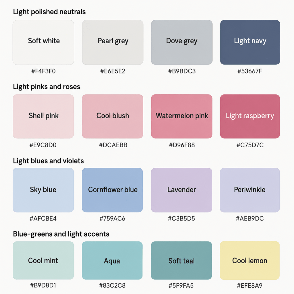
The Light, Airy Neutrals
- Soft White — cool and gentle, without the sharpness of optic white
- Pearl — a luminous off-white with a subtle cool quality
- Dove Grey — a light-to-medium cool grey
- Silver Grey — softly reflective and elegant
- Cool Taupe — a greyed beige without strong yellow warmth
- Light Navy — a softened blue-based navy rather than a dark inky version
These neutrals work because they support your natural lightness rather than surrounding you with visual weight.
Soft white may become one of your most useful wardrobe colours. It gives you the freshness of white without the stark contrast of brilliant optic white.
Dove grey and silver grey are equally dependable. They create structure without becoming dark or severe, and they work beautifully with nearly every colour in your palette.
Cool taupe can act as your version of beige, provided it remains greyed and does not lean camel, caramel, or golden brown.
Light navy is your darker anchor. It gives you more definition than pale grey without becoming as heavy as black or very deep navy.
You may also suit:
- Pale mushroom
- Blue-grey
- Rose taupe
- Soft pewter
- Light charcoal
- Cool cocoa used sparingly
Yes, “light navy” sounds mildly contradictory. Fashion has survived stranger things.
Light Pinks & Reds
- Shell Pink
- Cool Blush
- Watermelon Pink
- Rose Pink
- Light Raspberry
- Strawberry Pink
- Soft Cranberry
- Cool Coral-Pink
Your pinks and reds should feel fresh and rosy rather than earthy or orange-based.
Shell pink and cool blush make excellent light neutrals. Watermelon pink adds brightness without becoming neon. Light raspberry provides a stronger option while still respecting your lighter value.
Some cooler coral-pinks may work because of your Spring influence, but they should remain pink-dominant rather than orange-dominant. Think chilled watermelon, not tropical sunset.
Very dark burgundy, brick red, tomato red, and brownish rose may feel too heavy or too warm.
Blues
- Sky Blue
- Powder Blue
- Cornflower Blue
- Periwinkle
- Light Denim
- Soft French Blue
- Bluebell
- Light Navy
Blue is one of your strongest colour families.
Sky blue and powder blue reflect your lightness beautifully. Cornflower and soft French blue provide more presence without becoming overpowering. Periwinkle is particularly useful because it bridges blue and violet while remaining light and gentle.
Look for denim that appears:
- Light blue
- Cool faded blue
- Blue-grey
- Softly washed
- Clear rather than yellowed
Avoid heavily distressed denim with warm beige fading or very dark indigo washes that become too visually dense.
Purples
- Lavender
- Lilac
- Wisteria
- Orchid Pink
- Soft Violet
- Periwinkle
- Light Mauve
- Heather
Purple can be especially flattering because it naturally combines cool blue and pink.
Your best purples remain light and visibly colourful. Lavender, lilac, and wisteria are excellent when they are neither too grey nor too sugary.
Light mauve works well as a softer neutral, while orchid pink provides more life. Dark plum and aubergine may be too heavy in large areas, though they can still work in smaller accents.
Greens & Blue-Greens
- Cool Mint
- Seafoam
- Aqua
- Light Teal
- Eucalyptus
- Pale Jade
- Blue-Green
- Soft Turquoise
Your strongest greens lean blue rather than yellow.
Cool mint, seafoam, and aqua reflect your Spring-adjacent freshness while still maintaining a Summer coolness. Light teal and soft turquoise give you more definition without becoming too saturated.
Eucalyptus can work well when it stays light and blue-based. Some sage shades may also suit you, but avoid versions that lean strongly olive, khaki, or yellow-grey.
You want the sort of green that looks as though it has been near water recently.
Yellows & Warm-Leaning Colours
Yellow is not always the easiest colour family for Summer palettes, but your Spring influence gives you a little more flexibility.
Try:
- Cool Lemon
- Primrose
- Pale Butter Yellow
- Soft Banana
- Light Cream Yellow
The best yellows are pale, fresh, and only gently warm.
Avoid:
- Mustard
- Marigold
- Ochre
- Golden yellow
- Deep butter
- Orange-yellow
You may also suit very light peach-pink, shell peach, or cool apricot in small doses, provided they remain pale and pink-based rather than golden.
This is a “small sip of warmth” situation, not an all-inclusive resort.
Pastels & Light Colours
- Icy Pink
- Powder Blue
- Lavender Mist
- Cool Mint
- Soft Lemon
- Seafoam
- Pearl
- Pale Aqua
Light colours are central to your palette, but they should still contain enough pigment to be recognisable.
An extremely chalky pastel can look flat. A heavily beige pastel can look dull. A very icy Winter pastel can look stark.
Your best pastels are:
- Light
- Cool
- Gently softened
- Fresh
- Clearly identifiable as colour
Think watercolour, not correction fluid.
A Starter Palette
| Colour | Hex | Notes |
|---|---|---|
| Soft White | #F4F3F0 | Cool and gentle |
| Pearl | #E6E5E2 | Luminous light neutral |
| Dove Grey | #B9BDC3 | Soft, versatile grey |
| Silver Grey | #CDD1D6 | Light and polished |
| Cool Taupe | #B6ADA8 | Soft grey-beige |
| Light Navy | #53667F | Structured without heaviness |
| Shell Pink | #E9C8D0 | Delicate cool pink |
| Cool Blush | #DCAEBB | Soft everyday pink |
| Watermelon Pink | #D96F8B | Fresh and lively |
| Light Raspberry | #C75D7C | Stronger, but still light |
| Rose Pink | #CD8195 | Balanced rosy pink |
| Soft Cranberry | #B7657A | Rich without becoming dark |
| Sky Blue | #AFCBE4 | Clear, airy blue |
| Powder Blue | #BDD0E2 | Soft light blue |
| Cornflower Blue | #759AC6 | Fresh medium blue |
| Soft French Blue | #6F8FB5 | Polished and gentle |
| Periwinkle | #AEB9DC | Blue-violet light tone |
| Lavender | #C3B5D5 | Cool soft purple |
| Wisteria | #B9A7C8 | Light muted violet |
| Heather | #A991B2 | Soft medium purple |
| Cool Mint | #B9D8D1 | Fresh blue-green |
| Seafoam | #A9CEC7 | Light and softened |
| Aqua | #83C2C8 | Fresh but controlled |
| Light Teal | #5F9FA5 | Deeper blue-green accent |
| Pale Jade | #A7C8BE | Gentle cool green |
| Soft Turquoise | #69B1B4 | Lively without neon intensity |
| Cool Lemon | #EFE8A9 | Pale, fresh yellow |
| Icy Pink | #E8D2DC | Cool light pastel |
Part 3: The “Handle With a Little Extra Care” List
This is not a list of colours you must remove from your wardrobe while a tiny fashion tribunal watches disapprovingly.
These are simply colours that sit further away from your natural combination of lightness, cool-neutral temperature, and gentle clarity. They may require more thoughtful styling, particularly when worn near your face.
The Darkest Colours
- Jet black
- Near-black navy
- Espresso brown
- Blackened burgundy
- Deep aubergine
- Very dark forest green
- Deep charcoal
- Oxblood
Darkness is often your biggest challenge.
These colours can create too much visual weight and contrast, making your features look smaller, shadowed, or overwhelmed.
If you need a dark neutral, try:
- Light navy
- Medium blue-grey
- Soft charcoal
- Cool taupe
- Pewter
- Medium grey
If you already own black, there is no need to arrange a formal farewell. Soften it with a light colour near your face:
- A shell-pink scarf
- A powder-blue blouse
- Pearl earrings
- A lavender cardigan
- Cool rose lipstick
The Warmest Colours
- Rust
- Burnt orange
- Pumpkin
- Mustard
- Golden brown
- Camel
- Warm coral
- Terracotta
- Cognac
- Yellow olive
These colours contain warmth and depth that your colouring does not naturally echo.
Your Spring influence allows you a little more warmth than some Summer palettes, but the colour still needs to remain light, gentle, and reasonably neutral.
A pale peach-pink may work beautifully. Burnt orange is less “fresh morning light” and more “decorative autumnal squash”.
Warm colours are generally easier:
- Away from the face
- In small accessories
- Mixed into cooler patterns
- Lightened substantially
- Paired with one of your best colours
The Most Muted, Dusty Colours
- Muddy mauve
- Grey-beige
- Dusty khaki
- Browned rose
- Weathered terracotta
- Faded olive
- Dark mushroom
- Smoky brown
Summer softness is part of your palette, but very greyed shades can become too dull.
Your Spring influence means your colours need a little life. If a colour appears as though it has spent several years at the back of a linen cupboard, it may not be your strongest option.
Instead of muddy mauve, try lavender or rose pink.
Instead of khaki, try eucalyptus or pale jade.
Instead of weathered terracotta, try watermelon pink.
Instead of brown-grey, try cool taupe or dove grey.
The Brightest Spring and Winter Colours
- Neon pink
- Electric blue
- Brilliant orange
- Acid green
- Vivid turquoise
- Hot magenta
- Optic white
- Highly saturated jewel tones
You can borrow some freshness from Spring, but not its most intense brightness.
A colour that is both very light and very bright can become sharp rather than fresh. Similarly, highly saturated Winter colours may overpower the blended quality of your colouring.
Choose:
- Aqua instead of electric turquoise
- Watermelon instead of neon pink
- Soft French blue instead of royal blue
- Cool lemon instead of bright yellow
- Light raspberry instead of intense magenta
Heavy Earth Tones
- Chocolate brown
- Deep olive
- Moss
- Mahogany
- Dark camel
- Bronze
- Burnt sienna
- Warm taupe
Earth tones often combine depth, warmth, and mutedness — three qualities that can all work against your palette when pushed too far.
If you love earthy dressing, reinterpret it through lighter, cooler shades:
- Eucalyptus
- Pale jade
- Rose taupe
- Dove grey
- Soft navy
- Heather
- Cool mushroom
How to Make a Less-Ideal Colour Work
You have several options:
- Move it away from your face
- Pair it with one of your best light colours
- Use it in a smaller proportion
- Choose a lighter version
- Add silver jewellery or cool makeup near your face
- Place a cool neckline, scarf, collar, or jacket between you and the colour
- Use the colour in shoes, trousers, bags, or patterns
- Keep the overall outfit light, even if one piece is deeper
The goal is not wardrobe perfection. It is understanding why something may feel heavy, dull, or disconnected — and knowing what to do about it.
Part 4: Pattern Play — Best Prints & Patterns (and Why)
Light Summer patterns work best when they reflect the same balance found in your solid colours:
- Light overall value
- Cool or cool-neutral temperature
- Low-to-medium contrast
- Gentle freshness
- Soft definition rather than sharp edges
What Works for You
Low-to-Medium Contrast Patterns
Think:
- Soft white and sky blue
- Dove grey and shell pink
- Lavender and periwinkle
- Light navy and pearl
- Seafoam and cool mint
These combinations create interest without overwhelming your natural lightness.
Tonal Patterns
Tonal patterns use several versions of a similar colour:
- Sky blue, cornflower, and light navy
- Shell pink, rose pink, and light raspberry
- Lavender, wisteria, and heather
- Cool mint, seafoam, and aqua
These can look especially harmonious because they create depth without relying on strong contrast.
Watercolour Prints
Watercolour florals and blended abstract prints are a natural fit for your palette.
Look for prints in:
- Powder blue
- Lavender
- Cool pink
- Seafoam
- Light teal
- Pearl grey
- Soft lemon
The colours should blend, but they should not dissolve into one indistinct grey cloud.
You want artistic softness, not a print that looks as though it has been through an emotional ordeal in the washing machine.
Light Florals
Excellent florals include:
- Bluebells
- Lavender flowers
- Pale pink roses
- Cool green leaves
- Hydrangea blues
- Soft violet petals
- White or pearl backgrounds
Be cautious with florals dominated by:
- Rust
- Mustard
- Deep burgundy
- Dark olive
- Warm beige
- Black backgrounds
Refined Stripes and Checks
Try:
- Soft white and powder-blue stripes
- Lavender and pearl checks
- Cool pink gingham
- Light navy and soft white
- Aqua and dove-grey geometrics
Very sharp black-and-white stripes may create too much contrast.
Animal Prints
Traditional leopard is often too warm and dark, but lighter, cooler versions can work:
- Dove-grey leopard
- Pale taupe-and-grey snake print
- Blue-grey animal print
- Soft lavender abstract print
- Pearl and light charcoal markings
You are allowed animal print. The animal simply needs to appear as though it has excellent Scandinavian lighting.
Patterns Worth a Second Look
- Black backgrounds
- Stark black-and-white prints
- Very dark florals
- Warm brown animal prints
- Orange, mustard, and olive combinations
- Neon multicoloured patterns
- Extremely dense motifs
- Heavy geometric contrast
- Very muddy, low-definition prints
Pattern Scale
Colour analysis does not determine pattern scale by itself; your facial features, height, frame, personal style, and garment shape also matter.
However, your lighter colouring often works well with:
- Small-to-medium florals
- Airy spacing
- Fine stripes
- Light geometrics
- Delicate abstract prints
- Patterns with visible background space
The print does not need to be tiny, but it generally benefits from having room to breathe.
If the pattern looks as though twelve separate ideas are all trying to leave through the same doorway, it may be a bit much.
Part 5: Metal Detector — Best Metals & Jewellery (and Why)
Your undertone is cool-neutral, with enough Spring influence to give you slightly more flexibility than the coolest Summer palettes.
Best Metals
- Silver
- White gold
- Platinum
- Light pewter
- Soft stainless steel
- Pale rose gold
- Very light champagne gold
Silver is one of your easiest options because it reflects your coolness and lightness without adding visual weight.
White gold and platinum create a clean, polished effect. Light pewter works well when you prefer something softer and less reflective.
Pale rose gold can also be flattering, especially when it looks pink rather than coppery.
Because of your Spring influence, very light champagne gold may work better than deep yellow gold, provided it remains pale and subtle.
Finish Matters
Your palette usually favours:
- Soft shine
- Satin finishes
- Brushed metal
- Frosted finishes
- Fine sparkle
- Delicate polish
- Pearlised effects
Very dark, oxidised, or heavily antique metals may look too weighty.
You can wear polished jewellery, but oversized mirror-finish pieces may become more visually dominant than your colouring.
Think shimmer, not satellite dish.
Yellow Gold
Yellow gold is easiest when it is:
- Pale
- Soft
- Light
- Slightly neutral
- Delicate in scale
Be more careful with:
- Rich yellow gold
- Orange gold
- Antique brass
- Deep bronze
- Copper
A light gold chain may work nicely. A large, richly yellow statement necklace may begin making independent decisions.
Rose Gold
Your best rose gold is:
- Pale
- Pink-based
- Light
- Softly reflective
Avoid very coppery or peach-heavy rose gold.
Gemstones
Excellent options include:
- Aquamarine
- Moonstone
- Pearl
- Pink pearl
- Lavender pearl
- Blue topaz
- Light amethyst
- Morganite with a cool pink cast
- Rose quartz
- Opal
- Pale sapphire
- Cool turquoise
- Labradorite
- Light pink tourmaline
Your best stones tend to be light, translucent, softly reflective, or delicately coloured.
Very dark stones can work in small amounts, but large black onyx, deep garnet, or smoky brown stones may feel heavy.
Pearls are especially useful:
- Soft white
- Silver
- Pink
- Lavender
- Blue-grey
They look as though they were personally briefed on your palette.
Part 6: Face Value — Your Makeup Roadmap
Your most flattering makeup enhances your lightness, coolness, and freshness without becoming harsh or overly muted.
The goal is not to disappear beneath translucent pink powder and hope for the best. You still need definition — just in lighter, softer forms.
Foundation & Concealer
Look for foundation undertones described as:
- Cool
- Neutral-cool
- Pink
- Rosy
- Cool beige
- Neutral pink
Because Light Summer often sits close to neutral, strongly pink formulas may sometimes be too rosy, while golden formulas may turn yellow.
The correct undertone depends on your individual skin tone, so always test rather than relying entirely on shade names.
“Porcelain cloud” may sound promising and still emerge from the bottle the colour of warm custard. Cosmetics remain committed to mystery.
Avoid formulas that become:
- Yellow
- Orange
- Golden
- Peach
- Warm olive
Natural, satin, and softly luminous finishes often suit your colouring beautifully.
Very heavy matte coverage can sometimes look dense, while intense glass-like shine may overpower your softness. A fresh, skin-like finish is usually an excellent middle ground.
Blush
Best blush colours include:
- Shell pink
- Cool blush
- Rose pink
- Watermelon
- Light raspberry
- Strawberry pink
- Pink-mauve
- Soft berry
Your blush should look fresh and light rather than earthy.
A cool pink or soft rose is often the easiest everyday choice. Watermelon and light raspberry provide more definition without becoming too deep.
Be cautious with:
- Terracotta
- Cinnamon
- Brown rose
- Deep plum
- Orange coral
- Warm apricot
A very beige nude blush may disappear or make the complexion look flat.
Bronzer & Contour
Traditional golden bronzer can be difficult because it introduces warmth and depth at the same time.
Try:
- Light cool taupe
- Rosy beige
- Soft neutral tan
- Pale grey-brown
- Cool mushroom
- Very light neutral bronzer
Use a light hand. Your colouring usually needs less depth than many bronzing products provide.
Contour should mimic natural shadow, so choose:
- Cool taupe
- Soft grey-brown
- Light mushroom
- Neutral-cool beige
Avoid orange, caramel, or reddish-brown contour.
The purpose is subtle dimension, not an urgent attempt to redraw the architecture of your face before breakfast.
Lips
Your best lip colours are light-to-medium, cool, and fresh.
Try:
- Cool pink
- Rose pink
- Watermelon
- Light raspberry
- Strawberry pink
- Soft cranberry
- Pink-mauve
- Cool coral-pink
- Sheer berry
- Rose balm
For a natural lip:
- Cool pink nude
- Rosy beige
- Soft mauve nude
- Shell pink
- Pink-pearl gloss
Your nude lipstick should still contain visible pink or rose. Beige, caramel, and brown nudes may drain your colouring.
For a stronger lip:
- Watermelon red
- Light raspberry
- Cool rose-red
- Soft cranberry
Very dark burgundy, brown-red, or black cherry may become heavy.
Eyes — Shadow
Excellent eyeshadow colours include:
- Pearl
- Dove grey
- Silver grey
- Cool taupe
- Lavender
- Wisteria
- Soft mauve
- Powder blue
- Periwinkle
- Light navy
- Rose taupe
- Seafoam
- Soft teal
- Pale pink
For an everyday neutral eye, combine pearl, cool taupe, and soft grey.
For colour, try lavender, periwinkle, aqua, or rose pink.
Your version of brown should be light, cool, and greyed. Avoid caramel, copper, orange-brown, and deep chocolate.
Eyes — Liner
Best eyeliner colours include:
- Soft grey
- Pewter
- Cool taupe
- Slate blue
- Light navy
- Plum-grey
- Soft teal
- Brown-grey
Black eyeliner may create too much contrast, particularly if it is thick or sharply applied.
For more definition, try navy or pewter. For softness, use cool taupe or grey.
A dense black wing may arrive before the rest of your face and start introducing itself to people.
Mascara
Try:
- Soft black
- Charcoal
- Brown-black
- Grey-black
- Navy-black
- Soft plum
Black mascara can still work, especially if your lashes or features provide enough contrast. However, brown-black or soft black may look more seamless for everyday wear.
Brows
Choose brow products that are:
- Ash blonde
- Cool taupe
- Light ash brown
- Grey-brown
- Soft medium ash
- Neutral-cool blonde
Avoid:
- Auburn
- Golden blonde
- Warm brown
- Copper
- Red-brown
- Very dark charcoal
Brows should provide definition without becoming the darkest feature on your face by a dramatic margin.
Highlighter
Best highlighters include:
- Pearl
- Soft pink
- Cool champagne
- Icy rose
- Opal
- Pale lavender
- Silver-pearl
Because of your lightness, pale highlighters can integrate beautifully.
Avoid:
- Yellow gold
- Copper
- Bronze
- Warm peach
- Deep champagne
A soft pearl sheen usually works better than a metallic stripe visible from low orbit.
Part 7: Through the Looking Glass — Eyewear
Eyewear sits directly on the face, so colour, depth, and visual weight matter.
Your best frames are light, cool, softly coloured, and not excessively heavy.
Best Frame Colours
- Dove grey
- Silver
- Pearl
- Cool taupe
- Soft navy
- Light blue-grey
- Lavender
- Wisteria
- Rose pink
- Cool blush
- Seafoam
- Aqua
- Soft teal
- Pale plum
- Clear frames with cool tinting
Cool tortoiseshell can work when it is:
- Light
- Greyed
- Rose-taupe
- Blue-grey
- Soft cocoa
- Low contrast
Traditional orange-and-brown tortoiseshell is usually too warm and heavy.
Transparent Frames
Transparent frames are especially good for Light Summer.
Try:
- Clear blush
- Frosted pearl
- Pale lavender
- Transparent blue-grey
- Soft aqua
- Clear rose
- Light taupe
- Cool transparent grey
Completely clear frames may also work, though a hint of cool colour can help them connect more naturally to your face.
Frame Contrast
Light-to-medium contrast frames are usually your easiest option.
Excellent choices include:
- Thin silver
- Soft navy
- Grey-blue
- Lavender
- Rose taupe
- Transparent cool colours
Dark frames can work when:
- The shape is delicate
- The frame is slim
- The colour is softened
- Your natural features provide enough contrast
Thick black frames may overpower you or make the glasses feel separate from your face.
Frames Worth a Second Look
- Heavy jet black
- Deep espresso
- Orange tortoiseshell
- Dark burgundy
- Mustard
- Warm camel
- Copper
- Deep gold
- Very thick dark frames
Your glasses should be part of your face, not an entirely separate architectural installation.
Part 8: Crowning Glory — Hair Colour
Your most harmonious hair colours are light-to-medium, cool-neutral, and softly blended.
Because hair surrounds the face, going too dark or too warm can alter the overall balance quickly.
Best Blonde Shades
- Ash blonde
- Pearl blonde
- Cool beige blonde
- Champagne blonde with a neutral-cool base
- Light mushroom blonde
- Soft silver blonde
- Dark ash blonde
- Icy beige blonde
Your blonde should remain cool or neutral-cool without becoming harshly white.
Very stark platinum may create too much contrast, while golden blonde can add more warmth than your colouring supports.
Avoid:
- Honey blonde
- Butterscotch
- Golden blonde
- Strawberry blonde
- Warm caramel blonde
- Copper blonde
Best Brunette Shades
- Light ash brown
- Mushroom brown
- Cool beige brown
- Taupe brown
- Soft medium ash brown
- Light cocoa
- Smoky brown
Your best brunettes remain relatively light and avoid visible red, gold, or orange.
Very dark brown, espresso, and black may overpower your natural lightness, particularly when applied as a solid all-over colour.
Red Hair
Naturally occurring red hair can appear within many palettes, and the full combination of skin, hair, and eyes determines the season.
For artificial red shades, your easiest options are:
- Soft rose-gold with minimal warmth
- Cool strawberry pink
- Muted berry blonde
- Light rose-brown
- Pink-beige copper used very softly
Classic copper, ginger, deep auburn, and rich red-brown are usually too warm or deep.
This is a delicate area because even “cool red” can quickly become too saturated. A skilled colourist is extremely helpful.
Fashion Colours
Excellent creative hair colours include:
- Lavender
- Pastel pink
- Powder blue
- Soft aqua
- Silver
- Rose
- Periwinkle
- Pale violet
- Cool mint
Choose colours that are light and softly pigmented rather than neon.
A pastel lavender may blend beautifully. Electric green may begin its own tour.
Highlights & Balayage
Look for:
- Pearl highlights
- Ash highlights
- Cool beige ribbons
- Mushroom balayage
- Silver-blonde pieces
- Soft taupe dimension
- Pale icy beige accents
Avoid:
- Caramel
- Honey
- Golden balayage
- Copper ribbons
- Warm bronze
- Strong root-to-tip contrast
Highlights should blend gently with the base colour.
Hair Depth
Because lightness is your dominant quality, going substantially darker may create imbalance.
Before darkening, consider:
- Whether the colour overwhelms your skin
- Whether your eyes appear smaller or shadowed
- Whether your features lose softness
- Whether you suddenly need heavier makeup
- Whether the colour feels like “hair first, person second”
You can still wear medium-depth hair, especially if it remains cool and softly dimensional. The issue is usually very dark, solid colour.
A Note on Grey Hair
Natural grey, silver, and white hair can harmonise beautifully with Light Summer.
Excellent tones include:
- Pearl grey
- Silver
- Soft white
- Pale pewter
- Blue-grey
- Cool beige-grey
If the hair begins to yellow, violet or blue-toning products may help maintain a cooler result when appropriate.
Grey hair does not automatically need to be darkened. In many cases, it reinforces your natural lightness beautifully.
Part 9: Fingertips — Nail Polish
Nail polish sits away from the face, so you have more flexibility, but your palette still offers an excellent shortcut.
Best Everyday Colours
- Shell pink
- Cool blush
- Rose pink
- Watermelon
- Light raspberry
- Pink-mauve
- Cool taupe
- Dove grey
- Soft lavender
Light Colours
- Pearl
- Icy pink
- Powder blue
- Cool mint
- Seafoam
- Pale lemon
- Wisteria
- Soft white
Medium Colours
- Cornflower blue
- Aqua
- Soft French blue
- Rose pink
- Light teal
- Heather
- Soft cranberry
Deeper Colours
- Light navy
- Medium plum
- Soft teal
- Cranberry
- Blue-grey
- Pewter
Your deeper nail shades can go a little darker than your ideal clothing colours because they cover a smaller area.
Nudes
Your best nude nail colours include:
- Pink-beige
- Rose taupe
- Cool mushroom
- Soft grey-pink
- Pale mauve
- Pearl nude
Avoid:
- Warm beige
- Peach nude
- Caramel
- Yellow cream
- Orange-brown
Metallic Nails
Try:
- Silver
- Pearl
- Icy rose
- Pale champagne
- Lavender shimmer
- Blue-grey metallic
- Opal finishes
Deep bronze, copper, and rich gold may look heavier and warmer than your palette.
Sometimes the goal is quiet elegance. Sometimes the goal is nails that look like tiny seashells from outer space. Both can be arranged.
Part 10: Texture & Fabric Talk
Colour does most of the heavy lifting in seasonal analysis, but texture changes how light, dark, bright, or muted a colour appears.
Light Summer tends to suit fabrics that feel airy, refined, softly luminous, and not visually heavy.
Fabrics That Flatter
- Fine cotton
- Linen in cool light shades
- Silk
- Chiffon
- Organza
- Cashmere
- Fine wool
- Soft denim
- Crepe
- Light suede
- Satin with gentle lustre
- Fine knits
- Brushed cotton
- Lightweight tweed
Your Summer quality is reflected in softness and blend, while your Spring influence allows freshness, lightness, and a touch of sheen.
A powder-blue silk blouse, lavender fine-knit jumper, or seafoam linen dress can all work beautifully.
Shine
You can handle:
- Pearl finishes
- Soft satin
- Delicate shimmer
- Light metallic thread
- Frosted shine
- Subtle sequins
- Iridescent finishes
Be more cautious with:
- Heavy patent leather
- Large areas of mirror-like sequins
- Dark high-gloss fabrics
- Intense metallics
- Neon shine
The issue is not shine itself. It is visual intensity and weight.
Your palette likes sparkle. It simply prefers sparkle that has received some home training.
Matte & Textured Fabrics
Matte fabrics can work well, but very rough, dark, or earthy textures may feel too heavy.
Be cautious with:
- Thick dark tweed
- Coarse camel wool
- Distressed brown leather
- Heavy khaki linen
- Dark rustic knits
- Muddy suede
Better alternatives include:
- Dove-grey knitwear
- Soft blue denim
- Rose-taupe suede
- Pearl tweed
- Light navy wool
- Lavender brushed cotton
Structure
You can wear both flowing and tailored shapes.
Your lightness tends to suit:
- Airy draping
- Fine layers
- Soft tailoring
- Delicate details
- Open necklines
- Lightweight structure
- Refined pleating
- Clean but gentle lines
Very stiff, heavy, or sharply structured pieces may feel more severe, especially in dark colours.
Think polished and buoyant.
Not dressed to negotiate the hostile acquisition of a shipping conglomerate before lunch.
Part 11: Putting It All Together — Styling Tips
Knowing individual colours is useful. Knowing how to combine them is what turns your palette into a functioning wardrobe.
Build Around Light Neutrals
Choose two or three primary neutrals, such as:
- Soft white
- Dove grey
- Cool taupe
- Silver grey
- Light navy
These make it easy to combine your lighter colours.
For example:
- Soft white + sky blue + light navy
- Dove grey + shell pink + lavender
- Cool taupe + seafoam + rose pink
- Pearl + aqua + cornflower
- Silver grey + periwinkle + light raspberry
Keep the Overall Outfit Light
You do not need to dress entirely in pastels, but the outfit should generally feel lifted.
A medium colour can work beautifully when balanced with lighter pieces:
- Light navy trousers with a soft-white blouse
- Cornflower knitwear with dove-grey trousers
- Light raspberry dress with silver accessories
- Soft teal cardigan over pearl
If every part of the outfit is dark, the overall effect may become too heavy.
Use Low-to-Medium Contrast
Your easiest outfit contrast is gentle to moderate.
Excellent combinations include:
- Pearl and powder blue
- Soft white and light navy
- Dove grey and watermelon pink
- Lavender and seafoam
- Cool taupe and shell pink
- Periwinkle and silver grey
For slightly more definition:
- Soft white + light navy + watermelon
- Pearl + cornflower
- Dove grey + light raspberry
- Aqua + cool taupe
Stark black and optic white may feel much harder than soft white and navy.
Borrow from Spring Carefully
Because Light Summer sits near Spring, you can borrow:
- Fresh aqua
- Cool mint
- Pale lemon
- Light coral-pink
- Airy fabrics
- Gentle shine
- Slightly cleaner colour
However, borrow one or two Spring qualities at a time.
For example:
- A pale lemon jumper in a soft knit
- Aqua paired with dove grey
- A light coral-pink blouse with silver jewellery
- A pearl satin top with light navy trousers
When you combine warmth, brightness, and strong contrast all at once, the overall effect may move too far away from you.
Spring has lent you a picnic basket. It has not asked you to become the sun.
Let Blue-Greens Do the Work
Blue-greens are among your strongest statement colours.
Use:
- Cool mint for softness
- Seafoam for freshness
- Aqua for energy
- Light teal for depth
- Soft turquoise for fun
- Eucalyptus for calm
These work beautifully in knitwear, swimwear, dresses, scarves, prints, accessories, and nail polish.
Replace Dark Wardrobe Staples
Instead of automatically choosing:
- Black, try light navy or soft charcoal
- Espresso, try cool taupe or mushroom
- Dark burgundy, try light raspberry or soft cranberry
- Deep forest, try eucalyptus or light teal
- Chocolate, try rose taupe or cool cocoa
- Dark indigo, try soft French blue
- Stark white, try soft white or pearl
These substitutions preserve the role of the colour while reducing visual heaviness.
Replace Warm Wardrobe Staples
Instead of:
- Camel, try cool taupe
- Cream, try pearl
- Cognac, try rose taupe
- Olive, try eucalyptus
- Rust, try watermelon or soft cranberry
- Peach, try shell pink
- Mustard, try cool lemon
- Warm coral, try cool coral-pink
Create a Cohesive Wardrobe
A practical Light Summer wardrobe might centre on:
Neutrals
- Soft white
- Dove grey
- Cool taupe
- Light navy
Core colours
- Cornflower blue
- Rose pink
- Aqua
- Lavender
Light accents
- Shell pink
- Cool mint
- Pale lemon
Because these colours share a light, cool foundation, they combine easily.
Your wardrobe begins quietly organising itself, which is frankly more initiative than some group projects have ever shown.
Part 12: Common Pitfalls (a.k.a. “Oh, That’s Why”)
“I’m a Summer, so everything should be dusty.”
Not quite.
You need softness, but your Spring influence also needs freshness.
Very greyed colours may make you look flat or tired. Your shades should be softened, but still recognisably colourful.
Move from muddy mauve to lavender.
From faded khaki to seafoam.
From brown rose to shell pink.
From dusty blue-grey to sky blue.
“Light means I can only wear pastel.”
No.
Lightness is your dominant quality, but you can still wear medium colours such as cornflower blue, light teal, rose pink, and soft cranberry.
The key is avoiding colours that become very deep, dense, or blackened.
“I’m close to Spring, so warm colours should work.”
Some gently warm, light colours may work because your undertone is often cool-neutral.
However, the strongest Spring colours may be:
- Too golden
- Too warm
- Too clear
- Too bright
- Too orange
A light peach-pink may work. Pumpkin orange is unlikely to be your wardrobe’s quiet achiever.
Defaulting to Black
Black is available everywhere and marketed as the answer to virtually every clothing-related question.
But it may overpower your light colouring.
You do not need to eliminate it, but consider whether light navy, dove grey, pewter, or soft charcoal might do the same job more gracefully.
Choosing Neutrals That Are Too Dark
Even cool neutrals can become too heavy.
Deep navy, dark charcoal, and espresso may create more weight than you need.
Try lighter versions first.
Choosing Colours That Are Too Pale and Chalky
Light does not mean nearly white.
If a pastel contains so much white that it loses all visible colour, it may make you look faded rather than radiant.
You still need some pigment.
Choosing Colours That Are Too Bright
Your Spring influence may tempt you towards vivid aqua, hot pink, or bright yellow.
Ask:
- Does the colour make me look fresh?
- Or does it make me look like supporting scenery?
Choose the version that enhances you rather than performing a solo.
Buying Warm “Basics”
Camel, tan, cognac, warm cream, and khaki are often treated as compulsory wardrobe staples.
They are not.
Cool taupe, soft white, dove grey, light navy, and rose taupe are more harmonious alternatives.
Avoiding All Dark Colours Completely
You still need some contrast and structure.
Light navy, medium blue-grey, soft charcoal, and deeper teal can all be useful.
The goal is not to dress exclusively as a softly coloured cloud.
Forgetting Personal Style
Your palette tells you which colours harmonise with your natural colouring. It does not tell you whether you prefer preppy tailoring, vintage dresses, minimalist basics, romantic layers, or clothing that makes you look like the mysterious owner of a seaside bookshop with several secrets.
Use the palette to support your style, not replace it.
Quick-Reference Cheat Sheet
| Category | Yes, Please | Worth a Second Look (Not Banned!) |
|---|---|---|
| Neutrals | Soft white, pearl, dove grey, silver grey, cool taupe, light navy | Jet black, deep espresso, camel, dark charcoal |
| Pinks | Shell pink, cool blush, watermelon, rose pink, light raspberry | Orange coral, hot pink, brown rose |
| Reds | Soft cranberry, cool rose-red, watermelon red | Brick, tomato, burgundy, orange-red |
| Blues | Sky blue, powder blue, cornflower, periwinkle, light navy | Near-black navy, electric blue, dark indigo |
| Purples | Lavender, lilac, wisteria, heather, orchid pink | Dark aubergine, black-purple, neon violet |
| Greens | Cool mint, seafoam, aqua, light teal, pale jade | Olive, moss, chartreuse, dark forest |
| Yellows | Cool lemon, primrose, pale butter | Mustard, marigold, ochre, golden yellow |
| Pastels | Icy pink, powder blue, lavender mist, cool mint, pale aqua | Chalky near-whites, beige pastels, very icy Winter pastels |
| Deep colours | Light navy, soft charcoal, light teal, soft cranberry | Jet black, espresso, blackened jewel tones |
| Brights | Aqua, watermelon, cornflower, soft turquoise | Neon, fluorescent, intensely saturated Spring brights |
| Patterns | Light, airy, tonal, watercolour, low-to-medium contrast | Black backgrounds, dark florals, warm animal prints |
| Metals | Silver, white gold, platinum, pale rose gold, light champagne gold | Copper, bronze, antique brass, rich yellow gold |
| Foundation | Cool or neutral-cool undertones matched carefully for depth | Golden, orange, peach, warm olive |
| Blush | Shell pink, rose pink, watermelon, light raspberry | Terracotta, cinnamon, deep plum, apricot |
| Bronzer | Light taupe, rosy beige, neutral-cool tan | Orange-gold, caramel, deep bronzer |
| Lipstick | Cool pink, rose, watermelon, light raspberry, soft cranberry | Brown nude, dark burgundy, orange-red |
| Eyeshadow | Pearl, dove grey, cool taupe, lavender, periwinkle, seafoam | Copper, bronze, orange-brown, very dark smoky shades |
| Eyeliner | Pewter, slate, soft navy, cool taupe, grey | Dense black, warm brown, copper |
| Hair colour | Ash blonde, pearl blonde, mushroom blonde, light ash brown, silver | Black, espresso, golden blonde, copper, deep auburn |
| Eyewear | Silver, dove grey, lavender, rose, light navy, cool transparent frames | Heavy black, orange tortoiseshell, dark brown, deep gold |
| Nail polish | Shell pink, lavender, aqua, rose, powder blue, silver | Rust, dark brown, warm nude, copper |
| Fabrics | Silk, fine cotton, chiffon, linen, soft denim, fine knits | Heavy rustic textures, dark patent, dense dark tweed |
A Final Word
Light Summer is a palette of freshness without harshness.
Your colours do not need to be deep, dramatic, or aggressively bright to make an impact. Their strength comes from lightness, harmony, and that quiet sense of air around them.
You sit in a particularly lovely place: anchored firmly in Summer, but close enough to Spring to borrow a little extra clarity and lift. That gives you access to soft blues, airy pinks, gentle lavenders, fresh blue-greens, pale yellows, and some of the most wearable light neutrals imaginable.
Your best wardrobe will not be entirely pastel, entirely muted, or entirely cool to the point of frostbite. It will move between delicate and defined while keeping that light, fresh thread running through everything.
So wear the aqua. Choose the dove grey instead of the black. Investigate the pearl jewellery. Approach mustard with sensible caution.
And remember: your palette is not “Summer, but paler.”
It is Summer, filled with light.
