Light Spring: Your Complete Colour Guide
- Light Spring: Your Complete Colour Guide
- Part 1: What Being a Light Spring Actually Means
- Part 2: Your Power Palette — Best Colours (and Why)
- Part 3: The “Handle With a Little Extra Care” List
- Part 4: Pattern Play — Best Prints & Patterns (and Why)
- Part 5: Metal Detector — Best Metals & Jewellery (and Why)
- Part 6: Face Value — Your Makeup Roadmap
- Part 7: Through the Looking Glass — Eyewear
- Part 8: Crowning Glory — Hair Colour
- Part 9: Fingertips — Nail Polish
- Part 10: Texture & Fabric Talk
- Part 11: Putting It All Together — Styling Tips
- Part 12: Common Pitfalls (a.k.a. “Oh, That’s Why”)
- “Light means I should only wear pastels.”
- “Spring means I should wear very bright colours.”
- “Warm means every golden or earthy colour should work.”
- Choosing Colours That Are Too Dark
- Choosing Colours That Are Too Cool
- Choosing Colours That Are Too Dusty
- Choosing Colours That Are Too Pale
- Choosing Colours That Are Too Bright
- Defaulting to Black
- Buying Cool “Basics”
- Making Every Outfit Extremely Delicate
- Being Afraid of Medium Colour
- Forgetting Personal Style
- Quick-Reference Cheat Sheet
- A Final Word
So, the results are in: you’re a Light Spring!
Which means your colouring belongs to the lightest, airiest corner of the Spring family — warm, fresh, delicate, and apparently committed to making ordinary colours look as though someone has opened a window.
Your palette is the visual equivalent of the first properly warm and lovely morning after winter.
The light is soft. The flowers have started showing off. Peach is behaving like a neutral. Aqua has plans. Butter yellow has brought snacks. Even the greens look as though they have recently stretched, watered themselves, and made several sensible life choices.
Light Spring does not deal in heaviness.
Black arrives wearing boots and immediately makes things awkward. Burgundy turns the lighting down. Mustard starts telling a long story about artisanal pottery. Meanwhile, your best colours are outside arranging tulips in a glass jug and wondering why everyone is being so serious.
Light Spring sits within the Spring family, but close to Summer. That means your colouring is fundamentally:
- Light in overall value
- Neutral-warm in undertone
- Low-to-medium in chroma, with a fresh rather than dusty quality
Lightness leads the entire operation.
Unlike brighter Springs, you do not need colours at full saturation. Unlike warmer Springs, you do not need everything drenched in gold. And unlike Summer, your softness still carries a gentle warmth and sunlit freshness rather than a cool, misty quality.
Your best colours are light without becoming icy, warm without becoming earthy, and soft without looking greyed or faded.
Think peach blossom rather than rust. Light aqua rather than steel blue. Fresh mint rather than dusty sage. Strawberry pink rather than burgundy. Delicate, but very much awake.
In other words: light, warm, fresh, and suspiciously good at making everyone else’s dark “investment pieces” look like they need to sit down for a moment.
Let’s get into what that actually means for your wardrobe — because once you know the difference between beautifully light and vaguely anaemic, shopping becomes considerably less mysterious.
Part 1: What Being a Light Spring Actually Means
Colour analysis looks at three main things about your natural colouring — your skin, hair, and eyes working together:
- Temperature — are your undertones warmer or cooler?
- Value — is your overall colouring lighter or deeper?
- Clarity — is your colouring clearer and more vivid, or softer and more muted?
For you, the strongest and most important quality is lightness.
Your natural colouring is supported by shades that are light to medium-light in value. Colours with a great deal of darkness or visual weight can overpower your features, create shadows, or make your colouring appear less lively.
This does not mean you must spend your entire life dressed as a sugared almond.
Light Spring includes plenty of visible colour:
- Peach
- Coral pink
- Aqua
- Light turquoise
- Apple green
- Butter yellow
- Warm periwinkle
- Strawberry red
- Light camel
- Warm navy used carefully
The colours simply need enough lightness to remain connected to you.
Your second quality is your neutral-warm temperature.
You belong to the Spring family, so your colouring generally responds well to warmth. Peach, apricot, warm pink, butter yellow, leaf green, and warm aqua all reflect that quality.
However, your proximity to Light Summer gives you more temperature flexibility than warmer Spring palettes.
You may wear some shades that are nearly neutral or gently cool, provided they remain light and fresh:
- Soft periwinkle
- Light denim blue
- Pale lavender-pink
- Cool aqua
- Light blue-grey in small amounts
- Soft rose
The difficulty begins when a colour becomes intensely cool, icy, or blue-based.
Your third quality is your low-to-medium chroma.
Spring still gives your palette freshness and visible colour, but you do not require highly saturated, vivid shades.
Your best colours are:
- Clear enough to look alive
- Soft enough not to overpower
- Light enough to reflect your natural value
- Warm or neutral enough to remain harmonious
This is where Light Spring differs from both Bright Spring and Light Summer.
Bright Spring may need stronger saturation. Light Summer can carry cooler, greyer softness. You need colour that feels gently sunlit.
Here is the easiest way to picture your palette:
Imagine a garden just after sunrise.
The flowers are peach, pink, pale coral, butter yellow, and lavender. The grass is fresh but not dark. The sky is pale aqua and soft blue. Everything has colour, but the light has softened the edges.
A few other things worth knowing:
- Light Spring can appear across many skin tones, hair colours, and eye colours. “Light” describes the overall relationship between your features, not one required complexion.
- Light does not mean colourless. Your palette contains lively coral, green, turquoise, and pink.
- Warm does not mean orange. Your warmth is gentle, peachy, golden, and fresh.
- Soft does not mean dusty. Too much grey may dull your natural brightness.
- Darkness is usually more difficult than brightness. A cheerful medium coral may work better than a muted but very dark burgundy.
- Your Summer influence is useful, but it does not make you cool. You can borrow some delicacy and gentle blues, but strongly cool shades may still look disconnected.
The central rule is simple:
Keep it light, keep it fresh, and add warmth gently rather than heavily.
Part 2: Your Power Palette — Best Colours (and Why)
The unifying theme of your palette is light, fresh colour with gentle warmth.
Your best shades are not dark, muddy, heavily greyed, or aggressively saturated. They look airy, colourful, and naturally luminous.
They bring light to your face without requiring you to stand beside an open refrigerator.
The Light, Gentle Neutrals
- Ivory — warm and light without becoming yellow
- Soft Cream — delicate and softly golden
- Light Warm Beige — a practical neutral with gentle warmth
- Oat Beige — soft, pale, and less golden than camel
- Light Camel — warm and polished without excessive depth
- Soft Warm Grey — a light neutral grey with a beige or taupe influence
These neutrals work because they preserve your lightness.
Ivory is usually more harmonious than optic white, which can appear too cold or stark. Soft cream gives you warmth without the density of deep golden cream.
Light beige and oat work beautifully in trousers, knitwear, coats, and leather accessories. Light camel gives you structure without becoming too brown.
Soft warm grey reflects your proximity to Summer and can be especially useful when standard camel feels too golden.
You may also suit:
- Warm stone
- Light mushroom
- Pale cognac
- Soft oatmeal
- Light taupe
- Warm pearl grey
Your neutrals should look as though someone has added sunlight.
They should not resemble the entire contents of a dark-roast coffee menu.
Peach, Apricot & Coral
- Peach
- Apricot
- Peach Blossom
- Soft Coral
- Melon
- Salmon Pink
- Light Papaya
- Coral Blush
This is one of your strongest colour families.
Peach reflects your gentle warmth beautifully. Apricot offers slightly more golden colour, while soft coral gives you enough brightness to bring your features into focus.
Melon and salmon bridge pink and orange without becoming intense. Light papaya can create a livelier accent while remaining within your value range.
Be cautious with:
- Burnt orange
- Dark terracotta
- Rust
- Strong tangerine
- Brown coral
- Neon orange
Your peach should look like fruit, flowers, or a very promising drink served with too much ice.
Pinks
- Strawberry Pink
- Warm Blush
- Peach Pink
- Light Watermelon
- Shell Pink
- Warm Rose
- Geranium Pink
- Soft Flamingo
Your pinks should remain light, fresh, and slightly warm or neutral.
Strawberry pink is particularly useful because it has enough colour to avoid disappearing while remaining light and cheerful.
Warm blush works as a quiet everyday shade. Light watermelon and geranium provide more visible colour. Shell pink is especially lovely when it remains peach-based rather than grey or icy.
Avoid:
- Cool magenta
- Deep raspberry
- Burgundy
- Mauve
- Dusty purple-pink
- Blue-based fuchsia
- Very pale icy pink
Your pink should suggest petals and berries.
Not a corporate waiting room painted in “muted rose”.
Reds
- Strawberry Red
- Coral Red
- Poppy Pink-Red
- Warm Watermelon Red
- Light Tomato Red
- Geranium Red
- Clear Salmon Red
- Warm Cherry Pink
Red can work beautifully when it remains lighter, warmer, and slightly softened.
Strawberry red is one of your strongest options because it sits between pink and red. Coral red and geranium red create lively statement shades without becoming dark.
Light tomato red may also work, provided it does not become overly orange or dense.
Avoid:
- Oxblood
- Burgundy
- Deep blue-red
- Black cherry
- Brick
- Maroon
- Dark cranberry
Your red should feel fresh and slightly playful.
It should not appear to have inherited an estate.
Yellows
- Butter Yellow
- Primrose
- Pale Daffodil
- Light Golden Yellow
- Vanilla Yellow
- Soft Lemon
- Champagne Yellow
- Pale Honey
Yellow is one of your strongest families because it naturally reflects light and warmth.
Butter yellow is an ideal everyday shade. Primrose gives you slightly more colour, while pale daffodil and light golden yellow add energy.
Soft lemon may work because of your proximity to Summer, provided it does not become icy or greenish.
Avoid:
- Dark mustard
- Ochre
- Strong marigold
- Fluorescent yellow
- Brown gold
- Deep honey
- Acid lemon
Your yellow should look like sunlight through curtains.
Not a condiment with a complicated backstory.
Greens
- Fresh Mint
- Apple Green
- Light Leaf Green
- Pistachio
- Spring Green
- Light Jade
- Celery Green
- Soft Lime
Green is another excellent family because it captures Spring freshness.
Fresh mint should lean warm or neutral rather than icy. Apple green adds more visible colour, while pistachio provides a softer option.
Light jade can look especially polished, and celery green works beautifully when it remains fresh rather than greyed.
Soft lime may work as an accent, but avoid highly acidic or fluorescent versions.
Be cautious with:
- Black forest
- Deep olive
- Cool pine
- Grey sage
- Khaki
- Moss
- Blue spruce
- Dark bottle green
You want the green of new leaves.
Not the green of an old military jacket with several stories to tell.
Blues & Aquas
- Light Aqua
- Warm Sky Blue
- Pale Turquoise
- Robin’s-Egg Blue
- Light Teal
- Aquamarine
- Soft Cornflower
- Warm Powder Blue
Because blue is naturally cool, your best blues are light, gentle, and often contain a touch of green.
Light aqua is one of your strongest shades. Warm sky blue gives you an easy everyday option. Pale turquoise and aquamarine add slightly more colour while preserving lightness.
Soft cornflower reflects your Summer influence and may work when it remains clear rather than grey.
Avoid:
- Midnight navy
- Electric cobalt
- Steel blue
- Deep sapphire
- Dark teal
- Blue-black
- Smoky slate
- Icy blue-white
Your blue should look like a clear sky or shallow tropical water.
Not an ocean trench where the submarine has lost contact.
Purples & Periwinkles
- Warm Periwinkle
- Light Orchid
- Peach Lavender
- Soft Violet
- Pink-Lavender
- Light Grape
- Lilac Rose
- Warm Wisteria
Purple can be slightly trickier because many versions lean strongly cool or become too dark.
Your best purples are light and contain enough pink or red to retain warmth.
Warm periwinkle is especially useful because it reflects your connection to Light Summer while remaining lively. Light orchid and pink-lavender create soft floral options.
Avoid:
- Deep plum
- Aubergine
- Blue-violet
- Ultraviolet
- Grey mauve
- Dark royal purple
- Black-purple
Your purple should look like spring flowers.
Not a velvet cloak belonging to someone who knows too much.
Light Blues, Greens & Crossovers
- Pale Aqua
- Seafoam
- Light Turquoise
- Mint Aqua
- Soft Teal
- Light Eucalyptus
- Blue Mint
- Pale Jade
Blue-green crossover shades are especially harmonious because they balance your warmth and your Summer-adjacent delicacy.
The best versions remain:
- Light
- Fresh
- Clearly coloured
- Free from excessive grey
- Neither icy nor tropical-neon
Light Warm Earth Tones
- Light Camel
- Pale Cognac
- Golden Beige
- Soft Terracotta
- Apricot Tan
- Light Olive
- Warm Sand
- Peach Brown
Your Spring warmth gives you access to some earth tones, but they must remain light.
Light camel and warm sand make excellent neutrals. Soft terracotta can work as an accent when it stays peachy rather than brown.
Light olive may also work, provided it remains yellow-green and not muddy.
Avoid:
- Mahogany
- Espresso
- Burnt umber
- Dark rust
- Deep olive
- Bitter chocolate
- Tobacco
- Dense brown terracotta
Autumn has lent you a handbag.
It has not given you the keys to the entire woodland lodge.
Deeper Accent Colours
- Warm Medium Teal
- Light Warm Navy
- Geranium Red
- Medium Coral
- Soft Cocoa
- Light Cognac
- Warm Medium Green
- Medium Warm Rose
You can wear some medium-depth colours, especially in smaller areas or when balanced with lighter shades.
The key is preserving enough warmth and colour that the shade does not become heavy.
A medium teal blouse may work beautifully. A near-black teal coat may look as though it has brought weather.
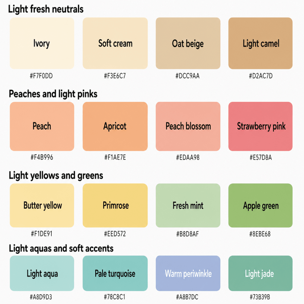
A Starter Palette
| Colour | Hex | Notes |
|---|---|---|
| Ivory | #F7F0DD | Light warm neutral |
| Soft Cream | #F3E6C7 | Gentle golden off-white |
| Oat Beige | #DCC9AA | Soft practical neutral |
| Light Camel | #D2AC7D | Warm without heaviness |
| Warm Stone | #C7B8A7 | Balanced light neutral |
| Soft Warm Grey | #BBB5AE | Light neutral grey |
| Peach | #F4B996 | Signature warm light |
| Apricot | #F1AE7E | Soft golden peach |
| Peach Blossom | #EDAA98 | Warm floral pink |
| Soft Coral | #E98779 | Fresh medium-light coral |
| Melon | #EFA889 | Gentle orange-pink |
| Coral Blush | #E9A091 | Soft everyday coral |
| Strawberry Pink | #E57D8A | Fresh warm pink |
| Light Watermelon | #E77882 | Clear but not intense |
| Shell Pink | #EDB4AA | Light peach-pink |
| Warm Rose | #D98B94 | Balanced warm pink |
| Strawberry Red | #D95D65 | Light warm red |
| Geranium Red | #D9585F | Clear floral red |
| Butter Yellow | #F1DE91 | Soft warm yellow |
| Primrose | #EED572 | Fresh gentle yellow |
| Pale Daffodil | #E9CF58 | Light colourful yellow |
| Fresh Mint | #B8D8AF | Warm fresh green |
| Apple Green | #8EBE68 | Lively light green |
| Pistachio | #B6C98B | Soft yellow-green |
| Light Jade | #73B39B | Polished light green |
| Light Aqua | #A8D9D3 | Signature blue-green |
| Pale Turquoise | #78C8C1 | Fresh but gentle |
| Warm Periwinkle | #A8B7DC | Light blue-violet |
Part 3: The “Handle With a Little Extra Care” List
This is not a list of colours you must remove from your wardrobe while a butter-yellow cardigan looks on with concern.
These are simply shades that sit further away from your natural combination of lightness, gentle warmth, and fresh softness.
The Darkest Colours
- Jet black
- Blue-black
- Espresso
- Midnight navy
- Deep burgundy
- Aubergine
- Black forest
- Dark chocolate
- Oxblood
- Charcoal
Darkness is often your clearest challenge.
These colours may overpower your light colouring, create shadows, or make your features appear less lively.
Choose:
- Warm soft grey instead of charcoal
- Light warm navy instead of midnight
- Soft cocoa instead of espresso
- Strawberry red instead of burgundy
- Light jade instead of forest green
- Warm periwinkle instead of aubergine
Black is not required to be removed from your home.
It may simply be happier further from your face, where it can reflect quietly on its behaviour.
The Coolest Colours
- Steel blue
- Cool navy
- Blue-violet
- Magenta
- Icy pink
- Cool raspberry
- Silver-grey
- Sharp lavender
- Blue-red
- Pure white
Your Summer influence gives you some flexibility, but strongly cool shades may still create a disconnected effect.
Choose:
- Warm sky blue instead of steel
- Strawberry pink instead of magenta
- Peach lavender instead of cool violet
- Strawberry red instead of blue-red
- Ivory instead of optic white
- Warm pearl grey instead of icy silver
The Most Muted, Dusty Colours
- Grey mauve
- Dusty blue-grey
- Murky sage
- Mushroom grey
- Weathered rose
- Browned lavender
- Faded khaki
- Smoky taupe
You can wear some softness, but too much grey may remove the freshness your Spring colouring needs.
Choose:
- Warm rose instead of dusty mauve
- Soft cornflower instead of blue-grey
- Fresh mint instead of grey sage
- Oat beige instead of mushroom
- Peach blossom instead of weathered pink
Your colours may be gentle.
They should not appear to have been emotionally buffering since 2007.
The Brightest, Most Saturated Colours
- Neon pink
- Electric blue
- Acid green
- Highlighter yellow
- Fluorescent orange
- Vivid magenta
- Intense royal purple
- Brilliant red
Highly saturated colour may overpower your delicacy.
Choose:
- Strawberry pink instead of neon
- Light turquoise instead of electric blue
- Apple green instead of acid green
- Primrose instead of highlighter yellow
- Soft coral instead of fluorescent orange
Your palette enjoys enthusiasm.
It simply prefers it at a conversational volume.
Heavy Autumn Colours
- Burnt orange
- Rust
- Deep mustard
- Mahogany
- Dark olive
- Tobacco
- Brown terracotta
- Warm chocolate
- Ochre
- Dense moss
These may be warm but too deep, muted, or earthy.
Choose:
- Apricot instead of burnt orange
- Pale daffodil instead of mustard
- Light camel instead of mahogany
- Pistachio instead of olive
- Soft cocoa instead of chocolate
- Soft terracotta instead of rust
The Iciest Pastels
- Frost pink
- Blue-white
- Icy lavender
- Silver mint
- Pale steel blue
- Near-white lilac
- Arctic aqua
A colour may be light enough but still too cool.
Choose:
- Shell pink instead of frost pink
- Ivory instead of blue-white
- Warm periwinkle instead of icy lavender
- Fresh mint instead of silver mint
- Light aqua instead of icy blue
Stark Contrast
Combinations such as:
- Black and white
- Black and hot pink
- Midnight navy and optic white
- Dark burgundy and pale pink
- Black and electric blue
may create more contrast than your colouring naturally supports.
Choose softer pairings:
- Warm navy and ivory
- Soft cocoa and peach
- Light camel and aqua
- Warm grey and strawberry pink
- Soft teal and cream
How to Make a Less-Ideal Colour Work
You have several options:
- Move it away from your face
- Use it in a smaller proportion
- Pair it with ivory, peach, aqua, or light camel
- Choose a lighter or warmer version
- Add gold or champagne jewellery near your face
- Use warm blush or lipstick to restore colour
- Place a light neckline between you and a dark garment
- Keep the overall outfit low-to-medium in contrast
- Use dark colours in shoes, trousers, belts, or bags
The goal is not wardrobe obedience.
It is knowing how to stop one navy blazer from turning the entire afternoon into November.
Part 4: Pattern Play — Best Prints & Patterns (and Why)
Light Spring patterns work best when they reflect the same balance found in your solid colours:
- Light overall value
- Warm or neutral-warm temperature
- Low-to-medium contrast
- Fresh visible colour
- Open, airy spacing
- Gentle but defined motifs
What Works for You
Light, Low-to-Medium-Contrast Patterns
Think:
- Ivory and peach
- Aqua and light camel
- Butter yellow and mint
- Warm periwinkle and cream
- Strawberry pink and oat beige
- Light jade and soft coral
These combinations create interest without becoming harsh.
Tonal Patterns
Try:
- Peach, apricot, and coral
- Aqua, mint, and turquoise
- Butter yellow, primrose, and cream
- Strawberry, shell pink, and warm rose
- Oat beige, camel, and ivory
Tonal patterns can look especially harmonious because they preserve your lightness while adding depth.
Fresh Florals
Excellent florals include:
- Peach blossoms
- Light coral petals
- Butter-yellow centres
- Fresh green leaves
- Aqua backgrounds
- Strawberry-pink accents
- Ivory or cream bases
- Small-to-medium motifs
Be cautious with florals dominated by:
- Black backgrounds
- Burgundy
- Cool mauve
- Dark forest green
- Dusty grey leaves
- High-contrast white and navy
- Very pale washed-out designs
Watercolour Prints — With Warmth
Your proximity to Summer means watercolour patterns can work beautifully.
Look for:
- Visible peach, aqua, coral, mint, or periwinkle
- Soft transitions
- Enough pigment to avoid fading
- Warm or neutral backgrounds
- Light overall value
A print can be blended without becoming grey.
The watercolour may soften the edges. It should not dissolve the entire garment into a polite sigh.
Small & Playful Geometrics
Try:
- Soft stripes
- Gingham
- Small checks
- Rounded dots
- Light abstract shapes
- Airy plaid
- Gentle colour blocking
- Organic geometrics
Warm navy can work as an outline or accent, but avoid heavy black borders.
Botanical & Nature Prints
Look for:
- New leaves
- Spring flowers
- Light birds
- Garden motifs
- Soft tropical details
- Citrus
- Strawberries
- Delicate greenery
Keep the overall palette light and fresh.
Animal Prints
Your best animal prints include:
- Light golden leopard
- Oat-and-cognac markings
- Soft peach-brown patterns
- Light tortoiseshell
- Warm grey-and-beige snake print
- Mint or coral abstract animal print
Avoid prints dominated by jet black, espresso, or strong orange.
Your animal print should look as though the animal has recently had a pleasant wash and excellent natural lighting.
Patterns Worth a Second Look
- Stark black-and-white prints
- Large dark florals
- Heavy jewel-tone patterns
- Muddy vintage motifs
- Burgundy-and-navy combinations
- Neon multicoloured prints
- Very dense small patterns
- Dark animal prints
- Grey-on-grey designs
- Prints with no light space
Pattern Scale
Colour analysis does not determine pattern scale by itself; your facial features, proportions, height, personal style, and garment shape also matter.
However, your light colouring often works well with:
- Small-to-medium florals
- Delicate geometrics
- Open spacing
- Fine stripes
- Airy botanical prints
- Rounded motifs
- Moderate visual movement
- Light backgrounds
Larger prints can still work when the colours remain light and the design contains enough open space.
The pattern may have personality.
It simply should not arrive with a fog machine.
Part 5: Metal Detector — Best Metals & Jewellery (and Why)
Your undertone is neutral-warm, and your lightness favours metals that feel delicate, luminous, and softly warm.
Best Metals
- Champagne gold
- Light yellow gold
- Rose gold
- Pale copper
- Soft silver
- Mixed light metals
- Light brass
- Warm pearl finishes
Champagne gold is one of your easiest metals because it combines warmth with lightness.
Light yellow gold brings more warmth, while rose gold reflects your peach and pink tones beautifully.
Because of your proximity to Light Summer, soft silver can also work — especially when it is brushed, delicate, or combined with warmer stones.
Finish Matters
Your palette suits:
- Soft polish
- Satin metal
- Delicate shine
- Fine chains
- Light hammered texture
- Pearl finishes
- Gentle sparkle
- Refined brushing
Very dark, heavily oxidised, or chunky metal may feel too weighty.
Extremely mirror-like metal can also appear sharper than necessary in large pieces.
Your jewellery should catch the light.
It does not need to operate as a secondary sun.
Yellow Gold
Your best yellow gold is:
- Light
- Clear
- Champagne-toned
- Softly polished
- Not overly orange
- Not heavily antiqued
Dark antique gold may become too heavy, while brassy gold may be too saturated.
Rose Gold
Rose gold is often excellent when it is:
- Peachy
- Light
- Warm
- Softly polished
- Delicate
- Free from heavy copper darkness
Silver
Silver can work because of your neutral-warm colouring and Summer influence.
Choose:
- Soft silver
- Brushed silver
- Light white gold
- Satin platinum
- Silver mixed with gold
- Silver paired with peach, pearl, or aqua stones
Be cautious with:
- Dark gunmetal
- Blackened silver
- Icy mirror chrome
- Heavy industrial pieces
Mixed Metals
Mixed metals can work beautifully when the overall effect remains light.
Try:
- Champagne gold with silver
- Rose gold with white gold
- Pale copper with gold
- Two-tone watches
- Layered fine chains
- Mixed-metal jewellery containing pearls
Gemstones
Excellent options include:
- Peach moonstone
- Aquamarine
- Morganite
- Peridot
- Light citrine
- Warm turquoise
- Rose quartz
- Pale coral
- Light jade
- Sunstone
- Opal
- Pale topaz
- Light amethyst
- Champagne sapphire
Your best stones tend to be:
- Light-to-medium in depth
- Clear or softly translucent
- Warm or neutral
- Luminous
- Delicately colourful
Pearls work beautifully in:
- Warm white
- Cream
- Peach
- Pale pink
- Champagne
- Soft grey
- Light lavender
The pearls should look luminous and approachable.
Not as though they are about to explain the seating plan at a very formal dinner.
Part 6: Face Value — Your Makeup Roadmap
Your most flattering makeup enhances your lightness, gentle warmth, and fresh clarity without becoming dark, muddy, cool, or overly saturated.
The goal is light, warm definition.
You need enough colour to look alive, but not so much that the makeup begins conducting separate interviews.
Foundation & Concealer
Look for undertones described as:
- Warm-neutral
- Peach
- Golden-neutral
- Neutral-warm
- Light golden
- Peach-neutral
- Neutral olive, where appropriate
Some Light Springs may suit neutral formulas because of their proximity to Summer. Others need more visible peach or warmth.
Always test the actual product.
A foundation called “Light Warm Beige” may be ideal. It may also turn orange after lunch, because cosmetic naming continues to be a largely decorative activity.
Avoid formulas that become:
- Strongly pink
- Blue-cool
- Grey
- Ashy
- Very yellow
- Orange
Natural, satin, and softly luminous finishes often work beautifully.
Very flat matte formulas may dull your freshness, while heavy dewy finishes can overwhelm delicate features.
Blush
Best blush colours include:
- Peach
- Apricot
- Coral Blush
- Warm Pink
- Strawberry Pink
- Salmon
- Shell Pink
- Light Golden Rose
Peach and soft coral are among your easiest everyday shades.
Strawberry pink adds more visible colour, while shell pink creates a delicate effect.
Be cautious with:
- Burgundy
- Plum
- Cool mauve
- Blue-pink
- Dark terracotta
- Brown rose
- Neon fuchsia
- Greyed blush
Your blush should create a fresh flush.
Not two small historical murals.
Bronzer & Contour
Choose bronzer carefully because very dark or orange formulas may overwhelm you.
Try:
- Light Golden Beige
- Soft Honey
- Light Peach-Bronze
- Warm Sand
- Light Caramel
- Neutral-Warm Tan
Avoid bronzers that are:
- Dark
- Orange
- Red-brown
- Muddy
- Grey
- Highly metallic
For contour, try:
- Light warm taupe
- Soft neutral brown
- Pale mushroom
- Light cocoa
- Warm beige-brown
The goal is gentle dimension.
Not a complete architectural redesign before school drop-off.
Lips
Your best lip colours are light-to-medium, warm, and fresh.
Try:
- Peach Pink
- Soft Coral
- Strawberry
- Light Watermelon
- Warm Rose
- Salmon
- Apricot Rose
- Geranium Pink
- Coral Red
- Warm Pink Gloss
For a natural lip:
- Peach nude
- Pink-peach
- Rose beige
- Coral balm
- Apricot gloss
- Shell pink
- Warm neutral rose
Your nude lipstick should contain visible peach, pink, or coral.
Be cautious with:
- Concealer beige
- Grey mauve
- Brown nude
- Burgundy
- Deep plum
- Blue-red
- Neon pink
For a stronger lip:
- Strawberry red
- Geranium
- Light coral red
- Warm watermelon
- Poppy pink-red
Eyes — Shadow
Excellent eyeshadow colours include:
- Champagne
- Peach
- Apricot
- Light Camel
- Warm Taupe
- Soft Gold
- Light Bronze
- Pistachio
- Mint
- Warm Aqua
- Soft Teal
- Warm Periwinkle
- Rose Gold
- Light Cocoa
For an everyday eye, combine champagne, peach, and warm taupe.
For colour, try mint, aqua, periwinkle, light teal, or pistachio.
Avoid:
- Black
- Charcoal
- Deep navy
- Dark plum
- Cool grey
- Heavy copper
- Blue-violet
- Muddy brown
Eyes — Liner
Best eyeliner colours include:
- Soft Brown
- Warm Taupe-Brown
- Bronze
- Light Navy
- Soft Teal
- Olive
- Warm Grey
- Plum-Brown
- Deep Aqua
Black may be too stark for everyday wear, especially when applied heavily.
Brown, soft navy, and teal provide enough definition without overpowering.
A thick black line may look dramatic.
It may also appear to have been drawn by a very determined calligrapher with no respect for your value range.
Mascara
Try:
- Brown-black
- Soft brown
- Warm black
- Navy-brown
- Deep taupe-brown
- Soft black used lightly
Black may work when your natural lashes and brows provide enough contrast, but brown-black is often more seamless.
Brows
Choose brow products that are:
- Light warm taupe
- Neutral blonde
- Golden blonde
- Soft caramel
- Light ash-warm brown
- Soft auburn, where appropriate
- Light neutral brown
Avoid:
- Charcoal
- Blue-black
- Dark espresso
- Strong red
- Ash grey
- Very dark brown
Brows should gently frame the face rather than submitting a separate application for visual dominance.
Highlighter
Best highlighters include:
- Champagne
- Peach Pearl
- Soft Gold
- Warm Ivory
- Pale Rose Gold
- Light Opal
- Pearl
- Soft Silver-Champagne
Avoid:
- Icy white
- Blue pearl
- Dark bronze
- Yellow gold
- Lavender frost
- Heavy silver
- Copper
Your highlighter should look like natural light catching the skin.
Not a strip of aluminium foil applied during a moment of optimism.
Part 7: Through the Looking Glass — Eyewear
Eyewear sits directly on the face, so value and visual weight matter enormously.
Your best frames are light, warm, translucent, or softly defined.
Best Frame Colours
- Light golden tortoiseshell
- Honey
- Champagne
- Peach
- Soft coral
- Warm blush
- Light camel
- Pale olive
- Light teal
- Aqua
- Warm periwinkle
- Soft warm grey
- Rose gold
- Light gold
Tortoiseshell
Light Spring often wears tortoiseshell beautifully when it is:
- Light
- Golden
- Honeyed
- Amber-toned
- Medium-low in contrast
- Translucent
- Free from large black patches
Dark tortoiseshell may create too much weight.
Your ideal tortoiseshell should look sunlit and delicate.
Not as though it has been passed down with a mahogany writing desk and several unresolved inheritance questions.
Transparent Frames
Transparent frames can be especially harmonious.
Try:
- Peach crystal
- Warm clear
- Light aqua
- Pale coral
- Champagne
- Soft rose
- Light olive
- Honey
- Warm grey
- Periwinkle tint
Completely clear frames may also work, particularly when the shape provides enough definition.
Frame Contrast
Low-to-medium contrast is generally easiest.
Excellent options include:
- Light tortoiseshell
- Rose gold wire
- Champagne metal
- Translucent peach
- Light teal acetate
- Warm grey
- Fine gold frames
Dark frames can work when:
- They are slim
- The colour is softened
- The shape is delicate
- Your natural features support the contrast
- They are balanced by light clothing or makeup
Sunglasses
Try:
- Light tortoiseshell
- Honey
- Champagne gold
- Warm grey
- Olive
- Peach
- Soft rose
- Light brown gradient lenses
- Warm green lenses
- Fine gold frames
Frames Worth a Second Look
- Thick black
- Blue-black
- Dark burgundy
- Heavy espresso
- Gunmetal
- Steel grey
- Icy silver
- Stark optic white
- Neon acetate
- Very dark tortoiseshell
Your glasses should frame your face.
They should not arrive first and introduce you afterwards.
Part 8: Crowning Glory — Hair Colour
Your most harmonious hair colours are light-to-medium, warm or neutral-warm, and softly dimensional.
Because hair surrounds the face, extreme darkness, cool ashiness, or heavy saturation may alter the balance quickly.
Best Blonde Shades
- Light Golden Blonde
- Champagne Blonde
- Honey Blonde
- Warm Beige Blonde
- Strawberry Blonde
- Wheat Blonde
- Light Caramel Blonde
- Soft Copper Blonde
Blonde is often especially harmonious because it naturally supports your lightness.
Your best blonde remains luminous rather than icy, grey, or strongly yellow.
Avoid:
- Silver blonde
- Icy platinum
- Dark ash blonde
- Grey beige
- White blonde with dark roots
- Strongly yellow gold
Best Brunette Shades
- Light Golden Brown
- Caramel Brown
- Warm Light Brown
- Soft Hazelnut
- Light Chestnut
- Neutral Beige Brown
- Soft Milk Chocolate
- Golden Mushroom Brown
Brunette shades should remain light enough to preserve your overall value.
Very dark brown, espresso, and black may create excessive weight.
Red Hair
Light Spring can wear lighter red shades beautifully.
Excellent options include:
- Strawberry Blonde
- Light Ginger
- Peach Copper
- Golden Copper
- Light Auburn
- Apricot Red
- Rose Copper
- Soft Cinnamon
Avoid:
- Deep mahogany
- Burgundy
- Violet-red
- Dark auburn
- Brown rust
- Black cherry
The best red should look luminous and slightly playful rather than dark or dramatic.
Fashion Colours
Excellent creative hair colours include:
- Peach
- Soft Coral
- Rose Gold
- Light Aqua
- Warm Mint
- Strawberry Pink
- Warm Periwinkle
- Pale Apricot
- Soft Lavender-Pink
Choose colours that are light and fresh rather than greyed, neon, or dark.
A peach wash may look delightful.
Midnight violet may look as though it has arrived to collect a debt.
Highlights & Balayage
Look for:
- Champagne highlights
- Honey ribbons
- Light caramel pieces
- Strawberry-blonde accents
- Warm beige balayage
- Peach-gold dimension
- Soft face-framing brightness
- Low-to-medium contrast
Avoid:
- Blue-grey highlights
- Silver ribbons
- Stark platinum pieces
- Very dark roots
- Heavy black lowlights
- Copper-orange stripes
- High-contrast colour blocking
Highlights should create sunlight, not a barcode.
Hair Depth & Contrast
Before darkening significantly, consider:
- Whether your eyes lose brightness
- Whether shadows appear around the face
- Whether the hair demands heavier makeup
- Whether your skin appears paler
- Whether a lighter, dimensional shade would work better
Before going extremely pale, consider whether enough warmth and definition remain.
A Note on Grey Hair
Natural grey can introduce more coolness into your overall colouring.
Excellent approaches include:
- Champagne grey
- Warm silver
- Soft pearl
- Creamy white
- Light beige-grey
- Silver blended with honey
- Warm salt-and-pepper
- Pale pewter
You do not need to cover grey.
You may simply want to keep the overall effect luminous and prevent the hair from becoming either strongly yellow or intensely blue-grey.
Grey hair can look beautiful with peach, aqua, ivory, strawberry pink, light camel, and champagne gold.
Part 9: Fingertips — Nail Polish
Nail polish sits away from the face, so you have more freedom, but your light, fresh palette still offers an excellent shortcut.
Best Everyday Colours
- Peach
- Soft Coral
- Strawberry Pink
- Apricot
- Shell Pink
- Warm Rose
- Light Aqua
- Butter Yellow
- Light Jade
Light Colours
- Ivory
- Peach Cream
- Warm White
- Fresh Mint
- Pale Aqua
- Soft Periwinkle
- Light Sage
- Champagne
Medium Colours
- Geranium Pink
- Strawberry Red
- Pale Turquoise
- Apple Green
- Primrose
- Warm Orchid
- Light Papaya
- Coral Red
Deeper Colours
- Soft Teal
- Warm Navy
- Medium Coral
- Light Cognac
- Soft Cocoa
- Medium Warm Rose
- Warm Plum
- Medium Olive
Deep polish may work more easily on the nails than in clothing because it occupies a smaller area.
Statement Colours
- Bright coral
- Turquoise
- Apple green
- Golden shimmer
- Warm multicoloured art
- Peach chrome
- Strawberry glitter
- Butter-yellow French tips
Nudes
Your best nude nail colours include:
- Peach Beige
- Pink-Beige
- Light Caramel
- Warm Cream
- Shell Pink
- Apricot Nude
- Soft Oat
- Pale Rosewood
Avoid:
- Grey taupe
- Dark brown nude
- Mauve
- Blue-pink
- Stark white
- Espresso
- Charcoal
Metallic Nails
Try:
- Champagne
- Rose Gold
- Light Gold
- Peach Shimmer
- Soft Copper
- Pearl
- Warm Silver
- Pale Bronze
Dark gunmetal and heavy black chrome may feel too weighty, although they remain available as deliberate contrast.
French Manicure
For a French manicure:
- Choose an ivory or warm-white tip
- Use a peach, pink-beige, or clear base
- Try coral, aqua, mint, or champagne tips
- Keep the contrast light and fresh
Sometimes the goal is understated polish.
Sometimes the goal is ten tiny fruit sorbets.
Both have merit.
Part 10: Texture & Fabric Talk
Colour does most of the heavy lifting in seasonal analysis, but texture changes how light, deep, clear, or muted a colour appears.
Light Spring tends to suit fabrics that feel airy, soft, luminous, and gently polished.
Fabrics That Flatter
- Lightweight cotton
- Linen
- Silk
- Chiffon
- Fine cashmere
- Light wool
- Soft denim
- Satin with gentle shine
- Fine knits
- Crepe
- Voile
- Light suede
- Soft leather
- Organza
- Jersey
These fabrics preserve movement and lightness.
A peach silk blouse, aqua linen dress, or ivory cashmere cardigan can all work beautifully.
Shine
You can handle:
- Gentle satin
- Silk
- Champagne shimmer
- Delicate sequins
- Pearl finishes
- Soft metallic thread
- Light gloss
- Polished leather in pale colours
Be more cautious with:
- Black patent leather
- Mirror silver
- Dark sequins
- Heavy bronze lamé
- High-gloss neon
- Large areas of intense metallic shine
Your palette appreciates sparkle.
It simply prefers sparkle that has remembered to use its indoor voice.
Matte Fabrics
Excellent matte choices include:
- Linen
- Cotton
- Fine wool
- Cashmere
- Crepe
- Soft jersey
- Light suede
- Washed silk
Be cautious when matte fabrics are also dark, dusty, or heavily distressed.
Textured Fabrics
You can wear:
- Fine knits
- Light bouclé
- Soft corduroy
- Basket-weave cotton
- Light tweed
- Brushed cashmere
- Delicate embroidery
- Soft linen texture
Be cautious with textures that are:
- Extremely chunky
- Very rough
- Dark and dense
- Heavily distressed
- Muddy in colour
- Bulky
- Rustic and brown
A light apricot cardigan may look lovely.
A dark rust cable-knit coat may appear to be escorting you into a completely different guide.
Lightweight & Sheer Fabrics
Light Spring is especially compatible with:
- Chiffon
- Organza
- Voile
- Fine silk
- Lace
- Mesh
- Lightweight linen
- Georgette
Choose warm or neutral-light colours to keep the effect connected.
Structure
You can wear both soft and tailored shapes, but extremely rigid construction may feel heavy.
Excellent options include:
- Relaxed tailoring
- Softly defined shoulders
- Rounded collars
- Natural drape
- Light layering
- Open necklines
- Delicate details
- Refined but easy silhouettes
- Airy movement
Think polished without looking stern.
Not dressed to deliver disappointing news about everyone’s expense claims.
Part 11: Putting It All Together — Styling Tips
Knowing individual colours is useful. Knowing how to combine them turns your palette into a wardrobe rather than a beautiful assortment of pastel objects that refuse to coordinate.
Build Around Light Neutrals
Choose two or three primary neutrals, such as:
- Ivory
- Oat Beige
- Light Camel
- Warm Stone
- Soft Warm Grey
- Light Warm Navy
These make your stronger colours easier to combine.
For example:
- Ivory + peach + aqua
- Light camel + strawberry pink + cream
- Warm grey + periwinkle + coral
- Oat beige + mint + butter yellow
- Warm navy + shell pink + ivory
Keep the Overall Outfit Light
You do not need every item to be pale, but the overall visual impression should remain lifted.
For example:
- Light trousers + medium-coloured top
- Ivory dress + coral accessories
- Warm navy trousers + peach blouse
- Camel coat + aqua scarf
- Light denim + butter-yellow knit
Use Low-to-Medium Contrast
Your easiest combinations include:
- Ivory + Aqua
- Oat Beige + Strawberry Pink
- Light Camel + Peach
- Warm Grey + Periwinkle
- Cream + Apple Green
- Warm Navy + Shell Pink
Stark black and white may look harsh. Ivory and warm navy create a similar structure with less drama.
Use Dark Colours in Smaller Amounts
When wearing a dark shade:
- Use it in trousers, shoes, bags, or belts
- Pair it with a light neckline
- Add warm jewellery
- Keep the fabric lightweight
- Repeat a lighter colour near the face
- Choose softened dark shades rather than jet black
Let Peach & Aqua Do the Work
Peach and blue-green shades are among your most useful colour families.
Use:
- Peach for warmth
- Coral for energy
- Aqua for freshness
- Turquoise for definition
- Mint for softness
- Strawberry pink for visible colour
These work beautifully in tops, dresses, scarves, makeup, eyewear, and accessories.
Borrow from Summer Carefully
Because Light Spring sits close to Light Summer, you can borrow:
- Soft periwinkle
- Light denim
- Pale lavender-pink
- Powder blue
- Soft grey
- Delicate watercolour prints
- Soft silver
However, borrow one or two Summer qualities at a time.
For example:
- Periwinkle paired with ivory
- Soft grey warmed with peach
- Powder blue beside camel
- Silver jewellery with coral
- Light denim with butter yellow
When coolness, grey, softness, and low contrast all appear together, the outfit may become too misty.
Summer has lent you a cardigan.
It has not asked you to move into a coastal fog bank.
Replace Dark Wardrobe Staples
Instead of:
- Black, try warm navy or soft cocoa
- Charcoal, try warm grey
- Espresso, try light cognac
- Burgundy, try strawberry red
- Forest green, try light jade
- Dark denim, try a medium wash
- Aubergine, try warm periwinkle
Replace Cool Wardrobe Staples
Instead of:
- Optic white, try ivory
- Steel grey, try warm pearl grey
- Cool navy, try softened warm navy
- Mauve, try warm rose
- Icy blue, try aqua
- Magenta, try strawberry pink
- Blue-red, try coral red
- Silver, try champagne or mixed metal
Create a Cohesive Wardrobe
A practical Light Spring wardrobe might centre on:
Neutrals
- Ivory
- Oat Beige
- Light Camel
- Soft Warm Grey
Core colours
- Peach
- Light Aqua
- Strawberry Pink
- Fresh Mint
Golden accents
- Butter Yellow
- Apricot
- Light Jade
Because these colours share a light, warm, fresh foundation, they combine easily.
Your wardrobe begins behaving like a well-organised picnic: everything is cheerful, nothing is too heavy, and black has been asked to bring napkins rather than dominate the conversation.
Part 12: Common Pitfalls (a.k.a. “Oh, That’s Why”)
“Light means I should only wear pastels.”
No.
Your palette includes:
- Strawberry red
- Soft coral
- Apple green
- Pale turquoise
- Geranium pink
- Warm teal
- Primrose
- Light jade
The colours should remain light relative to other seasonal palettes, but they still need visible pigment.
“Spring means I should wear very bright colours.”
Not necessarily.
You need freshness, but high saturation may overwhelm your lighter colouring.
Choose cheerful colour rather than fluorescent colour.
“Warm means every golden or earthy colour should work.”
A warm shade may still be:
- Too dark
- Too muddy
- Too orange
- Too brown
- Too saturated
- Too heavy
Apricot may work. Burnt umber may arrive with an entirely different agenda.
Choosing Colours That Are Too Dark
This is one of the easiest mistakes to make.
Black, espresso, midnight navy, burgundy, and deep forest may overpower your features.
Try lighter, softened alternatives.
Choosing Colours That Are Too Cool
Your Summer influence does not make you fully cool.
Steel blue, icy lavender, cool magenta, and silver-grey may create a disconnected effect.
Warm or neutral-light versions are generally easier.
Choosing Colours That Are Too Dusty
Because you are delicate, it can be tempting to choose extremely muted shades.
However, too much grey may make you look tired.
Choose softness with freshness.
Choosing Colours That Are Too Pale
A colour can also become so pale that it contains almost no visible pigment.
Near-white pink, mint, or yellow may wash you out rather than support you.
Choose light shades that still look recognisably coloured.
Choosing Colours That Are Too Bright
Neon coral, acid green, vivid cobalt, and hot pink may appear before your face does.
Move towards lighter or softer versions.
Defaulting to Black
Black is widely available and apparently determined to enter every wardrobe.
You do not need to ban it, but consider:
- Wearing it below the waist
- Pairing it with ivory
- Adding peach or coral near your face
- Choosing a lighter fabric
- Replacing it with warm navy, cocoa, or light cognac
Buying Cool “Basics”
Optic white, charcoal, steel grey, cool navy, and black are often treated as universal.
They are not.
Ivory, oat, warm grey, light camel, and softened navy are more reliable for you.
Making Every Outfit Extremely Delicate
Your colouring is light, but your wardrobe does not need to become an endless parade of tiny flowers, chiffon sleeves, and garments named after baked goods.
You can wear:
- Denim
- Tailoring
- Leather
- Geometric patterns
- Stronger coral
- Modern shapes
- Clean colour blocking
Keep the colour light enough, and your personal style can do whatever it likes.
Being Afraid of Medium Colour
A medium coral or strawberry red may look bold on the hanger but beautifully balanced on you.
You still need enough colour to bring your features into focus.
Forgetting Personal Style
Your palette tells you which colours harmonise with your natural colouring. It does not tell you whether you prefer minimalist tailoring, romantic dresses, colourful vintage, sporty basics, or clothing that makes you look like the cheerful owner of a seaside bakery where at least one croissant may be enchanted.
Use the palette to support your style, not replace it.
Quick-Reference Cheat Sheet
| Category | Yes, Please | Worth a Second Look (Not Banned!) |
|---|---|---|
| Neutrals | Ivory, soft cream, oat beige, light camel, warm stone, soft warm grey | Optic white, charcoal, black, espresso, cool grey |
| Pinks | Strawberry pink, peach pink, shell pink, light watermelon, warm rose | Magenta, burgundy, deep raspberry, icy pink, mauve |
| Reds | Strawberry red, coral red, geranium, light tomato red | Oxblood, burgundy, brick, deep blue-red, maroon |
| Oranges | Peach, apricot, melon, light papaya, soft coral | Burnt orange, dark rust, brown terracotta, neon orange |
| Yellows | Butter yellow, primrose, pale daffodil, soft lemon | Mustard, ochre, fluorescent yellow, dark marigold |
| Greens | Fresh mint, apple green, pistachio, light jade, celery | Forest, deep olive, pine, khaki, grey sage |
| Blues | Light aqua, warm sky blue, pale turquoise, soft cornflower | Midnight navy, cobalt, steel blue, sapphire, blue-black |
| Purples | Warm periwinkle, light orchid, pink-lavender, warm wisteria | Aubergine, dark plum, blue-violet, grey mauve |
| Light colours | Peach cream, ivory, pale aqua, butter yellow, fresh mint | Near-white icy pastels, chalky or blue-based lights |
| Deep colours | Warm teal, softened navy, medium coral, soft cocoa | Jet black, espresso, midnight navy, blackened jewels |
| Brights | Strawberry, coral, apple green, pale turquoise, geranium | Neon, fluorescent, highly saturated Winter brights |
| Patterns | Light florals, watercolours, airy botanicals, gentle geometrics | Stark black-and-white, dark florals, dense jewel-tone prints |
| Metals | Champagne gold, light gold, rose gold, soft silver, mixed light metals | Gunmetal, blackened silver, dark antique gold, heavy chrome |
| Foundation | Warm-neutral, peach, light golden, neutral-warm undertones | Cool pink, grey, strongly orange, heavily yellow formulas |
| Blush | Peach, apricot, coral blush, strawberry pink, shell pink | Burgundy, plum, mauve, neon fuchsia, dark terracotta |
| Bronzer | Light golden beige, soft honey, warm sand, light caramel | Dark, orange, red-brown, muddy or grey bronzers |
| Lipstick | Peach pink, soft coral, strawberry, watermelon, warm rose | Burgundy, brown nude, grey mauve, blue-red, neon pink |
| Eyeshadow | Champagne, peach, warm taupe, mint, aqua, periwinkle | Black, charcoal, deep plum, cool grey, heavy copper |
| Eyeliner | Soft brown, bronze, light navy, teal, olive, warm grey | Thick black, charcoal, blue-black, dark purple |
| Hair colour | Champagne blonde, honey, strawberry blonde, light caramel, warm light brown | Icy platinum, black, espresso, blue-black, dark auburn |
| Eyewear | Light tortoiseshell, peach, honey, aqua, champagne, rose gold | Thick black, gunmetal, dark burgundy, heavy tortoiseshell |
| Nail polish | Peach, coral, strawberry, aqua, mint, butter yellow | Black, burgundy, deep plum, charcoal, cool mauve |
| Fabrics | Linen, silk, chiffon, cotton, fine knits, light suede, satin | Heavy black patent, bulky dark knits, dense rustic textures |
A Final Word
Light Spring is a palette of delicacy with genuine colour.
Your shades do not need to become icy, dusty, or nearly colourless to feel light. Their strength comes from freshness: peach that warms the face, aqua that brings clarity without coldness, greens that look newly grown, and soft golden neutrals that support without weighing you down.
You sit in a particularly lovely place: firmly within Spring, but close enough to Summer to borrow a little softness, airiness, and temperature flexibility.
That gives you access to ivory, oat beige, peach, apricot, strawberry pink, butter yellow, mint, light jade, aqua, warm periwinkle, and softly warmed blues — all united by that same lifted, luminous quality.
Your best wardrobe will not be entirely pastel, entirely warm, or entirely delicate. It will move between gentle and colourful, airy and polished, while keeping the overall effect light enough that you remain at the centre.
So wear the peach. Choose the oat beige instead of the charcoal. Investigate the champagne-gold jewellery. Approach jet black with the same friendly caution one might use when a relative says, “I’ve brought a slideshow from our holiday.”
And remember: your palette is not “Spring, but faded.”
It is Spring, touched by morning light.
