Cool Summer: Your Complete Colour Guide
- Cool Summer: Your Complete Colour Guide
- Part 1: What Being a Cool Summer Actually Means
- Part 2: Your Power Palette — Best Colours (and Why)
- Part 3: The “Handle With a Little Extra Care” List
- Part 4: Pattern Play — Best Prints & Patterns (and Why)
- Part 5: Metal Detector — Best Metals & Jewellery (and Why)
- Part 6: Face Value — Your Makeup Roadmap
- Part 7: Through the Looking Glass — Eyewear
- Part 8: Crowning Glory — Hair Colour
- Part 9: Fingertips — Nail Polish
- Part 10: Texture & Fabric Talk
- Part 11: Putting It All Together — Styling Tips
- Part 12: Common Pitfalls (a.k.a. “Oh, That’s Why”)
- “I’m a Summer, so I should only wear pale, dusty colours.”
- “I’m close to Winter, so I can wear every Winter colour.”
- Defaulting to Black
- Buying Warm “Basics”
- Choosing Colours That Are Too Dusty
- Choosing Colours That Are Too Bright
- Avoiding All Warm Colours Completely
- Assuming All Cool Colours Work
- Forgetting Personal Style
- Quick-Reference Cheat Sheet
- A Final Word
So, the results are in: you’re a Cool Summer!
Which means your colouring has all the elegant softness of Summer, but with a little extra bite.
You’re not floating around in a cloud of vague, powdery pastels, quietly hoping nobody introduces a colour with an actual opinion. Your palette has presence. It is cool, composed, and slightly sharpened by its proximity to Winter — rather like Summer went away for the weekend, borrowed Winter’s excellent coat, and decided not to give it back.
Cool Summer sits firmly within the Summer family, meaning your colouring is fundamentally:
- Cool in undertone
- Moderate in depth
- Moderately clear, rather than heavily muted
But because you sit closer to Winter than many other Summer palettes do, you can handle a little more contrast, saturation, and intensity. Your best colours still have Summer’s softness, but they are cleaner, cooler, and more defined. Think raspberry rather than dusty rose. Blueberry rather than faded mauve. Cool navy rather than hazy denim. Polished, not piercing.
The goal is not to turn you into a Winter. Winter colours can become too stark, too dark, or too electrically bright against you. Instead, you borrow just enough of Winter’s clarity to keep your Summer palette looking fresh and intentional.
In other words: cool, refined, softly vivid.
Let’s get into what that actually means for your wardrobe.
Part 1: What Being a Cool Summer Actually Means
Colour analysis looks at three main things about your natural colouring — your skin, hair, and eyes working together:
- Temperature — are your undertones warmer or cooler?
- Value — is your overall colouring lighter or deeper?
- Clarity — is your colouring clearer and more vivid, or softer and more muted?
For you, the strongest and most important quality is coolness.
Your colouring is supported by shades with blue, pink, violet, or cool grey undertones. Warm colours containing a noticeable amount of yellow, orange, peach, rust, or golden brown tend to sit separately from you rather than blending naturally with you.
That does not mean every colour has to look as though it has just been retrieved from an Arctic research station. Your colours are cool, but they still need enough richness and substance to match your moderate intensity.
Your second important quality is your slightly increased clarity.
Summer palettes are often described as muted, misty, or blended. Some of that still applies to you, but you sit closer to Winter, which gives your palette a cleaner and more saturated quality. You can handle colours that are stronger and more defined than heavily greyed Summer shades.
A heavily faded mauve may make you look as though you have been standing beside an old curtain for too long. A clear raspberry, on the other hand, brings your colouring into focus.
Your overall depth tends to sit around the middle of the value scale. You are not limited to pale colours, and you can wear several reasonably deep shades, particularly cool navy, charcoal, plum, and blue-based berry tones. However, the darkest Winter colours — solid jet black, blackened burgundy, midnight purple — may become heavier than your colouring needs.
Here is the easiest way to picture your palette:
Imagine Summer’s watercolour palette, then add one more layer of pigment.
The colours are still blended and elegant. They have not become neon, sharp, or dramatically contrasting. They are simply a little clearer, cooler, and more substantial.
A few other things worth knowing:
- Cool Summer can appear across many skin tones, hair colours, and eye colours. It is not restricted to fair skin, light eyes, or ash-blonde hair.
- Cool does not automatically mean pale. Plenty of rich colours are cool: cranberry, plum, cool teal, navy, raspberry, and blue-red.
- Your palette is not timid. Softness and visibility are not opposites. Your colours can have real impact without becoming loud.
- Your Winter influence is useful, but it is not the whole story. You can borrow some of Winter’s colour strength, but Winter’s starkest extremes may overpower you.
- Temperature matters more than whether a colour is technically “light” or “dark.” A medium warm camel may be less harmonious than a deeper cool navy.
The central rule is simple:
Keep it cool, keep it moderately clear, and stop before the colour becomes harsh.
Part 2: Your Power Palette — Best Colours (and Why)
The unifying theme of your palette is cool colour with controlled intensity.
Your best shades are neither chalky nor fluorescent. They are not buried under layers of grey, but they are not glowing from across the car park either. They look crisp enough to define your colouring and soft enough to remain harmonious.
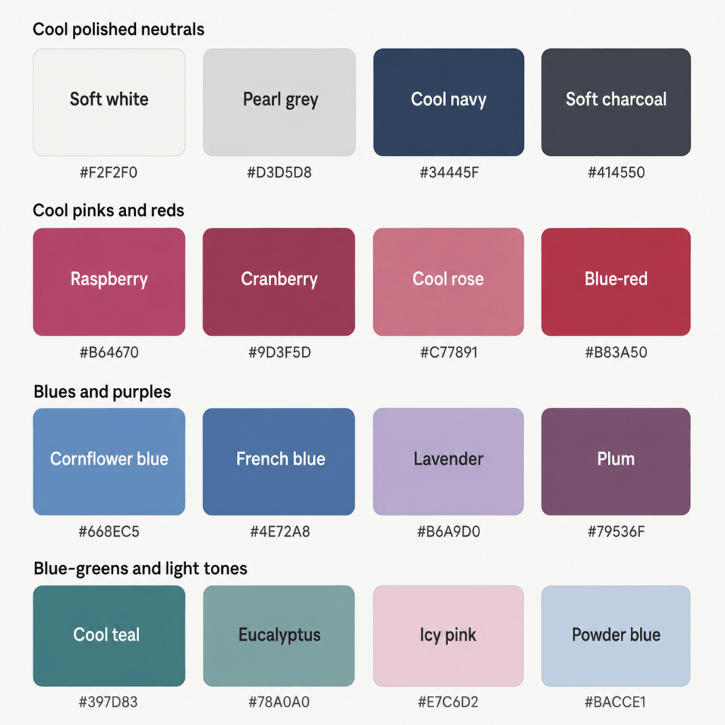
The Cool, Polished Neutrals
- Soft White — cool and clean, without the hardness of brilliant optic white
- Pearl Grey — a light, cool grey with a smooth, elegant finish
- Dove Grey — slightly deeper and softer than pearl grey
- Pewter — a medium-to-deep cool grey with more presence
- Cool Navy — one of your best dark neutrals
- Soft Charcoal — deep enough to provide structure without becoming as severe as black
These neutrals work because they support your coolness without swallowing your moderate colouring.
Cool navy may become one of the hardest-working colours in your wardrobe. It gives you much of the sophistication and practicality of black, but with a slightly softer, more connected effect.
Pearl grey and dove grey are equally useful at the lighter end. Unlike warm beige or camel, they mirror the cooler, ashier qualities running through your colouring.
You may also suit:
- Cool taupe
- Blue-grey
- Slate
- Soft blue-black
- Cool cocoa
- Muted aubergine used as a neutral
Yes, aubergine can be a neutral. No, the Neutral Police will not be attending.
Cool Pinks & Reds
- Raspberry
- Cranberry
- Cool Rose
- Watermelon Pink
- Blue-Red
- Cherry Rose
- Deep Pink
- Soft Fuchsia
Your pinks and reds should have a blue-based or rosy quality rather than a coral, tomato, brick, or orange-red base.
Raspberry is particularly strong for you because it combines coolness, moderate depth, and enough clarity to reflect your Winter influence. It has energy, but it is not as electrically bright as a full Winter magenta.
Cranberry gives you a richer option, while cool rose creates a quieter everyday effect. Blue-red can be excellent for statement clothing or lipstick, provided it is not so dark or intensely saturated that it becomes theatrical.
Your reds should look as though someone added a drop of blue — not as though they accidentally tipped in an entire bottle of orange.
Blues
- Cornflower Blue
- Cool Denim
- Periwinkle
- Slate Blue
- French Blue
- Soft Cobalt
- Blueberry
- Deep Cool Navy
Blues are one of the easiest and broadest parts of your palette.
Because blue is naturally cool, you have access to everything from gentle periwinkle through to richer French blue and softened cobalt. The key is keeping the shade cool and stopping short of the most intense, electric Winter blues.
Cornflower blue is especially flattering because it is clear without being sharp. Slate blue works when you want something calmer. French blue adds a little more strength and looks excellent in dresses, knitwear, scarves, and blouses.
Cool denim is also highly practical. Look for denim that reads blue, blue-grey, or inky rather than faded yellow-blue or heavily whiskered warm grey.
Purples
- Lavender
- Cool Mauve
- Orchid
- Plum
- Blue-Violet
- Soft Aubergine
- Iris
- Blackberry
Purple tends to be an excellent colour family for Cool Summer because it naturally bridges blue and red — both of which already sit comfortably within your palette.
Your lighter purples should remain visibly cool. Lavender and iris work better than sugary lilac containing noticeable pink warmth. At the deeper end, plum, blackberry, and softened aubergine provide richness without requiring you to rely on black or brown.
The most heavily greyed mauves can sometimes become too flat, while extremely vivid violet can become too bright. Your ideal purples sit between those two points: recognisably colourful, but still refined.
Greens & Blue-Greens
- Cool Teal
- Blue-Green
- Sea Green
- Cool Jade
- Pine
- Spruce
- Eucalyptus
- Soft Emerald
Green can be slightly trickier because many greens contain a great deal of yellow. Your strongest greens lean blue.
Cool teal, sea green, spruce, and eucalyptus all work because their blue base connects with your cool undertone. Soft emerald can also be beautiful, particularly when it is slightly moderated rather than intensely jewel-like.
Avoid assuming that all sage greens will work automatically. Some sages are cool and greyed; others are surprisingly yellow or olive. You want the sort of sage that looks as though it has spent its life beside the sea, not sunbathing in Tuscany.
Pastels & Light Colours
- Icy Pink
- Cool Blush
- Lavender Mist
- Powder Blue
- Soft Periwinkle
- Cool Mint
- Pearl
- Pale Blue-Grey
Because of your increased clarity, your best light colours should still contain visible colour. Extremely dusty, beige-softened pastels can make you look faded.
Your version of a pastel is cool, fresh, and slightly crisp. It may be softened with white, but it should not be so diluted that it appears nearly colourless.
Icy pink can work particularly well because of your Winter influence, but it should still have a little softness. Winter’s palest icy shades may be almost white with only a hint of pigment. You usually benefit from slightly more colour than that.
A Starter Palette
| Colour | Hex | Notes |
|---|---|---|
| Soft White | #F2F2F0 | Cool and gentle |
| Pearl Grey | #D3D5D8 | Light, polished neutral |
| Dove Grey | #AEB2B8 | Soft medium grey |
| Pewter | #777D88 | Cool, structured neutral |
| Cool Navy | #34445F | Rich without harshness |
| Soft Charcoal | #414550 | Softer alternative to black |
| Raspberry | #B64670 | Cool and moderately clear |
| Cranberry | #9D3F5D | Rich blue-based red |
| Cool Rose | #C77891 | Elegant everyday pink |
| Watermelon Pink | #D65D7E | Fresh, lively pink |
| Blue-Red | #B83A50 | Cool statement red |
| Soft Fuchsia | #B84D88 | Brightened, but controlled |
| Cornflower Blue | #668EC5 | Clear, balanced blue |
| French Blue | #4E72A8 | Polished medium blue |
| Soft Cobalt | #41699A | Strong without becoming electric |
| Blueberry | #4D5E86 | Deep blue-violet |
| Lavender | #B6A9D0 | Cool light purple |
| Orchid | #A96FA7 | Moderately clear purple |
| Plum | #79536F | Rich, cool depth |
| Blackberry | #59465E | Deep but not blackened |
| Cool Teal | #397D83 | Blue-based teal |
| Sea Green | #57979A | Fresh cool green |
| Eucalyptus | #78A0A0 | Soft blue-green |
| Spruce | #426F70 | Deep, calm green |
| Icy Pink | #E7C6D2 | Cool, fresh pastel |
| Powder Blue | #BACCE1 | Light but visibly blue |
| Cool Mint | #B8D8D3 | Crisp blue-green pastel |
| Pale Blue-Grey | #C4CCD5 | Quiet cool light neutral |
Part 3: The “Handle With a Little Extra Care” List
This is not a list of colours you must ceremonially remove from your wardrobe while sad violin music plays.
These are simply colours that sit further away from your natural combination of coolness, moderate depth, and controlled clarity. They may require more thoughtful styling, especially when worn close to your face.
The Warmest Colours
- Pumpkin
- Rust
- Burnt orange
- Mustard
- Golden yellow
- Warm camel
- Peach
- Coral
- Tomato red
- Yellow-based olive
These colours contain warmth that your colouring does not naturally echo.
When worn near your face, they may create the impression of extra redness, sallowness, shadows, or unevenness. The colour may enter the room first and leave you following several paces behind.
This does not mean you can never own a camel handbag or wear rust-coloured shoes. Distance from the face changes the effect considerably. Warm colours are often much easier to use in accessories, trousers, skirts, or patterns containing plenty of your cooler colours.
The Most Muted, Dusty Colours
- Heavily greyed beige
- Faded mushroom
- Dusty khaki
- Muddy rose
- Browned mauve
- Soft olive-grey
- Weathered terracotta
Because Cool Summer is still part of the Summer family, some softness is welcome. The issue appears when a colour becomes so muted that it loses all freshness.
Extremely dusty shades may make your complexion look tired or undefined. You generally need a little more visible pigment — a colour that has remembered what colour it was supposed to be.
Instead of muddy rose, try cool rose or raspberry. Instead of grey-green khaki, try eucalyptus or cool teal. Instead of brownish mauve, try plum or orchid.
The Brightest Winter Colours
- Neon pink
- Electric blue
- Brilliant magenta
- Acid green
- Intense royal purple
- Stark optic white
- Highly saturated jewel tones
You sit near Winter, so you can borrow some of its intensity. However, borrowing is the key word. You have not moved into Winter’s house, changed the locks, and begun ordering fluorescent furniture.
Colours that are extremely saturated may overpower the softer qualities that still exist within your colouring. They can look separate from you, particularly when paired with dramatic contrast or glossy fabrics.
Choose softened cobalt instead of electric blue, raspberry instead of neon magenta, and soft emerald instead of intensely saturated emerald.
The Darkest Shades
- Jet black
- Blackened burgundy
- Near-black navy
- Deep espresso brown
- Black-purple
- Very dark forest green
Some dark shades can be useful, especially cool navy, charcoal, plum, and spruce. The difficulty begins when the colour becomes so dark that it reads almost black.
These shades can create too much visual weight, especially in large blocks near your face. They may sharpen shadows and make your features look more severe.
If you already own a black coat, blazer, or dress, there is no need to launch it into the sea. Soften it with a Cool Summer colour near your face: a raspberry scarf, pearl earrings, a powder-blue blouse, or a cool rose lipstick.
The Yellowest Browns
Warm browns are often among your least effortless neutrals because brown usually contains some combination of yellow, orange, or red warmth.
Look twice at:
- Cognac
- Caramel
- Golden tan
- Chocolate with a red base
- Warm chestnut
- Camel
Cool cocoa, taupe-grey, charcoal-brown, and plum-brown are more connected alternatives.
How to Make a Less-Ideal Colour Work
You have several options:
- Move it away from your face
- Pair it with one of your best colours
- Use it in a smaller proportion
- Choose a cooler pattern containing the colour
- Add cool jewellery or makeup near your face
- Place a cool neckline, scarf, collar, or jacket between you and the colour
- Choose a softer or cooler version of the same colour family
The goal is not wardrobe obedience. It is knowing why something may feel slightly “off” and having the tools to fix it.
Part 4: Pattern Play — Best Prints & Patterns (and Why)
Cool Summer patterns work best when they reflect the same balance found in your solid colours:
- Cool overall temperature
- Medium contrast
- Visible, but controlled, colour
- Clean enough to avoid looking faded
- Soft enough to avoid becoming severe
What Works for You
Medium-Contrast Patterns
Think:
- Cool navy and soft white
- Raspberry and dove grey
- Plum and powder blue
- Charcoal and icy pink
- Teal and pearl grey
These combinations create definition without introducing the hard visual edge of stark black and optic white.
Tonal Patterns
Tonal patterns use several versions of a similar colour:
- Lavender, iris, and plum
- Powder blue, cornflower, and navy
- Cool rose, raspberry, and cranberry
- Eucalyptus, sea green, and spruce
These can look particularly elegant because they create interest without requiring extreme contrast.
Watercolour Prints — With Enough Definition
Watercolour florals and blended abstract prints suit your Summer softness beautifully, but the colours should still be recognisable.
A print in cool rose, blue-grey, lavender, and plum can look wonderful. A print where every shade has dissolved into a vague grey-beige puddle may look as though it lost confidence halfway through production.
Cool Florals
Look for:
- Blue-based pink flowers
- Lavender and violet petals
- Blue-green leaves
- Cool white backgrounds
- Plum or navy outlines
- Berry-coloured accents
Be cautious with florals dominated by coral, peach, mustard, rust, or golden leaves.
Refined Geometrics
Your extra clarity means you can carry clean stripes, checks, spots, and geometric motifs more easily than heavily muted palettes might.
Try:
- Soft navy and pearl stripes
- Raspberry and charcoal checks
- Slate-blue geometric prints
- Cool multicoloured patterns with moderate contrast
Animal Prints
Traditional leopard can be very warm, but cooler versions can work:
- Grey leopard
- Charcoal-and-dove snake print
- Blue-grey animal print
- Cool taupe with soft black
- Plum-toned abstract animal prints
You are allowed to wear leopard. It simply helps if the leopard appears to have been raised somewhere with central heating problems.
Patterns Worth a Second Look
- Stark black-and-white prints
- Warm beige-and-brown animal prints
- Orange, mustard, and olive combinations
- Extremely tiny, low-contrast prints that blur into one muted mass
- Neon multicoloured prints
- Very dark patterns with little visible colour
- High-contrast patterns paired with equally dramatic styling
Pattern Scale
Colour analysis does not determine pattern scale on its own; your facial features, height, frame, style preferences, and garment shape also matter.
However, your moderate intensity often works well with:
- Medium-scale florals
- Refined geometrics
- Clearly defined stripes
- Layered abstract prints
- Patterns with a visible rhythm, rather than chaotic contrast
You can wear bold patterns, particularly when the palette remains cool. The pattern does not need to whisper. It simply should not begin delivering a keynote address without consulting you first.
Part 5: Metal Detector — Best Metals & Jewellery (and Why)
Your undertone is decisively cool, which makes cool-toned metals your most harmonious choice.
Best Metals
- Silver
- White gold
- Platinum
- Pewter
- Cool-toned stainless steel
- Soft gunmetal
- Cool rose gold, provided it does not lean coppery
Silver is one of your easiest options because it reflects the cool quality of your colouring without adding yellow warmth.
White gold and platinum provide a polished, refined effect. Pewter and brushed silver are excellent when you prefer something softer or less reflective.
Gunmetal can work well in smaller quantities, but extremely dark, blackened metal may become heavy. A softened charcoal-metal finish tends to integrate more easily.
Finish Matters
Your increased clarity allows you to wear more polish than very muted palettes, but your Summer softness still tends to prefer:
- Satin finishes
- Brushed metal
- Soft shine
- Hammered silver
- Frosted or lightly reflective finishes
- Delicate sparkle
You can absolutely wear polished jewellery. It does not all need to look as though it has been discovered in an archaeological dig.
The most mirror-like, high-shine finishes may work best in refined shapes or smaller amounts rather than oversized, highly reflective statement pieces.
Yellow Gold
Yellow gold is not your most natural metal, especially when it is:
- Very yellow
- Richly antique-gold
- Brassy
- Coppery
- Paired with warm gemstones
That said, sentimental jewellery is not legally required to pass a colour analysis.
Cooler, paler gold can be easier than deep yellow gold. You can also combine a gold piece with silver, cool gemstones, or clothing from your palette to bring the overall effect back towards you.
Rose Gold
Rose gold varies enormously.
Your better versions are:
- Pale
- Pink-based
- Soft
- Less coppery
Very peachy or copper-heavy rose gold may create too much warmth.
Gemstones
Excellent options include:
- Sapphire
- Amethyst
- Aquamarine
- Moonstone
- Cool pink tourmaline
- Blue topaz
- Tanzanite
- Pearl
- Grey pearl
- Cool ruby
- Garnet with a blue-red base
- Labradorite
- Opal with cool blue or violet flashes
Clear stones can work because of your Winter influence, while softly diffused stones reflect your Summer quality.
Pearls are especially strong: white, silver-grey, pink-grey, lavender, and blue-grey pearls all fit beautifully.
Warm amber, orange coral, yellow citrine, and golden-brown stones may be less effortless near your face.
Part 6: Face Value — Your Makeup Roadmap
Your most flattering makeup enhances your coolness and moderate clarity without becoming harsh.
The goal is not to coat your face in mauve and call it a day. It is to use cool, blue-based colours that echo your natural colouring while keeping enough definition to prevent the look from becoming flat.
Foundation & Concealer
Look for foundation undertones described as:
- Cool
- Pink
- Rosy
- Red
- Blue-red
- Cool-neutral
The exact label will depend on your depth and skin tone. Some Cool Summers sit clearly within cool foundation ranges, while others need a neutral-cool shade because strongly pink formulas become too rosy.
Foundation names are not legally binding documents. “Cool beige” from one brand may resemble “warm biscuit” from another, because apparently chaos keeps the cosmetics industry youthful.
Always test the product against your skin.
Avoid formulas that turn:
- Yellow
- Golden
- Peach
- Orange
- Warm olive
Finish is a separate choice from colour, but satin, natural, and softly luminous finishes often harmonise well with your combination of softness and clarity.
Blush
Best blush colours include:
- Cool rose
- Raspberry pink
- Berry pink
- Mauve-rose
- Watermelon
- Blue-based pink
- Soft plum
- Cranberry rose
Blush should look cool and fresh rather than earthy.
A clear cool rose is one of your most reliable everyday choices. Raspberry and berry shades create more impact, particularly on deeper skin tones or for evening makeup.
Be careful with:
- Coral
- Apricot
- Peach
- Terracotta
- Orange-red
- Warm cinnamon
These may sit on top of the skin rather than blending naturally.
Extremely pale, dusty blushes can also disappear or make the complexion look muted. You generally benefit from a little more pigment than that.
Bronzer & Contour
Traditional orange-gold bronzers are often tricky for cool palettes.
For warmth and dimension, try:
- Cool taupe bronzer
- Rosy beige
- Neutral-cool sculpting powder
- Soft plum-brown
- Grey-brown contour
- Muted cocoa with no orange cast
The aim is not to make your face look “warmer” at all costs. Sometimes makeup advice behaves as though every human being is desperately trying to become a toasted bread product.
A cool taupe or rosy-neutral bronzer can add shape without introducing artificial orange warmth.
Contour should mimic natural shadow, so cool grey-brown shades tend to work particularly well.
Lips
Your lip colours can carry a pleasing amount of strength.
Best options include:
- Cool rose
- Raspberry
- Cranberry
- Berry
- Blue-red
- Watermelon pink
- Mauve-pink
- Plum-rose
- Soft fuchsia
- Cool cherry
For a natural lip:
- Cool pink nude
- Rose-beige
- Mauve nude
- Soft berry balm
- Pink-plum
Your nude lipstick should still contain some visible rosy or mauve pigment. Beige, caramel, peach, and brown nudes can drain the face or turn orange.
For a statement red, look for a blue-based red with medium-to-high saturation. Extremely dark burgundy may feel heavy, while a neon red may feel too sharp. Cranberry and cool cherry often hit the sweet spot.
Eyes — Shadow
Excellent eyeshadow colours include:
- Dove grey
- Pewter
- Cool taupe
- Slate
- Lavender
- Mauve
- Plum
- Blackberry
- Blue-grey
- Soft navy
- Cool cocoa
- Icy pink
- Silver-grey
- Eucalyptus
- Cool teal
For an everyday neutral eye, combine pearl grey, cool taupe, and soft charcoal.
For something more colourful, try lavender, plum, slate blue, or muted teal.
Your version of a brown eyeshadow should be cool and slightly greyed rather than caramel, bronze, orange-brown, or red-brown.
Eyes — Liner
Best eyeliner colours include:
- Charcoal
- Soft black
- Cool navy
- Plum
- Blackberry
- Slate
- Deep teal
- Cool espresso
Black eyeliner can work because of your Winter influence, particularly if your features have enough contrast. However, a dense black line may still become severe.
For everyday wear, charcoal, navy, or plum often creates enough definition without hardening the face.
Mascara
Try:
- Soft black
- Black
- Charcoal-black
- Navy-black
- Plum-black
- Cool brown-black
The best option depends on your natural contrast.
If black mascara looks balanced rather than obvious, wear it. If it seems to arrive five minutes before the rest of your face, try soft black or charcoal-black.
Brows
Choose brow products that are:
- Ash blonde
- Cool taupe
- Ash brown
- Cool dark brown
- Soft charcoal
- Grey-brown
Avoid products with obvious:
- Red
- Auburn
- Golden brown
- Warm chocolate
- Orange undertones
Matching depth is important, but temperature matters too. A brow pencil can be the correct darkness and still look strangely warm, like two tiny chestnuts have taken up residence above your eyes.
Highlighter
Best options include:
- Pearl
- Icy pink
- Silver-champagne
- Cool opal
- Soft lavender
- Pale rose
- Blue-white in very small amounts
Avoid yellow gold, peach, copper, or warm champagne highlighters.
Because you have some added clarity, you can usually handle a noticeable sheen. However, an intensely metallic stripe may still overpower the blended quality of your colouring.
Soft luminosity tends to look more integrated than molten foil.
Part 7: Through the Looking Glass — Eyewear
Eyewear sits directly on the face, so colour matters more here than it does for a handbag or pair of shoes.
Your best frames reflect your cool undertone and moderate intensity.
Best Frame Colours
- Cool navy
- Plum
- Blackberry
- Raspberry
- Cranberry
- Blue-grey
- Slate
- Pewter
- Charcoal
- Cool taupe
- Soft black
- Cool teal
- Lavender-grey
- Silver
- Gunmetal
- Clear frames with a cool grey, blue, pink, or violet tint
Cool tortoiseshell can also work, provided it leans towards:
- Grey
- Charcoal
- Plum
- Blue-grey
- Cool cocoa
Traditional orange-brown tortoiseshell may be too warm.
Transparent Frames
Transparent frames can be excellent when they contain:
- Icy pink
- Cool blush
- Lavender
- Blue-grey
- Clear charcoal
- Cool mauve
- Soft navy
Completely colourless clear frames may work, but a hint of cool colour often connects more effectively with your face.
Frame Contrast
Because you sit closer to Winter, you can wear more frame definition than many softer palettes.
Medium-to-dark frames can be excellent, particularly when the shape is not excessively heavy. Navy, plum, charcoal, and cool teal all offer definition without the starkness of solid jet black.
Black frames are possible, especially if:
- Your hair or eyes provide enough depth
- The frame is slim
- Your features have natural definition
- The rest of your styling supports the contrast
A very thick, rectangular jet-black frame may become severe. A delicate black or soft-black frame is usually easier.
Frames Worth a Second Look
- Warm caramel
- Orange tortoiseshell
- Golden beige
- Peach
- Mustard
- Yellow gold
- Copper
- Warm olive
- Heavy jet-black frames
- Very pale beige frames that disappear into the skin
Your glasses should frame your face, not argue with it.
Part 8: Crowning Glory — Hair Colour
Your most harmonious hair colours are cool, ash-based, and moderately rich.
Because hair surrounds the face, even subtle warmth can make a noticeable difference. A colour may be marketed as “natural brown” while secretly containing enough red-gold pigment to qualify as a small sunset.
Best Blonde Shades
- Ash blonde
- Cool beige blonde
- Mushroom blonde
- Pearl blonde
- Smoky blonde
- Silver blonde
- Dark ash blonde
- Cool taupe blonde
Your blonde should remain cool without becoming excessively white or icy.
Because you borrow some clarity from Winter, you may carry a brighter pearl or silver blonde better than heavily muted palettes. However, very stark platinum can create more contrast than your overall colouring supports.
Avoid:
- Honey blonde
- Golden blonde
- Butterscotch
- Strawberry blonde
- Warm beige blonde
- Caramel highlights
Best Brunette Shades
- Ash brown
- Mushroom brown
- Cool medium brown
- Cool dark brown
- Taupe brown
- Smoky brown
- Cool cocoa
- Soft espresso
Cool brown shades can look exceptionally polished on you.
Your best brunettes avoid visible red, copper, mahogany, or gold. They should have an ash, taupe, violet, or cool-neutral base.
Soft espresso can work when you want depth, but an almost-black espresso may become heavy.
Red Hair
Naturally occurring red hair can appear within many palettes, and colour analysis considers the whole person rather than assigning a season based on one feature.
However, when choosing an artificial red, Cool Summer usually benefits from cooler red-violet directions, such as:
- Cool burgundy
- Berry brown
- Plum brown
- Muted cherry
- Cool auburn with minimal orange
Classic copper, ginger, strawberry blonde, and golden auburn are generally warmer than your palette.
Fashion Colours
Excellent creative hair colours include:
- Lavender
- Smoky violet
- Cool pink
- Raspberry
- Blue
- Blue-grey
- Silver
- Plum
- Cool teal
Choose softened or medium-intensity versions rather than neon shades.
A smoky lavender may blend beautifully. Fluorescent lime may have other plans.
Highlights & Balayage
Look for:
- Ash highlights
- Pearl highlights
- Cool beige pieces
- Mushroom balayage
- Silver-grey ribbons
- Cool taupe dimension
Avoid overly golden, caramel, honey, or copper balayage.
Highlights should look connected to the base colour rather than creating strong warm stripes.
Hair Depth
You can usually move somewhat deeper because of your Winter influence, but you still want to preserve a degree of softness.
Before going dramatically darker, consider:
- Whether your brows and eyes support the depth
- Whether the colour creates shadows beneath the eyes
- Whether your skin appears clearer or paler
- Whether the colour requires heavier makeup to feel balanced
If a hair colour only works after you apply a full face of makeup and stand beneath highly flattering lighting, it may not be doing its fair share of the work.
A Note on Grey Hair
Natural grey, silver, and white hair often harmonises beautifully with Cool Summer colouring.
Excellent tones include:
- Pearl grey
- Silver
- Pewter
- Soft white
- Blue-grey
- Charcoal-grey
Yellowing can introduce warmth, so purple or blue-toning products may help maintain a cooler effect when appropriate for your hair.
You do not need to darken grey hair automatically. Silver can become one of the strongest and most elegant colours in your entire palette.
Part 9: Fingertips — Nail Polish
Nail polish gives you more freedom because it sits away from the face, but your palette still provides an excellent shortcut when you want something especially harmonious.
Best Everyday Colours
- Cool rose
- Mauve-pink
- Raspberry
- Berry
- Watermelon
- Blue-red
- Plum
- Cool taupe
- Dove grey
- Slate
Light Colours
- Icy pink
- Lavender
- Powder blue
- Pearl grey
- Cool mint
- Pale mauve
- Blue-grey
Deep Colours
- Cranberry
- Blackberry
- Soft aubergine
- Cool navy
- Deep teal
- Charcoal
- Plum
Your deeper nail colours can go slightly darker than your ideal clothing colours because they cover a smaller area.
Statement Colours
- Soft fuchsia
- French blue
- Cool teal
- Blue-violet
- Raspberry red
- Silver
- Cool holographic finishes
Nudes
Your best nude nail colours tend to be:
- Pink-beige
- Rose taupe
- Mauve nude
- Cool mushroom
- Soft grey-pink
Warm beige, caramel, peach nude, and yellowed cream may look disconnected from the skin.
Metallic Nails
Try:
- Silver
- Pewter
- Icy rose
- Cool pearl
- Blue-grey metallic
- Lavender shimmer
Gold, copper, and bronze can still be worn for fun, but they will create a warmer contrast rather than a seamless effect.
And sometimes the goal is seamless. Sometimes the goal is tiny disco hands. Both are valid.
Part 10: Texture & Fabric Talk
Colour does most of the heavy lifting in seasonal analysis, but texture changes how intense a colour appears.
A glossy surface reflects more light and can make a shade appear clearer, brighter, or more dramatic. A heavily textured surface absorbs and scatters light, making a colour appear softer or more muted.
Cool Summer sits between these extremes.
Fabrics That Flatter
- Fine wool
- Cashmere
- Smooth cotton
- Brushed cotton
- Soft denim
- Silk with a gentle sheen
- Satin with controlled lustre
- Velvet
- Suede in cool shades
- Fine knits
- Chiffon
- Crepe
- Soft leather
- Refined tweed
Your Summer quality is reflected in softness and blend, while your Winter influence allows a little more polish and structure.
A cool navy satin blouse, raspberry velvet jacket, or silver-grey silk scarf can all work beautifully because the fabric adds definition without requiring an extremely bright colour.
Shine
You can handle:
- Soft satin
- Pearl finishes
- Polished leather
- Metallic thread
- Delicate sequins
- Frosted shine
- Moderate gloss
Be more careful with:
- Head-to-toe patent leather
- Extremely reflective metallic fabrics
- Large areas of mirror-like sequins
- High-gloss neon materials
The issue is not that shiny fabric is forbidden. It is that extreme shine increases intensity, and your palette prefers intensity with an indoor voice.
Matte & Textured Fabrics
Matte fabrics work well, but heavily rustic or rough textures can sometimes mute your colours too much.
Very nubby oatmeal knits, rough camel tweed, distressed tan leather, and heavily washed khaki linen may feel warmer and earthier than your colouring.
Cooler alternatives include:
- Dove-grey knitwear
- Blue-grey linen
- Plum suede
- Charcoal tweed
- Cool navy denim
- Raspberry brushed wool
Structure
You can wear both flowing and tailored shapes.
Your increased clarity often pairs nicely with:
- Clean seams
- Refined tailoring
- Defined collars
- Structured bags
- Polished shoes
- Sleek jewellery
However, you do not need the extreme precision associated with very high-contrast colouring. A little softness in drape, texture, or styling keeps the overall effect connected to Summer.
Think: tailored, but approachable.
Not: dressed for a hostile corporate takeover at 8:30 in the morning.
Part 11: Putting It All Together — Styling Tips
Knowing individual colours is useful. Knowing how to combine them is where your palette becomes a wardrobe rather than a collection of attractive swatches sitting politely in a drawer.
Build Around Cool Neutrals
Choose two or three primary neutrals, such as:
- Cool navy
- Dove grey
- Charcoal
- Pewter
- Soft white
- Cool taupe
This makes it much easier to combine your stronger colours.
For example:
- Cool navy + raspberry + soft white
- Charcoal + lavender + plum
- Dove grey + French blue + cranberry
- Pewter + cool rose + navy
- Soft white + teal + blue-grey
Use Colour Near the Face
When an outfit includes a less harmonious neutral — perhaps black trousers, a camel coat, or a warm brown jacket — place one of your best colours near your face.
Try:
- Raspberry lipstick
- A cool navy scarf
- Silver jewellery
- A powder-blue blouse
- A plum neckline
- A cool rose cardigan
The closer the colour is to your face, the more influence it has.
Choose Moderate Contrast
Your easiest outfit contrast is medium, with occasional higher-contrast moments.
Excellent combinations include:
- Soft white and cool navy
- Pearl grey and plum
- Powder blue and charcoal
- Cool rose and slate
- Lavender and blackberry
- Eucalyptus and navy
For more drama:
- Soft white + raspberry + navy
- Icy pink + charcoal
- French blue + pearl grey
- Cool teal + soft black
Stark black and optic white may create more contrast than you need, particularly when used alone. Soft white and navy provide a similarly polished effect without becoming severe.
Borrow from Winter Carefully
Because Cool Summer sits closer to Winter, you can borrow:
- Slightly clearer blues
- Richer berry tones
- Deeper navy
- Brighter cool pinks
- More polished metallics
- A little more contrast
- Some icy pastels
However, borrow one or two Winter qualities at a time.
For example:
- A brighter raspberry in a softly draped fabric
- A deep navy paired with powder blue
- A crisp soft-white shirt with dove-grey trousers
- A polished silver necklace with a muted plum dress
When you combine Winter-level brightness, darkness, contrast, and shine all at once, the overall effect may become too hard.
Winter has kindly lent you a blazer. It has not asked you to take over its entire wardrobe.
Let Berry Shades Do the Work
Berry colours are among your most useful statement shades because they sit naturally between pink, red, and purple.
Use:
- Raspberry for energy
- Cranberry for richness
- Plum for sophistication
- Blackberry for depth
- Cool rose for softness
- Soft fuchsia for fun
They work in lipstick, dresses, knitwear, scarves, jewellery, prints, and nail polish.
Replace Warm Wardrobe Staples
Instead of automatically reaching for:
- Camel, try cool taupe or dove grey
- Tan, try pewter or rose taupe
- Chocolate brown, try plum-brown or charcoal
- Cream, try soft white or pearl
- Olive, try eucalyptus or spruce
- Rust, try cranberry or plum
- Coral, try watermelon or raspberry
- Mustard, try cool lemon or icy yellow in small amounts
These substitutions preserve the function of the colour while moving the temperature back into your palette.
Create a Cohesive Wardrobe
A practical Cool Summer wardrobe might centre on:
Neutrals
- Navy
- Soft white
- Dove grey
- Charcoal
Core colours
- Raspberry
- French blue
- Plum
- Cool teal
Light accents
- Powder blue
- Lavender
- Icy pink
Because these colours share a cool base, they combine easily. You get more outfits with fewer pieces, which is frankly the closest wardrobes come to performing administrative labour on your behalf.
Part 12: Common Pitfalls (a.k.a. “Oh, That’s Why”)
“I’m a Summer, so I should only wear pale, dusty colours.”
Not quite.
You are part of the Summer family, but Cool Summer carries more intensity than the stereotype suggests. Very faded colours can make you look tired or undefined.
You still want softness, but you also need enough pigment to bring your features into focus.
“I’m close to Winter, so I can wear every Winter colour.”
You can borrow some Winter qualities, particularly coolness, clearer colour, richer blues, and berry tones.
However, Winter’s most extreme colours may be:
- Too bright
- Too dark
- Too sharp
- Too contrasting
- Too glossy
Your palette is Winter-influenced, not Winter-in-witness-protection.
Defaulting to Black
Black is practical, available everywhere, and apparently compulsory in approximately 84% of modern shops.
But it may look harder against you than cool navy, charcoal, pewter, or soft black.
You do not need to eliminate it. Just consider whether another dark neutral might make you look more present while doing the same job.
Buying Warm “Basics”
Retailers often treat camel, tan, cream, khaki, cognac, and warm beige as universal neutrals.
They are not.
They may be easy to find, but that does not make them automatically harmonious. Cool taupe, navy, grey, soft white, plum-brown, and charcoal are more reliable basics for you.
Choosing Colours That Are Too Dusty
Because Summer is associated with muted colours, it is easy to overcorrect and choose shades containing too much grey.
If a colour makes you look flat, tired, or slightly beige around the edges, try a cleaner version.
Move from dusty mauve to cool rose.
From faded denim to French blue.
From grey-green to eucalyptus.
From washed-out pink to raspberry.
Choosing Colours That Are Too Bright
The opposite problem can happen when focusing too heavily on your Winter influence.
A bright colour may be cool but still too saturated.
Ask:
- Does the colour enhance my face?
- Or does my face become background scenery for the colour?
You want the first one.
Avoiding All Warm Colours Completely
You do not need to treat a warm handbag as a security threat.
Warm colours are easiest:
- Away from the face
- In smaller amounts
- Mixed into cool patterns
- Paired with strong Cool Summer shades
- Used when you simply love the item and do not require it to perform a flattering miracle
Knowing your palette gives you options, not a new set of anxieties.
Assuming All Cool Colours Work
A colour can be cool and still be:
- Too dark
- Too pale
- Too neon
- Too muted
- Too stark
Temperature is your strongest quality, but clarity and value still matter.
Forgetting Personal Style
Your palette tells you which colours harmonise with your natural colouring. It does not tell you whether you prefer romantic dresses, oversized tailoring, vintage knitwear, minimalist basics, or clothing that makes you look like the charismatic owner of an extremely suspicious art gallery.
Use the palette to support your style, not replace it.
Quick-Reference Cheat Sheet
| Category | Yes, Please | Worth a Second Look (Not Banned!) |
|---|---|---|
| Neutrals | Soft white, pearl grey, dove grey, pewter, cool navy, soft charcoal | Warm cream, camel, cognac, golden beige, jet black |
| Pinks | Cool rose, raspberry, watermelon, soft fuchsia | Peach, salmon, coral, neon pink |
| Reds | Cranberry, cherry rose, blue-red | Tomato red, brick, orange-red, blackened burgundy |
| Blues | Cornflower, French blue, powder blue, slate, soft cobalt, navy | Electric blue, warm turquoise, yellowed denim |
| Purples | Lavender, orchid, plum, blackberry, blue-violet | Red-purple, brown mauve, neon violet |
| Greens | Cool teal, sea green, eucalyptus, spruce, cool jade | Olive, moss, chartreuse, yellow-green |
| Pastels | Icy pink, powder blue, lavender mist, cool mint | Peach, buttercream, beige-softened pastels |
| Deep colours | Cool navy, plum, blackberry, spruce, charcoal | Near-black jewel tones, espresso, black-purple |
| Brights | Raspberry, French blue, soft fuchsia, softened cobalt | Fluorescent and highly saturated Winter brights |
| Patterns | Cool, medium-contrast, tonal, watercolour with definition, refined geometrics | Warm animal prints, stark black-and-white, muddy low-contrast prints |
| Metals | Silver, white gold, platinum, pewter, cool rose gold | Yellow gold, copper, brass, warm antique gold |
| Foundation | Cool or neutral-cool undertones matched carefully for depth | Golden, peach, orange, warm olive |
| Blush | Cool rose, raspberry, berry pink, mauve-rose | Coral, apricot, terracotta, cinnamon |
| Bronzer | Cool taupe, rosy beige, neutral-cool brown | Orange-gold or caramel bronzer |
| Lipstick | Raspberry, cranberry, cool rose, plum-rose, blue-red | Peach nude, coral, orange-red, warm brown |
| Eyeshadow | Pewter, cool taupe, lavender, plum, slate, soft navy | Gold, copper, warm bronze, orange-brown |
| Eyeliner | Charcoal, navy, plum, soft black, deep teal | Warm brown, copper, dense black when too harsh |
| Hair colour | Ash blonde, pearl blonde, mushroom brown, cool brunette, silver | Honey, caramel, copper, golden blonde, warm auburn |
| Eyewear | Navy, plum, slate, raspberry, pewter, cool transparent frames | Orange tortoiseshell, caramel, gold, heavy jet black |
| Nail polish | Berry, cool rose, plum, navy, lavender, silver-grey | Coral, rust, warm nude, copper |
| Fabrics | Fine wool, silk, satin, velvet, soft denim, refined textures | Extremely rustic warm textures or head-to-toe mirror shine |
A Final Word
Cool Summer is a palette of quiet confidence.
Your colours do not need to shout, flash, or arrive carrying their own lighting equipment. They have enough coolness to look polished, enough softness to remain elegant, and enough intensity to ensure you do not disappear behind them.
You sit in a particularly useful place: anchored firmly in Summer, but close enough to Winter to borrow a little extra definition. That gives you access to graceful pastels, sophisticated greys, strong blues, cool teals, and some of the best berry colours known to humankind.
Your best wardrobe will not be entirely pale, entirely muted, or entirely dark. It will move between soft and strong while keeping that cool thread running through everything.
So wear the raspberry. Choose the navy instead of the black. Investigate the silver jewellery drawer. Approach camel with healthy scepticism.
And remember: your palette is not “Summer, but louder.”
It is Summer, brought beautifully into focus.
