True Winter: Your Complete Colour Guide
Welcome! Let’s make sense of this together.
So, the results are in: you’re a True Winter.
Here’s a fun way to think about it: have you ever opened a brand-new box of crayons and looked at the red one, and thought, “yes — that’s red. Not orangey-red, not pinky-red. Just… red”? That’s the energy of your entire palette. True Winter is all about purity of colour — hues that are exactly, recognisably, unmistakably themselves, with a cool, clean edge running through all of it.
This guide is going to unpack exactly what that means in practice — for your wardrobe, your makeup bag, your jewellery box, and everything in between.
Part 1: What Being a True Winter Actually Means
Colour analysis looks at three main things about your natural colouring (hair, skin, and eyes, working together):
- Temperature — are your undertones warmer (golden, peachy) or cooler (pink, blue, ash)?
- Value — is your overall colouring more light or more deep?
- Clarity — is your colouring more clear/vivid or more soft/muted?
For True Winter, the headline isn’t that one of these is dialled all the way up while the others sit back — it’s that cool, clear, and contrasted all show up together, in balance. Your colouring has a crisp, defined quality: nothing about it looks “blended” or “hazy.” Hair, skin, and eyes each read as distinct from one another, and each reads as a fairly true, unmuddied version of its own colour.
That’s where the “true” in your name comes from. In colour terms, every hue has a “purest” version — a point on the colour wheel where it isn’t drifting toward its warmer neighbour or its cooler neighbour, where it isn’t diluted with white, and where it isn’t greyed-down or muddied. Think of true red sitting exactly between orange-red and purple-red. True blue sitting exactly between sky blue and navy, without tipping into teal or violet. True green sitting between yellow-green and blue-green, without becoming lime or forest. Your natural colouring has that same “exactly itself” quality — and colours with that same purity tend to sit beautifully alongside you.
A few things worth clarifying:
- True Winter isn’t about being the “most extreme” anything. You’re not necessarily the highest-contrast, the brightest, or the deepest — you’re the most balanced combination of cool, clear, and contrasted. That balance is its own kind of striking.
- This shows up across every skin tone, hair colour, and eye colour. What unites True Winters isn’t a specific look — it’s that crisp, “nothing blurred together” quality, and the coolness underlying it.
- Why does this matter? When the colours near your face are pure and cool — true to their hue, not drifted toward warm, not diluted, not muddied — they match the clean, defined quality of your natural colouring. Your face becomes the focal point, your features look sharp and well-defined, your skin looks clear. When a colour has “drifted” toward warmth, or has been muted down with grey, or diluted with too much white, it can introduce a kind of mismatch — the colour might look slightly “off” against you, or your skin might pick up a bit of that murkiness.
Once you start noticing the difference between a “true” colour and one that’s drifted or muddied, it becomes a genuinely useful shortcut for almost every colour decision you’ll make.
Part 2: Your Power Palette — Best Colours (and Why)
The unifying theme: pure, saturated, cool-leaning hues — the “no notes” version of each colour.
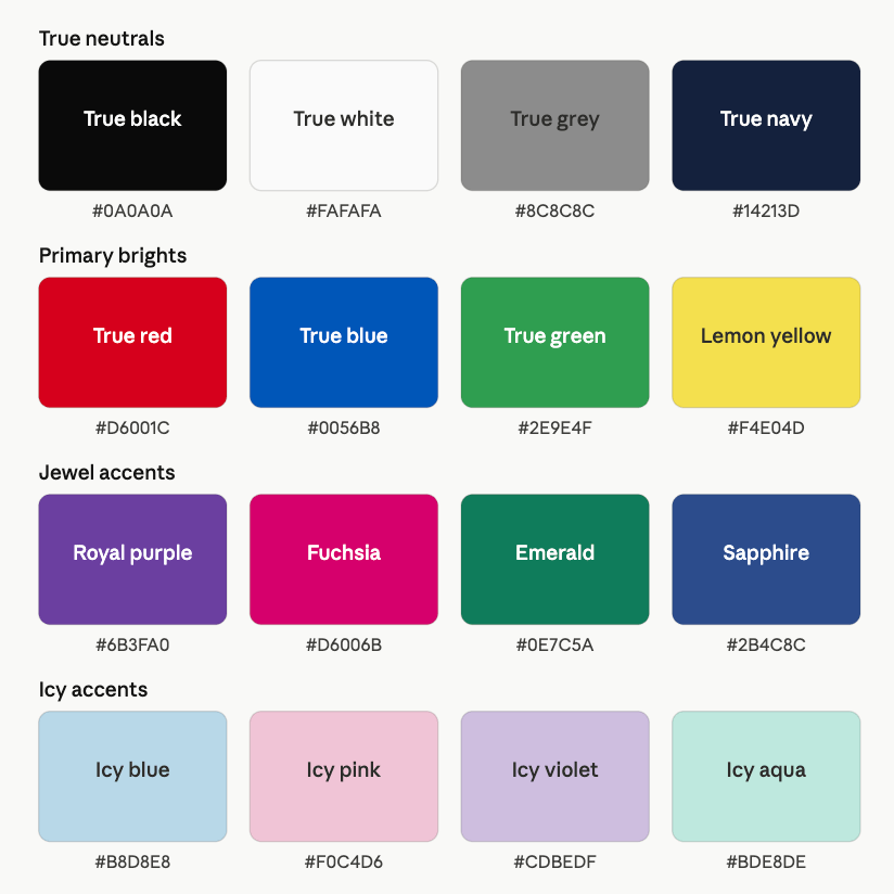
True Neutrals
- True Black
- True White
- True Grey (a clean, balanced grey — neither warm nor especially icy, just… grey)
- True Navy
These work because they’re as “unbiased” as neutrals get. True grey, in particular, is a quietly powerful tool for you — it’s neither a warm taupe-grey nor a frosty silver-grey, just a clean, balanced grey that pairs effortlessly with almost everything else in your palette.
Primary Brights
- True Red
- True Blue
- True Green
- Lemon Yellow
This is your “colour wheel basics, at full strength” category. These are the hues most people would point to if you asked them to name “red,” “blue,” “green,” and “yellow” without overthinking it. Lemon yellow is worth a special mention — yellow can be a tricky colour for cool-toned palettes, but a clear, cool-leaning lemon (rather than a warm golden or mustard yellow) can work beautifully as an occasional pop.
Jewel Accents
- Royal Purple
- Fuchsia
- Emerald
- Sapphire
These take the “true and pure” quality of your primary brights and add some richness and depth — without losing that essential clarity. They’re brilliant for adding a sense of occasion to an outfit, and because they’re cool and pure rather than warm or muddied, they tend to look polished rather than “loud.”
Icy Accents
- Icy Blue
- Icy Pink
- Icy Violet
- Icy Aqua
Pale doesn’t have to mean diluted-to-the-point-of-disappearing. These icy tones are still clear and cool — they’ve been lightened, but not muddied or warmed in the process. They’re particularly useful near your face (shirts, scarves) as a softer complement to your bolder colours.
A Starter Palette
| Colour | Hex | Notes |
|---|---|---|
| True Black | #0A0A0A | Crisp and grounding |
| True White | #FAFAFA | Clean, balanced white |
| True Grey | #8C8C8C | Neither warm nor icy |
| True Navy | #14213D | Deep, balanced blue |
| True Red | #D6001C | Pure, unmistakable red |
| True Blue | #0056B8 | Clean royal blue |
| True Green | #2E9E4F | Pure, balanced green |
| Lemon Yellow | #F4E04D | Clear, cool-leaning yellow |
| Royal Purple | #6B3FA0 | Rich, true purple |
| Fuchsia | #D6006B | Vivid pink-purple |
| Emerald | #0E7C5A | Rich jewel green |
| Sapphire | #2B4C8C | Deep jewel blue |
| Icy Blue | #B8D8E8 | Pale but clear |
| Icy Pink | #F0C4D6 | Pale but clear |
| Icy Violet | #CDBEDF | Pale but clear |
| Icy Aqua | #BDE8DE | Pale but clear |
Part 3: The “It’s Not You, It’s the Colour” List
For True Winter, there are two separate things to watch for — and they’re not quite the same issue, so it’s worth understanding both.
The first is temperature, same as it is for most cool-leaning palettes:
- Camel, tan, terracotta, rust — warm and earthy
- Mustard, golden yellow, warm gold — warm versions of a colour family that has a much better cool option (lemon yellow) available to you
- Warm olive, khaki — muted and warm, a combination that doesn’t do you any favours
- Cream, ivory, oatmeal — warm, diluted neutrals
The second — and this one is more specific to True Winter — is “drift.” This is where a colour is technically cool, but has drifted away from its “true” point toward a neighbouring hue, or has been muted down so much that its purity is lost:
- Teal, instead of true blue or true green — teal sits between blue and green, and that in-between quality can read as slightly muddled next to your defined colouring
- Chartreuse or yellow-green, instead of true green or lemon yellow — again, an in-between hue that lacks the “exactly itself” quality
- Dusty rose, mauve, or muted lilac, instead of fuchsia or icy pink/violet — these are cool, but they’ve been greyed-down, which softens their edges in a way that doesn’t match your defined look
- Burgundy or maroon, instead of true red — these drift toward brown, losing the “pure red” quality
To be clear: there’s nothing wrong with any of these colours in absolute terms — they’re simply not your strongest options. The fix is usually simple: if you’re drawn to teal, try true blue or emerald instead. If you love mauve, try fuchsia or icy violet. If maroon catches your eye, true red will likely do more for you. Same general colour family, truer version.
Part 4: Pattern Play — Best Prints & Patterns (and Why)
The good news for you: because your colouring is balanced rather than extreme in any one direction, you have a fairly wide range of patterns available — the main thing to watch is the colour palette within the pattern, more than the pattern style itself.
What works for you:
- Classic high-contrast patterns — stripes, polka dots, houndstooth, gingham, plaid — especially in combinations of true black, true white, and one or two of your jewel or primary colours
- Colour-blocking in true, pure hues
- Bold florals or graphic prints, as long as the colours within them are clear and cool rather than muted or warm
- Geometric patterns of pretty much any scale — your balanced contrast means you’re not limited to either “very large” or “very small” the way some palettes are
What tends to fight you:
- Patterns dominated by warm or earthy tones — a rust-and-cream plaid, for instance, regardless of how “on trend” it is
- Patterns where the colours have “drifted” — a teal-and-mauve floral, for example, even if it’s technically cool overall, can lack the crispness that suits you
- Heavily faded, washed-out, or “vintage” prints — these tend to mute the very quality (purity) that’s working in your favour
The short version: almost any pattern style can work, as long as the colours in it pass the same test as your solid colours — pure, cool, and clear.
Part 5: Metal Detector — Best Metals & Jewellery (and Why)
Best Metals
- Silver
- Platinum
- White Gold
- Chrome or polished gunmetal
Cool, clean metals are a natural match for your “exactly itself” colouring — there’s no ambiguity to a polished silver finish, and that suits you perfectly.
Yellow Gold & Rose Gold — Approach with Caution
Both tend to introduce a warmth that sits at odds with your cool undertone. If you’re drawn to gold tones, a brighter, cleaner yellow gold (rather than an antiqued or rose-toned one) will generally be the more harmonious choice of the two — though silver-family metals will likely still be your most reliable everyday option.
Gemstones
- Best: sapphire, emerald, ruby, amethyst, diamond, clear white stones — pure, saturated, or perfectly clear stones
- Approach with caution: stones with a warm or “drifted” colour cast — citrine, smoky topaz, or stones with a noticeably golden or brownish tint
Part 6: Face Value — Your Makeup Roadmap
Foundation & Concealer
- Look for cool or neutral-cool undertones
- A satin finish tends to suit you well — enough to look fresh, without veering into either “flat matte” or “overly dewy”
- For concealer, stick with cool or neutral tones; avoid anything with a strong golden or peachy cast
Blush
- Best: true pink, berry, fuchsia, clear rose — pinks that are pure rather than dusty
- Approach with caution: peach, apricot, or bronze-toned blushes, and very dusty or “mauve-y” pinks — both can look slightly out of step with your clear colouring
Bronzer
- As with most cool-toned palettes, traditional warm bronzer isn’t generally your strongest tool
- If you want definition, a cool-toned contour shade (a clean, balanced grey-brown rather than an orange-toned bronzer) will sit more naturally
Lips
- Best: true red, fuchsia, berry, clear rose, royal purple — pure, saturated shades that match your “exactly itself” colouring
- Approach with caution: brick red, maroon, brown-toned nudes, dusty mauve — these “drifted” shades can look a touch flat against your clarity
- A true red lip is something of a True Winter signature — it doesn’t lean orange, it doesn’t lean purple, it’s just… red. And it tends to look fantastic on you.
Eyes — Shadow
- Best: true black, charcoal, true navy, sapphire, emerald, royal purple, icy silver — clear, cool, defined shades
- Approach with caution: warm browns, golds, oranges, and “muddy” mixed tones (a brownish-mauve, for instance) — these tend to lack the clarity your colouring is looking for
- A cool-toned smoky eye (charcoal, navy, or even a deep sapphire) can look striking and well-defined on you
Eyes — Liner & Mascara
- Black is a reliable, flattering choice — it matches the defined quality of your features
- Navy or charcoal liners offer a slightly softer alternative while still reading as “true” rather than warm
- Mascara: black works well; there’s no real need to soften it
Brows
- Cool-toned brow products — ash brown, soft black, true grey-brown — matching your natural cool colouring
- Avoid warm, red, or auburn-leaning brow shades, which can introduce a “drift” relative to the rest of your face
Highlighter
- Cool-toned, clear finishes — a clean silver or “white gold” sheen rather than a warm golden or honey-toned glow
- The goal is a highlight that looks like light, not like a colour in its own right
Part 7: Through the Looking Glass — Eyewear
Best Frame Colours
- True black
- True navy
- True grey
- Jewel tones — sapphire, emerald, royal purple frames can look excellent
- Silver, chrome, or gunmetal metal frames
Frames to Approach with Caution
- Warm tortoiseshell (the golden/amber-heavy kind)
- Rose gold metal frames
- Camel, tan, or muted “drifted” colours (mauve, dusty olive frames, for instance)
As with patterns, the main thing to check is whether the frame colour is “true” — a true black or true navy frame will generally do more for you than a frame in a warm or muddied tone, regardless of the shape or style.
Part 8: Crowning Glory — Hair Colour
- Cool-based browns and blacks — soft black, cool espresso, ash brown — tend to integrate most seamlessly with your natural colouring
- Avoid warm gold, copper, or auburn tones, which introduce exactly the kind of “drift” that works against you
- Going lighter? A clean ash or icy blonde will likely suit you better than a golden or honey blonde
- Fashion colours: jewel tones (sapphire, emerald, royal purple) or a clean blue-black can look striking, while staying true to your overall palette
A note on grey hair
Grey and silver tend to be a natural, harmonious fit for True Winter — they’re cool, balanced, and “exactly themselves” in much the same way your best colours are. If your natural grey is coming through, there’s a good chance it’ll slot into your colouring with very little friction.
Part 9: Fingertips — Nail Polish
- Best: true red, fuchsia, sapphire, emerald, true black, true grey
- Approach with caution: brick red, maroon, mauve, dusty or “drifted” shades, warm nudes
- A true red or fuchsia manicure functions almost like a neutral for you — easy, versatile, and reliably flattering
Part 10: Texture & Fabric Talk
Fabrics that flatter:
- Smooth, clean-finished fabrics — cotton, fine wool, silk, satin — tend to echo the “defined” quality of your colouring
- A bit of sheen (satin, a polished leather accessory) can work nicely, without needing to be the dominant texture in an outfit
Fabrics to be more thoughtful with:
- Heavily textured, “blended-look” fabrics — chunky boucle, very fuzzy mohair, distressed or “weathered” finishes — these can introduce a softness that sits at odds with your crisp colouring
- This doesn’t mean texture is off-limits — just that very soft, blurred textures may not be where your fabrics do their best work. If you love a textured piece, pairing it with one of your true, pure colours (rather than a muted or warm one) helps keep the overall look aligned with your palette
Part 11: Putting It All Together — Styling Tips
- When in doubt, ask “is this colour exactly itself?” A true red, a true blue, a clean emerald — these are safe bets. A colour that feels like it’s “trying to be two things at once” (teal, mauve, brick) is worth a second look
- Classic combinations are classic for a reason, on you specifically — black and white, navy and true red, true grey and sapphire — these pairings lean into your balanced, defined quality rather than working against it
- A single jewel-toned piece can elevate a neutral outfit — a sapphire scarf or an emerald bag against true black or true grey is a simple, reliable formula
- Icy accents work well as “breathing room” — if an outfit feels a little heavy with bold colour, an icy blue or icy pink piece can lighten things without introducing warmth or muddiness
Part 12: Common Pitfalls (a.k.a. “Oh, That’s Why”)
- Reaching for “in-between” colours — teal instead of blue or green, mauve instead of pink or purple, brick instead of red — these can feel like reasonable substitutes, but they tend to lack the clarity that suits you
- Assuming “muted” automatically means “sophisticated” for you — for many palettes, muted tones read as elevated; for True Winter, muted often just means “less true,” which isn’t the same thing as “more elevated”
- Choosing warm “neutrals” like cream, camel, or warm taupe, assuming neutrals are universally safe — your most reliable neutrals are true black, true white, true grey, and true navy
- Going for yellow tones that lean golden or mustard, when a clear lemon yellow would do the same job while staying true to your palette
- Underestimating true red — it’s one of the most versatile colours in your palette, but it’s easy to overlook in favour of “safer” options that don’t actually suit you as well
Quick-Reference Cheat Sheet
| Category | Yes, Please | Approach with Caution |
|---|---|---|
| Neutrals | True black, true white, true grey, true navy | Cream, ivory, camel, warm taupe |
| Standout colours | True red, true blue, true green, royal purple, fuchsia, emerald, sapphire | Teal, chartreuse, mauve, brick/maroon |
| Pastels | Icy blue, icy pink, icy violet, icy aqua | Dusty or warm-tinted pastels |
| Patterns | Classic high-contrast prints (stripes, houndstooth, plaid) in true colours | Patterns dominated by warm or drifted tones |
| Metals | Silver, platinum, white gold, chrome/gunmetal | Rose gold, antiqued yellow gold |
| Foundation | Cool/neutral undertone, satin finish | Golden/warm undertone |
| Blush | True pink, berry, fuchsia, clear rose | Peach, bronze, dusty mauve |
| Lipstick | True red, fuchsia, berry, royal purple | Brick red, maroon, brown-toned nudes |
| Eyeshadow | True black, charcoal, navy, sapphire, emerald, royal purple | Warm brown, gold, muddy mixed tones |
| Eyewear | True black, navy, true grey, jewel tones, silver/gunmetal | Warm tortoiseshell, rose gold, camel |
| Hair colour | Cool brown/black, ash/icy blonde, jewel-tone fashion colours | Warm gold, copper, auburn |
| Fabrics | Smooth, clean-finished — cotton, wool, silk, satin | Heavily textured “blended-look” fabrics |
A Final Word
If there’s one idea to carry with you, it’s this: your best colours are the ones that are exactly what they claim to be. True red. True blue. True green. No drift, no dilution, no mud. When you’re standing in a shop holding something up to the light and asking yourself “is this really that colour, or is it sort of edging toward something else?” — trust that instinct. It’s doing more work than you might think.
