Deep Winter: Your Complete Colour Guide
Welcome! Let’s make sense of this together.
So, the results are in: you’re a Deep Winter.
If your colouring were a piece of music, it wouldn’t be the loudest thing in the room — it’d be the one with all the bass. Rich, resonant, a bit dramatic without even trying. That’s the essence of Deep Winter: depth. Your colouring has a richness and intensity to it that most colours simply can’t match — which means most colours end up looking a bit thin, pale, or washed-out next to you, rather than the other way around.
The good news? Once you know this is your “thing,” shopping gets a lot easier. You’re not looking for “safe.” You’re looking for colours with enough substance to hold their own against you. Let’s get into exactly what that means.
Part 1: What Being a Deep Winter Actually Means
Colour analysis looks at three main things about your natural colouring (hair, skin, and eyes, working together):
- Temperature — are your undertones warmer (golden, peachy) or cooler (pink, blue, ash)?
- Value — is your overall colouring more light or more deep?
- Clarity — is your colouring more clear/vivid or more soft/muted?
For Deep Winter, value is the headline act — specifically, the “deep” end of it. Your hair, eyes, and often your skin sit toward the richer, darker end of the spectrum. This might mean very dark hair with deep brown or dark eyes, or it might mean a deep complexion with equally deep hair and eyes — what matters isn’t the exact combination, it’s the overall sense of richness and depth.
Coolness is your supporting trait — your undertones lean cool-to-neutral, which means rich jewel tones and deep cool colours feel like home, while warm, golden, earthy tones tend to sit slightly at odds with you.
A few things worth clarifying, because “deep” gets misunderstood a lot:
- Deep doesn’t necessarily mean “high contrast.” Some Deep Winters have a lot of contrast (very fair skin against very dark hair), but plenty of Deep Winters have lower contrast — their skin, hair, and eyes are all sitting in a similar, rich, deep range. Either way, the unifying thread is depth and richness, not necessarily a stark light-versus-dark divide.
- Deep Winter shows up across every skin tone. This isn’t about how light or dark your skin is in isolation — it’s about the overall depth and richness of your colouring as a whole, and how it relates to the colours around you.
- Why does this matter? Here’s the mechanism: when the colours near your face are rich and deep, they sit at a similar “weight” to your natural colouring, and your face becomes the focal point — your features look defined, your eyes look brighter, your skin looks luminous. When a colour is too pale or too light, it can flatten everything by comparison — your features can look less defined, your skin can look a bit grey or tired, and the colour itself can end up looking slightly “chalky” or insubstantial against you. It’s not a flaw in the colour or in you — it’s simply a mismatch in weight.
Once you start noticing which colours have enough “weight” to stand up to you, this becomes second nature.
Part 2: Your Power Palette — Best Colours (and Why)
The unifying theme for almost everything on this list: rich, deep, and substantial — colours that feel like they have some weight to them, rather than colours that feel thin or diluted.
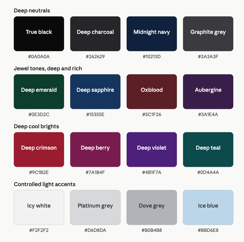
Deep Neutrals
- True Black
- Deep Charcoal
- Midnight Navy
- Graphite Grey (a deep, cool-toned grey — not a pale silvery one)
These aren’t “boring basics” for you — they’re some of your most flattering colours, full stop. Black in particular tends to look exceptional on Deep Winters; it has the richness to match your natural depth rather than competing with it.
Jewel Tones — Deep & Rich
- Deep Emerald
- Deep Sapphire
- Oxblood
- Aubergine (a deep, cool-leaning plum-purple)
This is your “instant elegance” category. These colours are saturated and deep — they don’t read as bright or “loud,” but they have real presence. A deep emerald coat or an oxblood jumper can look quietly spectacular on you in a way that a paler version of the same colour simply wouldn’t.
Deep Cool Brights
- Deep Crimson (a rich, slightly darker take on true red)
- Deep Berry
- Deep Violet
- Deep Teal
These give you a bit more vibrancy while staying anchored in depth. Think of this category as “your version of bold” — rich and saturated, but never pale or pastel. A deep berry lip or a deep teal scarf can do the work of a much “louder” colour on someone with less natural depth.
Controlled Light Accents
- Icy White
- Platinum Grey
- Dove Grey
- Ice Blue
Here’s the nuance that’s genuinely useful to know: pale, light colours aren’t off-limits for you — they just tend to work best as accents rather than the main event, especially when grounded by something deeper nearby. An ice-blue blouse under a charcoal blazer, or a platinum grey scarf against a black coat, lets a paler tone do its job (adding light near your face) without leaving you looking washed out, because it’s anchored by depth elsewhere in the outfit. A head-to-toe pale outfit, on the other hand, can leave your features looking a bit “lost.”
A Starter Palette
| Colour | Hex | Notes |
|---|---|---|
| True Black | #0A0A0A | Rich, grounding |
| Deep Charcoal | #262629 | Cool-toned, substantial |
| Midnight Navy | #10213D | Deep and cool |
| Graphite Grey | #3A3A3F | Deep, cool grey |
| Deep Emerald | #0E3D2C | Rich jewel green |
| Deep Sapphire | #15355E | Deep jewel blue |
| Oxblood | #5C1F26 | Deep wine-red |
| Aubergine | #3A1E4A | Deep cool plum |
| Deep Crimson | #9C1B2E | Rich, deep red |
| Deep Berry | #7A1B4F | Deep magenta-plum |
| Deep Violet | #4B1F7A | Rich purple |
| Deep Teal | #0D4A4A | Deep blue-green |
| Icy White | #F2F2F2 | Clean, slightly soft |
| Platinum Grey | #D6D8DA | Cool, light grey |
| Dove Grey | #B0B4B8 | Soft, cool grey |
| Ice Blue | #BBD6E8 | Frosty pastel |
Part 3: The “It’s Not You, It’s the Colour” List
For Deep Winter, the colours that tend to fight you share one quality above all: they’re too light, too soft, or too warm to match your natural depth.
Colours to be cautious with:
- Cream, ivory, oatmeal, beige — too pale and too warm to give your colouring anything to “match”
- Camel, tan, terracotta, rust, warm chestnut — these have some depth, but the wrong temperature; they can look slightly muddy against your cool-leaning undertones
- Mustard, warm olive, khaki — muted and warm, a combination that doesn’t do you any favours
- Dusty rose, sage, mauve — soft, muted, and lacking the depth that creates harmony with your colouring
- Pale pastels worn head-to-toe — not “wrong,” exactly, but as discussed above, an entire outfit in pale pink or baby blue can leave your features looking a little washed out without something deeper to ground it
A quick gut-check: if a colour looks like it’s been diluted — mixed with a lot of white, or faded by the sun — it’s probably going to read as a bit “thin” next to your natural richness. The fix isn’t to avoid these colours entirely — it’s to either swap them for their deeper cousins (instead of dusty rose, try deep berry; instead of camel, try graphite grey or aubergine), or to use them as small accents alongside something richer.
Part 4: Pattern Play — Best Prints & Patterns (and Why)
The guiding principle here: patterns should carry some depth overall, whether that comes from contrast, richness of colour, or both.
What works for you:
- Deep tonal patterns — combinations like charcoal and midnight navy, or black and deep emerald — where everything sits in a rich, deep range. These can look sophisticated and intentional on you in a way they might look a little flat on someone with less natural depth
- High-contrast patterns where dark dominates — think a mostly-black pattern with pops of a jewel tone, rather than a mostly-white pattern with small dark accents
- Bold, dramatic prints — large-scale florals, abstract prints, animal prints — particularly when they’re rendered in deep, rich colourways
- Jewel-toned patterns — prints that combine several of your rich colours (deep emerald, oxblood, aubergine) together
What tends to fight you:
- Patterns where pale or pastel tones dominate — a mostly cream-and-pale-pink print, for example, even if it has some dark accents, can end up reading as “light” overall
- Watercolour, faded, or “sun-bleached” looking prints — these tend to lack the richness your colouring is asking for
- Very small, busy prints in low-contrast, muted colourways — these can feel a little timid against your presence
Why this works the way it does: a pattern’s overall impression — is it mostly light, or mostly deep? — tends to matter more for you than the specific colours within it. A pattern that reads as “rich” overall, even if it includes a few paler accents, will generally sit better with you than one that reads as “light” overall, even if it includes a few deep accents.
Part 5: Metal Detector — Best Metals & Jewellery (and Why)
Best Metals
- Silver
- White Gold
- Platinum
- Gunmetal
- Hematite
- Oxidised or “antiqued” silver
Cool metals are your foundation — but here’s a nuance worth knowing: you can often carry darker, more dramatic metal finishes (oxidised silver, hematite, black-toned metals) particularly well, because they share that quality of depth with your natural colouring. A piece that might look a bit “heavy” on someone with lighter colouring can look perfectly balanced on you.
Yellow Gold & Rose Gold — A Bit More Nuance Than You Might Expect
Bright, pale yellow gold tends to be the trickiest fit, working against your cool undertone in the same way it might for other cool-leaning colouring. However, deep, rich, antiqued yellow gold — the kind with a slightly burnished or aged quality rather than a bright shine — can occasionally work in small doses, because its depth gives it some common ground with your colouring even though the temperature isn’t a perfect match. This isn’t a free pass to load up on warm gold — but if you already own a piece in a deep antique gold finish, it’s likely more wearable for you than a bright, pale gold equivalent would be.
Rose gold tends to be the least successful option — it combines warmth with a lightness that doesn’t align well with either of your dominant traits.
Gemstones
- Best: onyx, deep sapphire, emerald, garnet, smoky quartz, deep amethyst — stones with real depth and saturation
- Approach with caution: pale or light-toned stones worn as a centrepiece (very pale aquamarine, light rose quartz) — lovely stones, but they can get a little “lost” as the main feature of a piece on you. They tend to work better as small accent stones alongside something deeper
Part 6: Face Value — Your Makeup Roadmap
Foundation & Concealer
- Look for cool or neutral-cool undertones, as with the broader Winter palette
- The bigger consideration for you is pigment and finish — a sheer, very light-reflecting foundation can sometimes “flatten” your natural depth. A foundation with good pigment payoff and a satin or natural finish tends to let your skin look like itself, rather than slightly diluted
- For concealer, cool or neutral tones work best; avoid anything that leaves a pale, chalky cast
Blush
- Best: deep berry, deep rose, plum, rich raspberry
- Approach with caution: very pale or sheer pink blushes — these can disappear rather than add definition
- A blush with a bit of pigment intensity will generally read as more natural on you than a “barely-there” one — counterintuitive, but true
Bronzer
- A cool-toned, deep contour shade can work nicely for definition — think a rich taupe-grey rather than an orange-toned bronzer
- True warm bronzer is still generally not your best friend, for the same temperature reasons as the rest of the palette — but a deep cool-toned contour is a different story, and can genuinely add to your look rather than fight it
Lips
This is arguably your signature category. Deep, rich lip colours are basically a Deep Winter speciality.
- Best: oxblood, deep berry, deep plum, aubergine, deep crimson
- Approach with caution: very pale, sheer, or “barely there” lip colours — these can look a little washed out against your natural depth, the opposite problem to what they’re usually meant to solve
- A bold, deep lip that might feel like “a lot” for someone with lighter colouring often looks completely proportionate — even understated — on you
Eyes — Shadow
- Best: charcoal, black, deep plum, midnight navy, deep emerald, deep teal — a smoky eye in deep, rich tones can look stunning on you, with real depth rather than harshness
- Approach with caution: very pale, frosty, or shimmery light shadows worn alone — these can sometimes look slightly chalky against your colouring, particularly if they’re the only colour on the lid. (A pale shimmer used as a small highlight alongside a deeper shadow is a different story, and can work nicely)
- Warm browns, golds, and oranges tend to clash with your cool undertone, same as elsewhere in this guide
Eyes — Liner & Mascara
- Black is an easy win for you — it has the depth to match your natural colouring without looking severe
- A deep brown-black or charcoal liner can offer a very slightly softer alternative for daytime, while still carrying enough depth
- Mascara: black, with no real need to “lighten” it — your colouring can carry the definition beautifully
Brows
- Deep, cool-toned brow products — your brows likely already have some natural depth, and leaning into that (rather than trying to soften it) tends to look most “you”
- Avoid warm, red, or auburn-leaning brow shades
Highlighter
- Cool-toned, with some richness to the shimmer — a champagne-pewter or soft platinum finish tends to work better than a very pale, frosty white highlighter, which can look slightly stark against deep colouring
- The goal is a glow that sits with your skin’s depth, not one that sits on top of it looking disconnected
Part 7: Through the Looking Glass — Eyewear
Best Frame Colours
- Black
- Deep charcoal or graphite
- Midnight navy
- Deep tortoiseshell (cool-based, with dark tones dominating)
- Deep jewel tones — emerald, aubergine, oxblood frames can look wonderful
- Gunmetal or dark silver metal frames
Frames to Approach with Caution
- Pale or light tortoiseshell
- Light pastel frames
- Warm camel or honey-toned frames
- Very pale, icy metal frames (these can look a little insubstantial against your features)
The same logic applies here as everywhere else: frames with some depth to them will generally frame your features beautifully, while very pale or light frames can sometimes get visually “lost” against your colouring rather than defining it.
Part 8: Crowning Glory — Hair Colour
- Deep, cool-toned browns and blacks — espresso, soft black, deep cool brunette — tend to look the most seamless with your natural colouring
- Avoid warm gold, copper, or auburn tones, which can sit at odds with your cool undertone
- Going lighter is worth approaching thoughtfully — a significant jump to a pale or icy blonde can sometimes create a stronger contrast with your skin than feels balanced; if you do go lighter, doing so gradually, or keeping some deeper tones underneath, tends to look more harmonious
- Fashion colours: deep burgundy, deep violet, or blue-black tones can look genuinely striking — these lean into your natural richness rather than away from it
A note on grey hair
If your natural grey is coming through, it’s worth knowing that grey reads as a cool, neutral tone — which means it’s not inherently “against” you the way it might be for warmer colouring. That said, because your overall impression benefits from depth, a fuller head of light grey may shift your overall colouring toward “lighter” than you’re used to. Some Deep Winters love this change; others prefer to retain some depth through colour. Either is a valid choice — it’s simply worth being aware of the shift.
Part 9: Fingertips — Nail Polish
- Best: oxblood, deep berry, deep emerald, black, deep plum, midnight navy
- Approach with caution: pale nudes, sheer pastels, very light shades — these can look a little flat or “washed” against your hands and overall colouring
- A deep, rich polish colour functions almost like a neutral for you — it’s an easy, everyday choice rather than a “statement”
Part 10: Texture & Fabric Talk
Fabrics that flatter:
- Rich, substantial fabrics — velvet, leather, suede, wool, deep-coloured silk and satin
- You can generally handle more texture and weight than colourings with less natural depth — a chunky, richly-coloured knit or a substantial wool coat tends to look proportionate on you, where it might overwhelm someone with a lighter, more delicate overall impression
Fabrics to be more thoughtful with:
- Very lightweight, sheer, or delicate fabrics in pale colours — a pale, floaty chiffon, for instance, may end up looking slightly insubstantial against your presence
- This doesn’t mean you can’t wear lightweight or sheer fabrics at all — just that they tend to work best in your deeper colours, where the richness of the colour compensates for the lightness of the fabric
Part 11: Putting It All Together — Styling Tips
- Lead with depth, not necessarily contrast. If you’re unsure whether a colour will work, ask “does this have some richness to it?” before asking “is this dramatic enough?”
- Deep monochrome outfits can look fantastic on you — an all-charcoal look, or navy-on-navy with a hint of deep teal, tends to read as polished and intentional
- Use pale colours as accents, not anchors — a pale grey scarf with a black coat, or an ice-blue shirt under a deep navy jumper, lets lighter tones do their job without leaving you looking washed out
- Rich jewel tones are an easy “elevate this outfit” tool — a deep emerald or oxblood piece can transform a simple black-based outfit instantly
- You can wear a lot of black, and it will likely look good — for many people, “all black” can feel a bit flat; for you, it’s more likely to look polished and deliberate
Part 12: Common Pitfalls (a.k.a. “Oh, That’s Why”)
- Reaching for “soft” or “muted” colours thinking they’re safer — soft and muted often means light, which is the one quality that doesn’t suit your colouring, regardless of how “elegant” it’s marketed as
- Avoiding black or other deep colours out of a sense that they’re “too much” — for you, they’re often the opposite: a comfortable, flattering default
- Pairing your best deep colours with pale, warm “neutrals” like cream or beige, which can undercut the very richness that made the deep colour work in the first place
- Choosing warm-toned “rich” colours — rust, chestnut, warm brown — assuming that because they’re deep, they’ll automatically work. Depth alone isn’t enough; the cool undertone still matters
- Going very light with hair colour quickly, rather than gradually, and finding the overall effect feels more jarring than expected
Quick-Reference Cheat Sheet
| Category | Yes, Please | Approach with Caution |
|---|---|---|
| Neutrals | True black, deep charcoal, midnight navy, graphite grey | Cream, ivory, beige, camel |
| Standout colours | Deep emerald, deep sapphire, oxblood, aubergine, deep crimson, deep berry | Mustard, terracotta, rust, dusty rose, sage |
| Lighter tones | Icy white, platinum grey, dove grey, ice blue — used as accents | Pale pastels worn head-to-toe |
| Patterns | Deep tonal combinations, dark-dominant high-contrast prints, jewel-toned prints | Pale-dominant prints, faded/watercolour prints |
| Metals | Silver, white gold, platinum, gunmetal, hematite, oxidised silver | Bright pale yellow gold, rose gold |
| Foundation | Cool/neutral undertone, good pigment payoff, satin finish | Very sheer, light-reflecting formulas |
| Blush | Deep berry, deep rose, plum, raspberry | Very pale or sheer pink |
| Lipstick | Oxblood, deep berry, deep plum, aubergine, deep crimson | Pale, sheer, “barely there” shades |
| Eyeshadow | Charcoal, black, deep plum, midnight navy, deep emerald/teal | Pale frosty shades worn alone, warm brown/gold |
| Eyewear | Black, deep charcoal, midnight navy, deep tortoiseshell, deep jewel tones | Pale tortoiseshell, light pastels, warm camel |
| Hair colour | Deep cool brown/black, deep burgundy/violet fashion tones | Warm gold, copper, auburn; very sudden lightening |
| Fabrics | Velvet, leather, suede, wool, deep silk/satin | Lightweight sheer fabrics in pale colours |
A Final Word
If there’s one thing to take from all of this, it’s that your natural colouring has substance — and the colours that work best for you are the ones that match it. That doesn’t mean everything you wear has to be dark or dramatic. It just means that whatever you choose — bold or quiet, simple or patterned — it tends to do best when it has a bit of weight behind it.
Lean into the depth. It’s working in your favour.
