COOL Winter: Your Complete Colour Guide
Welcome! Let’s make sense of this together.
So, the results are in: you’re a Cool Winter.
Here’s the headline: if Bright Winter is “turn the saturation all the way up,” Cool Winter is “turn the temperature all the way down — and let the saturation settle wherever it wants to.” Coolness is your defining trait. Not “a little cool” — properly, purely, unmistakably cool. Blue-based, ash-based, frost-based. That’s your whole vibe.
But here’s the part that makes Cool Winter really fun to work with: because your temperature is doing all the heavy lifting, your intensity doesn’t have to. You don’t need everything to be neon-bright or laser-sharp to look incredible — you’ve got a bit of breathing room to play with some gently muted, cooler-toned colours too (the kind that would feel a bit flat on a Bright Winter, but feel right at home on you). Think of it as borrowing a little bit of Summer’s “soft exhale” energy, while staying firmly in Winter’s cool, clear-eyed world.
This guide is going to walk you through exactly what that means for your closet, your makeup bag, your jewelry box — all of it. Let’s go.
Part 1: What Being a Cool Winter Actually Means
Quick refresher on the three things colour analysis looks at:
- Temperature — cool (blue/pink/ash undertones) vs. warm (golden/peachy undertones)
- Value — how light or deep your overall colouring reads
- Clarity — how clear/vivid vs. soft/muted your colouring reads
For Cool Winter, temperature is the headline act, full stop. Your undertones are unambiguously cool — and this is the trait that should drive almost every colour decision you make. Contrast and clarity still matter (you’re a Winter, after all — you’re not a low-contrast season), but they’re not pushed to the absolute max the way they are for Bright Winter. There’s a little more flexibility, a little more nuance.
What does that mean in practice? It means:
- Pure, true, saturated cool colours are still your best friends — true red, sapphire, emerald, plum
- But you also have access to some softer, slightly muted cool tones — slate blue, dove gray, cool berry — that would feel a bit “meh” on a Bright Winter but feel completely natural on you
- What you don’t have access to (regardless of intensity) is warmth. A muted warm colour (camel, olive, terracotta) won’t work just because it’s muted — the issue isn’t intensity, it’s temperature
A useful mental shortcut: for Bright Winter, the question is “is this colour clear enough?” For Cool Winter, the question is “is this colour cool enough?” Once a colour passes the coolness test, you’ve got more room to play with how soft or saturated it is than you might expect.
As with every season — Cool Winter shows up across every skin tone, hair colour, and eye colour combination. It’s not about looking like a specific “type.” It’s about your undertones being cool, and your colouring carrying enough contrast and presence to handle Winter’s confident colour — just without needing them to be turned up to eleven.
Part 2: Your Power Palette — Best ColoUrs (and Why)
The unifying theme: cool undertones, true-to-medium saturation — colours that feel crisp and wintry, whether they’re vivid or a little more hushed.
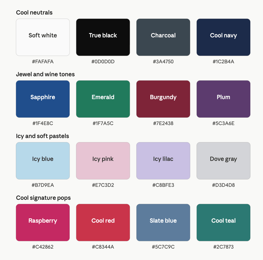
Cool Neutrals
- Soft White — a clean white, slightly gentler than stark “paper white”
- True Black
- Charcoal — cool-toned, slate-based
- Cool Navy
These are your foundation. Notice that even your “soft white” still reads as cool and clean — not creamy. The slight softening compared to Bright Winter’s stark white is subtle, but it’s there, and it means you have a touch more flexibility in how crisp vs. how gentle your neutrals feel.
Jewel & Wine Tones
- Sapphire
- Emerald
- Burgundy / Wine
- Plum
This is where your “Winter” really shows up — rich, cool, confident colours that work beautifully as statement pieces. Burgundy and plum in particular are a bit of a Cool Winter signature: deep, cool, slightly less “primary-colour-bright” than something like Bright Winter’s true red or fuchsia, but every bit as striking. These colors look “expensive” on you in a way that’s hard to fake.
Icy & Soft Pastels
- Icy Blue
- Icy Pink
- Icy Lilac
- Dove Gray
Here’s where the Summer influence really shows up. Icy blue, icy pink, and icy lilac are classic Winter pastels — clear, cool, a little frosty. But dove gray is the new addition: a soft, cool, slightly muted gray that wouldn’t have much “clarity” for Bright Winter, but reads as effortlessly chic on you. It’s proof that “muted” and “cool” aren’t mutually exclusive — they’re just two different dials, and you get to turn the second one down sometimes.
Cool Signature Pops
- Raspberry
- Cool Red
- Slate Blue
- Cool Teal
This is your “go bold, but make it cool” category. Raspberry and cool red give you vibrancy without veering into the neon, primary-colour territory that suits Bright Winter more. Slate blue and cool teal are gently muted but unmistakably cool — these are the colours that often get described as “that blue/green that looks so good on you, what is that?”
A Starter Palette
| Colour | Hex | Notes |
|---|---|---|
| Soft White | #FAFAFA | Clean, slightly gentler than stark white |
| True Black | #0D0D0D | Crisp, grounding |
| Charcoal | #3A4750 | Cool, slate-based |
| Cool Navy | #1C2B4A | Deep and cool |
| Sapphire | #1F4E8C | Rich jewel blue |
| Emerald | #1F7A5C | Cool-leaning green |
| Burgundy | #7E2438 | Deep wine red |
| Plum | #5C3A6E | Cool, muted purple |
| Icy Blue | #B7D9EA | Frosty pastel |
| Icy Pink | #E7C3D2 | Cool, soft pink |
| Icy Lilac | #C8BFE3 | Cool lavender pastel |
| Dove Gray | #D3D4D8 | Soft, cool gray |
| Raspberry | #C42862 | Cool-bright pink-red |
| Cool Red | #C8344A | Vivid but not neon |
| Slate Blue | #5C7C9C | Muted, cool blue |
| Cool Teal | #2C7873 | Deep, cool green-blue |
Part 3: The “It’s Not You, It’s the ColoUr” List
For Cool Winter, this list has one organising principle: warmth, in any amount, is the issue — not intensity. A muted colour isn’t automatically safe for you; it has to be muted and cool.
Colours to be cautious with:
- Camel, tan, terracotta, rust — warm and earthy, regardless of how “muted” or “elevated” they’re marketed as
- Mustard, warm yellow, golden tones — these fight your cool undertone directly
- Warm olive, khaki — muted, yes, but warm-muted, which doesn’t help you
- Cream, ivory, oatmeal — warm neutrals that can make cool undertones look slightly sallow by contrast
- Peach, coral-with-orange — lovely colours, just not on the cool side of the fence
A quick note on neon brights: colours like neon hot pink, neon yellow-green, or ultra-electric orange-toned hues might feel like “obviously a Winter colour” — but if they’re pushing past true/clear into neon/fluorescent territory, they can occasionally feel like they’re overpowering rather than flattering on Cool Winter specifically. Not a hard “no” — just something to be a little more selective about, especially in large doses. Your sweet spot is “rich and saturated,” not “glow-in-the-dark.”
The fix: if you’re drawn to a warm colour, look for its cool cousin. Instead of camel, try dove gray or charcoal. Instead of terracotta, try burgundy or raspberry. Instead of cream, try soft white or icy pink. The warmth is the only thing that needs swapping out — the mood of the colour (earthy, soft, grounded) can often stay.
Part 4: Pattern Play — Best Prints & Patterns (and Why)
Here’s where Cool Winter gets more flexibility than Bright Winter, and it’s directly because of that Summer influence.
What works for you:
- High-to-medium contrast prints — you can absolutely do bold (stripes, geometrics, colour-blocking), but you don’t need maximum contrast the way Bright Winter does
- Tonal cool prints — patterns where everything is in the cool family but at different values (e.g., navy, slate blue, and icy blue together) can look elegant and cohesive on you, where they might feel a bit “flat” on a Bright Winter
- Cool-toned florals — florals in jewel and icy tones (think plum, sapphire, icy lilac) rather than warm-toned florals
- Subtle texture-based patterns — herringbone, subtle plaid, soft jacquard — these have a gentleness that pairs nicely with your slightly-softer-than-Bright-Winter energy
What tends to fight you:
- Anything warm-toned, regardless of contrast level — a warm-toned pattern (rust and cream, mustard and brown) won’t be rescued by being “bold”
- Faded, sun-bleached, or “vintage” looking prints — these usually carry a warm cast even when the base colours are technically cool
- Overly saccharine pastel prints (think very pale pink-and-cream “shabby chic” florals) — too soft and often slightly warm
Why this works the way it does: because your defining trait is temperature rather than maximum contrast, a pattern’s colour story matters more for you than its contrast level. A softer print in cool tones will generally serve you better than a high-contrast print in warm tones.
Part 5: Metal Detector — Best Metals & Jewelry (and Why)
Best Metals
- Silver
- Platinum
- White Gold
- Pewter / Gunmetal
Cool metals are your foundation, same as the other Winters — but you’ve got a bit more room to enjoy brushed or matte silver finishes, not just high-polish. A soft, brushed-silver piece has a gentle quality that suits your slightly-softer energy beautifully, where a Bright Winter might want that piece to be more mirror-polished.
Yellow Gold & Rose Gold — Approach with Caution
Because coolness is doing so much work for you, yellow gold (in most finishes) tends to be one of the trickier metals — even bright, polished yellow gold can read as a bit “off” against your undertone. Rose gold has the same issue, often more so, since it combines warmth with a muted quality that doesn’t align with your cool palette.
If you love warm metals, the easiest workaround is to keep them away from your face (a yellow gold ring, perhaps, rather than yellow gold earrings or a necklace) — or look for “white gold with a warm-toned gemstone” pieces, where the metal itself stays cool.
Gemstones
- Best: sapphire, emerald, amethyst, garnet, ruby, diamond, white topaz — rich, cool-toned stones
- Approach with caution: citrine, amber, warm topaz, turquoise (the warmer/greener varieties) — lovely stones, just working against your undertone
Part 6: Face Value — Your Makeup Roadmap
Foundation & Concealer
- Look for “cool” or “neutral-cool” undertone foundations — avoid anything labeled “warm” or “golden”
- A satin or natural finish tends to suit you well — you don’t need the ultra-luminous “lit from within” finish that Bright Winter often gravitates toward, but full matte can occasionally feel a touch flat. Satin is your sweet spot
- For concealer, stick to cool or neutral tones; avoid warm/peachy correctors unless colour-correcting specific redness, and keep them minimal
Blush
- Best: cool rose, berry, plum, raspberry — anything with a blue or purple undertone to the pink
- Approach with caution: peach, apricot, bronze-toned blushes — these can look a little disconnected from your cool undertone
- You have a bit more room than Bright Winter to go softer with your blush placement and intensity — a gentle wash of cool rose can look just as “you” as a more vivid berry
Bronzer
Similar story to Bright Winter — true bronzer (warm, matte) generally isn’t your best friend. If you want definition:
- A cool-toned contour shade (think soft taupe-gray rather than orange-brown) works better than traditional bronzer
- If you do use a touch of bronzer, go for the least orange option you can find, and use it sparingly
Lips
- Best: berry, plum, wine, raspberry, cool-toned red, rose — you have a wide range here, from “vivid raspberry” all the way to “soft cool rose,” and most of it will work
- Approach with caution: anything orange-based — coral-with-orange, brick red, warm terracotta lip shades
- A plum or wine lip is almost a Cool Winter signature — it’s rich without being neon, and cool without being washed-out
Eyes — Shadow
- Best: cool taupe, charcoal, navy, plum, lavender, silver, smoky gray — you can do a beautiful smoky eye in cool tones, and it won’t read as “harsh” the way it might on some other seasons
- Sapphire, emerald, and amethyst (your jewel tones) also work beautifully when you want something more vivid
- Approach with caution: warm browns, golds, oranges, warm copper — these tend to clash with your undertone, even in small amounts
Eyes — Liner & Mascara
- Black, charcoal, and navy liners all work well — navy in particular can be a lovely, slightly softer alternative to black for everyday wear
- Mascara: black is reliable, but a navy or deep charcoal mascara can add definition with a touch less starkness — worth experimenting with if black ever feels like “a lot” for daytime
Brows
- Cool-toned, ash-based brow products — ash brown, soft black, taupe — matching your natural cool colouring
- Avoid warm, red, or auburn-leaning brow shades
Highlighter
- Cool, icy, or “white gold” finishes — pearl, silver-champagne, frost
- Warm golden or honey-toned highlighters tend to sit oddly against your undertone, even when they look gorgeous in the pan
Part 7: Through the Looking Glass — Eyewear
Best Frame ColoUrs
- Black
- Charcoal / gray
- Navy
- Plum or deep burgundy
- Silver or gunmetal metal frames
- Cool-toned (gray-based) tortoiseshell
Frames to Approach with Caution
- Warm, golden-heavy tortoiseshell
- Rose gold metal frames
- Camel, tan, or warm beige frames
You’ve got a bit more latitude than Bright Winter when it comes to finish — matte and satin frame finishes can look just as good as glossy ones on you. The colour temperature is what matters most; the shine level is more flexible.
Part 8: Crowning Glory — Hair ColoUr
- Cool-based browns and blacks — espresso, soft black, ash brown — tend to look the most seamless
- Avoid warm gold, copper, or auburn tones, which can create a visible disconnect with your cool undertone
- Going lighter? Ash or icy blonde reads beautifully — avoid golden or honey blonde
- Fashion colours: deep plum, wine, or blue-black tones can look stunning — these lean into your “rich but cool” signature colours
A note on gray hair
Like other Winters, gray and silver hair tend to look really flattering on Cool Winters — it’s a cool, neutral tone that integrates easily with your palette. If your gray is coming in naturally, it’s very likely to be a gift rather than something to colour away.
Part 9: Fingertips — Nail Polish
- Best: berry, plum, wine, cool red, raspberry, navy, charcoal, soft cool gray
- Approach with caution: orange-based reds, warm browns, mustard, peachy nudes
- You have more room than Bright Winter to wear a soft cool gray or muted plum as a quiet, everyday colour — it won’t read as “boring” on you the way a warm nude might
Part 10: Texture & Fabric Talk
This is one of the bigger differences from Bright Winter.
Fabrics that flatter:
- Smooth fabrics (satin, silk, fine cotton) still work beautifully
- But you also have real room for matte and soft-finish fabrics — cashmere, fine wool, suede, brushed cotton — these have a gentle quality that complements your slightly-softer energy
- A mix of textures (a smooth silk blouse with a soft wool coat, for example) tends to look effortless on you
Fabrics to be more thoughtful with:
- Very rough, heavily textured, or “rustic” fabrics (raw burlap-like linen, very chunky distressed knits) can occasionally feel at odds with your overall polish — not because of colour, but because of texture
- Anything with a warm cast built into the fabric itself — some textured fabrics (certain tweeds, some boucles) have a warm, flecked quality that can undercut an otherwise-great cool colour
The takeaway: for you, texture is a much smaller lever than it is for Bright Winter. Focus your attention on temperature first, and let texture be a more flexible, secondary choice.
Part 11: Putting It All Together — Styling Tips
- Lead with temperature, not intensity. When in doubt, ask “is this cool?” before asking “is this bold enough?” — the second question matters much less for you than the first
- Tonal cool outfits are a genuine option for you — an all-navy look, or charcoal-on-charcoal with a hint of icy blue, can look chic and intentional rather than “flat,” which is a styling trick that doesn’t always translate to Bright Winter
- Rich, cool jewel tones (plum, burgundy, sapphire, emerald) make excellent “instead of black” options — when you want something a little more interesting than your basic black but still want that grounded, polished feeling
- A cool pastel can do a lot of work — icy blue or icy lilac near your face can soften an outfit without making you look washed out, the way it might on a season with less natural contrast
- When you do go bold, lean toward “rich” over “neon” — raspberry over hot pink, cool red over a primary fire-engine red, sapphire over an electric cobalt. Same energy, better fit
Part 12: Common Pitfalls (a.k.a. “Oh, That’s Why”)
- Reaching for warm “neutrals” because they’re marketed as universally flattering — camel, cream, and tan are not your friends, no matter how “classic” they’re billed as
- Assuming “Winter” automatically means “stark and maximal” — and therefore avoiding some of the gentler cool tones (dove gray, slate blue, soft cool pink) that actually suit you really well
- Going for neon/fluorescent brights expecting them to read the same as they would on a Bright Winter — they might feel like “too much” in a way that rich jewel tones don’t
- Choosing warm-toned “elevated neutral” makeup (warm taupe eyeshadow, peachy blush, golden highlighter) because it’s trending — these fight your undertone regardless of how “sophisticated” they’re styled
- Underestimating plum, burgundy, and wine — these are some of your best colours, and they’re often overlooked in favor of “safer” black or navy
A Quick Note: Cool Winter vs. Bright Winter
Since these are easy to mix up (they’re both “Winters,” after all): the difference comes down to which trait is doing the most work.
- Bright Winter = clarity is everything. Colours need to be vivid and clear. Coolness matters, but clarity matters more.
- Cool Winter = temperature is everything. Colours need to be unmistakably cool. Clarity matters, but it’s flexible — you can go quite saturated or gently muted, as long as it stays cool.
If you’ve ever tried on a “classic Winter” outfit and felt like it was almost right but somehow a bit much — that’s often this distinction at play. You don’t need less colour. You might just need less neon and a little more “rich.”
Quick-Reference Cheat Sheet
| Category | Yes, Please | Approach with Caution |
|---|---|---|
| Neutrals | Soft white, true black, charcoal, cool navy, dove gray | Cream, ivory, beige, camel |
| Standout colours | Sapphire, emerald, burgundy, plum, raspberry, cool red | Mustard, terracotta, warm olive, rust |
| Pastels | Icy blue, icy pink, icy lilac, dove gray | Warm, creamy, or peachy pastels |
| Patterns | Cool tonal prints, cool-toned florals, subtle texture | Warm-toned prints, faded/vintage prints |
| Metals | Silver, platinum, white gold, pewter/gunmetal (matte ok) | Yellow gold, rose gold |
| Foundation | Cool/neutral undertone, satin finish | Golden/warm undertone |
| Blush | Cool rose, berry, plum, raspberry | Peach, apricot, bronze |
| Lipstick | Berry, plum, wine, cool red, rose | Orange-based corals, brick red |
| Eyeshadow | Cool taupe, charcoal, navy, plum, silver, jewel tones | Warm brown, gold, copper |
| Eyewear | Black, charcoal, navy, plum, silver, cool tortoise | Warm tortoise, rose gold, camel |
| Hair colour | Cool brown/black, ash blonde, plum/wine fashion tones | Warm gold, copper, auburn |
| Fabrics | Smooth or matte — cashmere, wool, satin, silk | Warm-flecked tweeds/boucles, very rustic textures |
A Final Word
If Bright Winter’s motto is “go big or go home,” Cool Winter’s might be: “keep it cool, and the rest takes care of itself.” You’ve got a truly wide range available to you — from rich jewel tones to softer, gently muted cool shades — and almost all of it comes down to one simple filter. Is it cool? Then it’s probably worth a try.
That’s a pretty manageable rule to shop by.
