Bright Winter: Your Complete Colour Guide
Welcome! Let’s make sense of this together.
So, the results are in: you’re a Bright Winter.
If you’ve ever stood in front of your closet wondering why some colours make you look like you just got back from vacation and others make you look like you’re coming down with something — this guide is going to explain exactly why, and (more importantly) what to do about it.
Here’s the short version: your whole “thing” is contrast and clarity. You’re naturally vivid — the kind of person where colours don’t get to be vague around you. They have to show up, be themselves, and mean it. The good news? This makes shopping easier, not harder, once you know what you’re looking for. The slightly annoying news? A lot of “classic neutral” and “trendy muted” colours that get marketed to literally everyone are quietly working against you. We’re going to fix that.
Grab a coffee. This one’s thorough.
Part 1: What Being a Bright Winter Actually Means
Colour analysis looks at three main things about your natural colouring (hair, skin, eyes, working together):
- Temperature — are your undertones warmer (golden, peachy) or cooler (pink, blue, ash)?
- Value — is your overall colouring more light or more deep?
- Clarity — is your colouring more clear/vivid or more soft/muted?
For Bright Winter, clarity is the headline act. You have a level of contrast and vividness in your natural colouring that’s, frankly, a little dramatic — in the best way. That might show up as very dark hair against fair skin, or jewel-bright eyes that seem to “pop” more than you’d expect, or skin and hair that just read as crisp rather than blended.
Coolness is your supporting actor — your undertones lean cool-to-neutral, which is why icy and jewel tones feel so at home on you, while warm, golden, earthy tones tend to fight a little.
A few things worth saying clearly, because colour analysis has a reputation for being weirdly narrow about this stuff:
- Bright Winter isn’t one “look.” You can have fair skin or deep skin, light eyes or dark eyes, straight hair or curly hair. What unites Bright Winters isn’t a specific combination of features — it’s the relationship between them. High contrast + high clarity = Bright Winter, regardless of what that looks like on you specifically.
- This isn’t about being “bright” personality-wise (although, no judgment if you are). It’s purely about how your colouring interacts with colour.
- Why does any of this matter? Here’s the actual mechanism: when the colours near your face match the saturation level and temperature of your natural colouring, your face becomes the focal point — your skin looks clearer, your eyes look brighter, and people register you first. When there’s a mismatch, one of two things happens: either the colour overpowers you (you start “wearing” the outfit instead of the outfit working for you), or — more often — a soft, muted colour makes your face look muted by comparison. Same skin, same makeup, but suddenly you look tired, sallow, or like you didn’t sleep well. It’s not your skin’s fault. It’s colour theory (specifically something called simultaneous contrast — colours literally look different depending on what’s next to them).
Once you start seeing it, you’ll see it everywhere.
Part 2: Your Power Palette — Best ColoUrs (and Why)
The unifying theme for every colour on this list: clear and saturated, not dusty or blended. Picture colours that look like they came straight out of the tube, rather than colours that look like they’ve been left in the sun for a while.
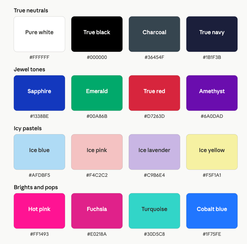
True Neutrals
Your neutrals aren’t beige, cream, or taupe — they’re:
- Pure White — crisp, bright white, not ivory or cream
- True Black — the real deal, not “almost black” charcoal
- Charcoal Gray (cool-toned) — think slate, not warm “greige”
- True Navy — a clean, cool navy, not a faded denim navy
Why these work: they’re high-contrast and undiluted, exactly like your natural colouring. Cream and ivory in particular tend to read as slightly dingy next to a Bright Winter’s cool undertone — they don’t have enough “pop” to hold their own.
Jewel Tones (your bread and butter)
- Emerald Green
- Sapphire / Royal Blue
- Ruby Red
- Amethyst / True Purple
- Fuchsia / Magenta
These are saturated, cool-leaning, and confident — basically the clothing equivalent of your natural contrast level. You can wear these as a statement (full dress, coat, etc.) without them wearing you. Most other seasons need to use jewel tones more sparingly; you get to be generous with them.
Icy Pastels (the detail that changes everything)
This is the one that trips people up, so let’s get specific: there’s a difference between an icy pastel and a dusty pastel, and it’s the difference between a colour that’s been mixed with white versus one that’s been mixed with gray.
- Icy Blue ✅ vs. Dusty Blue ❌
- Icy Pink ✅ vs. Dusty Rose ❌
- Icy Lavender ✅ vs. Mauve ❌
- Icy Yellow (pale, clear, almost lemon-sorbet) ✅ vs. Buttercream/Vanilla ❌
Icy pastels still have clarity — they’re just lighter versions of clear colours. Dusty pastels have had their saturation turned down, which is exactly the quality that fights your natural vividness. If you’re shopping and a pastel feels “chalky” or “soft-focus,” that’s probably the dusty version. If it feels like it has a little sparkle or light to it even though it’s pale, that’s your icy version.
Brights & Pops
- Hot Pink
- Electric/Cobalt Blue
- True Turquoise
- Bright True Red (a clean red — not brick, not orange-leaning, not blue-burgundy)
These are your “I forgot my outfit needed a personality” colours. A hot pink bag, a cobalt scarf, a red lip — these aren’t “bold choices” for you, they’re basically your neutrals in disguise.
A Starter Palette
| Colour | Hex | Notes |
|---|---|---|
| True Red | #D7263D | Clean, slightly cool red |
| Royal/Sapphire Blue | #1338BE | Rich, jewel-toned |
| Emerald Green | #00A86B | Vivid, cool-leaning green |
| Fuchsia | #E0218A | Confident pink-purple |
| True Purple | #6A0DAD | Deep amethyst |
| Hot Pink | #FF1493 | A true pop |
| Turquoise | #30D5C8 | Bright, clear blue-green |
| Ice Blue | #AFDBF5 | Pale but crisp |
| Ice Pink | #F4C2C2 | Pale but clear |
| Ice Lavender | #C9B6E4 | Soft but not dusty |
| Pure White | #FFFFFF | Crisp |
| True Black | #000000 | Sharp |
| Charcoal | #36454F | Cool, slate-based |
| True Navy | #1B1F3B | Clean and deep |
Part 3: The “It’s Not You, It’s the ColoUr” List
Every season has colours that just don’t return the favour, and for Bright Winter, it’s anything muted, dusty, or earthy. These colours are lower in saturation than your natural colouring, which means next to your face, they can look a bit flat or grayed-out — and worse, they can pull that flatness onto your skin.
Colours to be cautious with:
- Dusty rose, mauve, dusty lavender — too soft/grayed
- Sage green, olive, moss — too muted and warm
- Mustard, camel, tan, terracotta, rust — warm and earthy, working against your cool-clear lean
- Cream, ivory, oatmeal — not enough contrast or brightness
- Warm “millennial” beige/greige — same issue as cream, just trendier
A quick gut-check: if a colour reminds you of a latte, a desert landscape, or “quiet luxury” Pinterest boards — it’s probably not your best friend. (It might be gorgeous on someone else! Just maybe not as a “wear it right against your face” choice.)
The fix isn’t “never wear these colours.” It’s: if you love sage green, wear it further from your face (a bag, shoes, pants) and let a true-colour top or scarf do the work near your face. Or look for the “Bright Winter version” of the colour you’re drawn to — instead of sage, try emerald; instead of dusty rose, try fuchsia or true red; instead of camel, try charcoal or true navy.
Part 4: Pattern Play — Best Prints & Patterns (and Why)
Here’s the underlying logic for patterns, and it’s the same logic as everything else: patterns should match your contrast level.
What works for you:
- High-contrast prints — black and white anything (stripes, polka dots, houndstooth, graphic florals)
- Colour-blocking — large, distinct blocks of saturated colour
- Bold geometric prints — sharp lines, clean shapes
- Graphic florals — think vivid flowers on a stark background (black, white, or jewel-toned), not a “wallflower” print
- Larger-scale prints generally — you have the visual presence to carry them, and small busy prints can get visually “lost” against your features
What tends to fight you:
- Watercolour or “blended” prints — soft edges, blurred transitions
- Tonal prints — patterns where everything is close in colour/value (e.g., cream-on-cream florals)
- Small, busy, low-contrast “ditsy” florals — the kind you’d find on a cottage-core tea dress
- Faded or “vintage-look” prints — anything deliberately muted to look worn-in
Why: a soft, blended pattern essentially asks your eye to relax and blur things together — but your face is doing the opposite (it’s sharp and defined). The result is a visual disagreement between your face and your outfit, and your face usually loses that argument. A bold, high-contrast pattern, on the other hand, is speaking the same visual language as your features — so instead of competing, it frames you.
Part 5: Metal Detector — Best Metals & Jewelry (and Why)
Best Metals
- Silver
- Platinum
- White Gold
- Chrome / Gunmetal (great for a more edgical look)
These cool, polished metals echo both halves of your “Bright Winter equation” — they’re cool-toned (matching your undertone) and high-shine (matching your clarity). A polished silver piece basically functions like a mini exclamation point.
Yellow Gold — It’s Complicated (But Not Off-Limits)
Here’s the nuance: bright, polished, high-shine yellow gold can absolutely work — especially in clean, simple shapes (a sleek bangle, simple hoops). What doesn’t work as well is antiqued, brushed, matte, or “old gold” finishes — those have a softness and warmth that pulls in the opposite direction from your natural clarity.
Rose gold is generally the trickiest of the bunch — its warm-meets-muted quality tends to look a little “off” next to cool-clear colouring. Not a crime to own it, just maybe not your most flattering everyday metal.
Gemstones
Lean into clear, bright stones: diamonds, white sapphire, emerald, ruby, sapphire, amethyst, garnet. These have the same saturated clarity as your colour palette. Matte or “earthy” stones — turquoise (matte finish), jasper, tiger’s eye, unpolished amber — tend to read as muted, same issue as the muted clothing colours above.
Part 6: Face Value — Your Makeup Roadmap
This is where things get really practical, so let’s go product by product.
Foundation & Concealer
Your undertone is cool-to-neutral, so:
- Look for foundations labeled “neutral” or “cool” rather than “warm” or “golden”
- Be cautious of formulas that oxidize warm/orange over time — if a foundation looks great at 9am and weirdly golden by 1pm, that’s oxidation working against your undertone
- Finish matters: a satin or natural-luminous finish tends to flatter you more than a full, flat matte. Full matte can dull the natural “lit from within” quality that’s part of your clarity — you don’t need to fight shine, you need to manage it
- For concealer, stick with cool/neutral tones; avoid heavily peach- or orange-based correctors unless you’re specifically colour-correcting, and even then, keep it minimal and blend well
Blush
Think “slapped cheek,” not “sun-kissed.”
- Best: clear pinks, berry, fuchsia, cool-toned rose (the bright kind, not the dusty kind — same rule as the clothing palette!)
- Approach with caution: peachy, terracotta, or bronze-toned blushes — these can look a little muddy rather than fresh on you
- A vivid blush shade that might look “too much” swatched on your hand often looks completely normal — even subtle — on your actual cheek, because it’s matching your natural contrast
Bronzer
Controversial opinion (in the nicest way): bronzer is not really your friend, and that’s okay.
Bronzer is, by nature, a warm, low-saturation product — pretty much the opposite of your colour profile. If you love the look bronzer gives (definition, a little glow), consider:
- A cool-toned contour shade instead of a true bronzer
- Adding warmth via blush placement rather than an all-over bronze wash
- If you must bronze, go lighter-handed than you think, and avoid anything with strong orange or terracotta undertones
Lips
This is one of your superpowers. Bold lip colour is basically a Bright Winter neutral.
- Best: true red (blue-based red), berry, fuchsia, bright pink, deep plum/wine, cool-toned coral (coral with pink in it, not orange)
- Approach with caution: brown-nude, terracotta, muted “my lips but better” mauve shades — these can look a little flat or even slightly “bruised” against your natural contrast
- If you’re a “no lipstick most days” person — even a tinted lip balm in a clear berry or pink tone will do more for you than a beige one
Eyes — Shadow
- Best: jewel tones (sapphire, emerald, amethyst), true black, charcoal/graphite, icy silver or platinum shimmer, cool-toned taupe (if you want a neutral, make sure it’s the cool/gray-based version, not warm/brown-based)
- Approach with caution: warm browns, golds, oranges, terracotta — these tend to look heavy or muddy rather than warm-and-glowy on you
- A navy or charcoal smoky eye reads as elegant on you in a way it might read as “harsh” on a softer-colouring person — lucky you
Eyes — Liner & Mascara
- Black and navy/charcoal liners give you the definition that matches your natural contrast — no need to “soften” with brown
- For a fun twist, jewel-toned liners (emerald, sapphire, deep purple) along the lower lash line can be a great low-commitment way to incorporate your colours
- Mascara: black is your friend here too — it’s not about needing drama, it’s about matching the contrast that’s already happening on your face
Brows
- Look for cool-toned brow products — ash brown, soft black, taupe-gray — matching the natural coolness of your hair colour
- Avoid warm, red, or auburn-leaning brow shades, which can look a little disconnected from the rest of your colouring
Highlighter
- Cool-toned, icy, or “white gold” finishes generally outperform golden/champagne highlighters
- If you love a champagne highlighter, look for one that leans more “white gold” / silvery-champagne than “warm honey”
Part 7: Through the Looking Glass — Eyewear
Glasses (and sunglasses) sit right on your face all day, so the same rules apply, just with extra importance.
Best Frame ColoUrs
- Black — an easy, chic, high-contrast classic for you
- Cool-toned tortoise (a tortoiseshell with more gray/black in the mix, less golden/amber)
- Red
- Jewel tones — emerald, sapphire, deep purple frames can look so fantastic
- Clear/crystal — surprisingly versatile, has that “clarity” quality built right in
- Silver, gunmetal, or chrome metal frames
Frames to Approach with Caution
- Warm, golden-heavy tortoiseshell
- Rose gold metal frames
- Beige, camel, or muted pastel frames
The logic is identical to clothing: high-contrast frames frame (pun intended) your features the way they’re “designed” to be framed. Soft, warm, or muted frames can make your whole face look a little less defined — which sounds dramatic for a pair of glasses, but it’s really noticeable.
Part 8: Crowning Glory — Hair ColoUr
If you colour your hair (or are thinking about it):
- Cool-based browns and blacks tend to look the most seamless — think espresso, blue-black, soft black, ash brown
- Avoid warm gold, copper, or auburn tones unless you’re going for an intentional, high-fashion contrast statement (it can be done, but it’s a deliberate choice, not a “safe” one)
- Going lighter? Keep it cool — icy or ash blonde rather than golden or honey blonde. A pure platinum or icy blonde can look incredible on a Bright Winter because it’s essentially an “icy pastel” for your hair
- Fashion colours: jewel tones (deep wine/burgundy, blue-black with a hint of blue, even a peekaboo of cobalt or emerald) suit your “go bold or go home” energy
A note on gray hair
If your natural gray/silver is coming in (or you’re considering letting it) — good news. Gray and silver are literally in your colour family. Many Bright Winters look more striking with silver hair than they did with their original colour, simply because gray reads as another cool, icy neutral. If you’ve been dreading the transition, you might end up loving it.
Part 9: Fingertips — Nail Polish
- Best: true red, fuchsia, cobalt, emerald, bright berry, classic black, icy white, silver
- Approach with caution: dusty/muted shades, mauve, taupe, milky “barely-there” nudes — these can look a bit lifeless on you
- French manicure tip: go for a bright white tip rather than a cream/ivory tip, paired with a clear or pale pink base
Bottom line: a very bold nail colour functions like a neutral for you. If you’ve been gravitating toward “safe” nude nails because they “go with everything” — a clear red or cobalt blue probably goes with more of your wardrobe than you’d think, because your wardrobe should be full of clear, saturated colours too.
Part 10: Texture & Fabric Talk
This one doesn’t get covered enough, so let’s dig in.
Fabrics that flatter:
- Smooth, crisp, structured fabrics — satin, silk, smooth cotton, structured wool, leather, patent leather
- A bit of shine or sheen generally works in your favor (within reason — this isn’t a “go full sequins to brunch” mandate, unless you want to, in which case, go for it)
Fabrics to be more thoughtful with:
- Nubby, textured, or fuzzy fabrics — tweed, boucle, mohair, chunky cable-knit, raw/textured linen, distressed denim
These textures have a “softening” visual effect — kind of like the fabric equivalent of a dusty colour. That doesn’t mean you can never wear a chunky sweater (please, it’s a sweater, wear it). It just means: if you’re drawn to heavily textured pieces, try to choose them in your better colours (a chunky knit in true red or charcoal rather than oatmeal), so the texture’s softening effect doesn’t compound with a colour that’s already working against you.
Part 11: Putting It All Together — Styling Tips
A few practical, “use this on a Tuesday morning” takeaways:
- Contrast is your friend in outfit-building, not just colour choice. Pairing a dark piece with a light piece (black + white, navy + ice blue, charcoal + emerald) tends to look more “you” than an all-one-tone-family outfit.
- A pop near your face changes everything. If you’re wearing a more muted or neutral outfit (it happens — laundry day exists), a scarf, earrings, or lip colour in a true/clear shade near your face can do a lot of heavy lifting.
- “True” versions of neutrals, always. True navy instead of washed navy, true black instead of “almost black,” true white instead of cream — this one swap alone will upgrade most of your wardrobe basics.
- You can wear a LOT of colour at once, and in larger doses, than a lot of “matching tips” articles suggest. A full emerald dress, a cobalt suit, an all-fuchsia look — these aren’t “bold fashion risks” for you specifically, they’re just… your colours, at full volume.
- When in doubt, hold it up and check your face, not the fabric. The test isn’t “is this colour pretty” (almost everything is pretty!) — it’s “does my face look more awake, or less, when this is near it?” Trust that feeling. It’s doing real colour science even if it feels like vibes.
Part 12: Common Pitfalls (a.k.a. “Oh, That’s Why”)
A few patterns we see a lot with Bright Winters specifically:
- Defaulting to “classic” neutrals like camel, cream, and beige because they’re marketed as foolproof — they’re just not foolproof for you.
- Going soft with pastels — choosing the creamy/dusty version of a pastel instead of the icy version, then wondering why the “pretty spring colour” doesn’t feel as good on as it looks on the hanger.
- Playing it safe with makeup — sticking to “my lips but better” nude shades and soft browns when your skin really lights up with more saturated colour.
- Following muted colour trends (sage green, terracotta, dusty everything) because they’re everywhere — they can be everywhere and not be for you. Both things are true.
- Avoiding “loud” colours out of habit — when, for you, loud is just… normal volume.
Quick-Reference Cheat Sheet
| Category | Yes, Please | Approach with Caution |
|---|---|---|
| Neutrals | True white, true black, charcoal, true navy | Cream, ivory, beige, camel |
| Standout colours | Jewel tones, true red, hot pink, cobalt, emerald | Dusty rose, sage, mustard, terracotta |
| Pastels | Icy pastels (blue, pink, lavender, yellow) | Dusty/creamy pastels |
| Patterns | High-contrast, colour-blocked, bold geometric | Watercolour, tonal, faded vintage |
| Metals | Silver, white gold, platinum, gunmetal | Antique/brushed gold, rose gold |
| Foundation | Neutral/cool undertone, satin finish | Golden/warm undertone, flat matte |
| Blush | Clear pink, berry, fuchsia | Peach, terracotta, bronze |
| Lipstick | True red, berry, fuchsia, plum | Brown-nude, terracotta |
| Eyeshadow | Jewel tones, black, charcoal, icy silver | Warm brown, gold, orange |
| Eyewear | Black, jewel tones, clear/crystal, silver metal | Warm tortoise, rose gold, beige |
| Hair colour | Cool brown/black, ash/icy blonde, jewel fashion colours | Warm gold, copper, auburn |
| Fabrics | Smooth, crisp, satin, leather | Tweed, boucle, raw linen |
A Final Word
If there’s one thing to take away from all of this, it’s this: the colours that make you look “tired” or “washed out” were never a reflection of you — they were just a mismatch between their volume and yours. Your job isn’t to tone yourself down to match quieter colours. It’s to keep reaching for the colours that are already speaking your language.
And honestly? That’s kind of a fun assignment.
