Bright Spring: Your Complete Colour Guide
So, the results are in: you’re a Bright Spring!
Which means your colouring belongs to the most vivid, high-energy corner of the Spring family — warm, clear, colourful, and apparently unwilling to let a perfectly good shade fade quietly into the background.
Bright Spring does not do vague.
Coral is coral. Turquoise has turned up early. Green looks freshly polished. Yellow has excellent posture. Even your neutrals seem to have had a coffee and remembered why they came.
Your palette is the visual equivalent of opening the curtains on a sunny morning and discovering that someone has already arranged fresh flowers, sliced the fruit, and put on a playlist with suspiciously good energy.
Bright Spring sits within the Spring family, but close to Winter. That means your colouring is fundamentally:
- Very clear and highly saturated in chroma
- Neutral-warm in undertone
- Medium in overall value
Clarity leads the entire operation.
Unlike True Spring, you need more intensity. Unlike Light Spring, you are not easily overwhelmed by stronger colour. And unlike Bright Winter, your palette carries warmth, light, and a distinctly sunlit quality rather than icy sharpness.
Your best colours are vivid without becoming fluorescent, warm without becoming earthy, and strong without turning dark or severe.
Think hot coral rather than dusty rose. Clear turquoise rather than smoky teal. Apple green rather than olive. Poppy red rather than burgundy. Bright, not blinding. Warm, not baked.
In other words: clear, colourful, polished, and suspiciously capable of making everyone else’s “statement colour” look like it has forgotten its lines.
Let’s get into what that actually means for your wardrobe — because once you realise that the loud-looking colour on the hanger may be your version of perfectly normal, shopping becomes considerably more entertaining.
Part 1: What Being a Bright Spring Actually Means
Colour analysis looks at three main things about your natural colouring — your skin, hair, and eyes working together:
- Temperature — are your undertones warmer or cooler?
- Value — is your overall colouring lighter or deeper?
- Clarity — is your colouring clearer and more vivid, or softer and more muted?
For you, the strongest and most important quality is clarity.
Your natural colouring is supported by colours that are clean, saturated, and visibly alive. These shades contain very little grey, brown, or faded softness.
A colour should look recognisable and intentional.
Your pinks should still look pink. Your greens should still look green. Your blues should not appear to have been left beside an old curtain for several years.
Muted colours may lower the definition in your features, making the complexion look duller or less even. Clear colours tend to bring everything back into focus.
Your second quality is your neutral-warm temperature.
You belong to Spring, so warmth matters. Peach, coral, tomato red, fresh green, golden yellow, and warm turquoise all connect naturally with your colouring.
However, because you sit close to Winter, your warmth is not always overtly golden.
You can wear some colours that approach neutral:
- Clear red
- Strong turquoise
- Cobalt-teal
- Bright violet
- Crisp navy
- Fuchsia-coral
- Clear emerald
The key is that they remain vivid and avoid becoming strongly icy or blue-based.
Your third quality is your medium value.
You are not primarily light or deep. This gives you access to:
- Bright medium shades
- Clear light accents
- Some darker anchors
- High-contrast combinations
- Strong jewel-like colour
Very pale colours may lack enough pigment, while near-black colours may become heavy. Your easiest colours usually sit in the bright middle of the value scale.
Here is the easiest way to picture your palette:
Imagine a tropical garden beneath clear sunlight.
The flowers are coral, poppy red, hot pink, and orange. The leaves are brilliant green. The water is turquoise. The sky is an intense, warm blue. Everything is vivid, but the warmth keeps it joyful rather than icy.
A few other things worth knowing:
- Bright Spring can appear across many skin tones, hair colours, and eye colours. It is not one fixed combination of features.
- Bright does not mean neon. Your colours are saturated, but fluorescent shades may still become artificial.
- Warm does not mean muted or brown. Your palette is one of the least earthy parts of the warm spectrum.
- Your Winter influence is useful, but it does not make you cool. You can borrow contrast and intensity, but Winter’s iciest shades may disconnect from you.
- Darkness is not the same thing as strength. A vivid coral may have more impact on you than a blackened burgundy.
- Mutedness is often more difficult than warmth or depth. A slightly cool but crystal-clear shade may sometimes work better than a warm shade buried beneath grey.
The central rule is simple:
Keep it clear, keep it lively, and make sure the warmth has not disappeared completely.
Part 2: Your Power Palette — Best Colours (and Why)
The unifying theme of your palette is high-impact colour with warm, sunlit clarity.
Your best shades are not faded, dusty, brown, smoky, or shy. They have visible pigment and clean edges.
They look fresh, purposeful, and fully briefed.
The Crisp, Warm-Neutral Neutrals
- Bright Ivory — clean and warm without becoming creamy or dull
- Warm White — fresher than cream, softer than optic white
- Golden Beige — a clear, lively beige without grey
- Warm Charcoal — deep enough to anchor without becoming blue-black
- Warm Navy — rich, slightly greened, and less severe than cool navy
- Dark Chocolate — a clear, polished brown without muddy softness
These neutrals work because they support your warmth while maintaining clarity.
Bright ivory and warm white give you crispness without the icy effect of optic white. Golden beige creates warmth without the muted quality of greige.
Warm navy is especially useful because it provides depth and contrast without the hardness of black. Dark chocolate can work when it remains clean, glossy, and rich rather than dusty.
You may also suit:
- Clear camel
- Cognac
- Warm stone
- Bright tan
- Deep teal used as a neutral
- Warm black in smaller amounts
Your neutrals are supporting actors.
They should provide structure, not insist that the entire production become a beige period drama.
Corals, Pinks & Magentas
- Hot Coral
- Bright Coral
- Warm Fuchsia
- Watermelon
- Geranium Pink
- Clear Salmon
- Flamingo Pink
- Bright Peach Pink
This is one of your strongest colour families.
Hot coral combines Spring warmth with the intensity your colouring needs. Warm fuchsia reflects your Winter influence while retaining enough red or coral warmth.
Watermelon and geranium pink offer slightly more balanced options. Flamingo pink creates playful impact without needing to become blue-magenta.
Be cautious with:
- Dusty rose
- Grey mauve
- Cool magenta
- Pale blush
- Browned salmon
- Burgundy pink
Your pink should look like flowers, tropical fruit, or a very cheerful lipstick display.
It should not look as though it has been politely muted for an office waiting room.
Reds
- Poppy Red
- Clear Red
- Tomato Red
- Geranium Red
- Coral Red
- Bright Cherry
- Persimmon Red
- Warm Raspberry Red
Your reds should remain clear, bright, and warm or neutral-warm.
Poppy red is one of your signature colours. It has enough warmth for Spring and enough clarity to reflect your Bright influence.
Clear red and bright cherry may sit closer to neutral, making them useful when you want a slightly sharper effect. Tomato and coral reds add more warmth.
Avoid:
- Rust
- Brick
- Oxblood
- Burgundy
- Brown-red
- Black cherry
- Dusty cranberry
Your red should look freshly painted.
Not inherited with an oak dining room.
Oranges
- Tangerine
- Clear Orange
- Papaya
- Nectarine
- Bright Apricot
- Orange Coral
- Persimmon
- Mango
Orange can look exceptionally harmonious because it naturally combines warmth with high chroma.
Tangerine and clear orange create maximum impact. Papaya and mango provide slightly softer, fruitier options.
Bright apricot works when you want warmth without full orange intensity.
Avoid:
- Burnt orange
- Dark rust
- Brown pumpkin
- Muted terracotta
- Copper-brown
- Muddy paprika
You want fruit.
Not a heritage brick sample.
Yellows
- Clear Yellow
- Daffodil
- Sunflower
- Warm Lemon
- Golden Yellow
- Bright Primrose
- Pineapple
- Fresh Marigold
Yellow is one of your strongest families because it reflects both warmth and clarity.
Clear yellow and daffodil offer freshness. Sunflower and golden yellow create richer impact. Warm lemon is especially useful because it preserves clarity without becoming icy.
Avoid:
- Dusty mustard
- Brown ochre
- Pale buttercream
- Grey-yellow
- Very dark antique gold
- Fluorescent highlighter yellow
Your yellow should look cheerful and intentional.
It should not require a hard hat.
Greens
- Apple Green
- Kelly Green
- Fresh Grass
- Bright Jade
- Clear Emerald
- Leaf Green
- Chartreuse Green
- Tropical Green
Green is one of your broadest and most exciting families.
Apple and grass green reflect Spring freshness. Bright jade and clear emerald bring in some Winter-like polish. Kelly green provides strong medium colour.
Chartreuse may work because your palette can support both warmth and saturation, but it should remain green-dominant rather than aggressively yellow.
Avoid:
- Dusty sage
- Grey eucalyptus
- Muddy olive
- Black forest
- Muted moss
- Khaki
- Faded military green
Your green should look newly grown, freshly polished, or possibly capable of photosynthesis.
Blues & Blue-Greens
- Clear Turquoise
- Bright Aqua
- Peacock Blue
- Warm Cobalt
- Tropical Teal
- Marine Blue
- Clear Sky Blue
- Blue-Green
Because blue is naturally cool, your best blues usually contain some warmth, green, or brilliant clarity.
Clear turquoise is one of your strongest shades. Bright aqua adds lightness. Peacock and tropical teal provide depth without becoming smoky.
Warm cobalt may work because your Winter influence supports intensity, provided the blue is not too icy or violet.
Clear sky blue can also work when it remains saturated enough.
Avoid:
- Dusty blue
- Steel blue
- Grey navy
- Smoky teal
- Icy powder blue
- Blue-violet
- Faded denim
- Blackened navy
Your blue should look like a swimming pool in excellent weather.
Not the North Atlantic during a difficult documentary.
Purples
- Bright Orchid
- Warm Violet
- Red-Purple
- Clear Grape
- Hot Lavender
- Warm Amethyst
- Fuchsia-Purple
- Bright Aubergine
Purple can be slightly trickier because many shades lean strongly cool.
Your best purples contain enough red, warmth, or clarity to remain connected.
Bright orchid is particularly strong. Warm violet and clear grape provide rich colour. Hot lavender offers a lighter, more playful option without becoming icy.
Avoid:
- Dusty mauve
- Grey lavender
- Blue-violet
- Black-purple
- Smoky plum
- Pale lilac
- Muted aubergine
Your purple should look floral, jewel-like, or cheerfully dramatic.
Not like a velvet sofa in a room nobody uses.
Clear Light Colours
- Bright Ivory
- Warm White
- Clear Peach
- Light Aqua
- Fresh Mint
- Warm Lemon
- Clear Pink
- Bright Periwinkle
Your lighter shades need enough pigment to avoid disappearing.
Unlike Light Spring, you are not at your best in extremely delicate pastels. Choose light colours that remain crisp and visibly coloured.
Your version of a pastel may look almost icy in clarity, but it should retain warmth:
- Peach rather than frost pink
- Aqua rather than ice blue
- Warm lemon rather than blue-yellow
- Mint rather than grey sage
- Bright periwinkle rather than smoky lavender
Jewel-Like Spring Colours
- Clear Emerald
- Peacock
- Warm Sapphire
- Bright Amethyst
- Ruby-Coral
- Hot Pink
- Deep Turquoise
- Clear Jade
Your proximity to Winter gives you access to jewel-like intensity, provided the colours do not become too dark or cold.
These shades work beautifully in dresses, coats, tailoring, accessories, makeup, and evening wear.
The best versions remain:
- Luminous
- Clearly coloured
- Warm or neutral-warm
- Medium-to-deep rather than near-black
- Free from smoky or brown undertones
Deeper Accent Colours
- Warm Navy
- Deep Peacock
- Dark Chocolate
- Clear Aubergine
- Warm Charcoal
- Deep Jade
- Cognac
- Bright Burgundy-Coral
You can wear more depth than other Spring palettes, but the shade should retain clarity.
Warm navy works better than midnight navy. Deep jade works better than black forest. Clear aubergine works better than brown plum.
Depth may participate.
It simply should not turn off all the lights.
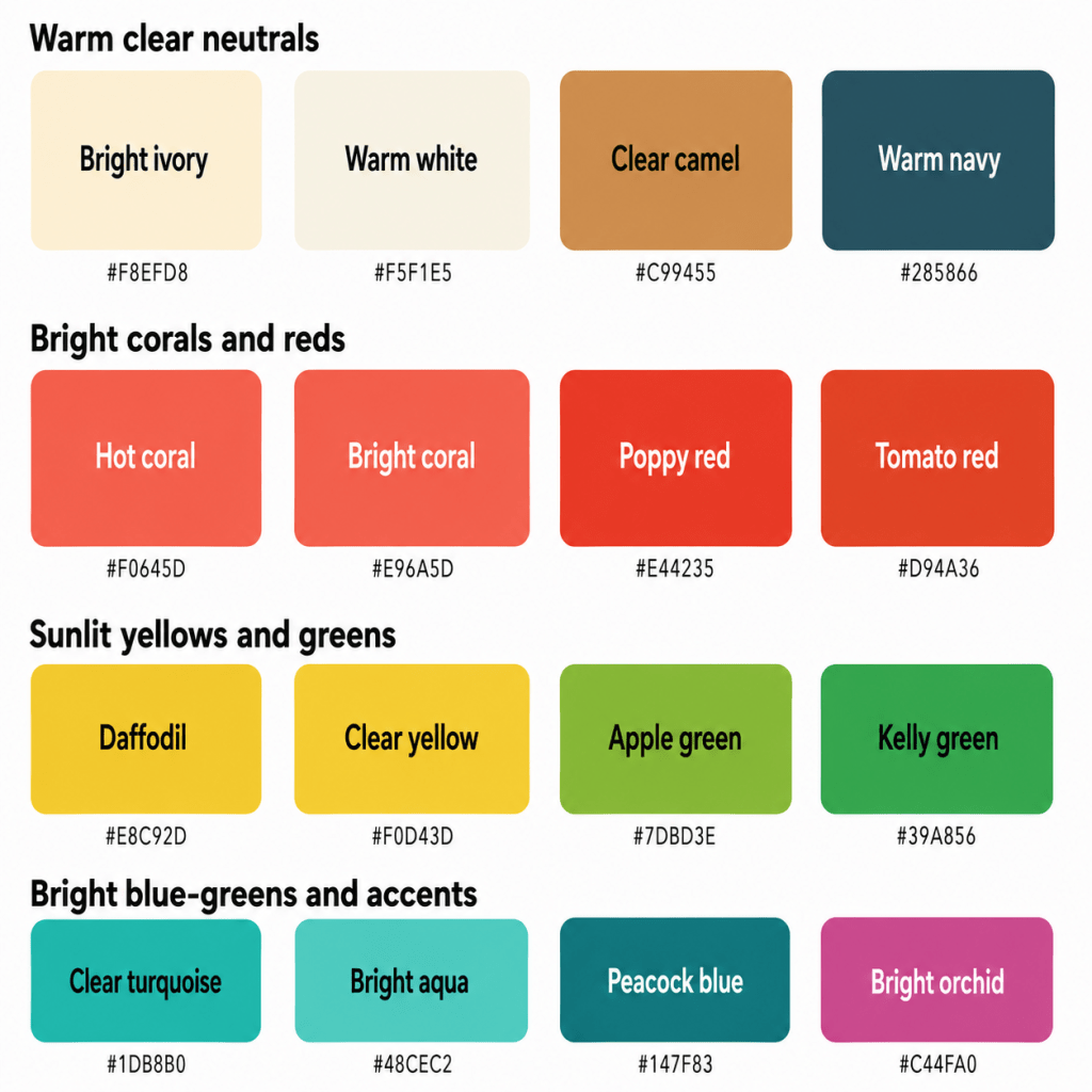
A Starter Palette (with hex codes, for your reference)
| Colour | Hex | Notes |
|---|---|---|
| Bright Ivory | #F8EFD8 | Crisp warm light neutral |
| Warm White | #F5F1E5 | Clean without icy sharpness |
| Golden Beige | #D8B47E | Clear practical neutral |
| Clear Camel | #C99455 | Warm but not muted |
| Warm Navy | #285866 | Deep blue-green neutral |
| Dark Chocolate | #4D332C | Rich polished brown |
| Hot Coral | #F0645D | Signature high-impact coral |
| Bright Coral | #E96A5D | Warm and clear |
| Warm Fuchsia | #D93F7D | Vivid pink with warmth |
| Watermelon | #E65870 | Fresh balanced pink |
| Geranium Pink | #D94A69 | Clear floral pink |
| Flamingo Pink | #EF6681 | Playful bright pink |
| Poppy Red | #E44235 | Clear warm red |
| Tomato Red | #D94A36 | Warm statement red |
| Bright Cherry | #D9364E | Clear neutral-warm red |
| Persimmon | #E3643C | Strong orange-red |
| Tangerine | #F0782F | Clear energetic orange |
| Papaya | #ED8A43 | Lively fruit orange |
| Clear Yellow | #F0D43D | Bright warm yellow |
| Daffodil | #E8C92D | Fresh golden yellow |
| Apple Green | #7DBD3E | Signature clear green |
| Kelly Green | #39A856 | Strong medium green |
| Bright Jade | #28A477 | Polished green |
| Clear Emerald | #169263 | Jewel-like but warm |
| Clear Turquoise | #1DB8B0 | Bright blue-green |
| Bright Aqua | #48CEC2 | Fresh and luminous |
| Peacock Blue | #147F83 | Deep clear blue-green |
| Bright Orchid | #C44FA0 | Warm vivid purple |
Part 3: The “Handle With a Little Extra Care” List
This is not a list of colours you must remove while a turquoise handbag supervises the process.
These are simply shades that sit further away from your combination of high clarity, neutral warmth, and medium value.
The Most Muted, Dusty Colours
- Dusty rose
- Grey mauve
- Faded sage
- Smoky blue
- Weathered teal
- Mushroom
- Dusty lavender
- Soft khaki
- Browned coral
Mutedness is usually your biggest challenge.
These colours contain enough grey or brown to lower their visual energy. Against your clear colouring, they may make your features appear duller or less defined.
Choose:
- Hot coral instead of dusty rose
- Bright orchid instead of mauve
- Apple green instead of sage
- Clear turquoise instead of smoky teal
- Warm cobalt instead of faded blue
Your colour should look awake.
It does not need to look as though it has just completed a twelve-hour webinar.
The Darkest, Blackened Colours
- Jet black
- Blue-black
- Midnight navy
- Oxblood
- Black forest
- Espresso
- Black-purple
- Deep burgundy
- Near-black charcoal
You can carry depth better than many Springs, but near-black colours may become heavy.
Choose:
- Warm navy instead of midnight
- Dark chocolate instead of espresso
- Clear aubergine instead of black-purple
- Deep jade instead of black forest
- Bright cherry instead of burgundy
Cool, Icy Colours
- Icy blue
- Steel grey
- Silver-white
- Cool magenta
- Blue-violet
- Blue-red
- Icy lavender
- Cool charcoal
- Pure optic white
Because your Winter influence is strong, some clear cool shades may look surprisingly good.
However, the most icy versions can still drain warmth from your complexion.
Choose:
- Bright aqua instead of ice blue
- Warm fuchsia instead of cool magenta
- Bright orchid instead of blue-violet
- Poppy red instead of blue-red
- Warm white instead of optic white
Heavy Autumn Colours
- Rust
- Burnt orange
- Deep mustard
- Dark olive
- Mahogany
- Tobacco
- Bitter chocolate
- Brown terracotta
- Muted pumpkin
These colours may be warm enough but too muted, deep, or brown.
Choose:
- Tangerine instead of rust
- Clear yellow instead of mustard
- Apple green instead of olive
- Dark chocolate instead of mahogany
- Persimmon instead of brown terracotta
Autumn has provided warmth.
It has not been asked to apply a sepia filter.
The Palest, Weakest Pastels
- Near-white pink
- Pale cream
- Washed mint
- Barely-there peach
- Powder blue
- Soft grey lavender
- Colourless beige
- Extremely pale yellow
A colour can become too diluted to match your natural intensity.
Choose light colours with visible pigment:
- Clear peach
- Light aqua
- Warm lemon
- Fresh mint
- Clear pink
- Bright periwinkle
Your pastel should still remember which colour family it belongs to.
Extremely Fluorescent Colours
- Highlighter yellow
- Neon green
- Fluorescent orange
- Laser pink
- UV purple
- Electric blue
Bright Spring can handle enormous saturation, but fluorescent colour may still look synthetic.
Choose clear, saturated versions that remain connected to natural colour:
- Daffodil rather than highlighter yellow
- Apple green rather than neon
- Tangerine rather than fluorescent orange
- Hot coral rather than laser pink
- Bright orchid rather than UV purple
The colour may be visible across the room.
It does not need to be detectable from space.
Muddy Warm Neutrals
- Greige
- Mushroom
- Dusty camel
- Grey taupe
- Muddy tan
- Faded khaki
- Browned olive
- Oatmeal
Your neutrals still need clarity.
Choose:
- Golden beige
- Clear camel
- Cognac
- Warm navy
- Dark chocolate
- Bright ivory
- Warm stone
How to Make a Less-Ideal Colour Work
You have several options:
- Move it away from your face
- Pair it with one of your clearest colours
- Use it in a smaller proportion
- Choose a brighter or warmer version
- Add polished gold jewellery
- Place a coral, turquoise, or ivory neckline near your face
- Add clear lipstick or blush
- Use the colour in trousers, shoes, belts, or bags
- Increase contrast elsewhere in the outfit
- Keep the overall effect crisp
The goal is not wardrobe obedience.
It is knowing how to stop one dusty cardigan from lowering the entire room’s enthusiasm.
Part 4: Pattern Play — Best Prints & Patterns (and Why)
Bright Spring patterns work best when they reflect the same qualities found in your solid colours:
- High clarity
- Warm or neutral-warm temperature
- Medium-to-high contrast
- Distinct colour separation
- Energetic visual rhythm
- Clean rather than blurred edges
What Works for You
Clear, High-Energy Patterns
Think:
- Coral and turquoise
- Apple green and warm white
- Poppy red and golden beige
- Fuchsia and warm navy
- Yellow and peacock
- Orange and jade
These combinations reflect your colourfulness without becoming icy.
Colour Blocking
Large areas of clear colour work beautifully:
- Hot coral + Turquoise
- Apple Green + Warm Navy
- Poppy Red + Bright Ivory
- Tangerine + Peacock
- Fuchsia + Golden Yellow
- Jade + Warm Cobalt
You can carry combinations that might overwhelm softer palettes.
Your colours are not arguing.
They are networking loudly but effectively.
Bold Florals
Look for:
- Tropical flowers
- Coral petals
- Hot pink blooms
- Bright green leaves
- Turquoise backgrounds
- Yellow centres
- Warm white or navy outlines
- Clear colour separation
Avoid florals that look:
- Dusty
- Faded
- Greyed
- Heavily brown
- Vintage-washed
- Muddy
Graphic Geometrics
Excellent options include:
- Bold stripes
- Colour-blocked checks
- Crisp polka dots
- Clear abstract shapes
- Rounded geometrics
- Warm multicoloured plaid
- Graphic botanical motifs
- Strong borders
Black-and-white may work because of your Winter influence, but warm white and navy or chocolate often create a more connected result.
Tropical & Botanical Prints
Bright Spring is exceptionally suited to:
- Tropical leaves
- Citrus prints
- Bold flowers
- Birds
- Fruit motifs
- Garden patterns
- Warm aquatic imagery
- Colourful abstract nature prints
Keep the colours polished enough that the print looks intentional rather than novelty-heavy — unless novelty-heavy is the whole delightful point.
Animal Prints
Your best animal prints include:
- Golden leopard
- High-contrast warm tortoiseshell
- Cognac-and-chocolate markings
- Bright multicoloured animal print
- Coral or turquoise zebra
- Warm black-and-ivory patterns
- Clear green snake print
Avoid dusty, faded, or excessively dark versions.
Your animal print should look alert, glossy, and very possibly in charge of the group chat.
Patterns Worth a Second Look
- Dusty watercolour prints
- Faded vintage florals
- Grey-on-grey patterns
- Muddy camouflage
- Low-contrast beige motifs
- Dark blackened prints
- Cool icy geometrics
- Tiny indistinct ditsy florals
- Patterns where every colour appears slightly tired
Pattern Scale
Colour analysis does not determine pattern scale by itself; your facial features, proportions, height, personal style, and garment shape also matter.
However, your clarity often works well with:
- Medium-to-large florals
- Strong geometrics
- Distinct motifs
- Clear spacing
- Graphic borders
- Energetic repeats
- Bold colour blocks
Small prints can work when the colours remain crisp and the contrast is visible.
The pattern may speak loudly.
It should simply have something useful to say.
Part 5: Metal Detector — Best Metals & Jewellery (and Why)
Your undertone is neutral-warm, while your clarity supports polished and reflective finishes.
Best Metals
- Bright yellow gold
- Champagne gold
- Polished rose gold
- Shiny copper
- Bright brass
- Polished silver
- Mixed polished metals
- Clear enamel jewellery
Yellow gold reflects your warmth, while its polished finish reflects your clarity.
Champagne gold gives you a slightly softer option. Bright rose gold can work beautifully when it remains pink-gold rather than dusty copper.
Because of your Winter influence, polished silver may also work, especially when combined with warm clothing or colourful stones.
Finish Matters
Your palette favours:
- High polish
- Smooth metal
- Clear shine
- Faceted surfaces
- Bright enamel
- Crisp geometric shapes
- Sparkle
- Clean hammered finishes
Be more cautious with:
- Heavy patina
- Dark antique metal
- Muted brushed finishes
- Tarnished copper
- Rustic hammered pieces
- Blackened metal
Your jewellery should reflect light.
It has no obligation to whisper about its archaeological provenance.
Yellow Gold
Your best gold is:
- Clear
- Polished
- Medium yellow
- Bright rather than antique
- Free from heavy orange or green casts
Dark antique gold may become too muted or heavy.
Rose Gold
Your best rose gold is:
- Bright
- Polished
- Pink-peach
- Clear
- Paired with vibrant stones
Dusty, matte, or heavily coppered rose gold may lose too much clarity.
Silver
Silver can work because Bright Spring sits near Winter.
Choose:
- Polished silver
- White gold
- Chrome accents
- Bright platinum
- Silver paired with coral, turquoise, or green stones
- Mixed gold-and-silver jewellery
Be cautious with dark gunmetal or heavily oxidised silver.
Mixed Metals
Mixed metals can look especially dynamic when the finishes remain polished.
Try:
- Gold and silver
- Rose gold and yellow gold
- Chrome and bright gold
- Tri-colour watches
- Mixed-metal chains
- Polished hardware combinations
Gemstones
Excellent options include:
- Peridot
- Citrine
- Bright turquoise
- Emerald
- Ruby
- Coral
- Carnelian
- Pink tourmaline
- Yellow sapphire
- Warm aquamarine
- Clear amethyst
- Fire opal
- Bright jade
- Blue topaz
- Diamond
Your best stones tend to be:
- Clear
- Saturated
- Faceted
- Luminous
- Warm or neutral-warm
- Visibly coloured
Pearls work beautifully in:
- Bright cream
- Warm white
- Peach
- Golden
- Clear pink
- Multicoloured strands
Pearls may be classic.
That does not mean they cannot turn up wearing coral lipstick and excellent earrings.
Part 6: Face Value — Your Makeup Roadmap
Your most flattering makeup enhances your warmth, clarity, and natural contrast without becoming muddy, pale, or excessively cool.
The goal is clear, lively definition.
A product may look startlingly colourful in the packaging and entirely reasonable once it reaches your face. The packaging is allowed its little moment.
Foundation & Concealer
Look for undertones described as:
- Warm-neutral
- Neutral-warm
- Peach
- Golden-neutral
- Neutral olive, where appropriate
- Warm olive
- Peach-neutral
Because of your Winter influence, some Bright Springs sit close to neutral and may find strongly golden formulas too yellow.
Always test the actual product.
Foundation names remain unreliable witnesses.
Avoid formulas that turn:
- Grey
- Ashy
- Strongly pink
- Blue-cool
- Orange
- Muddy yellow
Natural, satin, and luminous finishes often support your clarity beautifully.
Very flat matte formulas may dull the skin, while extremely wet finishes may compete with your already lively colouring.
Blush
Best blush colours include:
- Hot Coral
- Bright Peach
- Warm Pink
- Geranium
- Watermelon
- Clear Salmon
- Papaya
- Coral Red
A vivid blush can look surprisingly natural when applied lightly.
Be cautious with:
- Dusty rose
- Mauve
- Brown terracotta
- Burgundy
- Grey-pink
- Pale beige blush
- Cool plum
Your blush should make you look lively.
Not as though two faded cushions have been attached to the face.
Bronzer & Contour
You can often wear bronzer beautifully, provided it remains clear rather than muddy.
Try:
- Golden tan
- Warm-neutral bronze
- Clear caramel
- Peach bronze
- Bright honey
- Neutral warm brown
Avoid:
- Grey taupe
- Ash brown
- Dark orange
- Dusty red-brown
- Muddy contour powders
- Very deep bronzer
For contour, try:
- Neutral warm brown
- Clear taupe-brown
- Medium caramel
- Soft cocoa
- Warm mushroom
The goal is dimension.
Not a full structural renovation conducted with brown powder.
Lips
Lip colour is one of your greatest strengths.
Excellent options include:
- Hot Coral
- Poppy Red
- Tomato Red
- Bright Cherry
- Warm Fuchsia
- Watermelon
- Tangerine Red
- Geranium
- Papaya Pink
- Clear Raspberry-Coral
For a natural lip:
- Peach pink
- Clear coral balm
- Warm rose
- Salmon gloss
- Watermelon tint
- Pink-peach nude
- Bright neutral rose
Your nude lipstick should still contain visible colour.
Be cautious with:
- Beige nude
- Grey mauve
- Brown nude
- Dusty pink
- Burgundy
- Oxblood
- Cool magenta
For a statement lip, poppy red, hot coral, warm fuchsia, and bright cherry are excellent.
Bold lipstick is not a costume on you.
It is a weekday with reasonable expectations.
Eyes — Shadow
Excellent eyeshadow colours include:
- Bright Champagne
- Gold
- Peach
- Coral
- Copper
- Warm Taupe
- Clear Bronze
- Apple Green
- Jade
- Turquoise
- Peacock
- Warm Cobalt
- Bright Orchid
- Warm Violet
For an everyday neutral eye, combine champagne, warm taupe, and clear brown.
For colour, try jade, turquoise, warm violet, or peacock.
Be cautious with:
- Dusty mauve
- Grey taupe
- Charcoal
- Smoky brown
- Steel blue
- Muddy olive
- Blackened plum
Eyes — Liner
Best eyeliner colours include:
- Dark Chocolate
- Warm Navy
- Peacock
- Deep Teal
- Bright Plum
- Clear Olive
- Bronze
- Warm Black
- Cobalt-Teal
Black may work because of your Winter influence, particularly in clean, defined applications.
For everyday wear, chocolate, teal, navy, and bronze may feel more connected.
Mascara
Try:
- Black
- Warm black
- Brown-black
- Deep chocolate
- Navy-black
- Teal-black
- Plum-black
Black is often easier for you than for softer Spring palettes because your natural clarity can support definition.
Brows
Choose brow products that are:
- Warm taupe
- Neutral brown
- Golden brown
- Clear brunette
- Warm dark brown
- Auburn-brown, where appropriate
- Neutral deep brown
Avoid:
- Grey
- Charcoal
- Blue-black
- Muted ash
- Very red auburn
- Orange-brown
Brows should create crisp definition while remaining connected to your colouring.
They do not need to look as though two dark caterpillars have been appointed by an outside agency.
Highlighter
Best highlighters include:
- Bright Champagne
- Clear Gold
- Peach Pearl
- Warm Opal
- Rose Gold
- Golden Ivory
- Warm White
- Light Copper-Gold
Because of your clarity, you can support noticeable shine.
Be cautious with:
- Grey highlighter
- Blue pearl
- Dark bronze
- Dusty champagne
- Lavender frost
- Muddy rose gold
Your highlighter should catch the light.
It need not create a distress signal.
Part 7: Through the Looking Glass — Eyewear
Eyewear sits directly on the face, so colour, clarity, and contrast matter.
Your best frames are bright, polished, and clearly defined.
Best Frame Colours
- Bright tortoiseshell
- Clear cognac
- Warm navy
- Turquoise
- Bright teal
- Coral
- Tomato red
- Apple green
- Warm fuchsia
- Golden yellow
- Dark chocolate
- Bright gold
- Polished silver
- Clear crystal
Tortoiseshell
Bright Spring often wears tortoiseshell beautifully when it is:
- Clear
- Golden
- High enough in contrast
- Glossy
- Free from muddy greyness
- Warm without becoming dark brown
Very dusty, matte, or black-dominant tortoiseshell may feel heavy.
Your tortoiseshell should look polished and lively.
Not inherited from a distant uncle who collected maps.
Transparent Frames
Transparent frames can be excellent when they contain:
- Clear coral
- Turquoise
- Apple green
- Warm pink
- Golden amber
- Bright crystal
- Clear navy
- Peach
- Yellow
- Orchid
Completely clear frames can work, particularly when the shape is defined and the finish is glossy.
Frame Contrast
Medium-to-high contrast frames often work well.
Excellent options include:
- Warm navy acetate
- Clear tortoiseshell
- Bright-coloured frames
- Gold wire
- Silver wire
- Transparent saturated colour
- Two-tone designs
Black frames may work when:
- They are glossy
- The shape is clean
- Your features support the contrast
- Warm colour appears elsewhere
- The frame is not excessively heavy
Sunglasses
Try:
- Clear tortoiseshell
- Dark chocolate
- Warm navy
- Gold
- Bright teal
- Coral
- Polished black
- Green lenses
- Warm grey lenses
- Amber lenses
Frames Worth a Second Look
- Dusty beige
- Grey tortoiseshell
- Muted rose
- Soft sage
- Matte taupe
- Gunmetal
- Blue-grey
- Heavy black frames
- Deep burgundy
- Faded translucent frames
Your glasses should frame your face.
They should not look as though someone lowered the saturation before handing them over.
Part 8: Crowning Glory — Hair Colour
Your most harmonious hair colours are warm-neutral, glossy, and clear enough to support your natural chroma.
Because hair surrounds the face, ashy softness, heavy darkness, or muted colour can quickly lower your overall definition.
Best Blonde Shades
- Bright Golden Blonde
- Champagne Gold
- Clear Honey Blonde
- Warm Beige Blonde
- Strawberry Blonde
- Golden Copper Blonde
- Bright Caramel Blonde
- Light Amber Blonde
Your blonde should look luminous rather than dusty.
Avoid:
- Mushroom blonde
- Smoky ash
- Grey beige
- Flat dark blonde
- Silver
- Blue-toned platinum
Some Bright Springs can carry bright platinum because of their Winter influence, but it usually works best when it remains creamy or neutral rather than icy grey.
Best Brunette Shades
- Clear Golden Brown
- Warm Medium Brown
- Bright Chestnut
- Caramel Brown
- Rich Hazelnut
- Clear Chocolate
- Warm Espresso
- Copper Brown
Brunette shades should retain gloss and visible warmth.
Avoid flat ash brown, smoky mushroom, grey-brown, or near-black colours with no dimension.
Red Hair
Bright red hair can look exceptional.
Excellent options include:
- Bright Copper
- Clear Auburn
- Poppy Red-Copper
- Golden Red
- Strawberry Copper
- Ginger
- Coral Copper
- Warm Cherry Red
Avoid:
- Muted rust
- Brown mahogany
- Burgundy
- Violet-red
- Black cherry
- Dusty auburn
The best red should look polished and luminous rather than earthy.
Black Hair
Black can work better for Bright Spring than for other Spring palettes, especially when your natural features already provide strong contrast.
Better versions include:
- Warm black
- Neutral black
- Glossy soft black
- Dark chocolate-black
Blue-black may become too cool, while flat matte black may look heavy.
Fashion Colours
Excellent creative hair colours include:
- Hot Coral
- Bright Peach
- Turquoise
- Apple Green
- Warm Pink
- Tangerine
- Orchid
- Clear Violet
- Peacock
- Golden Yellow
Choose shades that are clear and glossy rather than smoky, dusty, or chalky.
A turquoise panel may look intentional.
Dusty lavender may look as though the toner became discouraged.
Highlights & Balayage
Look for:
- Bright golden ribbons
- Clear caramel highlights
- Honey pieces
- Copper accents
- Strawberry-blonde dimension
- High-gloss warm beige
- Defined face-framing colour
- Medium-to-high contrast placement
Avoid:
- Ashy balayage
- Mushroom colour melting
- Grey-blonde ribbons
- Muted lowlights
- Faded beige highlights
- Very smoky roots
Highlights should create light and definition rather than blur everything together.
Hair Depth & Contrast
You can handle stronger contrast than many Springs.
Before changing significantly, consider:
- Whether the colour remains warm or neutral
- Whether the hair retains shine
- Whether the eyes look brighter
- Whether the skin appears clearer
- Whether the colour is strong rather than heavy
- Whether definition remains visible
A Note on Grey Hair
Natural grey or silver introduces coolness, but your Winter influence can help you carry it.
Excellent approaches include:
- Bright silver
- Clear white
- Champagne silver
- Salt-and-pepper
- Neutral grey
- Silver with golden lowlights
- Bright pewter
- Glossy charcoal-grey used carefully
If the hair becomes very grey, use your best warm, clear colours near the face to preserve Spring energy.
Coral, turquoise, apple green, bright ivory, and gold can look excellent beside silver hair.
Part 9: Fingertips — Nail Polish
Nail polish sits away from the face, which gives you plenty of room to enjoy your brightest colours.
Best Everyday Colours
- Hot Coral
- Poppy Red
- Watermelon
- Warm Fuchsia
- Turquoise
- Apple Green
- Tomato Red
- Bright Peach
- Clear Pink
“Everyday” remains a flexible term. Your palette has reviewed the standard nude manicure and requested more options.
Light Colours
- Bright Ivory
- Clear Peach
- Light Aqua
- Fresh Mint
- Warm Lemon
- Clear Pink
- Bright Periwinkle
- Champagne
Medium Colours
- Tangerine
- Geranium
- Jade
- Kelly Green
- Warm Cobalt
- Bright Orchid
- Coral Red
- Daffodil
Deeper Colours
- Warm Navy
- Peacock
- Dark Chocolate
- Clear Aubergine
- Deep Jade
- Warm Plum
- Cognac
- Deep Teal
Statement Colours
- Neon-adjacent coral
- Multicoloured nail art
- Tropical colour blocking
- Bright chrome
- Gold foil
- Turquoise glitter
- Apple-green French tips
- Warm rainbow designs
Nudes
Your best nude nail colours include:
- Peach Beige
- Clear Pink-Beige
- Golden Nude
- Warm Caramel
- Coral Nude
- Light Cognac
- Apricot Beige
- Warm Rose
Avoid:
- Grey taupe
- Dusty mauve
- Cool beige
- Ash brown
- Milky blue-pink
- Lifeless greige
Metallic Nails
Try:
- Bright Gold
- Champagne
- Rose Gold
- Polished Copper
- Warm Chrome
- Emerald Metallic
- Turquoise Foil
- Coral Shimmer
Gunmetal and blackened silver may feel heavy, but they remain available as deliberate contrast.
French Manicure
For a French manicure:
- Choose warm white or bright ivory tips
- Use a peach, clear pink, or warm nude base
- Try coral, turquoise, apple green, or gold tips
- Keep the contrast clean and lively
Sometimes the goal is a tasteful manicure.
Sometimes the goal is ten tiny tropical cocktails.
Neither requires an apology.
Part 10: Texture & Fabric Talk
Colour does most of the heavy lifting in seasonal analysis, but texture changes how bright, muted, deep, or polished a colour appears.
Bright Spring tends to suit fabrics that are smooth, luminous, crisp, or lively.
Fabrics That Flatter
- Silk
- Satin
- Smooth cotton
- Crisp poplin
- Linen in clear colours
- Polished denim
- Fine wool
- Light leather
- Patent accents
- Sleek jersey
- Crepe
- Taffeta
- Fine knits
- Technical fabrics
- Glossy accessories
These materials preserve clarity.
A coral satin blouse, turquoise silk dress, or apple-green polished cotton jacket can all work beautifully.
Shine
You can handle:
- Satin
- Silk
- Polished leather
- Patent leather
- Sequins
- Metallic thread
- Gloss
- Bright shimmer
- Clear crystal embellishment
Be cautious when several high-intensity elements appear at once.
A hot-pink sequin dress with metallic turquoise boots may be entirely intentional, but it is no longer “just popping out for groceries”.
Matte Fabrics
Matte fabrics can work when:
- The colour remains vivid
- The surface is smooth
- The shape is clean
- Contrast appears elsewhere
- Accessories add polish
A matte poppy-red jacket can look excellent. A dusty coral nubby cardigan may lose too much energy.
Textured Fabrics
Be more thoughtful with:
- Heavy bouclé
- Fuzzy mohair
- Nubby tweed
- Chunky oatmeal knits
- Raw linen in muted colours
- Distressed denim
- Weathered leather
- Slub cotton
Texture softens colour.
Choose textured pieces in:
- Coral
- Apple green
- Turquoise
- Golden yellow
- Warm navy
- Bright ivory
- Tomato red
A chunky turquoise knit retains far more life than a mushroom one.
Structure
Your clarity often works beautifully with:
- Clean tailoring
- Defined seams
- Crisp collars
- Structured bags
- Polished footwear
- Graphic shapes
- Strong shoulders
- Colour blocking
- Sleek jewellery
You can also wear relaxed shapes, provided the fabric and colour remain fresh.
Think polished with enthusiasm.
Not dressed to conduct a serious disciplinary meeting in a room painted greige.
Part 11: Putting It All Together — Styling Tips
Knowing individual colours is useful. Knowing how to combine them is where your palette becomes a wardrobe rather than a magnificent pile of tropical swatches.
Build Around Clear Neutrals
Choose two or three primary neutrals, such as:
- Bright ivory
- Golden beige
- Warm navy
- Dark chocolate
- Clear camel
- Warm white
These give your stronger colours room to work.
For example:
- Warm navy + hot coral + ivory
- Golden beige + apple green + turquoise
- Dark chocolate + tangerine + warm white
- Camel + fuchsia + bright jade
- Ivory + poppy red + peacock
Use Strong Colour Near the Face
Your clearest shades are especially powerful close to the face:
- Coral blouse
- Turquoise scarf
- Apple-green cardigan
- Poppy-red lipstick
- Gold earrings
- Bright ivory neckline
- Warm fuchsia frames
Choose Medium-to-High Contrast
Excellent combinations include:
- Ivory + Warm Navy
- Coral + Turquoise
- Yellow + Peacock
- Apple Green + Dark Chocolate
- Poppy Red + Warm White
- Fuchsia + Golden Beige
For greater drama:
- Warm black + hot coral
- Bright ivory + warm cobalt
- Warm navy + tangerine
- Dark chocolate + vivid aqua
- Peacock + golden yellow
Borrow from Winter Carefully
Because Bright Spring sits near Winter, you can borrow:
- Strong contrast
- Polished surfaces
- Clear jewel tones
- Black in controlled amounts
- Cobalt
- Fuchsia
- Crisp white
- Silver
- Graphic patterns
However, borrow one or two Winter qualities at a time.
For example:
- Black trousers with a coral top
- Cobalt paired with golden beige
- Polished silver worn beside warm pink
- A black-and-ivory pattern with turquoise
- Bright fuchsia in a warm fabric
When coolness, darkness, sharp contrast, and icy shine all appear together, the outfit may move too far into Winter.
Winter has lent you a very good blazer.
It has not asked you to take over the entire board meeting.
Let Coral & Turquoise Do the Work
These are two of your strongest families.
Use:
- Coral for warmth
- Turquoise for contrast
- Aqua for freshness
- Poppy red for energy
- Peacock for depth
- Warm fuchsia for playful drama
Combine Several Colours
You can often wear multiple clear colours together.
Try:
- Coral + Turquoise + Yellow
- Apple Green + Aqua + Warm Navy
- Fuchsia + Tangerine + Golden Beige
- Poppy Red + Jade + Ivory
- Orchid + Peacock + Warm White
Keep the shades clear and repeat at least one colour to create cohesion.
Replace Muted Wardrobe Staples
Instead of:
- Dusty rose, try hot coral
- Sage, try apple green
- Faded denim, try warm cobalt
- Greige, try golden beige
- Smoky teal, try clear turquoise
- Mauve, try bright orchid
- Muted mustard, try daffodil
- Mushroom, try clear camel
Replace Cool Wardrobe Staples
Instead of:
- Optic white, try bright ivory
- Cool navy, try warm navy
- Magenta, try warm fuchsia
- Blue-red, try poppy red
- Icy blue, try aqua
- Silver-grey, try warm stone
- Blue-violet, try bright orchid
- Blue-black, try dark chocolate
Create a Cohesive Wardrobe
A practical Bright Spring wardrobe might centre on:
Neutrals
- Bright Ivory
- Golden Beige
- Warm Navy
- Dark Chocolate
Core colours
- Hot Coral
- Clear Turquoise
- Apple Green
- Poppy Red
Bright accents
- Daffodil
- Warm Fuchsia
- Bright Orchid
- Tangerine
Because these colours share clarity, warmth, and medium value, they combine easily.
Your wardrobe begins behaving like an extremely efficient tropical event committee: everyone is colourful, the lighting is excellent, and dusty mauve’s application has been respectfully declined.
Part 12: Common Pitfalls (a.k.a. “Oh, That’s Why”)
“Bright means neon.”
Not necessarily.
You need saturation, but fluorescent colours may still look synthetic.
Choose clear natural brights before reaching for highlighter shades.
“Spring means everything should be pale.”
No.
Bright Spring needs visible pigment and can carry strong medium colours exceptionally well.
Very pale shades may look weaker than coral, turquoise, jade, or poppy red.
“Warm means earthy.”
Absolutely not.
Your palette includes:
- Turquoise
- Aqua
- Hot pink
- Clear green
- Violet
- Cobalt
- Poppy red
- Bright yellow
Your warmth is lively, not rustic.
Choosing Colours That Are Too Muted
This is the most common mistake.
A dusty colour may be warm enough and still reduce your clarity.
Move from sage to apple green.
From dusty rose to coral.
From faded blue to turquoise.
From mushroom to golden beige.
Choosing Colours That Are Too Dark
You can wear more depth than other Springs, but near-black shades may still become heavy.
Choose warm navy, dark chocolate, peacock, and deep jade before reaching automatically for black.
Choosing Colours That Are Too Cool
Your Winter influence allows some cooler shades, but intensely icy colour may drain your warmth.
Pair cooler brights with gold, coral, peach, camel, or warm white.
Choosing Colours That Are Too Pale
Weak pastels may not have enough pigment to support you.
Choose light colours that remain clear and visibly coloured.
Choosing Colours That Are Too Fluorescent
If the colour seems to be producing its own light, check whether your face remains the focal point.
You want vivid, not electrically sponsored.
Buying Muted “Sophisticated” Neutrals
Greige, dusty taupe, mushroom, faded khaki, and soft grey are often marketed as elevated basics.
On you, they may simply look tired.
Golden beige, camel, chocolate, ivory, and warm navy are more useful.
Playing It Safe with Makeup
Beige lipstick, brown blush, and smoky taupe eyeshadow may feel neutral but can lower your definition.
Coral, peach, turquoise, bronze, and clear pink often look far more natural.
Avoiding Strong Contrast
Your Winter influence allows more contrast than many Springs can manage.
Do not automatically soften every outfit.
Warm navy with ivory, chocolate with aqua, and coral with turquoise can look beautifully balanced.
Wearing Too Many Cool Winter Qualities at Once
Black, optic white, icy cobalt, silver, and blue-red may each be wearable individually.
Together, they may take you too far from Spring.
Keep some warmth present.
Forgetting Personal Style
Your palette tells you which colours harmonise with your natural colouring. It does not tell you whether you prefer minimalist tailoring, bold vintage, sporty basics, romantic dresses, or clothing that makes you look like the highly charismatic owner of a tropical hotel where at least one guest is definitely hiding a secret identity.
Use the palette to support your style, not replace it.
Quick-Reference Cheat Sheet
| Category | Yes, Please | Worth a Second Look (Not Banned!) |
|---|---|---|
| Neutrals | Bright ivory, warm white, golden beige, clear camel, warm navy, dark chocolate | Greige, mushroom, charcoal, blue-black, dusty taupe |
| Pinks | Hot coral, warm fuchsia, watermelon, geranium, flamingo | Dusty rose, mauve, pale blush, cool magenta |
| Reds | Poppy red, tomato red, clear red, bright cherry, persimmon | Burgundy, oxblood, rust, brick, black cherry |
| Oranges | Tangerine, papaya, mango, bright apricot, clear orange | Burnt orange, dark rust, brown pumpkin |
| Yellows | Clear yellow, daffodil, sunflower, warm lemon, pineapple | Mustard, ochre, grey-yellow, fluorescent highlighter |
| Greens | Apple green, Kelly green, jade, clear emerald, tropical green | Sage, khaki, muddy olive, black forest, moss |
| Blues | Turquoise, aqua, peacock, warm cobalt, marine blue | Steel blue, dusty denim, icy blue, smoky teal |
| Purples | Bright orchid, warm violet, clear grape, warm amethyst | Grey mauve, blue-violet, dusty lavender, black-purple |
| Light colours | Clear peach, light aqua, mint, warm lemon, bright periwinkle | Near-white weak pastels, icy or heavily greyed lights |
| Deep colours | Warm navy, peacock, chocolate, deep jade, clear aubergine | Jet black, blue-black, oxblood, blackened forest |
| Brights | Coral, turquoise, apple green, poppy red, fuchsia, yellow | Fluorescent, synthetic neon, intensely icy brights |
| Patterns | Colour-blocked, tropical, graphic florals, clear geometrics | Dusty watercolours, faded vintage, muddy low-contrast prints |
| Metals | Bright gold, champagne, polished rose gold, silver, mixed polished metals | Blackened silver, antique gold, matte copper, gunmetal |
| Foundation | Warm-neutral, peach-neutral, golden-neutral, neutral olive | Grey, cool pink, strongly orange, muddy yellow formulas |
| Blush | Coral, peach, geranium, watermelon, papaya | Dusty rose, mauve, burgundy, brown terracotta |
| Bronzer | Golden tan, warm-neutral bronze, clear caramel, peach-bronze | Grey contour, muddy red-brown, dark orange bronzer |
| Lipstick | Hot coral, poppy red, warm fuchsia, cherry, watermelon | Beige nude, grey mauve, brown nude, burgundy |
| Eyeshadow | Gold, peach, copper, jade, turquoise, warm violet, bronze | Smoky grey, dusty mauve, charcoal, muddy olive |
| Eyeliner | Chocolate, warm navy, teal, peacock, bronze, warm black | Grey, blue-black, muted brown, cool violet |
| Hair colour | Golden blonde, honey, copper, bright chestnut, clear chocolate, warm black | Mushroom, smoky ash, blue-black, muted burgundy |
| Eyewear | Clear tortoise, turquoise, coral, apple green, gold, crystal | Dusty beige, grey tortoise, matte taupe, gunmetal |
| Nail polish | Coral, red, turquoise, apple green, fuchsia, yellow, gold | Dusty mauve, greige, smoky blue, muddy nude |
| Fabrics | Silk, satin, poplin, polished denim, leather, crisp linen | Fuzzy muted knits, distressed fabrics, nubby grey textures |
A Final Word
Bright Spring is a palette of energy with unmistakable warmth.
Your colours do not need to become neon, dark, or aggressively golden to make an impact. Their strength comes from clarity: coral that looks fully alive, turquoise that brings the eyes into focus, green that appears freshly grown, and yellow that seems to have brought its own good mood.
You sit in a particularly exciting place: firmly within Spring, but close enough to Winter to borrow stronger contrast, sharper definition, polished shine, and some genuinely spectacular colour.
That gives you access to bright ivory, golden beige, hot coral, poppy red, apple green, turquoise, warm cobalt, fuchsia, tangerine, daffodil, peacock, and clear orchid — all connected by the same bright, sunlit thread.
Your best wardrobe will not be entirely neon, entirely tropical, or entirely dramatic. It will move between crisp and colourful, warm and polished, while keeping enough clarity that you remain the focal point.
So wear the coral. Choose the turquoise instead of the smoky teal. Investigate the shiny gold jewellery. Approach greige with the same polite caution one might use when someone says, “I’ve made the presentation more dynamic,” and then opens a folder containing 73 slides.
And remember: your palette is not “Spring, but louder.”
It is Spring, turned brilliantly on.
